In this tutorial, I’ll show you a motion effect where a split-screen image grid layout will turn into a full-screen image.
1. Begin With the HTML Markup
We’ll define three sections:
- The first and third sections won’t have any real value, but we’ll utilize them to prove that the effect can work inside any page content.
- The second important section will include four Unsplash images along with their captions.
Here’s the markup:
1 |
<section class="section-text">...</section> |
2 |
|
3 |
<!--IMPORTANT SECTION-->
|
4 |
<section>
|
5 |
<div class="grid"> |
6 |
<div class="col col-1"> |
7 |
<figure>
|
8 |
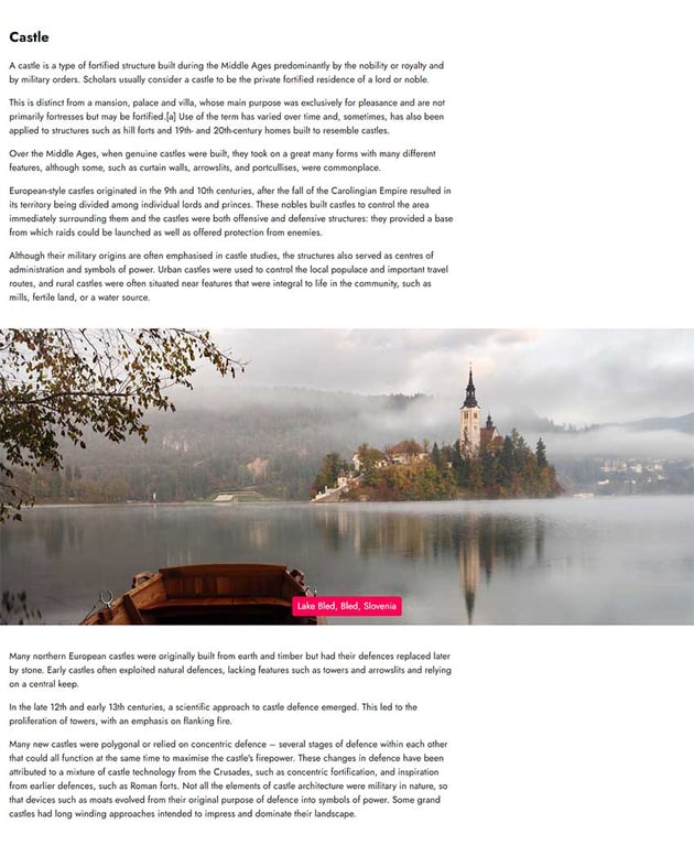
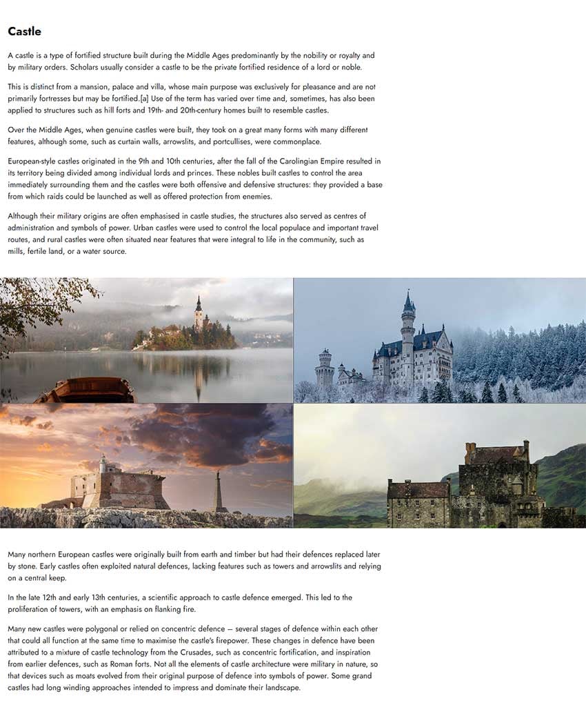
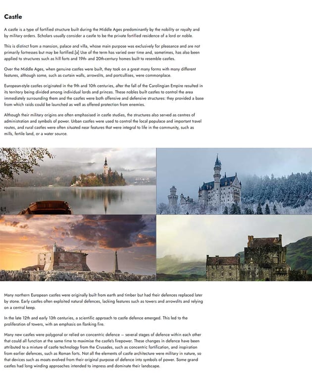
<img src="castle1-unsplash.jpg" alt="Lake Bled, Bled, Slovenia"> |
9 |
<figcaption>Lake Bled, Bled, Slovenia</figcaption> |
10 |
</figure>
|
11 |
</div>
|
12 |
<div class="col col-2"> |
13 |
<figure>
|
14 |
<img src="castle2-unsplash.jpg" alt="Schloss Neuschwanstein, Neuschwansteinstraße, Schwangau, Deutschland"> |
15 |
<figcaption>Schloss Neuschwanstein, Schwangau, Deutschland</figcaption> |
16 |
</figure>
|
17 |
</div>
|
18 |
<div class="col col-3"> |
19 |
<figure>
|
20 |
<img src="castle3-unsplash.jpg" alt="Isola di Capo Passero, Italia"> |
21 |
<figcaption>Isola di Capo Passero, Italia</figcaption> |
22 |
</figure>
|
23 |
</div>
|
24 |
<div class="col col-4"> |
25 |
<figure>
|
26 |
<img src="castle4-unsplash.jpg" alt="Eilean Donan Castle, Dornie, United Kingdom"> |
27 |
<figcaption>Eilean Donan Castle, Dornie, United Kingdom</figcaption> |
28 |
</figure>
|
29 |
</div>
|
30 |
</div>
|
31 |
</section>
|
32 |
|
33 |
<section class="section-text">...</section> |
2. Add the CSS
Let’s focus on the image grid styles—you can see all of them by clicking on the CSS tab of the demo project.
- The image gallery will cover the entire screen.
- Each column (grid item) will sit on top of the other. That said, by default, the last image will appear.


- The
clip-pathproperty will help us create the two-by-two grid that initially appears. The idea is that each column will cover one-fourth of the viewport size.

- Optionally, we’ll use the
::beforeand::afterpseudo-elements of the.gridelement to create some dividers between its columns.


- All
figureelements will be absolutely positioned and their position will depend on thetopandleftvalues. - We’ll use the
object-fit: coverproperty value to place the images inside their parent. This way they will perfectly fit inside it without losing their aspect ratio. Plus, theobject-position: topproperty value will move the image on top of the wrapper. - By default, all image captions won’t appear.
These are all the main styles:
1 |
.grid { |
2 |
position: relative; |
3 |
display: grid; |
4 |
height: 100vh; |
5 |
}
|
6 |
|
7 |
.grid::before, |
8 |
.grid::after { |
9 |
content: ""; |
10 |
position: absolute; |
11 |
background: #333; |
12 |
z-index: 1; |
13 |
}
|
14 |
|
15 |
.grid::before { |
16 |
top: 0; |
17 |
left: 50%; |
18 |
width: 1px; |
19 |
height: 100%; |
20 |
}
|
21 |
|
22 |
.grid::after { |
23 |
top: 50%; |
24 |
left: 0; |
25 |
width: 100%; |
26 |
height: 1px; |
27 |
}
|
28 |
|
29 |
.grid .col { |
30 |
position: relative; |
31 |
grid-area: 1/1; |
32 |
cursor: pointer; |
33 |
transition: clip-path 0.5s; |
34 |
}
|
35 |
|
36 |
.grid .col-1 { |
37 |
clip-path: inset(0 50% 50% 0); |
38 |
}
|
39 |
|
40 |
.grid .col-2 { |
41 |
clip-path: inset(0 0 50% 50%); |
42 |
}
|
43 |
|
44 |
.grid .col-3 { |
45 |
clip-path: inset(50% 50% 0 0); |
46 |
}
|
47 |
|
48 |
.grid .col-4 { |
49 |
clip-path: inset(50% 0 0 50%); |
50 |
}
|
51 |
|
52 |
.grid .col figure { |
53 |
position: absolute; |
54 |
top: 0; |
55 |
left: 0; |
56 |
width: 50%; |
57 |
height: 50%; |
58 |
margin: 0; |
59 |
transition: all 0.5s; |
60 |
}
|
61 |
|
62 |
.grid .col-2 figure { |
63 |
left: 50%; |
64 |
}
|
65 |
|
66 |
.grid .col-3 figure { |
67 |
top: 50%; |
68 |
}
|
69 |
|
70 |
.grid .col-4 figure { |
71 |
top: 50%; |
72 |
left: 50%; |
73 |
}
|
74 |
|
75 |
.grid .col img { |
76 |
width: 100%; |
77 |
height: 100%; |
78 |
object-fit: cover; |
79 |
object-position: top; |
80 |
}
|
81 |
|
82 |
.grid .col figcaption { |
83 |
position: absolute; |
84 |
bottom: 20px; |
85 |
left: 50%; |
86 |
transform: translateX(-50%); |
87 |
padding: 6px 12px; |
88 |
border-radius: 5px; |
89 |
width: max-content; |
90 |
max-width: 95%; |
91 |
line-height: 1; |
92 |
color: white; |
93 |
background: #ff0054; |
94 |
text-align: center; |
95 |
opacity: 0; |
96 |
transition-property: opacity; |
97 |
}
|
3. Apply the JavaScript
Each time we click on a column, we’ll toggle its animate-col class. At that point, the grid of images will morph into a full-screen image.
One important thing to note is that each time an image scales, it should sit on top of all the others. To implement this behavior, we’ll do something simple: we’ll utilize the transitionstart and transitionend events to apply a higher z-index to the target column when it scales in and restore its default stack order when it scales down. Any z-index higher than one will work, and place the full-screen image above the grid dividers.
Another notable thing is that the caption should smoothly appear after the completion of the full-screen image animation and disappear without animation when we click on the column. We follow this approach to prevent the awkward text wrapping on different lines on small screens. To understand it, make the caption always visible and run the animation from a small screen.
Here’s the required JavaScript code:
1 |
const cols = document.querySelectorAll(".grid .col"); |
2 |
const CLASS1 = "animate-col"; |
3 |
const CLASS2 = "animate-caption"; |
4 |
|
5 |
cols.forEach(function (col) { |
6 |
col.addEventListener("click", function () { |
7 |
this.classList.toggle(CLASS1); |
8 |
if (this.classList.contains(CLASS2)) { |
9 |
this.classList.remove(CLASS2); |
10 |
}
|
11 |
});
|
12 |
|
13 |
col.addEventListener("transitionstart", function () { |
14 |
this.style.zIndex = 2; |
15 |
});
|
16 |
|
17 |
col.addEventListener("transitionend", function () { |
18 |
if (col.classList.contains(CLASS1)) { |
19 |
col.classList.add(CLASS2); |
20 |
} else { |
21 |
col.style.zIndex = "auto"; |
22 |
}
|
23 |
});
|
24 |
});
|
And the associated styles:
1 |
.grid .col { |
2 |
transition: clip-path 0.5s; |
3 |
}
|
4 |
|
5 |
.grid .col figure { |
6 |
transition: all 0.5s; |
7 |
}
|
8 |
|
9 |
.grid .col figcaption { |
10 |
transition-property: opacity; |
11 |
}
|
12 |
|
13 |
.grid .col.animate-col { |
14 |
clip-path: inset(0); |
15 |
}
|
16 |
|
17 |
.grid .col.animate-col figure { |
18 |
top: 0; |
19 |
left: 0; |
20 |
width: 100%; |
21 |
height: 100%; |
22 |
}
|
23 |
|
24 |
.grid .col.animate-caption figcaption { |
25 |
opacity: 1; |
26 |
transition-duration: 0.3s; |
27 |
}
|
Conclusion
In this short tutorial, we learned how to take advantage of the clip-path property and turn an image grid into a full-screen image. This gives us endless possibilities for creating appealing motion effects that behave like single-page applications delivering AJAX-driven content with just a little CSS and JavaScript!
Let’s look once more at our creation:
As always, thanks a lot for reading!
More Clip-path Tutorials on Tuts+
Master the CSS clip-path property with these tutorials: