
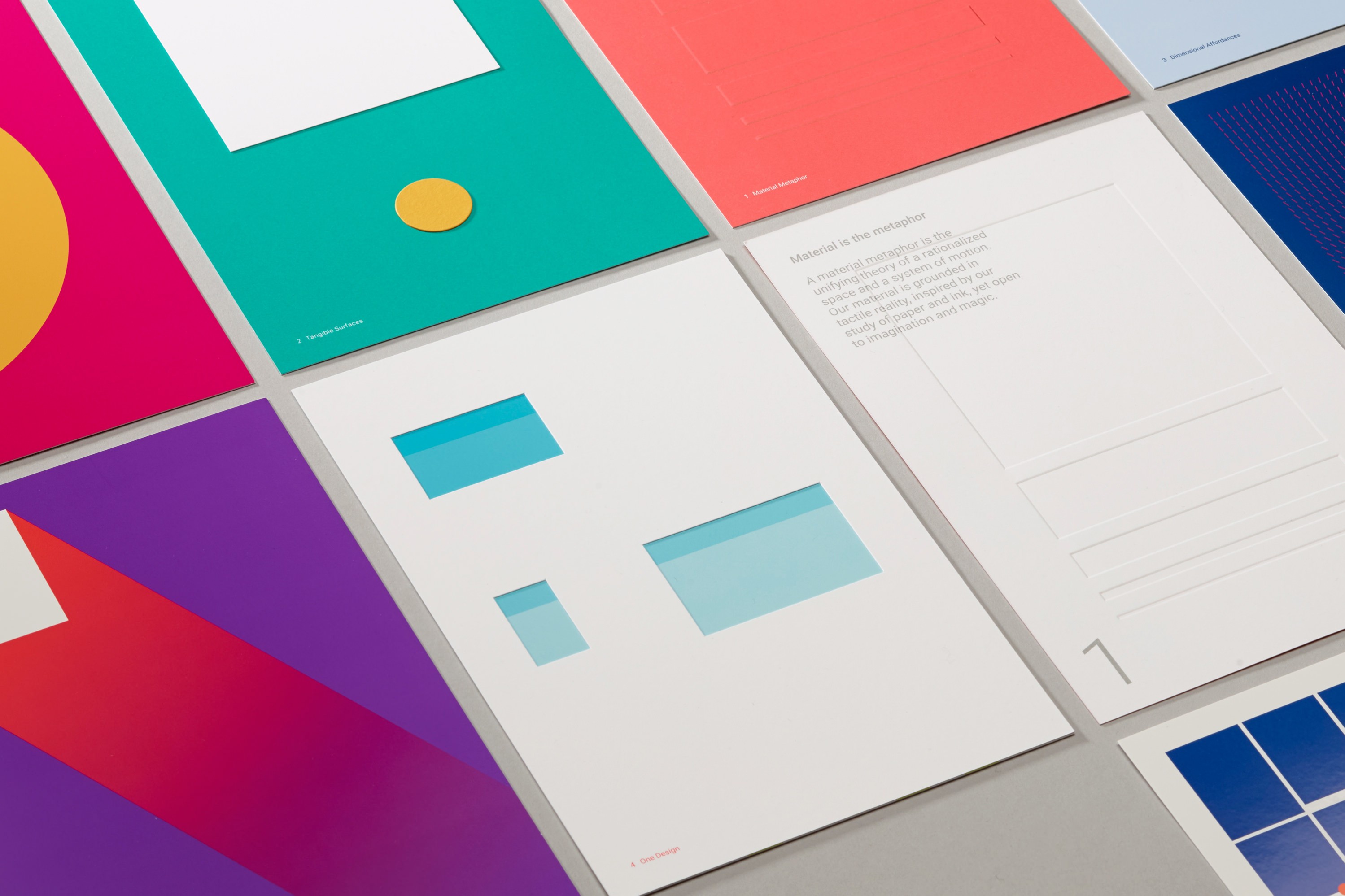
Google Material Design is a major part of the modern web’s design language. This is especially true for mobile websites and apps. It’s a clean, legible design with visually distinct elements to draw the eye and make user interaction simple. Material design apps, by and large, use flat, paper-based designs that rely on graphic color and bold typography. Images are edge-to-edge, and icons have a stacked paper feel to them. On the z-axis, elements are all the same paper-thin width, casting visible and distinct shadows. You can learn more about Material Design’s guidelines from their official guide.
1. Start with a wireframe
A major part of Google’s Material Design is edge-to-edge color and images. Look at Google’s own web services at apps (the ones that use Material Design, anyway) and you’ll see that everywhere. You’ll also notice meaningful, plentiful whitespace. This most often contains the most important data, or the data that needs to be most legible: i.e., songs on Google Play Music or emails on Inbox. This isn’t the kind of thing you can just drop in to a pre-existing website, but you need to design from the start with that in mind. The easiest way to get a design that harmonizes with this approach is to start with a wireframe. If you’re not familiar with the term, a wireframe is a broadly empty page design that focuses on layout instead of content. Make sure your horizontal elements fill the whole page (or close to it). Draw your wireframe in big, legible chunks. If you’ve never worked on a wireframe, we have some great web-based wire framing tools you can start out with. You can also use a framework like Material UI to help out.
2. Stack elements vertically
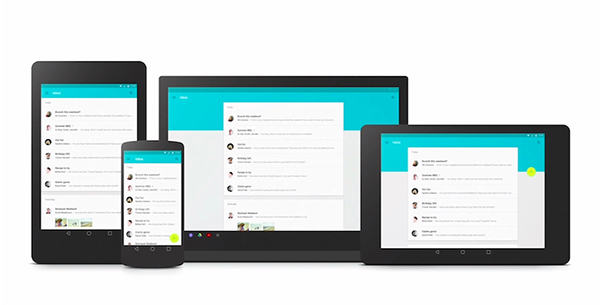
Adopt a mobile-centric design philosophy. When organizing the elements on your page, don’t put too many elements side-by-side. Instead, your body content should occupy around 60% of your desktop layout’s width (but more like 90% on mobile). To aid in this pursuit, focus on working your way down the page instead of stacking things next to each other. This will help you adopt a mobile design language, with page elements stack on top of each other instead of next to each other, as is seen on desktop.
3. Add graphic colors
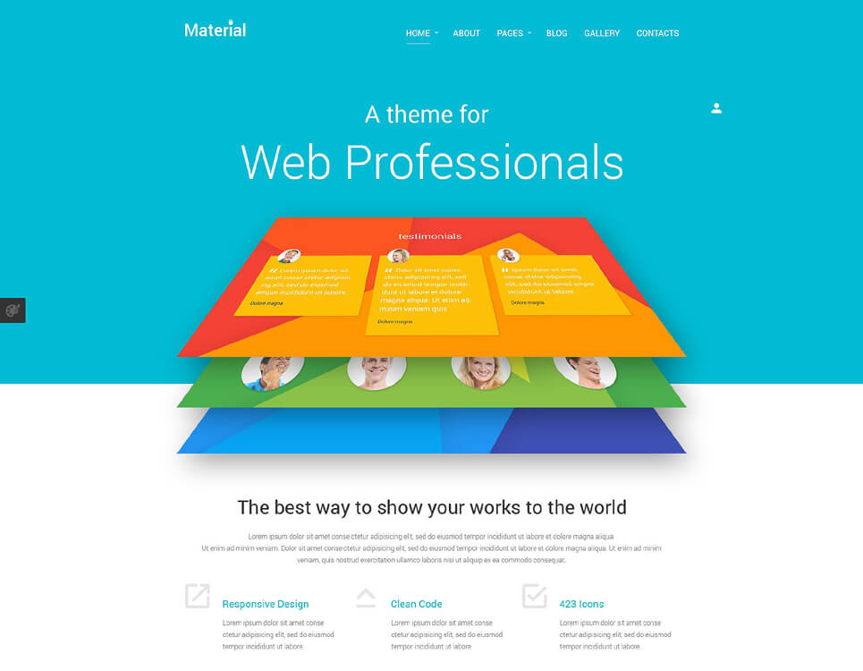
Once you’ve got the basics of your wireframe down, you can start adding colors. Material Design focuses on bold, extravagant uses of single colors. This graphic use of color draws the eye and helps the reader intuitively understand the design of the page. Looking at Google’s own Material Design pages, you can see that the top horizontal element often includes a full-width colored block. Adopt this strategy: it’s one of the most recognizable elements of Material Design. The color your choose should be bright, recognizable and, if possible, unique. Look through Google’s own apps and avoid picking any of the colors they use. Make sure that you do use a color that shows up decently on all screen types: it’s possible to use colors that look bad on cheaper mobile (or even desktop) displays, which you’d want to avoid. Also ensure that you use a similar or the same color as an accent on user interface elements, especially OK buttons or buttons to create new content, like a new email. This goes double if the icon is persistent.
4. Use whitespace for text or data
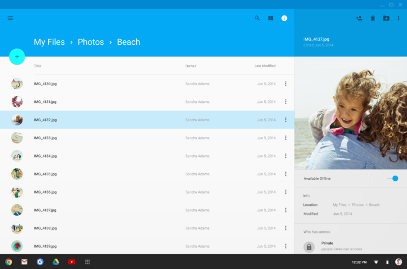
As much as bold color is a typical part of Google’s Material Design, whitespace is just as much part of the visual design language. You need to use considerable whitespace in your design to fit within the Material Design standards, as evidenced by reviewing Google’s own apps. It might be challenging to imagine this design, so it’s easiest to cop inspiration from one of the many Material Design apps Google and other developers have published. But, ideally, your colored interface will stop at the top of the page. Below that, the user will get plentiful whitespace. On top of this whitespace, we’ll see your users’ data. Maybe it’s bus times, maybe its messages, maybe its upcoming songs. Whatever it is, you’ll want to make sure that it’s on white and legible, in a sans-serif font.
5. Get bold typography
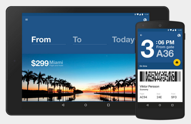
Bold typography doesn’t literally mean <strong>. It means creating typographic designs that use large text and numerals. These make the page’s function super clear, helping the reader understand what the most important data type is. On a weather app, for example, the current temperature should be gigantic. Look at some other apps, and you can see that sometimes this information appears comically large. That’s actually well in keeping with the Material Design ethos of making things super easy for the user to understand at a glance. You can include your H1 typography on top of your color block, and maybe a little H3 under your color block. Sans-serif is a must for Material Design, but feel free to play around with finding a unique font. This is especially true for data-based apps that might want interesting numerals. If you can’t find one you like, Roboto is generally the default English font for Material Design. Check out Material Design’s typography page for more info.
6. Use shadows
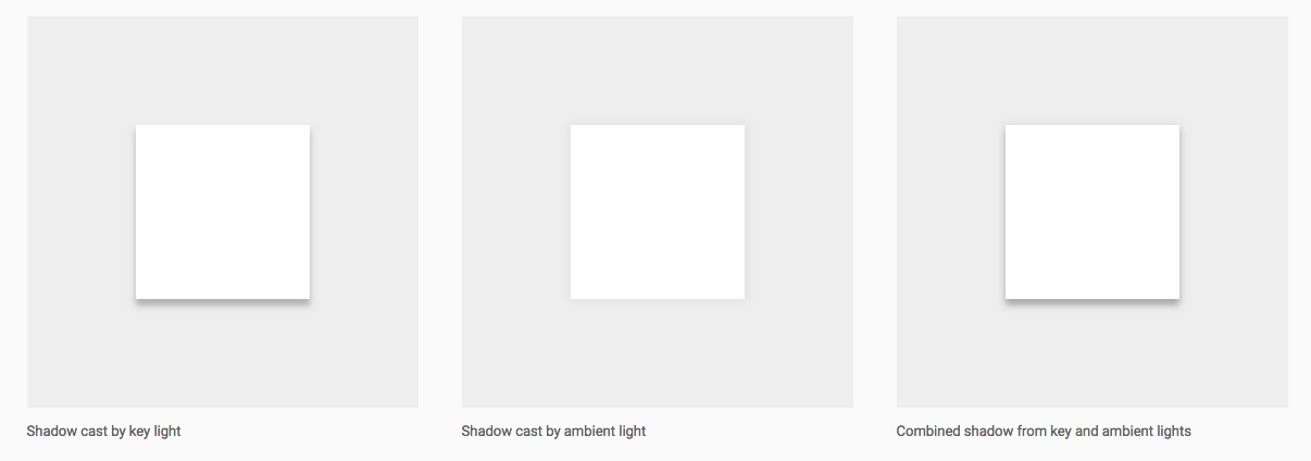
Material Design actually provides a fairly detailed guide to how shadows should work. There’s a concept called a “key light” which shines on the most important user interface element and casts a noticeably darker, better-defined shadow. Other stacked elements also have a shadow, but it’s softer and ambient. Also, this is a great time to mention that all elements in Material Design should be the same width, which is about “paper thin.” The idea behind Material Design is to emulate bold and graphic print designs, with paper stacked on top of paper. Don’t use elements that are thicker, and don’t let your shadows be of varying lengths. Use the “key light” to focus the user’s attention and ensure they see the most important element on the page.
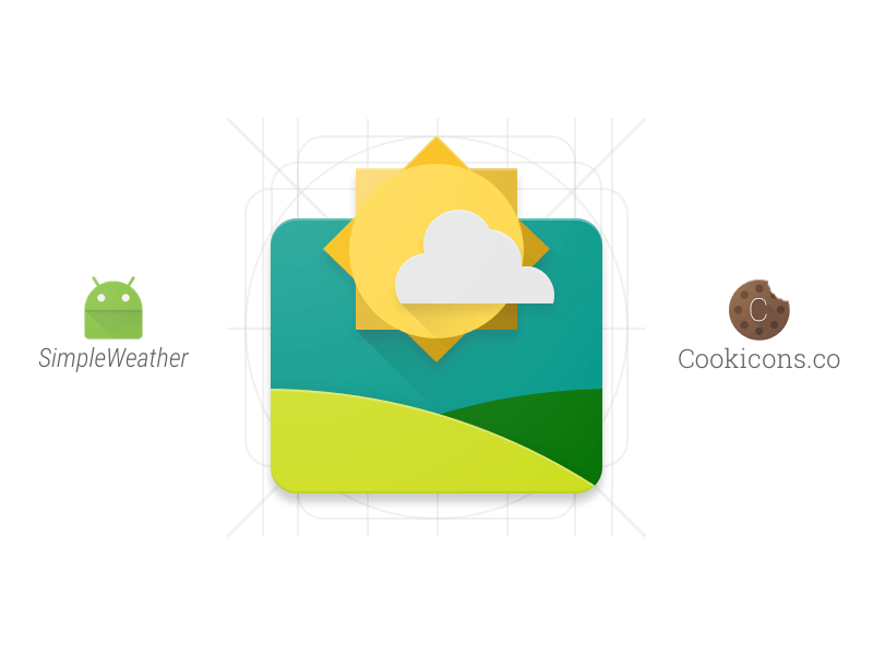
7. Create a Material icon
Since Material Design is a mobile-first design language, creating Material Design icons is important. These use the same design language of the rest of material design, stacking colorful, single-depth shapes like paper cutouts to create delightful images. These are some of our favorite icon designs, and you can check out a whole icon gallery for inspiration (and use!) at the Material Design site.
You might also like the following post:
15 Quality Web-Based Applications to Create Mock-Ups and Wireframe
How to Build a Chrome Extension
A Little Help – Developing A Tutorial-Driven Website