
Move aside brutalism, there’s a new web design trend in town. Welcome to the stage neubrutalism, which is a refreshing combination of the brutalist trend as well as the modern, minimalist trend that’s graced our screens for many years now. Read on for key features of this new design including what to look out for, real-world examples, plus a few neubrutalist-inspired web design templates from ThemeForest.
Okay, So What Actually Is Neubrutalism?
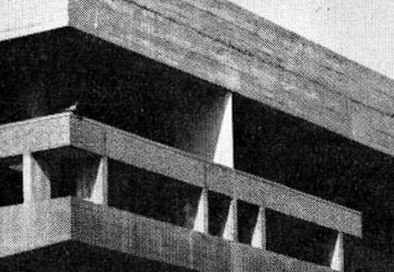
Friends (or foes) of the brutalism web design trend will know that it’s a style that earned its name due to its affinity to brutalism in architecture, i.e. it rejects decorative pomp and ceremony in favor of rough, unfinished surfaces, unusual shapes, solid materials, and contrasting small features. The concrete-heavy Barbican in London is a classic example of brutalist architecture.
It certainly won’t be to everyone’s tastes, but brutalist web design can be seen as rejecting the more popular, softer web and instead adopting harsh, raw, or uncomfortable forms. To see more examples of brutalist websites, check out brutalistwebsites.com.
Neubrutalism takes recent website trends to the next level—it retains its edge while also combining the unusual style with more modern animation, illustration, and text standards. Although neubrutalism is an unofficial term right now, it’s already being talked about in the world of web design and it’s the sort of thing which sticks, so it’s great to get ahead of the curve!
If you’re new to neubrutalism, here are a few traits to look out for:
- Ugly (ish): Whether you love or hate this style, it adds variety to the modern minimal style that has been popular for many years. Neubrutalism favors imagery that looks ‘a bit off’—whether through unusual color or design choices. Ultimately, it catches the eye by standing out from modern web design trends that have come before.
- Clashing colors: This is a website trend not afraid to stand out—colors are often clashing but muted. It certainly doesn’t follow the ‘less is more’ philosophy.
- No gradients: This has been a huge trend over the past years, but neubrutalism favors flat colors in an almost pop-art style.
- Modern typography: Although brutalism often opts for weird, stretched, or convoluted typography, neubrutalism tends to follow modern typography rules to allow for easier legibility. Think weird backgrounds and colors meet legible, geometric text. More on this in a moment.
- Animations: Despite the style looking back to the past in its overall naivety, the addition of modern animations helps to once again modernize the look.
A Word on Neubrutalist Typography
When you scroll through the neubrutalist website examples below you’ll likely notice the typography used for the headings—they almost all use quirky grotesque typefaces.
They’re often a bit beyond what we’d define as grotesque (or grotesk) and drift into the display font world, but however you define them they certainly make an impact. Get unlimited access to plenty of grotesque web fonts on Envato Elements right now!
“A grotesque sans serif font lacks a serif, which is a little extra stroke commonly seen at the end of some typefaces. It has, instead, a more abrupt edge.” — Daisy Ein
Real-World Examples of Neubrutalism
Read on for 10 examples of neubrutalist design hitting the web right now. Which is your favorite?
1. Gumroad
Check out the muted, clashing, gradient-free colors combined with thick black outlines. Typography is modern and easy to read, setting it apart from the often clunkier styles preferred within brutalist design. Animations also help to modernize brutalist design.
2. Figma
One of the most famous examples of neubrutalist web design, Figma avoids shadows across all imagery, instead opting for sharper, darker black lines surrounding the shapes. Clashing hues such as orange and yellow also feel a little challenging on the eye which helps them to stand out.
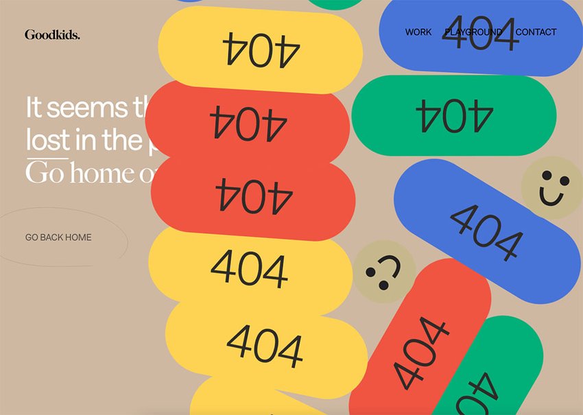
3. Goodkids Agency
As soon as you set a foot wrong on the Goodkids website, it’s impossible to miss the oversized 404 animations which unevenly pile on top of each other to fill the screen. Smiley emojis are in a similar tone to the website’s beige background, making them feel slightly jarring and therefore weirdly eye-catching.


4. Readymag
Channeling retro design trends, you’d be forgiven for thinking Readymag’s website comes straight out of the 90s. Subtle animations help to remind the user this is in fact a modern design choice! The flat grey navigation buttons are eye-catching in their simplicity.
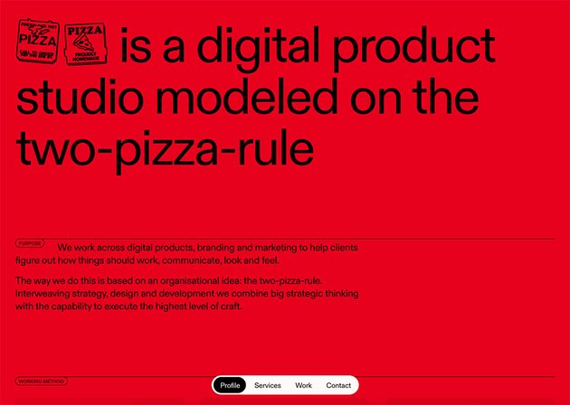
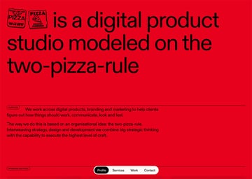
5. Pizza Pizza
Confident in its simplicity, Pizza Pizza opts for a flat red against black—it feels a little difficult on the eye, but you can’t help but carry on looking. The lack of imagery on the homepage also goes against most image-rich websites.

6. Guiacirugiacardiaca.com
Flat, muted imagery against minimal and modern typography, the Cardiac Surgery Guide is a classic example of neubrutalist web design. Striking simplicity meets modern touches like the cursor when you scroll over content pieces and the logo that spins when the user scrolls.
7. Christou 1910 Days
The bold white text against clashing colorful blocks is challenging to read—hence you pay extra attention! Modern animations like happy walking clouds fill this fun website, a great juxtaposition against the flat color scheme.
8. Plus
Orange and lilac? Lemon yellow and royal blue? Daring combinations, but Plus’ website combines them all for an undeniably neubrutalist look. Bold animations and the novelty cursers almost gamify this edgy site.
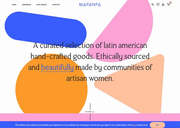
9. Mafanfa
As you scroll, fun animations burst into action within this neubrutalist website. A lot of thought has gone into how the user interacts with the site—when the mouse hovers over certain elements, many change color or move. To a certain extent, the user creates the website they’d like to see.


10. Castor & Pollux
A text-heavy site, the Castor & Pollux is sprinkled with color as the user scrolls. Even the social sharing buttons avoid the classic iconography you might expect in favor of simple text signposting.
Neubrutalism-Inspired Web Templates
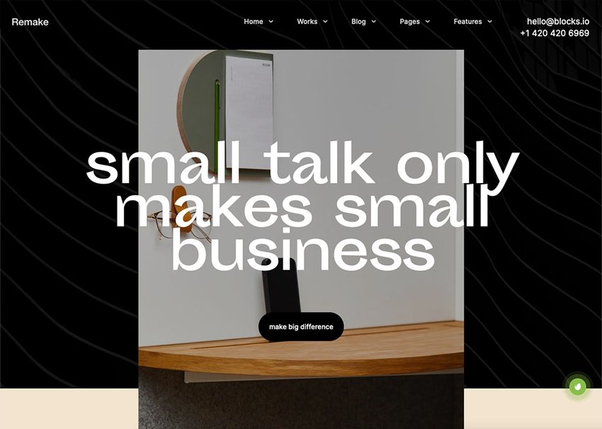
1. Remake – Minimal Theme
With 10+ premade skins to show off your work, Remake is a versatile web design theme. The Kyona theme, for example, uses a sprinkling of bright colors against more muted tones. The templates also come with single project and case study pages—perfect to display your work in style.

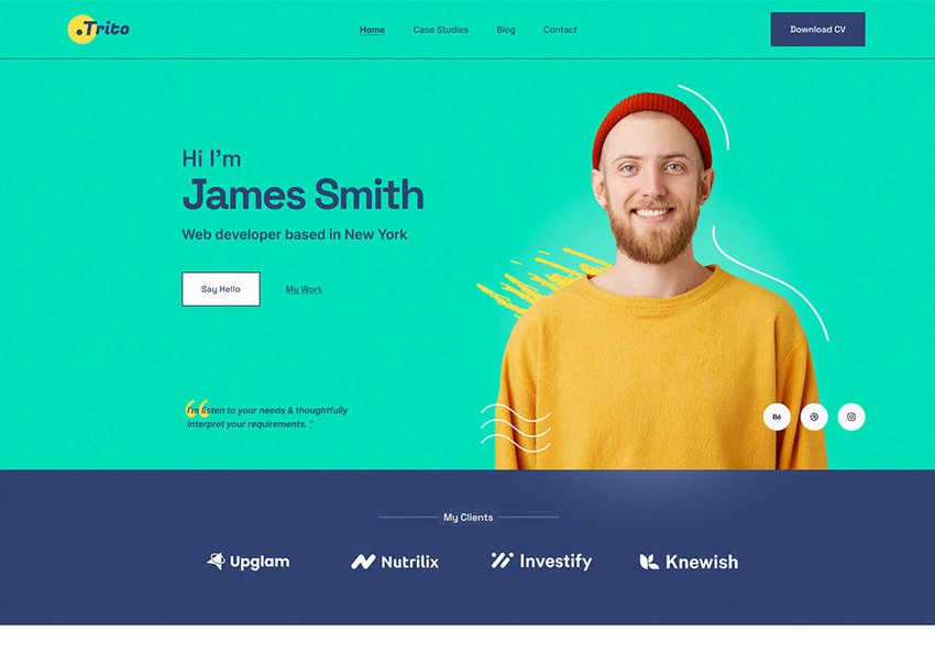
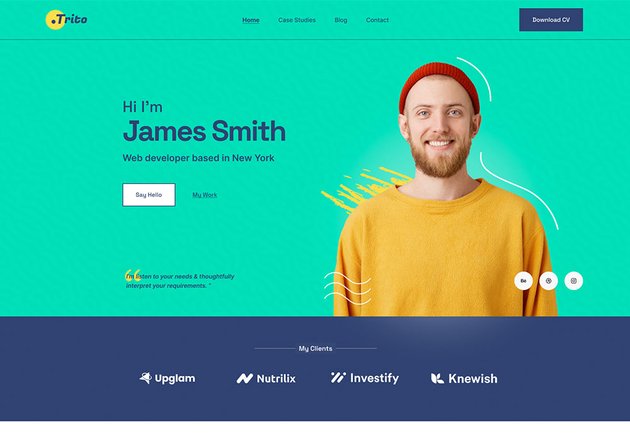
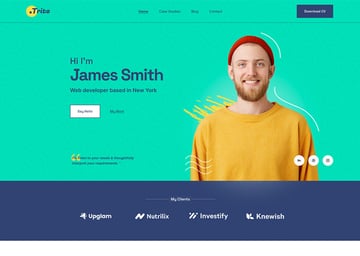
2. Trito – Personal Portfolio Website Figma Template
Flat colors meet modern imagery and contemporary illustrations within this neubrutalist web design template. A one-page personal portfolio template, this has been designed especially for developers or designers to showcase their skills. It comes with a light and dark mode, so you can edit your template according to your taste. Released in May 2022, it’s clear Trito has been designed with the latest web design trends in mind.
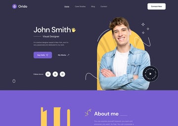
3. Orido – Personal Portfolio Website Figma Template
Also released in May this year, Orido comes with light and dark mode as well as free fonts and icons. The vibrant clashing yellow and purple color scheme and legible font choices are nods to the latest web design trend.


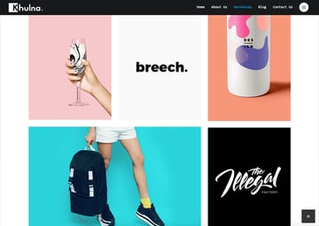
4. Khulna – Colourful Minimal Digital Agency HTML Template
A simple and easy-to-follow web design template, check out the colors chosen within the portfolio section. This template comes with features including the Slider revolution to hero content quickly and easily, as well as a responsive layout design. The blog pages are also well-designed.


Over to You!
Now you’ve learnt all about the neubrutalism website trend and explored some of my top web themes and templates, it’s time to get creative! Either pick a theme from this post that works for you or head over to ThemeForest and find or create your own. Which website trends are your favorite right now?