
We recently published a tutorial explaining how to build a JavaScript-driven Gantt Chart. I think it’s the perfect case study for CSS Grid, so in this tutorial we’ll see how well suited CSS Grid Layout is for building a flexible Gantt Chart.
Our CSS Grid Gantt Chart
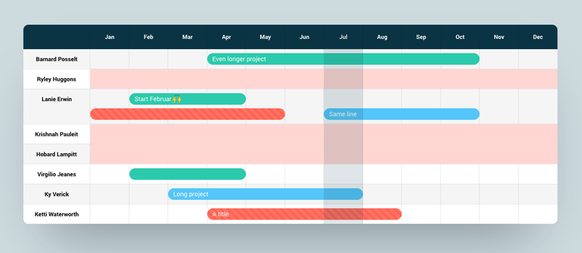
Here’s what we’re building. It uses CSS Grid to lay out the labels, dividing lines, and tasks. And it uses line names to help us define the task durations in a human-readable way.
For the complete effect, check out the fullscreen version and play with its fluid layout.
If you need a quick refresher on how to use CSS Grid, this guide will get you started:
Reminder: What Exactly is a Gantt Chart?
Henry Gantt was a mechanical engineer who, in the lead up to The Great War (as it was known before the need to number them arose) was tasked with project managing the American military and munitions. This was quite a meaty undertaking, so he used his own way of visualizing all the relevant jobs, their timelines, and designated responsibilities. Ladies and gentlemen, the Gantt Chart:
Right then, that’s enough preamble. Let’s build a Gantt chart with CSS Grid.
1. Begin with Some Markup
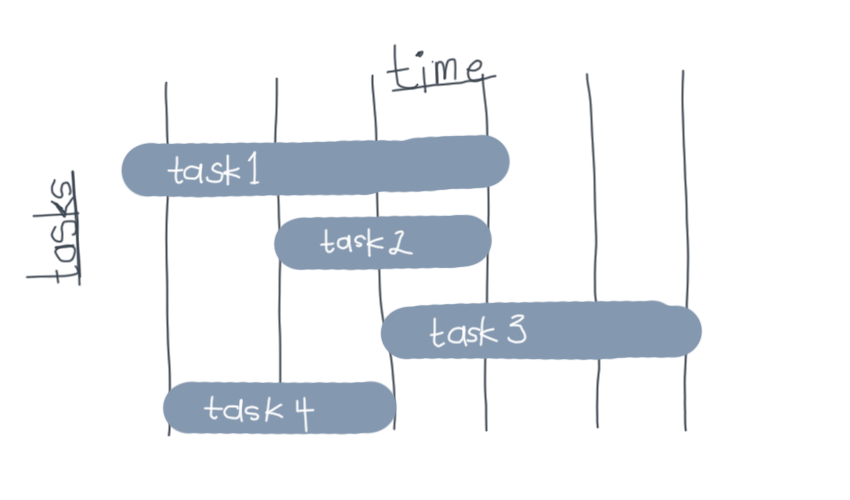
We’ll need a few elements for our chart. Look at this highly accurate diagram and all will become clear:

You can see we’ll need headers for our days, lines to divide the columns up, the tasks themselves, and probably a wrapper around the whole thing. So we’ll begin with the wrapper:
<div class="gantt">


</div>
This will serve as our grid, so we’ll need to say so in our first CSS declaration (along with some other stylistic bits and pieces):
.gantt {
  display: grid;
  grid-template-columns: repeat(14, 1fr);
  grid-gap: 10px 0px;
  width: 100%;
  max-width: 1150px;
  padding-top: 40px;
  margin: 0 auto;
}
You’ll notice we’ve declared the columns for our grid here, but I’ve said we want 14 of them with repeat(14, 1fr). You might think we’d need 7 (one for each day) but I’d like each day to be split in two so we can have tasks starting and ending in the middle of the day.
Also worth noting: we’ve added grid-gap: 10px 0px; which gives us 10px of grid gap top and bottom, but nothing to the left and right. This will space out our tasks vertically.
2. Add Some Headings and Lines
Without content we’ve literally nothing to see yet, so let’s add some headings (our days) and the dividing lines.
<div class="gantt">

  <span class="d-1"></span>
  <span class="d-2"></span>
  <span class="d-3"></span>
  <span class="d-4"></span>
  <span class="d-5"></span>
  <span class="d-6"></span>

  <h3 class="h-sun">sun</h3>
  <h3 class="h-mon">mon</h3>
  <h3 class="h-tue">tue</h3>
  <h3 class="h-wed">wed</h3>
  <h3 class="h-thu">thu</h3>
  <h3 class="h-fri">fri</h3>
  <h3 class="h-sat">sat</h3>

</div>
This might look a little heavy-handed, but we’re going to be laying some elements on the same grid coordinates as others–grid’s auto-placement won’t help us with that, so we’ll need to individually select most of the items.
On the next exquisitely crafted drawing you’ll see that our headings are each spanning two columns, and the dividing lines are positioned two columns away from one another as well.
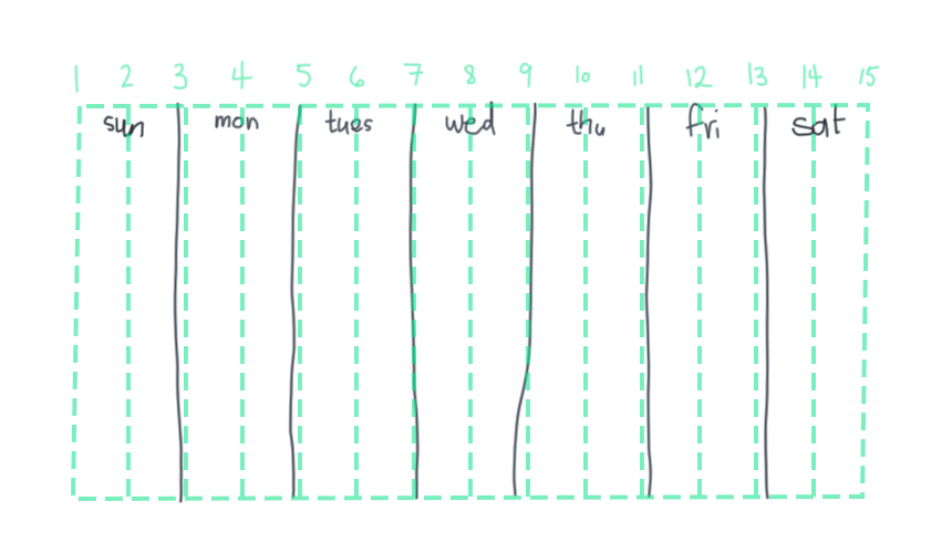
Our Tuesday heading, for example, is positioned on grid column line 5; so too is the dividing line between it and Monday.
Here we have some styles for our dividers, including a grid-column rule for each one to position it on the right grid line. We also need to make sure they span down all the rows we’ll need:
/* dividers */
span {
  border-left: 1px solid lightgrey;
  grid-row: 1 / span 10;
}

span.d-1 { grid-column: 3; }
span.d-2 { grid-column: 5; }
span.d-3 { grid-column: 7; }
span.d-4 { grid-column: 9; }
span.d-5 { grid-column: 11; }
span.d-6 { grid-column: 13; }
Next we do something similar for the headings. You’ll notice that these grid-column declarations include the span keyword to make each heading span across two columns.
/* days */
h3 {
  text-align: center;
  grid-row: 1;
}

h3.h-sun { grid-column: 1 / span 2; }
h3.h-mon { grid-column: 3 / span 2; }
h3.h-tue { grid-column: 5 / span 2; }
h3.h-wed { grid-column: 7 / span 2; }
h3.h-thu { grid-column: 9 / span 2; }
h3.h-fri { grid-column: 11 / span 2; }
h3.h-sat { grid-column: 13 / span 2; }
Now we actually have something to look at!
3. Add Some Tasks
Our tasks are a pile of div elements. I’ve included their grid-column values inline because in a real world scenario these would probably be added to the markup somehow, rather than the stylesheets.
  <div class="t-1" style="grid-column: 1 / span 4;">Take the badger for a walk</div>
  <div class="t-2" style="grid-column: 3 / span 12;">Manufacture some cheese</div>
  <div class="t-3" style="grid-column: 1 / span 5;">Prepare talk on foot hygiene</div>
  <div class="t-4" style="grid-column: 6 / span 3;">Sleep</div>
  <div class="t-5" style="grid-column: 3 / span 3;">Photograph breakfast</div>
  <div class="t-6" style="grid-column: 4 / span 6;">Paint the inside of the refrigerator</div>
  <div class="t-7" style="grid-column: 6 / span 9;">Sail to Madagascar</div>
  <div class="t-8" style="grid-column: 8 / span 1;">Sleep</div>
  <div class="t-9" style="grid-column: 10 / span 5;">Plan the following week’s tasks</div>
Without doing anything else we’ll already have these divs more or less positioned correctly on our Gantt chart. Saying that, some more styles are needed:
/* tasks */
.gantt div {
  color: white;
  font-size: 12px;
  padding: 10px 20px;
  border-radius: 20px;
}

@media only screen and (min-width: 600px) {
  .gantt div {
    font-size: 16px;
  }
}
These styles give our tasks some basic sizing, with a media query to increase the font-size on larger screens. Next we need the styles to give each task a background color and a specific row number. Without these grid-row rules CSS Grid Layout’s auto-placement would get to work and put our tasks wherever it saw fit (not ideal).
/* specific task styles */
.t-1 { background: #b03532; grid-row: 2; }
.t-2 { background: #33a8a5; grid-row: 3; }
.t-3 { background: #30997a; grid-row: 4; }
.t-4 { background: #6a478f; grid-row: 5; }
.t-5 { background: #da6f2b; grid-row: 6; }
.t-6 { background: #3d8bb1; grid-row: 7; }
.t-7 { background: #e03f3f; grid-row: 8; }
.t-8 { background: #59a627; grid-row: 9; }
.t-9 { background: #4464a1; grid-row: 10; }
With that done, we have ourselves a flexible Gantt chart!
4. Improvement: Name the Grid Lines
As I’ve mentioned before, it’s a good idea to give your grid lines names. Our Gantt chart is the perfect example of where that’s especially true.

When we’re positioning our tasks on the chart, having to visualize the grid line numbers is a clumsy way of doing things. It would be much easier if we could say, in a human way, at what point our tasks begin and end.
Let’s try this:

If we use a system like this we could say that a task “starts on Tuesday midday, then finishes on Thursday morning” for example.
We’ll begin by redefining our grid, this time wrapping each of our 14 columns in a line name:
.gantt {
    display: grid;
    grid-template-columns:
        [sun-morning] 1fr [sun-midday] 1fr [sun-night
Ah, now we’re stuck. We’ve named grid line 1 sun-morning, line 2 sun-midday, and line 3 sun-night. But line 3 is actually more than just Sunday night, it’s also Monday morning, depending on how you look at it.
Luckily, we can assign more than one name to a grid line, so we’ll name it sun-night mon-morning. Continue on, naming all the lines as you go.
.gantt {
  display: grid;
  grid-template-columns:
      [sun-morning] 1fr [sun-midday] 1fr
      [sun-night mon-morning] 1fr [mon-midday] 1fr
      [mon-night tue-morning] 1fr [tue-midday] 1fr
      [tue-night wed-morning] 1fr [wed-midday] 1fr
      [wed-night thu-morning] 1fr [thu-midday] 1fr
      [thu-night fri-morning] 1fr [fri-midday] 1fr
      [fri-night sat-morning] 1fr [sat-midday] 1fr
      [sat-night];
Now we need to change the way our tasks are positioned in the markup. We can define them all like this:
grid-column: mon-morning / sat-night;
How clear is that?! Here’s what we end up with:
Conclusion
And we’re done. We’ve used CSS Grid Layout to create a flexible Gantt chart. Not only that, we made the code human-readable to make organizing the chart data even easier.
If you want to take your own Gantt chart to the next level and you need some inspiration, take a look at Phil’s concept on CodePen (it’s a beauty):
If you have any questions or suggestions, let us know in the comments!
More Project-Based CSS Grid Tutorials
Nothing teaches better than “doing”.