Build a Static Portfolio With Advanced CSS Bar Chart
In a previous post, I showed you how to build a beautiful fullscreen portfolio page. During that tutorial we also learned how to create a responsive CSS column chart. In this tutorial we’ll build another attractive static portfolio page, this time featuring a pure CSS bar chart without using any external JavaScript library, SVG, or the canvas element!
What We’re Building
Here’s the project we’ll be creating:
We have a lot of exciting things to cover, so let’s get started!
Note: This tutorial assumes some good CSS knowledge. For instance, you should be familiar with CSS positioning and flexbox basics.
Note: Beyond the elements’ specific classes, our markup contains a number of utility (helper) classes. We’ll use this methodology to keep our CSS as DRY as possible. However, for the sake of readability, within the CSS we won’t group common CSS rules.
2. Define Some Basic Styles
Following what we’ve just discussed above, we first specify some reset rules along with a number of helper classes:
The call-to-action includes a thin line which is animated infinitely, compelling the user to scroll down to see what’s beneath “the fold” (which may or may not exist).
Initially the call-to-action will be visible. But when the user starts scrolling, it will disappear. More specifically, it will receive the is-hidden class which we have just defined in the styles above.
The left part of this section contains an image taken from WordPress Code Backgrounds on Envato Elements. It will give us the atmosphere we’re looking for, whilst inspiring the colors we use elsewhere in the design:
WordPress Code Backgrounds
Some key things:
The image will appear on screens wider than 900px and
we’ll use CSS (via the background-image property) and not HTML (via the img element) to place the image within the page. We choose this method because that gives us an easy way to enhance the image appearance. For example, we’ll skew it by taking advantage of its ::after pseudo-element. You could even play with its colors using background-blend-mode: luminosity, for instance.
Note: By default an img is an empty element and doesn’t have pseudo-elements.
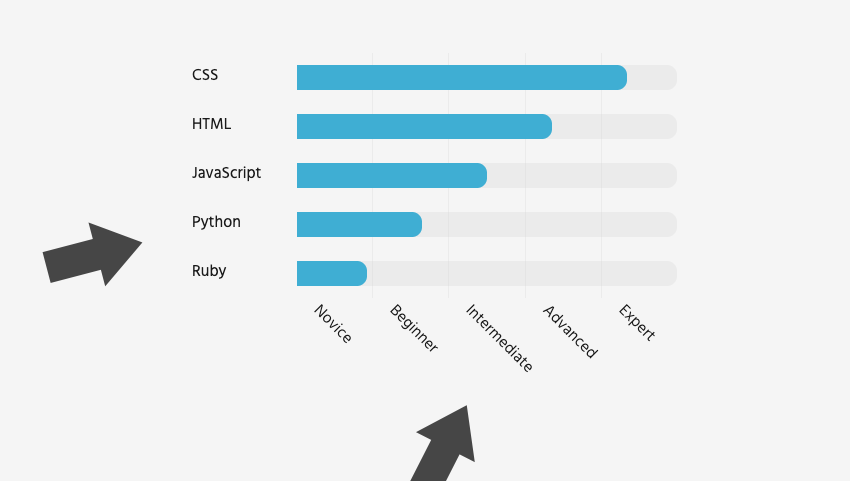
At this point we’ll concentrate on the most challenging part of our demo; how to construct the bar chart.
The chart will have two axes. On the y-axis we’ll place the web skills (CSS, HTML, JavaScript, Python, Ruby). On the other x-axis we’ll put the skill levels (Novice, Beginner, Intermediate, Advanced, Expert).
The y-axis
In terms of markup, each skill is a list item placed inside the .chart-skills list. Next, each list item will hold its text within a span element, like this:
We define a fixed width for the span element equal to 120px. To avoid repetition and so we can easily change this value (as other values will depend on it), let’s store it inside a CSS variable:
But as soon as the chart becomes visible in the viewport, their width will be animated and receive a value that will be determined by the associated skill level:
Add Class When in View
There are multiple ways to detect whether an element is visible in the viewport or not. Let’s take advantage of the following handy function extracted from an old, yet popular StackOverflow thread:
function isElementInViewport(el) {
  var rect = el.getBoundingClientRect();
  return (
    rect.top >= 0 &&
    rect.left >= 0 &&
    rect.bottom <= (window.innerHeight || document.documentElement.clientHeight) &&
    rect.right <= (window.innerWidth || document.documentElement.clientWidth)
  );
}
If you have read my previous tutorials, you might remember that I’ve also used this function to animate a vertical timeline.
So, back to the job in hand! When the chart becomes visible in the current viewport, we’ll give it the in-view class.
Here’s the JavaScript code that does this job:
const chartWrapper = document.querySelector(".chart-wrapper");

window.addEventListener("scroll", scrollHandler);

function scrollHandler() {
  if (isElementInViewport(chartWrapper)) chartWrapper.classList.add("in-view");
}
The ::before pseudo-elements should be animated sequentially. To give them the desired transition speed, we’ll use two other CSS variables along with the calc() CSS function.
Here are the CSS styles responsible for revealing those sudo-elements:
Keep in mind that Microsoft Edge doesn’t support the above math operations, so if you need to support it, just pass some static values instead, like this:
In terms of markup, each level is a list item placed inside the .chart-levels list. Next, each list item will hold its text within a span element, like this:
We’re almost done! As one last thing, let’s ensure that the text has a solid appearance across all screens. We’ll apply a rule targeting narrow screens:
@media screen and (max-width: 600px) {
  html {
    font-size: 12px;
  }
}
One important note here is that in our styles we’ve used rem for setting the font sizes. This approach is really useful because the font sizes are relative to the root element (html). If we decrease its font size like in the code above, the rem-related font sizes will be dynamically decreased. Of course, we could have used rems for the other CSS properties as well.
The final state of our project:
Conclusion
In this tutorial we improved our CSS knowledge by learning how to build an attractive static portfolio page. We went one step further and created a responsive bar chart without using any external JavaScript library, SVG, or the canvas element. Just with plain CSS!
Hopefully this tutorial has given you enough inspiration for building your awesome portfolio site. I’d love to see your work–be sure to share it with us!
Next Steps
If you want to further enhance or extend this demo, here are two things you can do:
Add smooth scrolling behavior to the menu links without using any external JavaScript library.
Use the more effective Intersection Observer API instead of the scroll event for checking whether the chart is visible in the viewport or not.
As always, thanks for reading!
More Practical Projects to Boost Your Front-end Skills