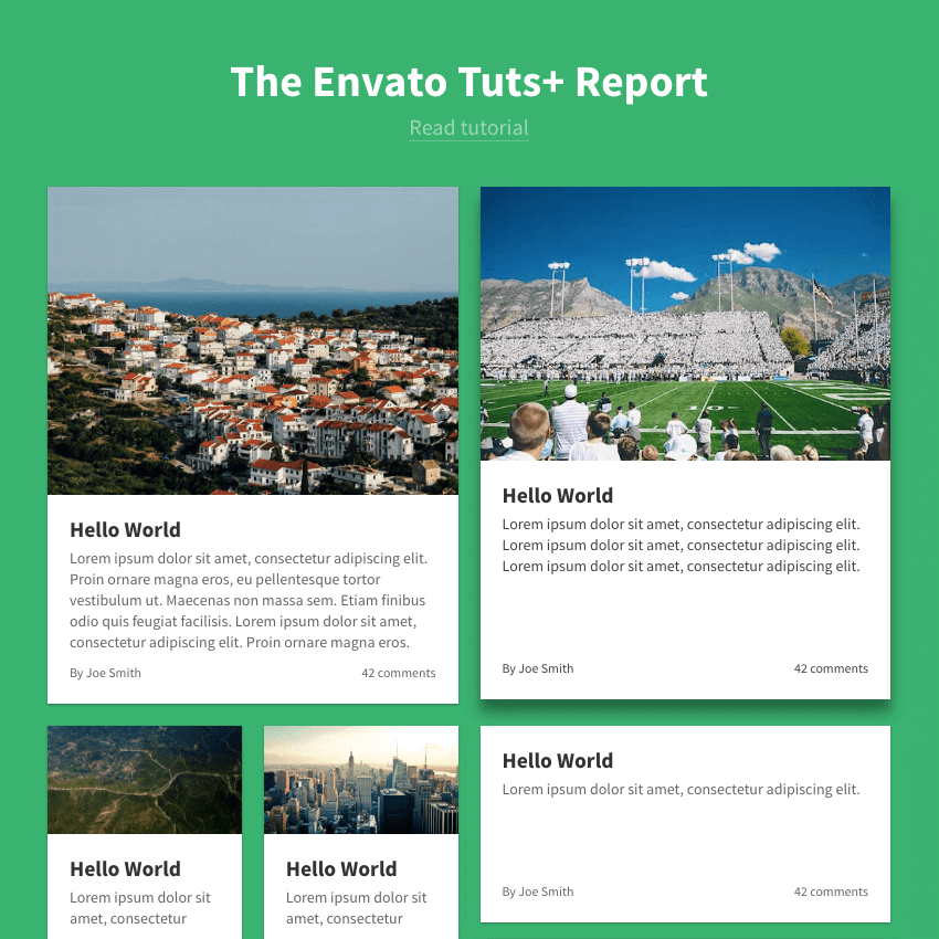
It’s not necessary to understand every aspect of Flexbox before you can jump in and get started. In this tutorial, we’re going to introduce a few features of Flexbox whilst designing a “news layout” like the one you can find on The Guardian.
The reason we’re using Flexbox is that it provides very powerful features:
- we can easily make responsive columns
- we can make columns of equal height
- we can push content to the bottom of a container
So let’s get started!
1. Start with Two Columns
Creating columns in CSS has always been a challenge. For a long time, the only options were to use floats or tables, but they both had their own issues.
Flexbox makes the process easier, giving us:
-
cleaner code: we only need a container with
display: flex - no need to clear floats, preventing unexpected layout behavior
- semantic markup
- flexibility: we can resize, stretch, align the columns in a few lines of CSS
Let’s start by making two columns; one that’s 2/3 of the width of our container, and one that’s 1/3.
<div class="columns">
  <div class="column main-column">
    2/3 column
  </div>
  <div class="column">
    1/3 column
  </div>
</div>
There are two elements here:
- the
columnscontainer - two
columnchildren, one with an additional class ofmain-columnwhich we’ll use to make it wider
.columns {
  display: flex;
}

.column {
  flex: 1;
}

.main-column {
  flex: 2;
}
As the main column has a flex value of 2, it will take up twice as much space as the other column.
By adding some additional visual styles, here’s what we get:
2. Make Each Column a Flexbox Container
Each of these two columns will contain several articles stacked vertically, so we’re going to turn the column elements into Flexbox containers too. We want:
- the articles to be stacked vertically
- the articles to stretch and fill the available space
.column {
  display: flex;
  flex-direction: column; /* Makes the articles stacked vertically */
}

.article {
  flex: 1; /* Stretches the articles to fill up the remaining space */
}
The flex-direction: column rule on the container, combined with the flex: 1 rule on the children ensures that the articles will fill up the whole vertical space, keeping our first two columns the same height.
3. Make Each Article a Flexbox Container
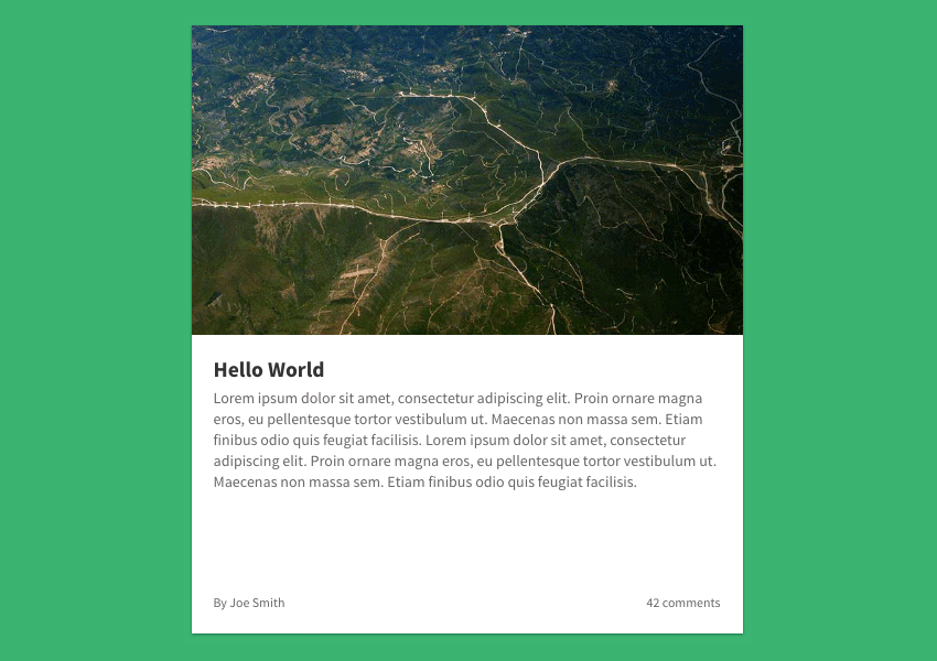
Now, to give us extra control, let’s turn each article into a Flexbox container too. Each of them will contain:
- a title
- a paragraph
- an information bar with the author and the number of comments
- an optional responsive image
We’re using Flexbox here in order to “push” the information bar to the bottom. As a reminder, this is the article layout we’re aiming for:

Here’s the code:
<a class="article first-article">
  <figure class="article-image">
    <img src="http://webdesign.tutsplus.com/">
  </figure>
  <div class="article-body">
    <h2 class="article-title">
      <!-- title -->
    </h2>
    <p class="article-content">
      <!-- content -->
    </p>
    <footer class="article-info">
      <!-- information -->
    </footer>
  </div>
</a>
.article {
  display: flex;
  flex-direction: column;
  flex-basis: auto; /* sets initial element size based on its contents  */
}

.article-body {
  display: flex;
  flex: 1;
  flex-direction: column;
}

.article-content {
  flex: 1; /* This will make the content fill up the remaining space, and thus push the information bar at the bottom */
}
The article’s elements are laid out vertically thanks to the flex-direction: column; rule.
We apply flex: 1 to the article-content element so that it fills up the empty space, and “pushes” the article-info to the bottom, no matter the height of the columns.
4. Add Some Nested Columns
In the left column, what we actually want is another set of columns. So we’re going to replace the second article with the same columns container we’ve already used.
<div class="columns">
  <div class="column nested-column">
    <a class="article">
      <!-- Article content -->
    </a>
  </div>

  <div class="column">
    <a class="article">
      <!-- Article content -->
    </a>
    <a class="article">
      <!-- Article content -->
    </a>
    <a class="article">
      <!-- Article content -->
    </a>
  </div>
</div>
As we want the first nested column to be wider, we’re adding a nested-column class with the additional style:
.nested-column {
  flex: 2;
}
This will make our new column twice as wide as the other.
5. Give the First Article a Horizontal Layout
The first article is really big. To optimize the use of space, let’s switch its layout to be horizontal.
.first-article {
  flex-direction: row;
}

.first-article .article-body {
  flex: 1;
}

.first-article .article-image {
  height: 300px;
  order: 2;
  padding-top: 0;
  width: 400px;
}
The order property is very useful here, as it allows us to alter the order of HTML elements without affecting the HTML markup. The article-image actually comes before the article-body in the markup, but it will behave as if it comes after.
6. Make the Layout Responsive
This is all looking just as we want, though it’s a bit squished. Let’s fix that by going responsive.
One great feature of Flexbox is that you need only remove the display: flex rule on the container to disable Flexbox completely, while keeping all the other Flexbox properties (such as align-items or flex) valid.
As a result, you can trigger a “responsive” layout by enabling Flexbox only above a certain breakpoint.
We’re going to remove display: flex from both the .columns and .column selectors, instead wrapping them in a media query:
@media screen and (min-width: 800px) {
  .columns,
  .column {
    display: flex;
  }
}
That’s it! On smaller screens, all the articles will be on top of each other. Above 800px, they will be laid out in two columns.
7. Add Finishing Touches
To make the layout more appealing on larger screens, let’s add some CSS tweaks:
@media screen and (min-width: 1000px) {
  .first-article {
    flex-direction: row;
  }

  .first-article .article-body {
    flex: 1;
  }

  .first-article .article-image {
    height: 300px;
    order: 2;
    padding-top: 0;
    width: 400px;
  }

  .main-column {
    flex: 3;
  }

  .nested-column {
    flex: 2;
  }
}
The first article has its content laid out horizontally, with the text on the left and the image on the right. Also, the main column is now wider (75%) and the nested column too (66%). Here’s the final result!
Conclusion
I hope I’ve shown you that you needn’t understand every aspect of Flexbox to jump in and start using it! This responsive news layout is a really useful pattern; pull it apart, play with it, let us know how you get on!