How to Quickly Build Layouts With Bootstrap 4’s Responsive Flexbox Utilities
In this tutorial I’ll show you how to quickly build layouts with Bootstraps 4’s responsive flexbox utilities. To gain a better understanding of these utilities, we’ll examine four different examples.
Note: this tutorial assumes you’re familiar with Bootstrap 4 as well as flexbox. Take a look at these courses to get you going in the right direction.
Introducing Bootstrap 4’s Responsive Breakpoints
Before we go through our examples, let’s first have a look at Bootstrap’s media queries. The framework defines five pixel-based breakpoints for grid columns, which are shown in the following table:
Screen
Viewport Size
Class prefix
Extra small
< 576px
.col-*
Small
≥ 576px
.col-sm-*
Medium
≥ 768px
.col-md-*
Large
≥ 992px
.col-lg-*
Extra large
≥ 1200px
.col-xl-*
Example #1
Down to business! In the first example, our goal is to horizontally and vertically center the contents inside a section, like this:
Notice that we’ve used a number of Bootstrap’s flexbox-related classes. For instance, we denote that the section element is a flex container by giving it the d-flex class. In addition, to center the contents of the .row element (which is by default a flex container) in both directions, we use the align-items-center and justify-content-center classes.
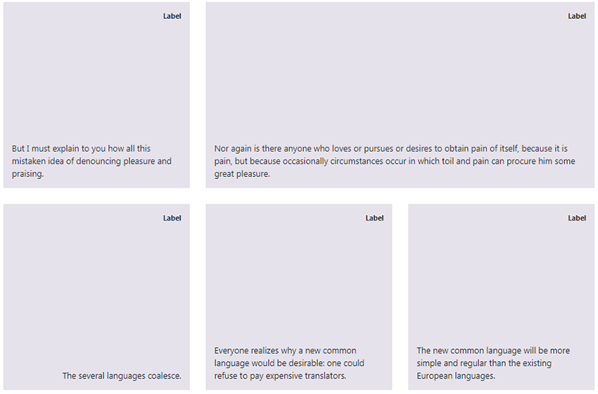
In the second example, our goal is to build the following layout with blocks containing text aligned to the bottom and top of each one.
This is the desired layout for large screens (when viewport width ≥ 1200px). Check the demo and resize the browser window to see how the layout changes at narrower screen sizes.
Just for practice let’s take a minute and think about two alternative flexbox ways to achieve the same layout for the columns’ content.
First, we remove the justify-content-between class from the link and add the mb-auto class to the element with the class of .label. Alternatively, we could have modified the .description element by giving it the class of mt-auto.
Once again the generated layout is exactly what we want!
Example #3
In the third example, we’ll start with a layout similar to the previous example. Our goal this time is to manipulate the order of the third and fourth columns depending on the viewport size.
When the viewport is at least 1200px wide, the columns’ order should be the following:
In any other case, the columns’ order changes; the third element should come after the fourth one:
Notice the order-* classes which appear in the third, fourth, and fifth columns.
Keep in mind that even if we want to change the order of the third and fourth columns, we also have to specify the order for the fifth column. If we don’t do this, the last column will always follow the second one.
Inside each of the columns, we center the content in both directions with the following familiar utility classes:
In this in-depth tutorial, we covered four real-world examples that take advantage of Bootstrap 4’s responsive flexbox utilities. I hope you enjoyed what we built here and they’ve motivated you to apply what you’ve learned in your upcoming Bootstrap projects.
As always, if you have any questions, let me know in the comments below.