Undeniably, website designing is a cut and dried chore these days.
First off, you get a simple layout ready. Next, you paint it with combination simpler colors. Then you stuff it with simplest words possible. Get set go!
However, in their eagerness to launch their site in a hurry, most website owners forget to address the subtle nuances (read: best practices) that may have kept the users hooked to the site for long. But then, failing to address these nuances, in the long run, could lead to painful user-experiences on your website, which in turn, would mean a loss of business.
Here I walk through 12 biggest UX flaws businesses are unknowingly committing and how to address them:
Ambiguous Messaging
Businesses these days focus a lot a lot on the look and feel of the page. However, not much attention is paid to the messaging part. The copies are found to be riddled with expert speak, which may not be easy for a novice to decipher. According to author and user experience professional Steve Krug, “copy should be such that both experts and amateurs could be able to easily comprehend.”
Krug in his bestseller, “Don’t Make Me Think” has clearly elucidated the importance of using plain and simple language in web copies, and avoiding complex jargons, altogether.
Messing up with Mobile Experience
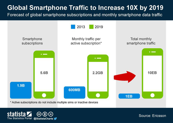
It comes as no surprise that businesses these days are focussing more on mobile experience than ever before. However, still, you will find sites haven’t really worked on their mobile experience as much as the users might have expected them to.

According to Urbanairship, eight out of ten smartphone owners complete their search on smartphones on a weekly basis or more. Even so, only 52% of the marketers are really focussed on optimizing mobile search in keeping with the user expectations. Most of the marketer resorts to quick-fixes that help them complete the mobile optimization process in a jiffy. The ultimate result? Same content gets plastered across all screens, regardless of the device type. The fact is: Users are looking for the right content in the right context and want marketers to leverage all things the devices are capable of.
For example, in terms of mobile, marketers need to experiment with real-time engagement and automation tools, leverage mobile wallets to support customer engagement and re-engagement programs and more.
Here’s a list of top web design companies to help you take your mobile experience a notch up.
Messy Information Architecture
As a matter of fact, every web designer knows that they cannot play around with the Information Architecture and, they should get it right in the first go itself. Notwithstanding the seriousness attached to the subject, most of the sites get it wrong. An ideal way to get your Information Architecture right is to rope in a tester outside of your company to interact with your site in the initial stages itself. This will help you quickly nail down issues which you weren’t able to locate in the first instance.
Read this article by conversion specialist Peep Laja: Getting The Website Information Architecture Right: How to Structure Your Site for Optimal User Experiences, to gain a detailed idea on what Information Architecture is like and how to optimize it for better user experience.
Burying Customer Service Info
No matter the industry, customer support is a fundamental service that websites need to offer. Nonetheless, several companies tend to, knowingly or unknowingly, avoid giving customer service numbers. This is a bad practice. What websites don’t realize is that every company out there is a customer-service company first and foremost. Anything and everything else is secondary.
So, always, I repeat always, splash your customer service number in, big, bold and bright numbers on your site.
Using Loads of JS Libraries
Does your online menu rely on 10 to 15 JavaScript libraries for display? Sure, this will help your menu look gloriously good on your desktops. But, what about mobile users? Loading these libraries on your mobile may take an enter lifetime. So, if possible, swap places with CDNs rather than opting for larger JS libraries.
Over Loading Your Site with Resources
If your website needs to load 50 resources and more before rendering, then it will surely slow down your site. And, it will even affect your mobile conversion rate. Nonetheless, you could enhance the performance of the site by ensuring that only the best resources are sent to visitor’s tablets, desktops, and smartphones. More important, learn to compress your CSS and JavaScript resources with tools such as SASS and Uglify.
Designing for Desktop
If you are planning to build a desktop design first and would be tweaking it later to making it mobile-responsive, then turn the process around. In other words, it’s always better to start designing for mobile first. This will ensure that all the crucial elements are part of your mobile site. This, in turn, will drastically reduce the work of the designer.

Ruining Touch Experience
Touch is mainly meant for handheld devices. And you need to bear in mind two things while designing for the touch experience. First, human fingers don’t work the way mouse clicks work. Second humans tend to miss the target often.
That’s why it’s important to ensure that your touch targets are at least 44px square. More importantly, use only a few on your site.
Blowing Up your Navigation
Instead of getting users trapped between a rock (read: meat navigation) and a hard place (too much of content), it’s always better to give visitors clear-cut visual cues as to what your clickable buttons do and where they lead them to on their mobile devices.
Consult top web development companies to get your navigation right in the first instance itself.
Wrong Ad Placements
Advertising is the mainstay of the web world. In fact, the blog world runs on ads. Nonetheless, flooding your site with loads of flashy ads will only lead to frustrated visitors leading to a loss in business. So keep an eye out on all kinds of ads. If it’s annoying you, be assured it will annoy the users as well. Also, look out for pop-ups. Make sure users can easily cancel them out and, most importantly, are not full-screen size.
Clash with Adblockers
If anything, it’s common for both technical and non-technical users to install ad-blockers. It’s fair from the user’s perspective. However, the problem is its crippling user experience in case of some sites when it shouldn’t. Websites should take note of it by getting this tested before it starts costing them revenue and users.
Wrapping Up
There you are! 11 UX flaws that are currently hijacking user experience. Are you aware of any more flaws that could be hampering user experience? Go ahead and talk to us on the same.
Author Bio:
This is Jennifer Warren, staff writer at GoodFirms – a review and research platform for top e-commerce development companies, digital marketing companies, among many others. A bookworm at heart, I have successfully guest blogged for top sites such as Crazyegg, Semrush, Searchenginepeople, Sitepronews, Volusion.com, Socialnomics, jeffbullas, mediapost among others.

