Have you ever built an advanced slider for a project? If so, you might have taken advantage of any one of a number of JavaScript carousels. In the past, I’ve covered two of them: slick and Owl. Today, I’ll introduce another well-known one: Swiper.
Ready to learn something new?
Our Slider Project
Check what we’ll be building:
Be sure to open the demo on a large screen and resize your window to see how the page layout changes.
What is Swiper Slider?
Swiper is a free JavaScript plugin created by Vladimir Kharlampidi that lets you create modern, responsive sliders.

With almost 30k GitHub stars at the time of this writing, it’s considered one of the most dominant JavaScript plugins out there. To better understand its capabilities, check out the available demos.
Swiper isn’t only available for use with pure JavaScript. If you plan to build an app with one of the popular JavaScript frameworks (e.g. React) and need a slider, consider looking at the associated built-in Swiper component.
Getting Started With Swiper
To get started with Swiper, begin by downloading and installing the following files in your project:
-
swiper-bundle.cssor its minified version -
swiper-bundle.jsor its minified version
You can grab a copy of these Swiper files by visiting the GitHub repo, using a package manager (e.g. npm), or loading the necessary assets through a CDN (e.g. cdnjs). For this tutorial, I’ll choose the last option.
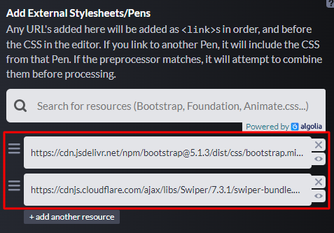
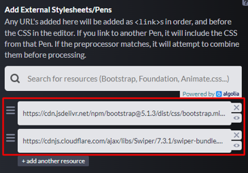
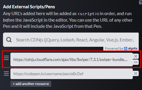
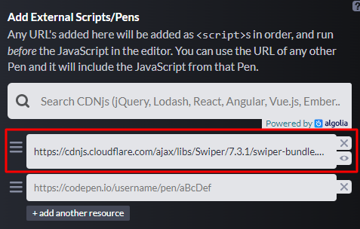
For this tutorial, beyond the Swiper files, I’ve also incorporated Bootstrap 5’s CSS file.
With that in mind, if you look under the Settings tab of our demo pen, you’ll see that there are two external CSS files and one external JavaScript file.
1. Identify the Layout
To get started, let’s first identify the project scope.
Today’s demo is a web page dedicated to Tanzania, a country with immense beauty. To set up the page, we’ll grab some content from Wikipedia and images from Unsplash.
Let’s determine how the page layout will appear on various screens.
The Mobile Layout
On small screens (<768px), its appearance will be like this:
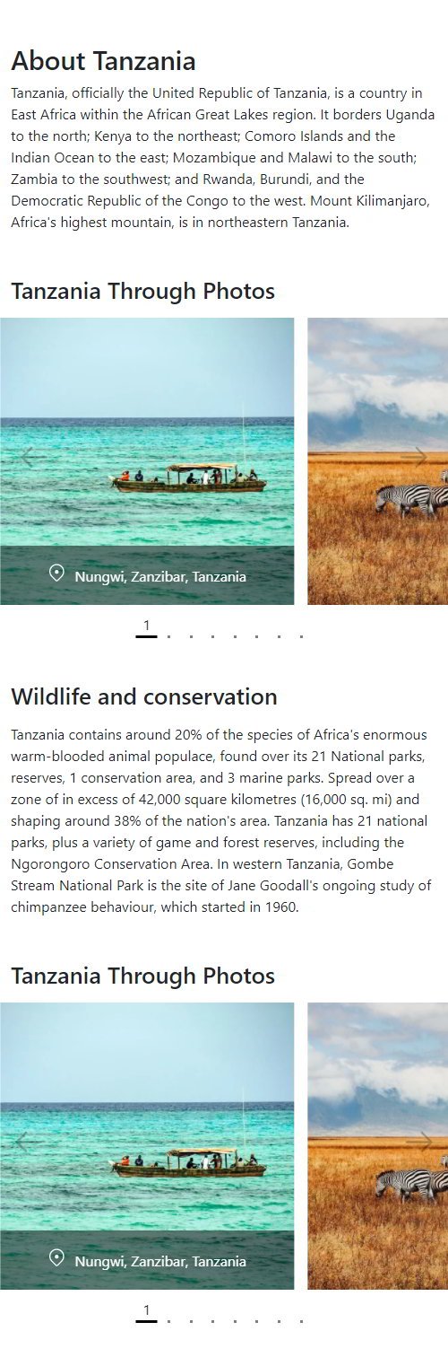
Notice that each slider shows the first slide and half of the second one.
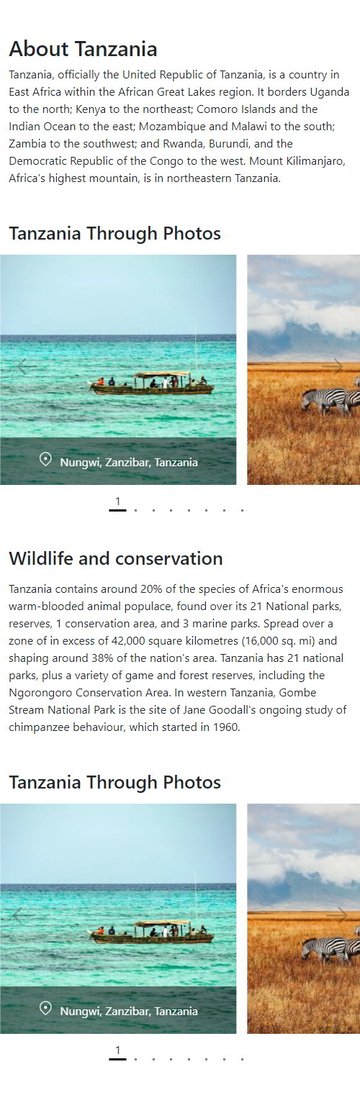
The Tablet Layout
Next, on medium screens (≥768px), its appearance will change as follows:

Notice that the first slider shows the first two slides and half of the third one, while the second slider still shows two slides.
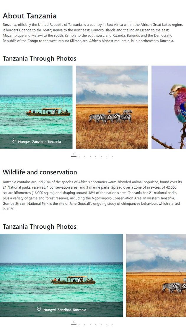
The Desktop Layout
Finally, on large screens (≥1200px), it will have this appearance:


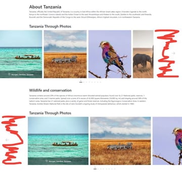
Again, consider that the first slider shows the first three slides and half of the fourth one, while the second slider shows the first two slides and half of the third one.
Also, pay attention to another thing: the right side of the first slider is aligned to the container width that, as we’ll see, will be 1100px. In the same way, the left slide of the second slider is aligned to the container width.
2. Define the HTML Markup
The markup for our page will consist of four sections:
- The first and third sections will contain info about Tanzania taken from Wikipedia.
- The second and fourth sections will include two equal carousels that will display Tanzania through Unsplash photos. These sections will only have a different class that will determine their layout. That said, the second section will have the
section-with-right-offsetclass, while the fourth section thesection-with-left-offsetone.
Here’s the page structure:
<section class="mt-5">
  <div class="container">...</div>
</section>

<section class="section-with-carousel section-with-right-offset position-relative mt-5">
  <div class="container">
    <h2 class="mb-3">...</h2>
  </div>
  <div class="carousel-wrapper">
    <div class="swiper">
      <div class="swiper-wrapper">
        <div class="swiper-slide">
          <figure>
            <img width="640" height="480" src="http://webdesign.tutsplus.com/tanzania1.jpg" alt="">
            <figcaption>
              <svg xmlns="https://www.w3.org/2000/svg" viewBox="0 0 24 24" width="20" height="20">
                <path d="M12 13.5a2.5 2.5 0 100-5 2.5 2.5 0 000 5z"></path>
                <path fill-rule="evenodd" d="M19.071 3.429C15.166-.476 8.834-.476 4.93 3.429c-3.905 3.905-3.905 10.237 0 14.142l.028.028 5.375 5.375a2.359 2.359 0 003.336 0l5.403-5.403c3.905-3.905 3.905-10.237 0-14.142zM5.99 4.489A8.5 8.5 0 0118.01 16.51l-5.403 5.404a.859.859 0 01-1.214 0l-5.378-5.378-.002-.002-.023-.024a8.5 8.5 0 010-12.02z"></path>
              </svg>
              Nungwi, Zanzibar, Tanzania
            </figcaption>
          </figure>
        </div>
        <!-- more slides here -->
      </div>
    </div>
  </div>
  <div class="carousel-controls">
    <button class="carousel-control carousel-control-left" type="button">
      <svg xmlns="http://www.w3.org/2000/svg" viewBox="0 0 24 24" width="40" height="40">
        <path fill-rule="evenodd" d="M10.78 19.03a.75.75 0 01-1.06 0l-6.25-6.25a.75.75 0 010-1.06l6.25-6.25a.75.75 0 111.06 1.06L5.81 11.5h14.44a.75.75 0 010 1.5H5.81l4.97 4.97a.75.75 0 010 1.06z"></path>
      </svg>
    </button>
    <button class="carousel-control carousel-control-right" type="button">
      <svg xmlns="http://www.w3.org/2000/svg" viewBox="0 0 24 24" width="40" height="40">
        <path fill-rule="evenodd" d="M13.22 19.03a.75.75 0 001.06 0l6.25-6.25a.75.75 0 000-1.06l-6.25-6.25a.75.75 0 10-1.06 1.06l4.97 4.97H3.75a.75.75 0 000 1.5h14.44l-4.97 4.97a.75.75 0 000 1.06z"></path>
      </svg>
    </button>
  </div>
  <div class="swiper-pagination"></div>
</section>

<section class="mt-5">
  <div class="container">...</div>
</section>

<section class="section-with-carousel section-with-left-offset position-relative mt-5">
  <!-- content same as second section -->
</section>
3. Specify the Main Styles
Let’s now concentrate on the most important styles of our page.
Here are the remarkable things:
- The container will have a maximum width of 1100px.
- The initial dimensions of the Unsplash images won’t be equal. With that in mind, the carousel images will have a fixed height that will vary across the screen sizes. Here we’ll use the
object-fit: coverproperty value for fitting the images within the container. Alternatively, we could have added the images as background ones. - By default, all image captions will be hidden apart from the caption of the active slide. As the active slide changes, the associated caption will appear with small slide animation.
Here are the associated styles:
.container {
  max-width: 1100px;
}

.section-with-carousel .swiper-slide figure {
  overflow: hidden;
}

.section-with-carousel .swiper-slide img {
  width: 100%;
  height: 320px;
  object-fit: cover;
}

.section-with-carousel .swiper-slide figcaption {
  position: absolute;
  bottom: 0;
  left: 0;
  right: 0;
  transform: translateY(20%);
  display: flex;
  align-items: baseline;
  justify-content: center;
  padding: 20px;
  text-align: center;
  opacity: 0;
  visibility: hidden;
  color: white;
  background: rgba(0, 0, 0, 0.5);
  transition: all 0.4s;
}

.section-with-carousel .swiper-slide figcaption svg {
  flex-shrink: 0;
  fill: white;
  margin-right: 10px;
}

.section-with-carousel .swiper-slide-active figcaption {
  opacity: 1;
  visibility: visible;
  transform: none;
}

.section-with-carousel .carousel-controls {
  position: absolute;
  top: 50%;
  left: 0;
  right: 0;
  transform: translateY(-50%);
  display: flex;
  justify-content: space-between;
  padding: 0 12px;
  z-index: 1;
}

.section-with-carousel .carousel-controls .carousel-control {
  opacity: 0.25;
  transition: opacity 0.3s;
}

.section-with-carousel .carousel-controls .carousel-control:hover {
  opacity: 1;
}

@media (min-width: 768px) {
  .section-with-carousel .swiper-slide img {
    height: 370px;
  }
}

@media (min-width: 1200px) {
  .section-with-carousel .swiper-slide img {
    height: 420px;
  }

  .section-with-carousel .carousel-controls {
    padding: 0 50px;
  }
}
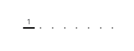
Customize Dot Navigation
The initial appearance of the dot navigation is this one:

Why not make it more informative and attractive? To achieve this, we’ll add some styles and update its default markup during the plugin initialization.
Here’s the updated navigation:
The required styles:
.section-with-carousel .swiper-pagination-bullets {
  position: static;
  display: flex;
  justify-content: center;
  margin-top: 10px;
}

.section-with-carousel .swiper-pagination-bullets .swiper-pagination-bullet {
  display: flex;
  flex-direction: column;
  align-items: center;
  justify-content: center;
  width: auto;
  height: auto;
  background: transparent;
  opacity: 0.5;
  margin: 0 8px;
  border-radius: 0;
  transition: opacity 0.3s;
}

.section-with-carousel
  .swiper-pagination-bullets
  .swiper-pagination-bullet
  .line {
  width: 3px;
  height: 3px;
  background: black;
  transition: transform 0.3s;
}

.section-with-carousel
  .swiper-pagination-bullets
  .swiper-pagination-bullet
  .number {
  opacity: 0;
  transform: translateY(-7px);
  transition: all 0.3s;
}

.section-with-carousel
  .swiper-pagination-bullets
  .swiper-pagination-bullet.swiper-pagination-bullet-active {
  opacity: 1;
}

.section-with-carousel
  .swiper-pagination-bullets
  .swiper-pagination-bullet.swiper-pagination-bullet-active
  .line {
  transform: scaleX(8);
}

.section-with-carousel
  .swiper-pagination-bullets
  .swiper-pagination-bullet.swiper-pagination-bullet-active
  .number {
  opacity: 1;
  transform: none;
}
Be sure to click on a dot to see the little slide animation that happens.
4. Add the JavaScript
At this point, we’re ready to turn our attention to JavaScript.
Offset Carousel Sections
As you can see from the previous visualizations, the carousel sections will be full-screen on screens up to 1199px wide. On larger screens, their left or right side will stop being full-screen and be aligned to the container width. As discussed earlier, this behavior will be determined by the section-with-left-offset and section-with-right-offset classes. This way, we’ll be able to generate unique layouts that won’t be limited to sections that follow a grid system.


Here’s the JavaScript code that implements this functionality:
createOffsets();
window.addEventListener("resize", createOffsets);

function createOffsets() {
  const sectionWithLeftOffset = document.querySelector(
    ".section-with-left-offset"
  );
  const sectionWithLeftOffsetCarouselWrapper = sectionWithLeftOffset.querySelector(
    ".carousel-wrapper"
  );
  const sectionWithRightOffset = document.querySelector(
    ".section-with-right-offset"
  );
  const sectionWithRightOffsetCarouselWrapper = sectionWithRightOffset.querySelector(
    ".carousel-wrapper"
  );
  const offset = (window.innerWidth - 1100) / 2;
  const mqLarge = window.matchMedia("(min-width: 1200px)");

  if (sectionWithLeftOffset && mqLarge.matches) {
    sectionWithLeftOffsetCarouselWrapper.style.marginLeft = offset + "px";
  } else {
    sectionWithLeftOffsetCarouselWrapper.style.marginLeft = 0;
  }

  if (sectionWithRightOffset && mqLarge.matches) {
    sectionWithRightOffsetCarouselWrapper.style.marginRight = offset + "px";
  } else {
    sectionWithRightOffsetCarouselWrapper.style.marginRight = 0;
  }
}
Initialize Swiper
This is the last required step to initialize Swiper. Here, we pass as part of the configuration object all our customizations. Look at the relevant code snippet below:
const sectionsWithCarousel = document.querySelectorAll(
  ".section-with-carousel"
);

for (const section of sectionsWithCarousel) {
  let slidesPerView = [1.5, 2.5, 3.5];
  if (section.classList.contains("section-with-left-offset")) {
    slidesPerView = [1.5, 1.5, 2.5];
  }
  const swiper = section.querySelector(".swiper");
  new Swiper(swiper, {
    slidesPerView: slidesPerView[0],
    spaceBetween: 15,
    loop: true,
    lazyLoading: true,
    keyboard: {
      enabled: true
    },
    navigation: {
      prevEl: section.querySelector(".carousel-control-left"),
      nextEl: section.querySelector(".carousel-control-right")
    },
    pagination: {
      el: section.querySelector(".swiper-pagination"),
      clickable: true,
      renderBullet: function (index, className) {
        return `<div class=${className}>
            <span class="number">${index + 1}</span>
            <span class="line"></span>
        </div>`;
      }
    },
    breakpoints: {
      768: {
        slidesPerView: slidesPerView[1]
      },
      1200: {
        slidesPerView: slidesPerView[2]
      }
    }
  });
}
As you can see, we pass in an array the number of slides that should appear depending on the viewport width. By using, not only integers but also decimals, we’ll be able to show just a portion of a slide.
Even though it isn’t necessary, the breakpoint values that determine when the number of visible slides changes will match Bootstrap’s breakpoints. Anyhow, be sure to read the API documentation to get a better understanding of what all these configuration parameters do.
Conclusion
And we’re done, folks! In this tutorial, we created an asymmetric page layout with just a few lines of JavaScript code and the power of Swiper.js.
We only covered just the very basics of this plugin. There are so many more advanced sliders that you can build with minimal effort. Just get some inspiration from a source like Dribbble and practice yourselves! This is the best way to learn!
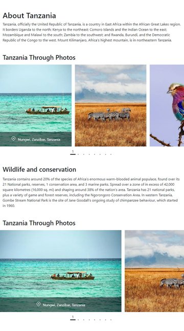
Let’s look again at what we built:
As always, thanks a lot for reading!
More Slider, Lightbox, and Carousel Tutorials


