In this new tutorial, we’ll get rid of the usual boring rectangular boxes and learn to build a landing page full of complex SVG shapes. We’ll even enhance it with Bootstrap styles as well as a full-screen background video.
The best way to understand what we’re going to build is by checking out the demo, so it’s all yours:
Shall we start?
1. Begin With the Necessary Assets
To speed up the development process, I’ve included Bootstrap 4 in the pen.
If you check the markup, you’ll notice that I heavily use Bootstrap’s helper classes. Although not necessary, in case you aren’t familiar with Bootstrap, take a minute to look at its documentation or my other Bootstrap tutorials.
 Bootstrap 4How to Quickly Build Layouts With Bootstrap 4’s Responsive Flexbox Utilities
-
Bootstrap 4How to Build a Landing Page Template With Bootstrap 4
-
Bootstrap 4Quick Tip: How to Customize Bootstrap 4’s Accordion Component
2. Continue With the Page Markup
Our page will consist of an SVG and three sections:
<svg style="display:none;">...</svg>
<section class="hero-section position-relative">...</section>
<section class="photos-section py-5 d-flex justify-content-center">...</section>
<section class="cover-section position-relative">...</section>
Note: In the demo, there’s also a simple footer layout which I won’t discuss in the tutorial.
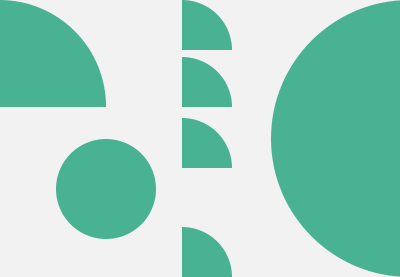
3. Create the SVG Sprite
For our layout, we’ll need a bunch of SVG shapes (waves, curves, whatever you’d like to call them). To create them, we won’t use an editing program like Adobe Illustrator or Sketch as you might expect; we’ll generate them by taking advantage of an awesome online tool made by z creative labs.
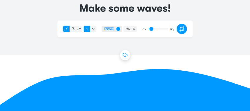
Pretty cool, right? No need to spend time manually creating them in a program (though obviously you can if you prefer). All we need is to experiment a bit with the options of this tool until we end up with the desired SVGs.
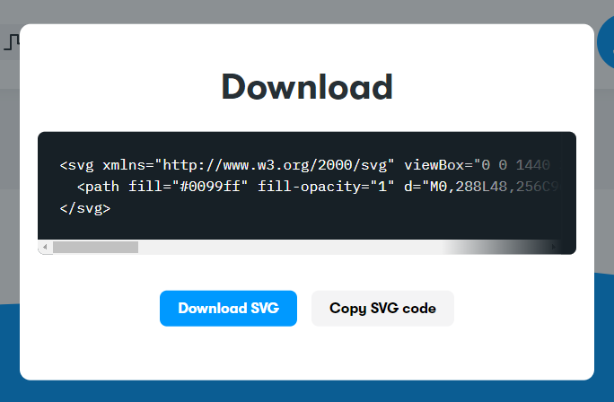
After grabbing the generated code for each SVG, we’ll create a sprite by wrapping them within an SVG container. This is a technique that I’ve discussed many times in the past.
Note: Depending on the layout, we might have to manually change the SVG’s path color.
We’ll place each icon inside a symbol element with a unique ID and a viewbox attribute which will specify its dimensions. Also, we’ll let it scale without keeping an eye on its aspect ratio thanks to the preserveAspectRatio="none" attribute value. Finally, we’ll render the target icon on the screen via the use element.
Here’s the markup needed for the SVG sprite:
<svg style="display:none;">
  <symbol id="one" viewBox="0 0 1440 320" preserveAspectRatio="none">
    <path fill="white" d="M0,96L1440,320L1440,320L0,320Z"></path>
  </symbol>
  <symbol id="two" viewBox="0 0 1440 320" preserveAspectRatio="none">
    <path fill="white" d="M0,32L48,37.3C96,43,192,53,288,90.7C384,128,480,192,576,197.3C672,203,768,149,864,138.7C960,128,1056,160,1152,160C1248,160,1344,128,1392,112L1440,96L1440,320L1392,320C1344,320,1248,320,1152,320C1056,320,960,320,864,320C768,320,672,320,576,320C480,320,384,320,288,320C192,320,96,320,48,320L0,320Z"></path>
  </symbol>

  <!-- more symbols here -->
</svg>
4. Define Some Basic Styles
Beyond Bootstrap’s default styles, let’s define some additional ones. We’ll also override some of Bootstrap’s button styles to cover our needs:
:root {
  --overlay: rgba(0, 0, 0, 0.35);
  --box-shadow: 0 5px 20px 2px rgba(0, 0, 0, 0.15);
  --green: #528119;
}

* {
  padding: 0;
  margin: 0;
  box-sizing: border-box;
}

a {
  color: inherit;
}

a:hover {
  color: currentColor;
  text-decoration: none;
}

.cover {
  background-repeat: no-repeat;
  background-position: center;
  background-size: cover;
}

.overlay {
  top: 0;
  left: 0;
  right: 0;
  bottom: 0;
  background: var(--overlay);
}

.btn-outline-success {
  color: var(--green);
}

.btn-outline-success:hover,
.btn-outline-success:not(:disabled):not(.disabled):active {
  background: var(--green);
}

.btn-outline-success,
.btn-outline-success:hover,
.btn-outline-success:not(:disabled):not(.disabled):active {
  border-color: var(--green);
}
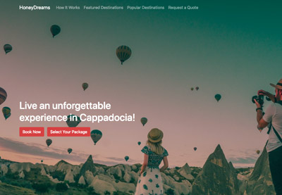
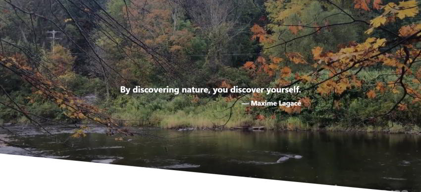
5. Build the First Section
The first section will include:
- A full screen background video.
- An overlay with a blockquote which will sit on top of the video.
- An absolutely positioned SVG shape at the bottom of this section which will give it a diagonal look and feel.
Here’s its appearance:
Section #1 HTML
<section class="hero-section position-relative">
  <video src="http://webdesign.tutsplus.com/down-by-the-river_compressed.mp4" autoplay loop muted playsinline></video>
  <div class="overlay position-absolute d-flex align-items-center justify-content-center font-weight-bold text-white h2 mb-0">
    <blockquote class="p-4 mb-0">
      <p>...</p>
      <footer class="blockquote-footer text-white text-right">...</footer>
    </blockquote>
  </div>
  <svg class="position-absolute w-100">
    <use xlink:href="#one"></use>
  </svg>
</section>
Tip: Instead of using an SVG shape, we can create diagonal layouts with other methods like CSS transforms (mainly with the skew() function) and the clip-path property.
Section #1 CSS
As we’ve already discussed this section will be fullscreen. With that in mind, let’s give it height: 100vh. Unfortunately, this unit isn’t still stable across all devices. So, as a best practice, we’ll keep it as a fallback and let JavaScript calculate the section height based on the window height.
Here are all styles that we’ll need:
/*CUSTOM VARIABLES HERE*/

.hero-section {
  height: 100vh;
}

.hero-section video {
  width: 100%;
  height: 100%;
  object-fit: cover;
 }

.hero-section svg {
  bottom: 0;
  left: 0;
  height: 30vh;
}
Section #1 JavaScript
const hero = document.querySelector(".hero-section");
hero.style.height = window.innerHeight + "px";

window.addEventListener("resize", function () {
  hero.style.height = this.innerHeight + "px";
});
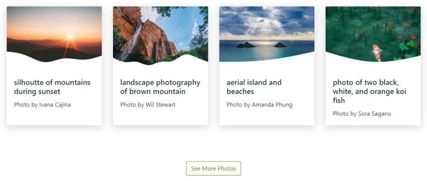
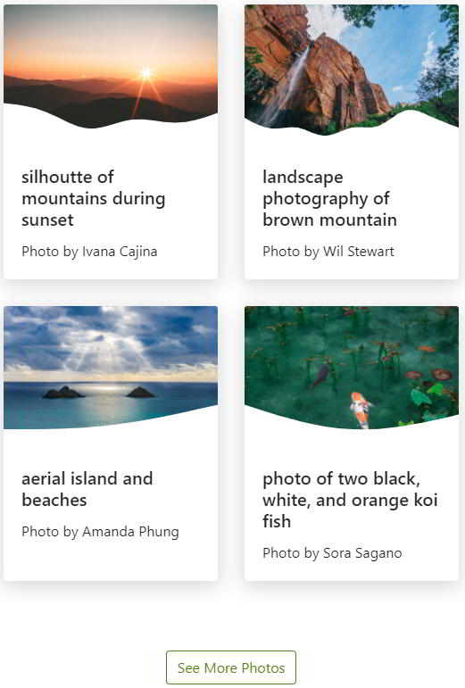
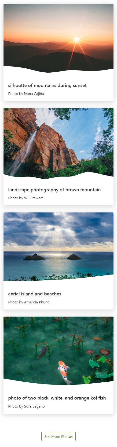
6. Build the Second Section
The second section will include four equal-width columns. Inside each column, we’ll put a card which will contain:
- An image.
- Its associated caption.
- An absolutely positioned SVG shape placed at the bottom part of the image. That way, each image will have a unique form.
To create the columns, we’ll take advantage of Bootstrap’s card component.
The number of columns will change depending on the screen size. With that said, on extra-large screens, the section should look like this:
On medium and large screens though, it should appear as follows:
Finally, on small screens all columns will be stacked:
Section #2 HTML
<section class="photos-section py-5 d-flex justify-content-center">
  <div class="container">
    <div class="row">
      <div class="col-12 col-sm-6 col-xl-3 d-flex card-outer">
        <div class="card">
          <div class="position-relative">
            <img src="http://webdesign.tutsplus.com/unsplash_nature11.jpg" class="card-img-top" alt="">
            <svg class="position-absolute w-100">
              <use xlink:href="#two"></use>
            </svg>
          </div>
          <div class="card-body">
            <h5 class="card-title">...</h5>
            <p class="card-text">Photo by <a href="" target="_blank">...</a></p>
          </div>
        </div>
      </div>
      <div class="col-12 col-sm-6 col-xl-3 d-flex card-outer">
        <div class="card">
          <div class="position-relative">
            <svg class="position-absolute w-100">
              <use xlink:href="#three"></use>
            </svg>
            <img src="unsplash_nature2.jpg" class="card-img-top" alt="">
          </div>
          <div class="card-body">
            <h5 class="card-title">...</h5>
            <p class="card-text">Photo by <a href="" target="_blank">...</a></p>
          </div>
        </div>
      </div>
      <div class="col-12 col-sm-6 col-xl-3 d-flex card-outer">
        <div class="card">
          <div class="position-relative">
            <img src="unsplash_nature4.jpg" class="card-img-top" alt="">
            <svg class="position-absolute w-100">
              <use xlink:href="#four"></use>
            </svg>
          </div>
          <div class="card-body">
            <h5 class="card-title">...</h5>
            <p class="card-text">Photo by <a href="" target="_blank">...</a></p>
          </div>
        </div>
      </div>
      <div class="col-12 col-sm-6 col-xl-3 d-flex card-outer">
        <div class="card">
          <div class="position-relative">
            <img src="unsplash_nature6.jpg" class="card-img-top" alt="">
            <svg class="position-absolute w-100">
              <use xlink:href="#five"></use>
            </svg>
          </div>
          <div class="card-body">
            <h5 class="card-title">...</h5>
            <p class="card-text">Photo by <a href="" target="_blank">...</a></p>
          </div>
        </div>
      </div>
    </div>
    <div class="row mt-5">
      <div class="col-12 text-center">
        <a href="" class="btn btn-outline-success" role="button" target="_blank">See More Photos</a>
      </div>
    </div>
  </div>
</section>
Section #2 CSS
/*CUSTOM VARIABLES HERE*/

.photos-section .card-outer {
  margin-bottom: 30px;
}

.photos-section .card {
  border: none;
  box-shadow: var(--box-shadow);
}

 .photos-section .card svg {
  bottom: 0;
  left: 0;
  height: 55px;
}

@media screen and (min-width: 1200px) {
  .photos-section .card-outer {
    margin-bottom: 0;
  }
}
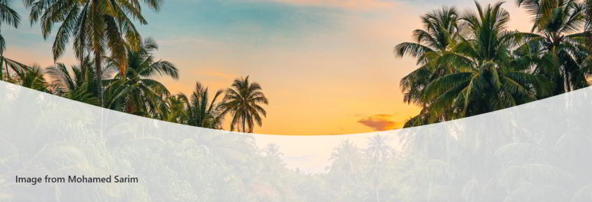
7. Build the Third Section
The third section will include:
- A fixed background image.
- The image caption.
- An absolutely positioned SVG shape (a curve) that will serve as a small overlay.
Here’s its appearance:
Section #3 HTML
<section class="cover-section position-relative">
  <div class="cover" style="background-image: url(nature-pexels.jpg);">
    <img src="http://webdesign.tutsplus.com/nature-pexels.jpg" class="img-fluid invisible" alt="" />
  </div>
  <div class="caption position-absolute h4 mb-0">
    Image from <a href="" target="_blank">...</a>
  </div>
  <svg class="position-absolute w-100">
    <use xlink:href="#six"></use>
  </svg>
</section>
Section #3 CSS
.cover-section .cover {
  background-attachment: fixed;
}

.cover-section .caption {
  bottom: 30px;
  left: 15px;
  z-index: 1;
}

.cover-section svg {
  bottom: 0;
  left: 0;
  height: 30vh;
}

@media screen and (min-width: 768px) {
  .cover-section .caption {
    bottom: 50px;
  }

  .cover-section svg {
    height: 50vh;
  }
}
8. Browser Support
I’ve tested the demo in various browsers and devices. It works great, apart from one small issue. In some browsers (like on Firefox) you might see that an SVG leaves a trace like having a bottom border. I’ve encountered this inconsistency as well on other projects for clients where the layout requires absolutely positioned SVGs like here:
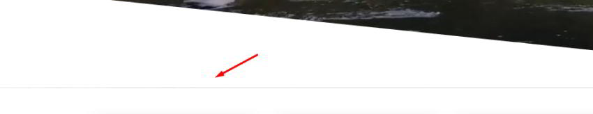
One fix that I’ve tried and seems to work is to decrease the SVG’s viewport height by one. For example, instead of viewBox="0 0 1440 320", set it as viewBox="0 0 1440 319". Feel free to do this modification, if you like.
If you know what causes this problem or you have a more elegant fix, share it with us!
Your Web Layout With SVG Shapes is Complete!
That’s all, folks! Today, we learned how to give life to our pages by building non-rectangular layouts with SVG shapes. Let’s recap the steps:
- Firstly, we went through a handy online tool that allows us to create different kinds of SVG shapes (curves and waves) in next to no time.
- Next, we created an SVG sprite with all the icons wrapped within it.
- Then, we rendered all those icons on the screen by setting them as absolutely positioned elements and give them some height.
As discussed earlier, using an inline SVG shape isn’t the only way for creating non-rectangular layouts. Depending on your needs, CSS transforms, the clip-path property, the border-radius property, and even a simple image can also do the job. For most cases though, inline SVGs seem the best way for constructing these complex layouts.
Let’s look at our creation once again:
Layout Challenge
Before closing, I have another challenge for you! This time your job is to extend the demo by adding functionality that stops the video if it’s out of the viewport. Hopefully, one of you will provide a solution in the comments below! Good luck!
As always, thanks a lot for reading!
More Landing Page Tutorials
If you want to get some inspiration about how to build attractive Bootstrap powered landing pages, check out the following tutorials:
-
Bootstrap 4How to Build an Animated Bootstrap Landing Page With Material Kit
-
Bootstrap 4How to Build a Landing Page Template With Bootstrap 4
