In this short tutorial, we’ll learn how to build a CSS-only switch component by taking advantage of the “CSS checkbox hack technique”. Along the way, we’ll also look at other switch implementations on Codepen. Sound like a good challenge?
Our Switch Component
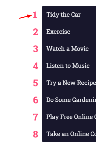
Here’s what we’ll be building during this tutorial–a simple todo checklist:
For design inspiration we’ll be using the Hngry UI Kit – Food Delivery UI Kit available on Envato Elements. It’s compatible with Sketch, Figma, and Adobe XD, comes with light and dark variants, and includes way more UI components than just these checkboxes. Take a look!

1. Begin With the HTML Markup
To begin with, we’ll define a plain ordered list with the class of switches. Each list item will contain a checkbox and its associated label. Each label will include two spans. The first one will hold the text content, while the second empty one will be responsible for the toggle switch.
Putting it all together, here’s what the required markup looks like:
<ol class="switches">
  <li>
    <input type="checkbox" id="1">
    <label for="1">
      <span>...</span>
      <span></span>
    </label>
  </li>
  <li>
    <input type="checkbox" id="2">
    <label for="2">
      <span>...</span>
      <span></span>
    </label>
  </li>

  <!-- more list items here -->
</ol>
2. Define the Styles
The first thing we need to deal with in our styles is visually hiding the checkbox:
[type="checkbox"] {
  position: absolute;
  left: -9999px;
}
Next up, the list will have a maximum width with horizontally centered content:
.switches {
  max-width: 500px;
  width: 95%;
  margin: 50px auto 0;
}
To style the numbers of our list exactly as we wish, we’ll get rid of the default browser styles and take advantage of CSS Counters. This will give us a list of numbers down the side, all generated by CSS:
Here are the related styles:
/*CUSTOM VARIABLES HERE*/

ol {
  list-style: none;
}

.switches li {
  position: relative;
  counter-increment: switchCounter;
}

.switches li::before {
  content: counter(switchCounter);
  position: absolute;
  top: 50%;
  left: -30px;
  transform: translateY(-50%);
  font-size: 2rem;
  font-weight: bold;
  color: var(--pink);
}

@media screen and (max-width: 600px) {
  .switches li::before {
    display: none;
  }
}
The labels will behave as flex containers and their direct children will be distributed in the boundaries of the main axis:
.switches label {
  display: flex;
  align-items: center;
  justify-content: space-between;
}
Build the Switch
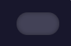
To build the switch component, we’ll first specify some fixed dimensions for the corresponding span element (last one).
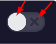
Next, we’ll define its ::before and ::after pseudo-elements. The ::before pseudo-element will be a circle, while the ::after pseudo-element will have a close icon as a background image.
To achieve all this, here are the corresponding styles:
/*CUSTOM VARIABLES HERE*/

.switches span:last-child {
  position: relative;
  width: 50px;
  height: 26px;
  border-radius: 15px;
  box-shadow: inset 0 0 5px rgba(0, 0, 0, 0.4);
  background: var(--gray);
  transition: all 0.3s;
}

.switches span:last-child::before,
.switches span:last-child::after {
  content: "";
  position: absolute;
}

.switches span:last-child::before {
  left: 1px;
  top: 1px;
  width: 24px;
  height: 24px;
  background: var(--white);
  border-radius: 50%;
  z-index: 1;
  transition: transform 0.3s;
}

.switches span:last-child::after {
  top: 50%;
  right: 8px;
  width: 12px;
  height: 12px;
  transform: translateY(-50%);
  background: url(uncheck-switcher.svg);
  background-size: 12px 12px;
}
3. Checkbox Hack: Toggle the Switches
Now for the interesting part! Each time we click on a switch, its appearance will change as follows:
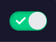
More specifically:
- Its color will change.
- The position of its
::beforepseudo-element will change. It’ll be moved with a slide transition from left to right. - The position and the background image of its
::afterpseudo-element will change. Now it will sit on the left side of its container and will include a checkmark as a background image.
To satisfy all the requirements above, we’ll take advantage of the :checked pseudo-class and the adjacent sibling combinator (+). If you need a refresher of what these selectors do, check out the resources at the end of this tutorial.
Here are the styles that handle this functionality:
/*CUSTOM VARIABLES HERE*/

.switches [type="checkbox"]:checked + label span:last-child {
  background: var(--green);
}

.switches [type="checkbox"]:checked + label span:last-child::before {
  transform: translateX(24px);
}

.switches [type="checkbox"]:checked + label span:last-child::after {
  width: 14px;
  height: 14px;
  left: 8px;
  background-image: url(checkmark-switcher.svg);
  background-size: 14px 14px;
}
Conclusion
That’s it, folks! In this tutorial, we took advantage of the “CSS checkbox hack technique” and managed to build a useful toggle switch component. Hopefully you enjoyed this exercise and you’ll incorporate it in an upcoming project.
Here’s a reminder of what we built:
As always, thanks a lot for reading!
Checkbox Hack Inspiration on CodePen
Where better to see other toggle switch implementations than CodePen? Here are some great examples to whet your appetite:
Colorful Switch by Nikolay Talanov
CSS Heart Switch by Aaron Iker
Toggle Switch by Håvard Brynjulfsen
(S)CSS Toggle Switch by oobleck
Gender Toggle Switch by Chintu Yadav Sara
Toggle Radial Effect by Florin Pop
Further Reading
Check out these tutorials to learn more about things you can build with the CSS checkbox hack technique:
 CSS SelectorsHow to Build a Simple Slideshow With the CSS Checkbox Hack
-
CSS SelectorsHow to Build an Accordion Component With the CSS Checkbox Hack
-
CSSQuick Tip: How to Create an Off-Canvas Feedback Form With Pure CSS
-
CSS SelectorsHow to Build a Filtering Component in Pure CSS


