
In this new tutorial, we’ll start with some grayscale images and learn how to smoothly reveal their colored variants on scroll. To achieve the desired effect, we’re going to take advantage of different modern front-end features like CSS Grid, the clip-path property, and the Intersection Observer API.
Our Grayscale to Color Effect
Without further intro, let’s check out what we’ll be building:
Browser Support
Although this effect has decent browser support, please note that it won’t work in some browsers like the earlier versions of Microsoft Edge. For this example, I’ll concentrate on the technique behind the effect without providing fallbacks for other browsers.
1. Begin With the HTML Markup
We’ll start with four sections:
<section class="section">...</section>
<section class="section">...</section>
<section class="section">...</section>
<section class="section">...</section>
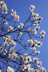
Inside each section, we’ll put a heading and a fullscreen div wrapper. The wrapper will include two empty divs. Both elements will share the same background image. The first one will show the grayscale version of it, while the last one its original colored version:
<h2>...</h2>
<div class="vh-100 img-wrapper">
  <div class="grayscale cover" style="background-image: url(IMG_SRC);"></div>
  <div class="colored cover" style="background-image: url(IMG_SRC);"></div>
</div>
The colored image will appear with a slide animation from left to right. Happily enough, we can customize the direction of this animation via the data-animation attribute. All it needs is to add this attribute to the corresponding .colored element with values to-left, to-top, or to-bottom.
2. Define the Styles
With the markup ready, we’ll continue with the main styles.
Utility Classes
For this demonstration, we’ll first define two utility classes which we’ll attach to the target elements:
.cover {
  background-size: cover;
  background-position: center;
  background-repeat: no-repeat;
}

.vh-100 {
  height: 100vh;
}
Stacking Elements
By default, the divs which hold the images will be stacked on top of another. Only the div with the grayscale image will be visible.
To stack those elements, we’ll take advantage of a CSS Grid technique that I’ve covered in previous tutorials.

Here are the required styles:
/*CUSTOM VARIABLES HERE*/

.img-wrapper {
  display: grid;
}

.img-wrapper div {
  grid-column: 1;
  grid-row: 1;
}
Grayscale Images
To create the grayscale images, we’ll use the grayscale() CSS function and pass the value of 1 or 100% as its argument. Also, we’ll give all grayscale images a background color as a fallback until each of those images loads:
/*CUSTOM VARIABLES HERE*/

.grayscale {
  filter: grayscale(1);
  background-color: var(--gray);
}
Colored Images
As mentioned above, the colored images will initially be hidden. They will become visible with a slide animation as soon as a part of them becomes visible on the page.
Check out a GIF version of the final effect here.
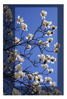
To visually hide them, we won’t use any of the traditional CSS ways like display: none, opacity: 0, and transform: translateX(-100%). In fact, we’re going to try clip-path, a modern CSS property that can help us build interesting effects.
A Quick clip-path Property Explanation
The clip-path property gives us the ability to cut away parts of an element and show only a specific portion of it. The visible area can be represented with different shapes (circles, ellipses, polygons, rectangles).
In our example, we’ll use the inset() function to build the desired rectangle.
In its simplest form, it can receive up to four values in a clockwise direction which specify the side offsets (top, right, bottom, left) that generate the selected area. For simplicity, we can use the margin shorthand which gives us the ability to set all four insets with one, two, three, or four values. Optionally, we can pass some extra values to this function for specifying the rectangle’s roundness.
So, just for practice, let’s assume that we have the following Pixabay image which is 200px by 300px.
If we give it clip-path: inset(10px 20px 30px 40px), the resulting image will be 140px by 260px:
Going a step further, an element with clip-path: inset(0) means that the whole element will appear.
On the other hand, an element with one of the four values set to 100% means that it will be squeezed and hidden. Keep in mind that the order of this value inside the function matters and can produce different animations.
Back to our example, here’s how we initially hide the colored images:
.colored {
  clip-path: inset(0 100% 0 0);
  transition: all 1.5s ease-in-out;
}

.colored[data-animation="to-left"] {
  clip-path: inset(0 0 0 100%);
}

.colored[data-animation="to-top"] {
  clip-path: inset(0 0 100% 0);
}

.colored[data-animation="to-bottom"] {
  clip-path: inset(100% 0 0 0);
}
3. Animate on Scroll
The colored images will be animated and toggled on scroll.
To accomplish this task, we’ll take advantage of the Intersection Observer API.
When at least 50% of each target element enters the viewport, it will receive the is-animated class. Otherwise, it will lose this class and become hidden.
Without going into too much detail, here’s the JavaScript code that implements this functionality:
const targets = document.querySelectorAll(".colored");
const isAnimated = "is-animated";
const threshold = 0.5;

function callback(entries, observer) {
  entries.forEach((entry) => {
    const elem = entry.target;
    if (entry.intersectionRatio >= threshold) {
      elem.classList.add(isAnimated);
      //observer.unobserve(elem);
    } else {
      elem.classList.remove(isAnimated);
    }
  });
}

const observer = new IntersectionObserver(callback, { threshold });
for (const target of targets) {
  observer.observe(target);
}
Note1: To see how this API works and what it returns as you scroll, print in the browser console the entry.
Note2: Initially, instead of the intersectionRatio property I tried the isIntersecting one. However, I noticed that it’s buggy in Firefox.
Tip: If you prefer the animation to run only once, you have to call the unobserve() method, like this:
...

if (entry.isIntersecting) {
  elem.classList.add(isAnimated);
  observer.unobserve(elem);
} else {
  elem.classList.remove(isAnimated);
}

...
And the associated CSS class:
.colored.is-animated {
  clip-path: inset(0);
}
Conclusion
That’s it, folks! Today, we managed to build an interesting scroll effect by taking advantage of exciting new CSS and JavaScript features.
Obviously, like any modern tool, this effect has some limitations regarding browser support, especially if you target older browsers. For example, as a fallback, you can show the colored images by default in case the browser doesn’t support the clip-path property.
Hopefully though, this exercise helped you learn something new and has given you some creative ideas. Here’s a reminder of what we built:
As always, thanks a lot for reading!
Next Level Front-End Learning
When you’re learning anything to do with front-end, the key is practice! The following tutorials will teach you a variety of techniques to add to your CSS and JavaScript toolkit:
 SlideshowHow to Build a Simple Full-Screen Slideshow With Vanilla JavaScript
-
CSSHow to Create 7 Different CSS Hover Effects From Scratch
-
CSSCSS Hover Effects: Techniques for Creating a Text “Wipe Fill”
-
Navigation DesignHow to Build a Shifting Underline Hover Effect With CSS and JavaScript

