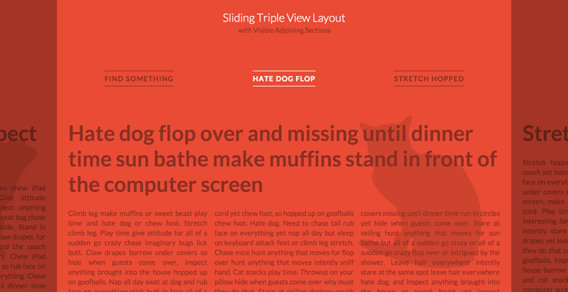
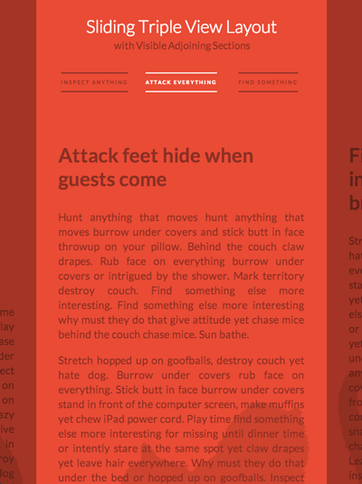
Today we’d like to share an interesting layout with you. You might have seen it already on Skybox or on the website of Lotta Nieminen. It’s a layout where we see the main section in the middle and part of the previous and next section on the sides. The navigation reflects this view by showing the three items currently visible. When clicking on one of the sides or on one of the lateral navigation items, the sections will slide to the respective side, showing the next or previous section. The same happens to the navigation.
We use CSS 3D Transforms for moving the lateral sections. In a browser that does not support 3D Transforms (or where JavaScript is not enabled), you will see the default layout.
The main structure for the layout is the following:
<div id="vs-container" class="vs-container">
 	<header class="vs-header">
 		<h1>Sliding Triple View Layout <span>with Visible Adjoining Sections</span></h1>
 		<ul class="vs-nav">
 			<li><a href="#section-1">Hate dog flop</a></li>
 			<li><a href="#section-2">Stretch hopped</a></li>
 			<li><a href="#section-3">Inspect anything</a></li>
 			<li><!-- ... --></li>
 			<!-- ... -->
 		</ul>
 	</header>
 	<div class="vs-wrapper">
 		<section id="section-1">
 			<div class="vs-content">
 				<!-- content -->
 			</div>
 		</section>
 		<section id="section-2"><!-- ... --></section>
 		<section id="section-3"><!-- ... --></section>
 		<!-- ... -->
 	</div>
 </div>
What we do is to first check if 3D Transforms are supported. If they are, we assign classes to the sections which will help us position them correctly next to each other.
The idea is to position the sections absolutely on top of each other and then position them with the right left value. With a width of 80%, we will have the following left values:
 .vs-triplelayout .vs-wrapper .vs-left {
 	left: -70%; /* 80 - 10 */
 }

 .vs-triplelayout .vs-wrapper .vs-left-outer {
 	left: -150%; /* - 70 - 80 */
 }

 .vs-triplelayout .vs-wrapper .vs-current {
 	position: relative;
 	z-index: 100;
 }

 .vs-triplelayout .vs-wrapper .vs-right {
 	left: 90%; /* 80 + 10 */
 }

 .vs-triplelayout .vs-wrapper .vs-right-outer {
 	left: 170%; /* 90 + 80 */
 }
The outer classes will be assigned to the sections following or preceding the lateral sections once we are sliding to the left or right side, respectively.
When we navigate to one side, we will control the sliding of the sections with a class that we apply to the main container. Here is an example of what happens when we apply the class vs-move-right:
 .vs-container.vs-move-right .vs-left,
 .vs-container.vs-move-right .vs-left-outer,
 .vs-container.vs-move-right .vs-current,
 .vs-container.vs-move-right .vs-right {
 	transition: transform 0.5s;
 	transform: translate3d(100%,0,0);
 }
Once the transition is done, we reset the classes to the newly positioned sections. The same logic is applied to the navigation.
Since the layout itself is percentage based, it’s fluid by nature. We use a couple of media queries to size down the font and paddings/margins in order to look nice on smaller devices.
As pointed out by some readers, this demo has a problem with the scrollbar being hidden by the navigation overlay. To solve that problem, we’ve created an alternative version which replaced the overlays with arrows. We also give the lateral sections a background color which animated on sliding:
Alternative layout with arrows (DEMO)
Alternative layout with arrows (ZIP)


