


In this short tutorial, we are going to create an interesting slide-out footer with a bit of CSS. Grab the zip from the download button above, open it in your favorite code editor and read on!
The Idea
The effect we are after, is to give the impression that the page lifts up to reveal a footer, fixed in place. To achieve this:
- The entire page content, apart from the footer, must reside in a single wrapping element (
<div id="main">in our case). This element will be given a z-index value of 1; - The footer must be set to a negative z-index value. It will provide the background color, and make room for the fixed part of the footer (the links and the colorful headings);
- There must be an element that is set to a fixed positioning with relation to the bottom of the window, and it must have a z-index lower than the #main element, but higher than the footer.
You can learn more about the idea in the following illustration:
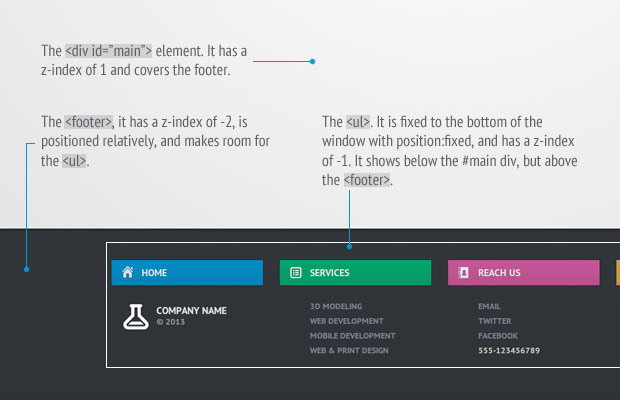
The Footer Explained
Now let’s see some code!
The HTML
Below you can see the markup of the page. This is basically a regular HTML5 document, in the <head> of which I include a font from Google Webfonts, and the HTML5 shim for older IE browsers.
index.html
<!DOCTYPE html>
<html>

    <head>
        <meta charset="utf-8"/>
        <title>Tutorial: A CSS3 slide-out footer</title>

        <link href="http://fonts.googleapis.com/css?family=PT+Sans+Narrow:700" rel="stylesheet" />

        <!-- The main CSS file -->
        <link href="assets/css/style.css" rel="stylesheet" />

        <!--[if lt IE 9]>
            <script src="http://html5shiv.googlecode.com/svn/trunk/html5.js"></script>
        <![endif]-->
    </head>

    <body>

        <div id="main">

            <h1>A CSS3 slide-out footer.</h1>

        </div>

        <!-- The footer will go here -->

    </body>
</html>
The #main element wraps around the content of the page. As you will see in the next section, we will assign a positive z-index value to it, so that it is rendered above the footer. And here is the markup of the footer itself:
<footer>
<ul>
<li>
<p class="home">Home</p>
<a class="logo" href="#">Company Name <i>© 2013</i></a>
</li>
<li>
<p class="services">Services</p>
<ul>
<li><a href="#">3D modeling</a></li>
<li><a href="#">Web development</a></li>
<li><a href="#">Mobile development</a></li>
<li><a href="#">Web & Print Design</a></li>
</ul>
</li>
<li>
<p class="reachus">Reach us</p>
<ul>
<li><a href="#">Email</a></li>
<li><a href="#">Twitter</a></li>
<li><a href="#">Facebook</a></li>
<li>555-123456789</li>
</ul>
</li>
<li>
<p class="clients">Clients</p>
<ul>
<li><a href="#">Login Area</a></li>
<li><a href="#">Support Center</a></li>
<li><a href="#">FAQ</a></li>
</ul>
</li>
</ul>
</footer>
Inside the footer tag, we have an unordered list which holds four groups of links (defined using <li> elements). Each group has a paragraph, which is transformed into a colorful heading for the group, and another <ul> which holds the links. The outermost <ul> will be set to position:fixed, which will make it static with regard to the bottom of the browser window.

The Footer
The CSS
As you might guess, this is the place where things get interesting. In the beginning of the tutorial, I mentioned that we are going to work with negative z-indexes to make the footer fixed to the bottom of the screen. There is a very good article that explains z-indexes in detail, which I highly recommend that you read before continuing further. Don’t worry, I will wait.
The first thing we have to do, is to create a stacking context on the body element (any element that contains both the footer and the #main div would work). If you don’t do this, in my experience, the negative z-indexes do not work in mobile Safari, and older IEs. To create a stacking context, we only have to give it a z-index and a position:
assets/css/styles.css
body{
    font:15px/1.3 'PT Sans', sans-serif;
    color: #5e5b64;

    /* Create a page-wide stacking context
    (so that negative margins work as you expect) */

    position:relative;
    z-index:0;
}
Now all other elements on the page with a z-index value will be stacked according to the body. Next we should assign a z-index to the #main element, so that it covers the footer (otherwise it would always be visible, fixed to the bottom of the window).
#main{
    position:relative;
    z-index:1;

    background-color: #fff;

    background-image:-webkit-radial-gradient(center, circle farthest-corner, #fff, #e2e2e2);
    background-image:-moz-radial-gradient(center, circle farthest-corner, #fff, #e2e2e2);
    background-image:radial-gradient(center, circle farthest-corner, #fff, #e2e2e2);

    padding: 120px 0 600px;
    box-shadow: 0 3px 3px rgba(0,0,0,0.2);
}
A z-index value of 1 is enough to bring the element above all other elements on the page which do not have explicit z-indexes set. In most browsers this is enough to achieve the behavior we are after, but unfortunately mobile Safari has a redrawing issue, which necessitates setting negative z-indexes on the footer. Another thing that we have to do is to set a background on the #main element, otherwise we would see the footer through it.
And here is the footer:
footer{
    height: 245px;
    color:#ccc;
    font-size:12px;

    position:relative;
    z-index:-2;

    background-color:#31353a;

    background-image:-webkit-linear-gradient(top, #31353a, #2f3337);
    background-image:-moz-linear-gradient(top, #31353a, #2f3337);
    background-image:linear-gradient(top, #31353a, #2f3337);
}
I have set a z-index value of -2. Which pushes it behind the #main div. Note that we have to give this element a height, because the UL element that is inside it has a fixed positioning and will not expand its parent to its size.
Next is the UL element inside it, which is fixed to the browser window:
/* Set a width to the outermost UL, center it and fix it to the window */

footer > ul{
    width:960px;
    position:fixed;
    left:50%;
    bottom:0;
    margin-left:-480px;
    padding-bottom: 60px;
    z-index:-1;
}
It is set to a z-index of -1, which causes it to show below the #main element, but above the footer, which is exactly what we want. This concludes the z-index trick, but there are a few more styles that are worth mentioning:
/* The four columns of links */

footer > ul > li{
    width:25%;
    float:left;
}

footer ul{
    list-style: none;
}

/* The links */

footer > ul > li ul li{
    margin-left:43px;
    text-transform: uppercase;
    font-weight:bold;
    line-height:1.8;
}

footer > ul > li ul li a{
    text-decoration: none !important;
    color:#7d8691 !important;
}

footer > ul > li ul li a:hover{
    color:#ddd !important;
}
We have to be extra careful when setting these styles, because the footer contains nested ULs which might get mixed up. To limit the effect of the styles, I am using the CSS child selector >.
Next is the company logo. The image is displayed from a sprite as a :before element.
/* The company logo */

footer a.logo{
    color: #e4e4e4 !important;
    text-decoration: none !important;
    font-size: 14px;
    font-weight: bold;
    position: relative;
    text-transform: uppercase;
    margin-left: 16px;
    display: inline-block;
    margin-top: 7px;
}

footer a.logo i{
    font-style: normal;
    position: absolute;
    width: 60px;
    display: block;
    left: 48px;
    top: 18px;
    font-size: 12px;
    color: #999;
}

footer a.logo:before{
    content: '';
    display: inline-block;
    background: url('../img/sprite.png') no-repeat -19px -70px;
    width: 48px;
    height: 37px;
    vertical-align: text-top;
}
After this, we can style the paragraph elements, which have to be transformed into brightly colored headings for each of the four sections.
footer p{
    width: 90%;
    margin-right: 10%;
    padding: 9px 0;
    line-height: 18px;
    background-color: #058cc7;
    font-weight: bold;
    font-size: 14px;
    color:#fff;
    text-transform: uppercase;
    text-shadow: 0 1px rgba(0,0,0,0.1);
    box-shadow: 0 0 3px rgba(0,0,0,0.3);
    margin-bottom: 20px;
    opacity:0.9;
    cursor:default;

    -webkit-transition: opacity 0.4s;
    -moz-transition: opacity 0.4s;
    transition: opacity 0.4s;
}

footer > ul > li:hover p{
    opacity:1;
}

footer p:before{
    content: '';
    display: inline-block;
    background: url('../img/sprite.png') no-repeat;
    width: 16px;
    height: 18px;
    margin: 0 12px 0 15px;
    vertical-align: text-bottom;
}
Another trick that I used here, is that I set the opacity of the elements to be 0.9 and I defined a transition which will smoothly animate the opacity when it changes. On hover, the opacity is set to 1, which triggers the animation.
Lastly, here are the different color themes, created with the help of a few CSS gradients:
footer p.home{
    background-color: #0096d6;

    background-image:-webkit-linear-gradient(top, #0096d6, #008ac6);
    background-image:-moz-linear-gradient(top, #0096d6, #008ac6);
    background-image:linear-gradient(top, #0096d6, #008ac6);
}

footer p.home:before{
    background-position: 0 -110px;
}

footer p.services{
    background-color: #00b274;

    background-image:-webkit-linear-gradient(top, #00b274, #00a46b);
    background-image:-moz-linear-gradient(top, #00b274, #00a46b);
    background-image:linear-gradient(top, #00b274, #00a46b);
}

footer p.services:before{
    background-position: 0 -129px;
}

footer p.reachus{
    background-color: #d75ba2;

    background-image:-webkit-linear-gradient(top, #d75ba2, #c75496);
    background-image:-moz-linear-gradient(top, #d75ba2, #c75496);
    background-image:linear-gradient(top, #d75ba2, #c75496);
}

footer p.reachus:before{
    background-position: 0 -89px;
}

footer p.clients{
    background-color: #e9ac40;

    background-image:-webkit-linear-gradient(top, #e9ac40, #d89f3b);
    background-image:-moz-linear-gradient(top, #e9ac40, #d89f3b);
    background-image:linear-gradient(top, #e9ac40, #d89f3b);
}

footer p.clients:before{
    background-position: 0 -69px;
}
This makes the headings pretty and colorful, without any images.
We’re done!
I hope that you liked this simple technique. It even works on mobile devices, although you will probably want to write a media query or two so it fits into the form factor better.