So you’re designing a logo. It sounds like an easy enough task, right? Draw a circle, type in the company name and you’re done (I’ve literally heard a designer suggest that very process). Unfortunately, if you’re really worth the money the client is paying you, there’s a lot more to it than that. There are… Continue reading 10 Tips for Designing Logos That Don’t Suck
Tag: ccc
A Look Into CSS Units: Pixels, EM, and Percentage
Unit takes an important role for measuring and building things like a house, a bridge or a tower, and building a website is not an exception. There are a number of methods of measurements used on the Web, specifically in CSS, namely Pixel, EM and Percentage. In this post, we are going to run through… Continue reading A Look Into CSS Units: Pixels, EM, and Percentage
How to Customize the Foundation 4 Top Bar
Zurb’s Foundation 4 features a brilliant top bar which has become almost symbolic of a Foundation site build. Today we’re going to look at how you can implement it in a different way, placing it elsewhere on the page, giving you a custom and responsive horizontal navigation menu. Getting Started First up, we’ll need… Continue reading How to Customize the Foundation 4 Top Bar
Learn AngularJS With These 5 Practical Examples
By now you’ve probably heard of AngularJS – the exciting open source framework, developed by Google, that changes the way you think about web apps. There has been much written about it, but I have yet to find something that is written for developers who prefer quick and practical examples. This changes today. Below you will… Continue reading Learn AngularJS With These 5 Practical Examples
Create a slide-out footer with this neat z-index trick
In this short tutorial, we are going to create an interesting slide-out footer with a bit of CSS. Grab the zip from the download button above, open it in your favorite code editor and read on! The Idea The effect we are after, is to give the impression that the page lifts up to reveal… Continue reading Create a slide-out footer with this neat z-index trick
Build a Dynamic Dashboard with ChartJS
Final Product What You’ll Be Creating DownloadSOURCE FILES DemoVIEW IT ONLINE Today we will be creating a dynamic dashboard with live charts, through the power of ChartJS. ChartJS is a powerful, dependency free JavaScript library which builds graphs via the canvas element. Best of all, it’s easy for designers to get up and running. We’ll be focusing… Continue reading Build a Dynamic Dashboard with ChartJS
Tutorial: How To Build Input Fields with Tag-Style Item Blocks
Many newer social media communities and web applications are pushing the boundaries of interface design. Form inputs have changed a lot over just the past 4-5 years. One such feature is the tag select input field, where users can enter tags which appear as block items within the field itself. For this tutorial I want… Continue reading Tutorial: How To Build Input Fields with Tag-Style Item Blocks
Working with Classes and IDs Generated By WordPress
Thumbnail Grid with Expanding Preview
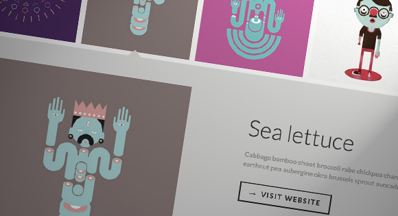
If you have searched images on Google recently, you might have noticed the interesting expanding preview for a larger image when you click on a thumbnail. It’s a really nice effect and it is very practical, making a search much easier. Today we want to show you how to create a similar effect on a… Continue reading Thumbnail Grid with Expanding Preview
CSS Buttons with Pseudo-Elements
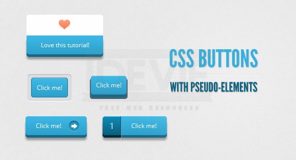
Hola, amigos. For the last month or so, I’ve been experimenting with the power of CSS pseudo-elements, specially when it comes to mixing them with buttons and that way recreating some great effects that were only possible to do with sprites, in the past. In this tutorial, I’ll show you how to create buttons with… Continue reading CSS Buttons with Pseudo-Elements


