
Zurb’s Foundation 4 features a brilliant top bar which has become almost symbolic of a Foundation site build. Today we’re going to look at how you can implement it in a different way, placing it elsewhere on the page, giving you a custom and responsive horizontal navigation menu.
Getting Started
First up, we’ll need the latest Foundation. Unzip and place all the files in your work or test directory. We will only be using index.html, making our own style.css in which we’ll override the different classes of the Top Bar to make our custom navigation.
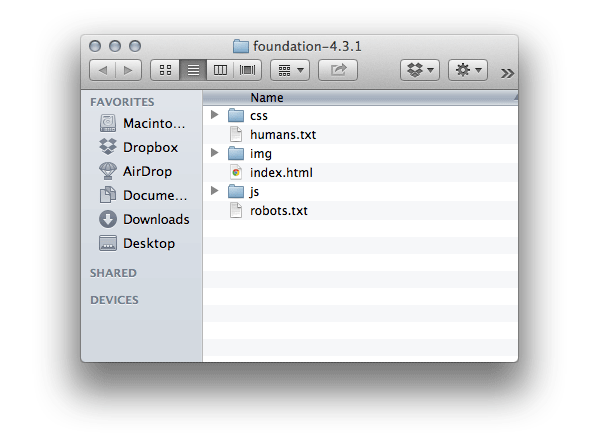
Also, download the background image provided above. We will be using this for the menu, so place that in your “img” folder. Have everything? Then fire up your favorite editor and let’s get going!
Setting up the HTML Structure
Step 1: General Markup
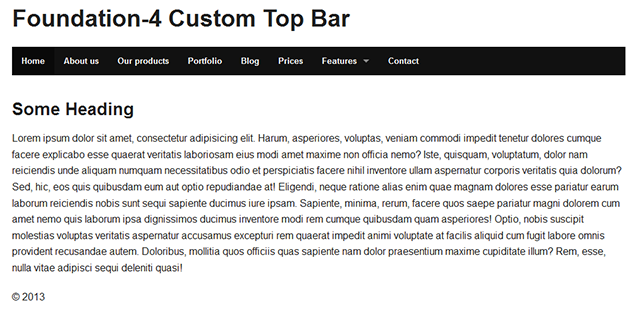
The index file in your download comes with some preset HTML. You can leave everything as you find it in the header tag, and you can leave the script links (before the closing body tag) where they are. We need all that to make sure the Grid and the Top Bar actually work.
You can clear out the rest of the dummy content. We’re going for a full width design here, nothing to complicated, just something to get a better idea of what we are working with.
Alright, let’s set up the header, navigation, content and footer area and put in some dummy content for filling purposes. We will give each area a class of “full-width”, then in each area we will place a div with a class=”row”, a div with a class=”large-12″ and class=”columns”. This sets up a basic grid structure.
Note: For more information on how the grid works, take a look at Foundation for Beginners: The Grid System
<!-- HEADER AREA --> <header class="full-width header-area"> <div class="row"> <div class="large-12 columns"> <h2>Foundation-4 Custom Top Bar</h2> </div> </div> </header> <!-- NAVIGATION AREA --> <div class="full-width navigation-area"> <div class="row"> <div class="large-12 columns"> <nav class="top-bar"></nav> </div> </div> </div> <!-- CONTENT AREA --> <div class="full-width content-area"> <div class="row"> <div class="large-12 columns"> <p> Lorem ipsum dolor sit amet, consectetur adipisicing elit. Harum, asperiores, voluptas, veniam commodi impedit tenetur dolores cumque facere explicabo esse quaerat veritatis laboriosam eius modi amet maxime non officia nemo? Iste, quisquam, voluptatum, dolor nam reiciendis unde aliquam numquam necessitatibus odio et perspiciatis facere nihil inventore ullam aspernatur corporis veritatis quia dolorum? Sed, hic, eos quis quibusdam eum aut optio repudiandae at! Eligendi, neque ratione alias enim quae magnam dolores esse pariatur earum laborum reiciendis nobis sunt sequi sapiente ducimus iure ipsam. Sapiente, minima, rerum, facere quos saepe pariatur magni dolorem cum amet nemo quis laborum ipsa dignissimos ducimus inventore modi rem cumque quibusdam quam asperiores! Optio, nobis suscipit molestias voluptas veritatis aspernatur accusamus excepturi rem quaerat impedit animi voluptate at facilis aliquid cum fugit labore omnis provident recusandae autem. Doloribus, mollitia quos officiis quas sapiente nam dolor praesentium maxime cupiditate illum? Rem, esse, nulla vitae adipisci sequi deleniti quasi! </p> </div> </div> </div> <!-- FOOTER AREA --> <div class="full-width footer-area"> <div class="row"> <div class="large-12 columns"> © 2013 </div> </div> </div>
Step 2: Top Bar Markup
Before we get styling, we’ll lay out the the essential HTML structure to make the Foundation Top Bar work properly. We need five basic elements to get the engine running:
nav with class="top-bar"ul with class="title-area"li with class="toggle-topbar"= to expand the menu in mobile layoutsection with class="top-bar-section"ul with class="left"andul with class="right"
Now, let’s set up these basics and implement the five elements.
Note: In this tutorial example we’ll want to make a custom navigation menu, thus removing the title in it (which usually holds the logo, in text or image form). To do this we simply leave the li with class=”name” in the ul with the class=”title-area” empty.
Also, let’s add some menu elements and a dropdown menu while we’re at it. To include a dropdown add the class “has-dropdown” to the li element you want to contain the dropdown, then bring in a new ul with a class of “dropdown”. To indicate the currently active page we can give our current menu item a class of “active” on the li element. We can leave the ul class=”right” empty. Normally you would use this area to add a button or a search input form. For more information on the specifics of the top bar markup, take a look at Foundation for Beginners: The Top Bar.
Look at the following HTML, the comments explain how it’s build up.
<!-- Nav Wrap -->
<nav class="top-bar">
<ul class="title-area">
	<!-- Title Area -->
	<li class="name"></li>
	<!-- Remove the class "menu-icon" to get rid of menu icon. Take out "Menu" to just have icon alone -->
	<li class="toggle-topbar menu-icon"><a href="#"><span>Menu</span></a></li>
</ul>
<!-- The Section wrap -->
<section class="top-bar-section">
<!-- Left Nav Section -->
<ul class="left">
	<li class="active"><a href="#">Home</a></li>
	<li><a href="#">About us</a></li>
	<li><a href="#">Our products</a></li>
	<li><a href="#">Portfolio</a></li>
	<li><a href="#">Blog</a></li>
	<li><a href="#">Prices</a></li>
	<li class="has-dropdown"><a href="#">Features</a>
	<ul class="dropdown">
		<li><a href="#">Modalboxes</a></li>
		<li><a href="#">Submenu's and navigation</a></li>
		<li><a href="#">Price tables</a></li>
		<li><a href="#">Buttons</a></li>
		<li><a href="#">Button groups</a></li>
		<li><a href="#">Labels, Keystrokes and Tooltips</a></li>
		<li><a href="#">Alert boxes</a></li>
		<li><a href="#">Columns</a></li>
	</ul>
	</li>
	<li><a href="#">Contact</a></li>
</ul>
<!-- Right Nav Section -->
<ul class="right">
</ul>
</section></nav>
Step 3: Results So Far
Look at the results in your browser. We now set up a basic Foundation framework using the Top Bar to create a horizontal menu. In order to place it somewhere other than in the top of the browser is to simply put the nav class=”top-bar” in a row and columns div.
When you re-size the browser you can see that the menu changes at the predefined break point.
The next step is to give it all some custom styling. We’ll be focusing on how we can style the Top Bar and which classes are used for that.
Setting up the CSS
Step 1: General Styling
If you haven’t already, create a new CSS file, name it style.css and place it in the css folder of your Foundation download. Don’t forget to include it in the header tag in your index file, referencing it beneath the foundation.css like so:
<head>
<meta charset="utf-8">
<meta name="viewport" content="width=device-width">
<title>Foundation 4</title>
<link rel="stylesheet" href="css/foundation.css">
<link rel="stylesheet" href="css/style.css">
<script src="js/vendor/custom.modernizr.js"></script>
</head>
If you don’t place it under the foundation.css it won’t override the Top Bar classes.
Alright, let’s first get some basic styling on the header, navigation, content and footer area. For the navigation area, we’ll be using a background image, which you’ll have previously downloaded. The general design is not that big of a deal, take a look at the CSS below. We add a full-width class to each area to make sure it fills the full width of the browser.
body {
		background-color:#ccc;
}
/** Set the backgrounds for the different sections **/ .header-area {
	background-color:#2d465c;
	min-height:160px;
}
.navigation-area {
		background-image:url('../img/navigation-container.jpg');
		background-repeat:repeat-x;
}
.content-area {
		padding:50px 0 70px 0;
}
.footer-area {
	background-color:#1f1f1f;
	color:#fff;
		min-height:50px;
		padding:20px 0 0 0;
}
.full-width {
		min-width:100%;
		position:relative;
}
h2 {
		color:#fff;
		font-weight:normal;
		margin-top: 50px;
}
Step 2: Top Bar Styles
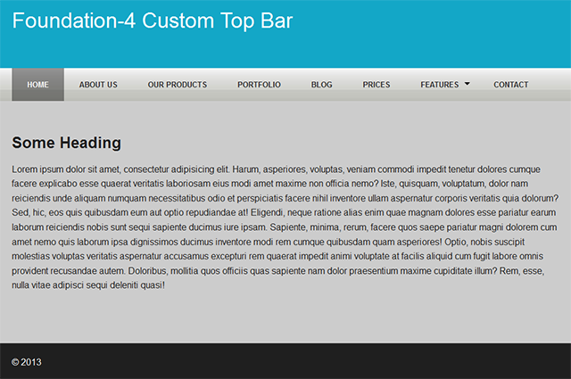
If you look at the results now, the menu still looks a bit out of place. That’s because it still uses the default CSS. Let’s fix it up!
There are a couple of CSS classes we need to address to get the desired results. First, we’ll remove some of the black background on the .top-bar class and the section lists and change the height and line-height to 58px (height of the navigation-area). Check out the comments for further explanation.
/** Changes background color,height and margin of the border **/ .top-bar {
	background:none;
	height:58px;
	line-height:58px;
	margin-bottom:0;
}
/** Removes black background on menu bar **/ .top-bar-section ul {
	background:none;
	text-transform:uppercase;
}
/** Removes black background on menu item **/ .top-bar-section li a:not(.button) {
	background:none;
	line-height:58px;
	padding: 0 27px;
}
We’ve removed the default black background from the nav class=”top-bar”, the section lists and the menu anchors. We adjust the height, line-height and padding and transform the text to uppercase to make it all fit with our custom design.
If you refresh your browser you’ll see that it’s starting to take shape. Let’s continue on with the dropdowns, menu items, active and hover states. Take a look at the CSS below and again, read the commented text for explanation:
/** Changes the active menu item from default black to a gradient **/ .top-bar-section ul li.active>a {
	background:rgb(0,0,0);
	background:linear-gradient(to bottom,rgba(0,0,0,0.4) 0%,rgba(0,0,0,0.7) 100%) repeat scroll 0 0 transparent;
	color:#fff;
}
/** Changes the hover state of non active menu items **/ .top-bar-section li:hover a {
	background:linear-gradient(to bottom,rgba(0,0,0,0.4) 0%,rgba(0,0,0,0.7) 100%) repeat scroll 0 0 transparent;
	color:#fff;
}
/** Changes non active menu items text color to black **/ .top-bar-section ul li>a {
	color:#2d2d2d;
}
/** Changes the hover state of dropdown menu items **/ .top-bar-section ul.dropdown li a:hover:not(.button) {
	background:none repeat scroll 0 0 rgba(0,0,0,0.9);
}
/** IMPORTANT fill for the ul dropdown container **/ .top-bar-section ul.dropdown {
	background:#333;
	color:#fff;
}
/** This fixes the position and the color of the dropdown arrow **/ .top-bar-section .has-dropdown>a:after {
	border-color:rgba(0,0,0,1) transparent transparent;
	margin-top: 2.5px;
}
We’ve made several changes to our menu here. First off, we changed the default black background of the active menu item to a CSS gradient. Then we gave the non active menu items a resembeling hover state. To make the non-active menu items more clearly visible we change the text color to a dark gray. The changes made on .top-bar-section li:hover a will keep the state of the dropdown menu on hovered when your mouse moves over the dropdown items. To complete the CSS we gave the ul dropdown container a background fill and repositioned the default position of the dropdown arrow, because of our padding adjustments to the top-bar-section.
Step 3: Results So Far
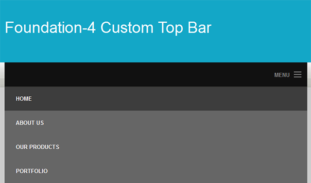
Refresh your browser and take a look at the results so far. We are not quite done yet; we still need to make sure it all looks good when we resize our browsers screen size (or, for that matter, when we look at it on a smaller device). To make that happen, we’ll add some Media Queries to our CSS file.
Setting up the Media Queries
Step 1: Media Queries
There are a couple of things that we need to adjust to make the menu work with our custom design when the screen size is being reduced. This mostly involves adding some padding, line-height, text colors and background colors. Take a look at the CSS below and look at the comments to get an explanation for each section.
@media only screen and (max-width:942px) {
	/* Makes the responsive menu fit in the navigation container and change its background to black */ .top-bar ul {
		background-color:rgba(0,0,0,0.5);
		padding-bottom:13px;
	}
	/* Change non active menu item color to black */ .top-bar-section ul li>a {
		color:#fff;
	}
	/* Gives the dropdown ul a black fill */ .top-bar-section ul {
		background:#000;
	}
	/* Give the BACK button after going in a submenu the appropriate filling */ .top-bar-section .dropdown li.title h5 a {
		line-height:57px;
	}
	/* This fixes the position and the color of the dropdown arrow */ .top-bar-section .has-dropdown>a:after {
		border-color:rgba(255,255,255,1) transparent transparent;
		margin-top: 2.5px;
	}
}
/* end media query */
Step 2: Enjoy Your Results
Save the file, refresh your browser and play around with the browser size. As you can see the menu fits in our design nicely.
Conclusion
So, that about wraps up our tutorial on how we can create a custom responsive menu using the Top Bar from the Foundation 4 framework. And remember, the menu doesn’t have to be at the top of the page. Just wrap it in its own row and columns div, then you can practically place it anywhere you want!
Foundation is a great tool to swiftly develop responsive designs, and when you know your way around, you can pretty much shape it any way you want. Have fun!