Final Product What You’ll Be Creating
DownloadSOURCE FILES
DemoVIEW IT ONLINE
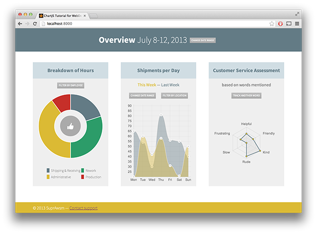
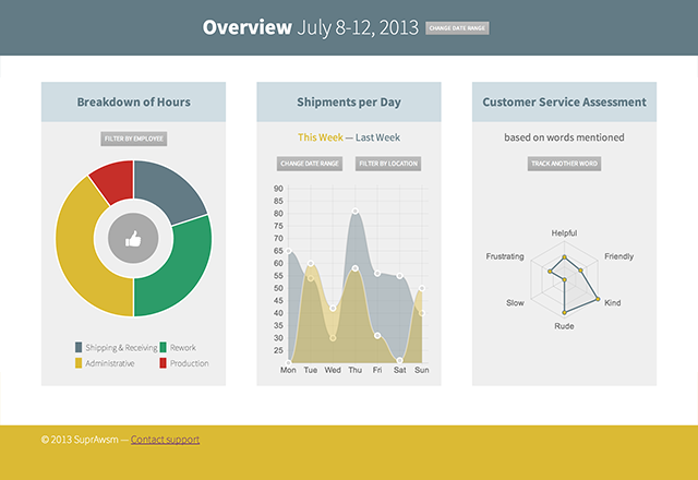
Today we will be creating a dynamic dashboard with live charts, through the power of ChartJS. ChartJS is a powerful, dependency free JavaScript library which builds graphs via the canvas element. Best of all, it’s easy for designers to get up and running. We’ll be focusing on the pieces of the library that get you up and running with beautiful and functional charts fast. We will build a mobile-friendly dashboard from start to finish.
Getting Started
We’re going to build our dashboard on top of HTML5 Boilerplate. Download the zip file, or clone the repository via Git. We’re going to name our project directory “chartjs_dashboard”, and drop all of the files directly there.
# On the command line
git clone [email protected]:h5bp/html5-boilerplate.git chartjs_dashboard
Next, we’ll grab ChartJS. Go to the uminified version at raw.github.com/nnnick/Chart.js/master/Chart.js, and copy the contents into your js/plugins.js file. Having the unminified version will make errors more readable if you run into them.
Tip: in production, you would use the minified version of the JavaScript, to make the dashboard more performant.
Your file structure should look like this:
├── 404.html
├── crossdomain.xml
├── css
│   ├── main.css
│   └── normalize.css
├── favicon.ico
├── img
├── index.html
├── js
│   ├── main.js
│   ├── plugins.js
│   └── vendor
│       ├── jquery-1.10.1.min.js
│       └── modernizr-2.6.2.min.js
└── robots.txt
Note: this does not include some of the files included in H5BP that we won’t be using.
Color Palette
Before we get into the coding of the site, let’s start by setting up a color palette that we will use throughout the design. By doing this, we can establish a future “style guide” of sorts; this is a common practice for basically any given design.
If you are building the dashboard with a particular brand in mind, start by using the brand’s colors. Today, we will define two main colors and two ancillary colors. We will also use shades or faded out versions of these colors.
- dark blue:
#637b85 - green:
#2c9c69 - yellow:
#dbba34 - red:
#c62f29
We will also use a lighter shade of the dark blue, #d0dde3. Lastly, we will be utilizing grayscale colors.
ChartJS Basics
ChartJS uses the canvas element. The canvas element provides a JavaScript-only interface to draw pixels to a given rectangle area. It is often compared to SVG, which offers a DOM node based solution to creating vector graphics in the browser. However, pixels drawn to the canvas element are not kept in memory and thus don’t respond to JavaScript events.
But enough with the tech talk – how do we get started quickly with ChartJS?
Luckily, the ChartJS homepage has plenty of examples to get us started quickly. The basic pattern is to create the canvas element in HTML, select it with JavaScript, and create the Chart while passing in the data the chart is built from.
<canvas id="something"></canvas>
<script>
var canvas = document.getElementById("something");
var ctx = canvas.getContext("2d");
new Chart(ctx).Line(data, options);
</script>
The above example would assume that you had defined `data` and `options` as objects, and would produce a line graph accordingly.
In our example, we will use the Doughnut graph, the Line graph, and the Radar graph. These graphs will represent different business-oriented metrics, but of course you can take this and adapt it to your needs.
Page Markup
Let’s start by defining some basic HTML for the layout of our page.
<div class="wrapper">
<header>
    <div class="container clearfix">
        <h1>Overview <span>July 8-12, 2013</span><a class="button">Change Date Range</a></h1>
    </div>
</header>
<div class="container clearfix">
    <div class="third widget doughnut">
        <h3>Breakdown of Hours</h3>
        <div class="canvas-container">
            <canvas id="hours"></canvas>
        </div>
    </div>
    <div class="third widget line">
        <div class="chart-legend">
            <h3>Shipments per Day</h3>
        </div>
        <div class="canvas-container">
            <canvas id="shipments"></canvas>
        </div>
    </div>
    <div class="third widget">
        <div class="chart-legend">
            <h3>Customer Service Assessment</h3>
        </div>
        <div class="canvas-container">
            <canvas id="departments"></canvas>
        </div>
    </div>
</div>
<div class="push"></div>
</div>
<footer>
</footer>
Here, we can see that we have a basic header, middle, and footer section. We are using the .wrapper class and .push class to create a sticky footer (see here for more info). We will be creating our layout to be mobile friendly first, and to scale up from there. There are a few tricks we will pull along the way, but this structure will do a lot of the work for us.
Before We Go Too Far…
Note that canvas doesnt play extremely well with media queries. For this tutorial, we will be creating a workaround to allow the charts to be redrawn at different sizes in the JavaScript.
Inside our main.js file, we will need to have a sizing function that is triggered by a window resize. We will also need a “redraw” function to fire after the resizing function fires. Finally, when we redraw the charts, we don’t want them to animate in, as if this is the first time they are being drawn.
(function(){
// set up the timeout variable
var t;
// setup the sizing function,
// with an argument that tells the chart to animate or not
function size(animate){
    // If we are resizing, we don't want the charts drawing on every resize event.
    // This clears the timeout so that we only run the sizing function
    // when we are done resizing the window
    clearTimeout(t);
    // This will reset the timeout right after clearing it.
    t = setTimeout(function(){
        $("canvas").each(function(i,el){
            // Set the canvas element's height and width to it's parent's height and width.
            // The parent element is the div.canvas-container
            $(el).attr({
                "width":$(el).parent().width(),
                "height":$(el).parent().outerHeight()
            });
        });
        // kickoff the redraw function, which builds all of the charts.
        redraw(animate);
        // loop through the widgets and find the tallest one, and set all of them to that height.
        var m = 0;
        // we have to remove any inline height setting first so that we get the automatic height.
        $(".widget").height("");
        $(".widget").each(function(i,el){ m = Math.max(m,$(el).height()); });
        $(".widget").height(m);
    }, 100); // the timeout should run after 100 milliseconds
}
$(window).on('resize', size);
function redraw(animation){
    var options = {};
    if (!animation){
        options.animation = false;
    } else {
        options.animation = true;
    }
    // ....
        // the rest of our chart drawing will happen here
    // ....
}
size(); // this kicks off the first drawing; note that the first call to size will animate the charts in.
If this seems a little daunting, don’t worry! Ask a question in the comments, and we and the Tuts+ community will help you understand fully!
Some CSS to Get Us Started
We want to set up some basic CSS structures to get us started. HTML5 Boilerplate of course includes normalize and some other defaults that you can change, but for the sake of the tutorial, we will write our CSS after the line “Author’s custom styles”.
html, body {
    height: 100%;
}
body {
    font-family: 'Source Sans Pro', sans-serif;
    color: #666;
}
/* button */
.button {
    cursor: pointer;
    text-decoration: none;
    font-size: 0.6em;
    font-weight: 400;
    text-transform: uppercase;
    display: inline-block;
    padding: 4px 6px;
    margin: 0 10px;
    position: relative;
    background: #ccc;
    color: #fff;
    box-shadow: 0 0 2px rgba(0,0,0,0.1);
    background: rgb(190,190,190); /* Old browsers */
    background: -moz-linear-gradient(top, rgba(190,190,190,1) 0%, rgba(170,170,170,1) 100%); /* FF3.6+ */
    background: -webkit-gradient(linear, left top, left bottom, color-stop(0%,rgba(190,190,190,1)), color-stop(100%,rgba(170,170,170,1))); /* Chrome,Safari4+ */
    background: -webkit-linear-gradient(top, rgba(190,190,190,1) 0%,rgba(170,170,170,1) 100%); /* Chrome10+,Safari5.1+ */
    background: -o-linear-gradient(top, rgba(190,190,190,1) 0%,rgba(170,170,170,1) 100%); /* Opera 11.10+ */
    background: -ms-linear-gradient(top, rgba(190,190,190,1) 0%,rgba(170,170,170,1) 100%); /* IE10+ */
    background: linear-gradient(to bottom, rgba(190,190,190,1) 0%,rgba(170,170,170,1) 100%); /* W3C */
    filter: progid:DXImageTransform.Microsoft.gradient( startColorstr='#bebebe', endColorstr='#aaaaaa',GradientType=0 ); /* IE6-9 */
}
.button:hover {
    background: #637b85;
}
/* Header styles */
header {
    text-align: center;
    background: #637b85;
    color: #fff;
    margin-bottom: 40px;
}
header span {
    font-weight: 200;
}
header .button {
    font-size: 0.2em;
    top: -6px;
}
/* various containers */
.container {
    width: 200px;
    margin: 0 auto;
}
.canvas-container {
    min-height: 300px;
    max-height: 600px;
    position: relative;
}
.widget {
    position: relative;
    margin-bottom: 80px;
    background: #efefef;
    padding: 12px;
    margin-bottom: 30px;
    -webkit-box-sizing: border-box;
    -moz-box-sizing: border-box;
    box-sizing: border-box;
}
Here, we define the necessary CSS for the sticky footer, as well as a button class, a self-centering container class, a class for containing our canvas elements inside of our widgets, and our widgets themselves. We will also need to add the Google font we are defining for the body by including this in our head tag.
<link href='http://fonts.googleapis.com/css?family=Source+Sans+Pro:200,400,700' rel='stylesheet' type='text/css'>
The Doughnut Graph
Doughnut graphs are a lot like pie graphs, except they have part of the middle cut out. By default, ChartJS defines that 50% of the area of the graph should be left out; we will stay with this default. The code to create the doughnut graph is shown below.
var data = [
    {
        value: 20,
        color:"#637b85"
    },
    {
        value : 30,
        color : "#2c9c69"
    },
    {
        value : 40,
        color : "#dbba34"
    },
    {
        value : 10,
        color : "#c62f29"
    }
];
var canvas = document.getElementById("hours");
var ctx = canvas.getContext("2d");
new Chart(ctx).Doughnut(data);
Here, you can see that we have defined our doughnut graph’s data and colors. This is all that is needed to make the doughnut graph work. However, what are each of the sections representing? Unfortunately, ChartJS does not yet have an easy way to define labels for the doughnut graph; however, we can make our own legend to describe each of the different sections. Modify the doughnut widget’s html to include the following.
<div class="third widget doughnut">
<h3>Breakdown of Hours</h3>
<p><a href="" class="button">Filter By Employee</a></p>
<div class="canvas-container">
<canvas id="hours"></canvas>
<span class="status"></span>
</div>
<div class="chart-legend">
<ul>
<li class="ship">Shipping & Receiving</li>
<li class="rework">Rework</li>
<li class="admin">Administrative</li>
<li class="prod">Production</li>
</ul>
</div>
</div>
We use these li’s by their classes very simply in the CSS, by leveraging the `:before` pseudo-class.
.chart-legend ul {
    list-style: none;
    width: 100%;
    margin: 30px auto 0;
}
.chart-legend li {
    text-indent: 16px;
    line-height: 24px;
    position: relative;
    font-weight: 200;
    display: block;
    float: left;
    width: 50%;
    font-size: 0.8em;
}
.chart-legend  li:before {
    display: block;
    width: 10px;
    height: 16px;
    position: absolute;
    left: 0;
    top: 3px;
    content: "";
}
.ship:before { background-color: #637b85; }
.rework:before { background-color: #2c9c69; }
.admin:before { background-color: #dbba34; }
.prod:before { background-color: #c62f29; }
Next, we want to have a nice “thumbs-up” in the center of the doughnut. This involves some CSS trickery, including a version of Uncle Dave’s Ol’ Padded Box to get the circle to be responsive. We will use the span with the class of .status to achieve this circle. Add the following rules to main.css:
.widget.doughnut .status {
    display: block;
    position: absolute;
    top: 50%;
    left: 50%;
    width: 30%;
    height: 0;
    padding-top: 12%;
    padding-bottom: 18%;
    color: #444;
    margin-top: -15%;
    margin-left: -15%;
    font-size: 1.4em;
    font-weight: 700;
    text-align: center;
    border-radius: 50%;
    background-color: #aaa;
    background-image: url(data:image/png;base64,iVBORw0KGgoAAAANSUhEUgAAAF8AAABkCAQAAABK+CQQAAAACXBIWXMAAFKnAABSpwHUSB+cAAADGGlDQ1BQaG90b3Nob3AgSUNDIHByb2ZpbGUAAHjaY2BgnuDo4uTKJMDAUFBUUuQe5BgZERmlwH6egY2BmYGBgYGBITG5uMAxIMCHgYGBIS8/L5UBFTAyMHy7xsDIwMDAcFnX0cXJlYE0wJpcUFTCwMBwgIGBwSgltTiZgYHhCwMDQ3p5SUEJAwNjDAMDg0hSdkEJAwNjAQMDg0h2SJAzAwNjCwMDE09JakUJAwMDg3N+QWVRZnpGiYKhpaWlgmNKflKqQnBlcUlqbrGCZ15yflFBflFiSWoKAwMD1A4GBgYGXpf8EgX3xMw8BSMDVQYqg4jIKAUICxE+CDEESC4tKoMHJQODAIMCgwGDA0MAQyJDPcMChqMMbxjFGV0YSxlXMN5jEmMKYprAdIFZmDmSeSHzGxZLlg6WW6x6rK2s99gs2aaxfWMPZ9/NocTRxfGFM5HzApcj1xZuTe4FPFI8U3mFeCfxCfNN45fhXyygI7BD0FXwilCq0A/hXhEVkb2i4aJfxCaJG4lfkaiQlJM8JpUvLS19QqZMVl32llyfvIv8H4WtioVKekpvldeqFKiaqP5UO6jepRGqqaT5QeuA9iSdVF0rPUG9V/pHDBYY1hrFGNuayJsym740u2C+02KJ5QSrOutcmzjbQDtXe2sHY0cdJzVnJRcFV3k3BXdlD3VPXS8Tbxsfd99gvwT//ID6wIlBS4N3hVwMfRnOFCEXaRUVEV0RMzN2T9yDBLZE3aSw5IaUNak30zkyLDIzs+ZmX8xlz7PPryjYVPiuWLskq3RV2ZsK/cqSql01jLVedVPrHzbqNdU0n22VaytsP9op3VXUfbpXta+x/+5Em0mzJ/+dGj/t8AyNmf2zvs9JmHt6vvmCpYtEFrcu+bYsc/m9lSGrTq9xWbtvveWGbZtMNm/ZarJt+w6rnft3u+45uy9s/4ODOYd+Hmk/Jn58xUnrU+fOJJ/9dX7SRe1LR68kXv13fc5Nm1t379TfU75/4mHeY7En+59lvhB5efB1/lv5dxc+NH0y/fzq64Lv4T8Ffp360/rP8f9/AA0ADzT6lvFdAAAAIGNIUk0AAHolAACAgwAA+f8AAIDpAAB1MAAA6mAAADqYAAAXb5JfxUYAAAUYSURBVHja1JxdTBxVFMd/O7vssgvLtxIQKrSVQluNiqVp0xAepKSpiaFKVEyMD2oQNGisifFJ06TRN2xjS2Js0geNHy9am5q0wRhNLNZUwI9aQmtDMbUtSFsKLOyye3xgl8KyHwM7uzv3vwkk99yZ+TF759xzzz0DQko/z8kl8ckt+U26pEEciZ4vtfAu6ZE7GpUjcr9K+EUyIEs1JC2irf6MGqmUi5ywlvUcpnX1J0wtvhvXsrZC3qNeDfwcnBFa7+FtclXAz8cRsb2BJhXwS7FHbHfwJBnmx6+IatlCmdnxtRj4JdSYHd9JeVSbg01mx8+jJIbV9INnDcUxrMWrYUkl/kbcMawOs+PXYYlhtZh78BRSG9M+S8DM+JupimkfNTd+U8yRD1fMPHhK2B3TPsegmfEfizMtjZsZv5QXscbscZ5hs+JrtPFInD6nuG1W/D10xPHqY5xc5bmTvjx/VIYlnj4VuxkzDZo0y99x4SekyYyJEqd0yqjE15fiNB9+kXwoHh3wt2Sn+dJUZfKF+EWSe++ThV8sX4s+JTDuk4VvlwOiV8fElci1kuH3G3leZ88ZjjKd2Ixo/IL8hTix5R2d5btEJ3SjVUuD7r5fccNc+BZayNPZ9wrfJh5OGavKOHH9Yp1hyGz4u1mru+9PeM2Fn0eL7oyBl3NGxOJGakecbMJSpzlmLnw7z0bYPYkmG5mJX9JmIP4Wdq6gt4smJsnEjg0NKxpa8LeFAH4C+PExwwyzeLjNNB68SJijE6PgrRzipRUdMctsENoS/BD8GYplAvjxM8csk9xknBEG+J4/F2WEDIt06uSapEL/yFuSbXTIZpNuSZW8clDcxuLv0LWuMko+2T+/OjbG82TSTlEKc9U2XuUp48Z+s9yWVOu8bDDm7hfzBtmkWht4BZtmwMTXznbSoSfYmrjfb+QT7iI96k4Uv5LPqCNdupQYfj6HeJr0yWsLBlsFOCKGuoKHceaihMf7aSGdGrQI1NHJwxFLVQCm6KWL35e1V7CPZ+Jk7ZOr/2hH6mUwro/tk5qFHE65VMhmeVn6JCDplF/eFStyUlfnriD+JumXYbkuc5JuHZcCwcY2XV/UVnKYAOysIZ/06yr7GAdN53zpWigkEsygs/StZLFowVxyz5eVaaipB+cnS1Xxc+ggS1182MUelfEz6aRCXXx4iHaV8TVaVcaHTJXx/RxVGf8b3lcX/2fe5Lqq+Bd5jQuq+n0P79CrbtAwwPGQ71Tz7ntVxl8bKuZWE788tPWtJr7G4/M7Y6o6zu08oDJ+IbtUxodtZKqM78KqMv6PTKmL388Rdcf+ZfZyUVX8ETroUXXaGqYtFLCphz9KJycWT79qqZtjS6MHlTRNz9IMt1r4PqbCYze1ZFEZXwvfClQLX8L3dtTCH+Wayvifh7/dpen+2qI8PClUDweXD55JXYdOBVMTPm7iTwv8r7zO1fBGG6dp1HHwGSYAGKKZKqqpYT1lFET5txHG6xfaIhQmYJF6PorzJi3008pfS1qsuCmmgmpqqOJe7iYracMqwAn2Rn4lM1SSURu1JHeK03wQ6S9feBacFFHOfWykmkpKyDW0NneMwxyIVu88X89jpwA7lmU75haEmagFMcuVQR6lrKOaGtZRSBZOHGRgW6iOXYmP9/AvP/AxvdGfNkuS9vituMnBTS755JNHAfnkkUM22WSThQM7GWSQgQ0IIAQQfMwwzQ3GGOEC5/iDy/hiXeb/AQDtquZeJxF4YgAAAABJRU5ErkJggg==);
    background-repeat: no-repeat;
    background-size: 30%;
    background-position: center;
}
Perhaps the most glaring element standing out here is the use of the data URI for the background image. This allows us to avoid an extra HTTP request, and is syntactically synonymous with using an actual http url. We are also setting this element to be positioned absolutely inside its .widget element, which we previously set to be position relative.
Let’s now go ahead and set up the widget typography. We only use h3 and p elements inside the widget; here is the accompanying css.
.widget p {
    margin-top: 0;
    text-align: center;
}
.widget h3 {
    margin: -12px 0 12px -12px;
    padding: 12px;
    width: 100%;
    text-align: center;
    color: #627b86;
    line-height: 2em;
    background: #d0dde3;
}
The margin and padding rules on the h3 element allow the element to stretch to the edge of the widget element over the top of the widget’s 12px of padding. We also set the top margin to 0 on the p element to fit closer to the header of the widget.
The Line Graph
One of the most useful features of ChartJS is that some of the charts allow for multiple datasets. These datasets will be drawn to the same chart sequentially, allowing for one dataset to be compared to another. A perfect example of this being useful is in line graphs. We will use two datasets to explore this functionality.
var data = {
    labels : ["Mon","Tue","Wed","Thu","Fri","Sat","Sun"],
    datasets : [
        {
            fillColor : "rgba(99,123,133,0.4)",
            strokeColor : "rgba(220,220,220,1)",
            pointColor : "rgba(220,220,220,1)",
            pointStrokeColor : "#fff",
            data : [65,54,30,81,56,55,40]
        },
        {
            fillColor : "rgba(219,186,52,0.4)",
            strokeColor : "rgba(220,220,220,1)",
            pointColor : "rgba(220,220,220,1)",
            pointStrokeColor : "#fff",
            data : [20,60,42,58,31,21,50]
        },
    ]
}
var canvas = document.getElementById("shipments");
var ctx = canvas.getContext("2d");
new Chart(ctx).Line(data, options);
A few things to note in this new code: first, we are reusing the variables we used to build the doughnut graph. This is completely valid in JavaScript, and actually slightly reduces the memory used by the script overall. However, this may cause confusion in the future, and if you plan to adapt this code to use in production, it may be more effective to use new variables for each new chart you create.
Next, the line graph supports labels. This is important, as it allows us to avoid creating HTML-based legends. However, it is also important that the data points line up with the labels given. In this example, our first data-point in the first dataset, 65, matches to “Mon” in the labels.
Lastly, our fillColors for these datasets are RGBa versions of the colors we previously defined (dark blue and yellow). We found the RGB values by inputting the colors into Photoshop’s color picker, but this can be done using any of a number of colorpicker tools.
We will also add markup for a few buttons and a human-readable range. The final line widget html looks like the following.
<div class="third widget line">
<div class="chart-legend">
<h3>Shipments per Day</h3>
<p><span>This Week</span> — <strong>Last Week</strong></p>
<p><a href="" class="button">Change Date Range</a><a href="" class="button">Filter by Location</a></p>
</div>
<div class="canvas-container">
<canvas id="shipments"></canvas>
</div>
</div>
We can polish the extra HTML and help users connect the dates with the following CSS:
.widget.line p span {
    color: #dbba34;
}
.widget.line p strong {
    color: #637b85;
    font-weight: 400;
}
Radar Graph
Radar graphs are useful to distill a selection of variables into a singularly readable graph to get a general perception of the interplay between the different variables. In our example, for instance, we will be exploring the idea of customer service, based on the number of times certain keywords are mentioned. On a radar graph, the points plotted will create a shape. That shape can give us an overall sense of the effectiveness of customer service.
Let’s see how this is created! Once again, we will reuse our variables from before.
var data = {
    labels : ["Helpful","Friendly","Kind","Rude","Slow","Frustrating"],
    datasets : [
        {
            fillColor : "rgba(220,220,220,0.5)",
            strokeColor : "#637b85",
            pointColor : "#dbba34",
            pointStrokeColor : "#637b85",
            data : [65,59,90,81,30,56]
        }
    ]
}
var canvas = document.getElementById("departments");
var ctx = canvas.getContext("2d");
new Chart(ctx).Radar(data, options);
And the accompanying HTML will look like the following:
<div class="third widget">
    <div class="chart-legend">
        <h3>Customer Service Assessment</h3>
        <p>based on words mentioned</p>
        <p><a href="" class="button">Track another word</a></p>
    </div>
    <div class="canvas-container">
        <canvas id="departments"></canvas>
    </div>
</div>
Intuitively, we can understand that a shape that is further up and to the right will be better than a shape that is further down and to the left. However, we don’t lose the specific data available to us within the graph at a granular, single-variable level. In this case, the word “rude” is being mentioned often, but the overall sense of customer service seems positive based on other keywords.
Making it All Responsive
We’ve already set up our canvas elements to be responsive with the JavaScript we used to respond to window resizing. Now, we need to make our CSS responsive using media queries. Here is the css we will use to do this.
@media only screen and (min-width:300px){
    .container {
        width: 300px;
        margin: 0 auto;
    }
}
@media only screen and (min-width:600px){
    .container {
        width: 580px;
        margin: 0 auto;
    }
    .third {
        float: left;
        width: 47.5%;
        margin-left: 5%;
    }
    .third:first-child {
        margin-left: 0;
    }
    .third:last-child {
        display: block;
        width: 100%;
        margin-left: 0;
    }
}
@media only screen and (min-width:960px){
    .container {
        width: 940px;
    }
    .third {
        float: left;
        width: 30%;
        margin-left: 2.5%;
        margin-right: 2.5%;
    }
    .third:first-child {
        margin-left: 0;
    }
    .third:last-child {
        margin-right: 0;
        margin-left: 2.5%;
        width: 30%;
    }
}
@media only screen and (min-width:1140px){
    .container {
        width: 1120px;
    }
}
@media only screen and (min-width:1360px){
    .container {
        width: 1300px;
    }
}
The first thing to notice about this CSS is that all of the media queries are min-width-based only. This means that we are designing from the lowest width screens and adding new rules as we move up. Our design does not require a lot of changes at each breakpoint, but this pattern is a best-practice in designs of all scales.


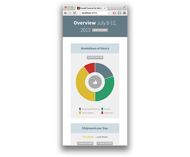
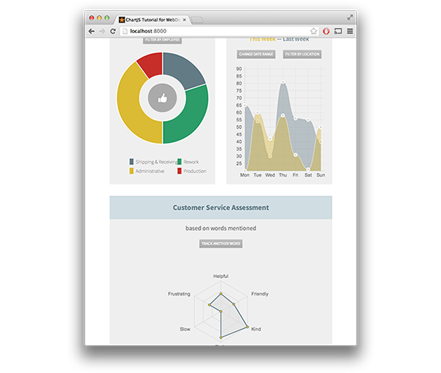
We can see some basic layout changes at each breakpoint, including the primary container element’s width as well as our treatment of the .third class, which we use on each of the widgets. Below 400, we stack all of the widgets on top of each other. Between 400 and 600, we make the first two widgets half-width columns, and the third widget (the radar graph) full-width. Finally, above 960, we use three columns inline.
Conclusion
This tutorial has taken you through the basic steps for creating a dashboard using ChartJS. The fundamental concepts described here should help you create more involved projects using ChartJS, and should also encourage you to think about responsive design from the perspective of bottom-up.
What experiences have you had with charting libraries? Do you use SVG or canvas for charting data? What things do you wish ChartJS would do that it doesn’t? Add your comments below!

