Key takeaways 👉 System Usability Scale, or SUS, is a standardized post-usability test questionnaire. ❗ SUS is comprised of 10 Likert-scale questions. ⚖️ To collect the SUS score, you have participants rate how strongly they agree or disagree with statements on a 1-5 scale ✔️ SUS helps measure the perceived ease of use for any systems,… Continue reading System Usability Scale (SUS) Practical Guide for 2025
Tag: chart
Axe Reports 2.0: Make better data-driven accessibility decisions at scale
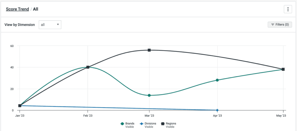
Successful digital accessibility programs run on great data. Without it, you can’t report on your progress or drive the right conversations around accessibility improvements with your stakeholders. That’s where axe Reports comes in. Available in the axe Platform, axe Reports is Deque’s enterprise-ready tool designed to help your organization track progress, pinpoint risks, and quickly… Continue reading Axe Reports 2.0: Make better data-driven accessibility decisions at scale
How to make interactive charts accessible
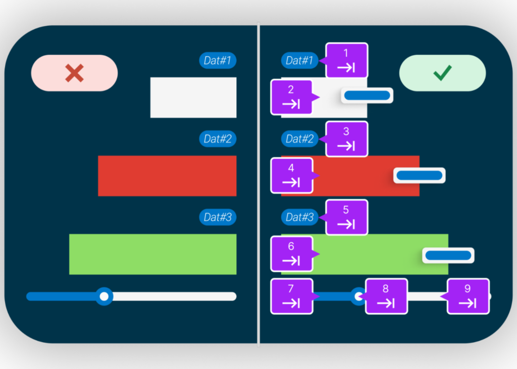
Interactive charts can transform data into compelling stories, offering valuable insights at a glance. But what happens when these visual tools are inaccessible to those with visual impairments? In this post, we’ll show you how to ensure your interactive charts are accessible to all users, regardless of their abilities. Before digging deeper, let’s establish what… Continue reading How to make interactive charts accessible
Top 10 UX Design Agencies to Work With – July 2024
While in-house UX consultants, UI/UX designers, and user researchers continue to gain popularity, some businesses continue to opt for the expertise of specialized UX design firms. Here, we listed user experience consultancies and full-service UI UX design agencies from the US to Europe, with a brief description of each to help you decide. If you… Continue reading Top 10 UX Design Agencies to Work With – July 2024
3 Common Color Accessibility Issues One Can Easily Avoid
Color is often used to evoke emotions and emphasis. That’s one of the reasons why designers see color as an important element in their work. Colors communicate messages on both psychological and visual level. The importance of color is undeniable, but is basing the message solely on color the right thing to do? This post… Continue reading 3 Common Color Accessibility Issues One Can Easily Avoid
Format, align, repeat: three steps to master chart labels
#32: Label formatting Continue reading on UX Collective »
How to optimally organize information on the chart?
#28: Limiting the categories for clarity Created using Freepik graphics People LOVE putting things into categories! If there is a lot of information, we will naturally create categories to make it easier to understand. This is one of the 100 things that every designer needs to know about people. Susan Weinschenk explains all of them… Continue reading How to optimally organize information on the chart?
Why does mixing apples and oranges work for juice but not for a chart?
#27: Providing the right aggregation level Created using Freepik graphic If data cleaning is the most time-consuming part of the data analyst’s job, understanding the chart’s purpose is the most important one. Before we design the visuals, we must know what question the chart should answer and why it is relevant. We need to know… Continue reading Why does mixing apples and oranges work for juice but not for a chart?
Gestalt psicology for dataviz
Understanding why specific data visualization techniques work better than others may not be so simple. Visual Pattern — Credits: Omar Flores on Unsplash We easily perceive a design that catches our attention, or elements that are out of place, but then we hardly know how to identify and evaluate them accurately, almost as if their effect acts at the… Continue reading Gestalt psicology for dataviz
Why component properties will save your design system
Figma dropped some huge new features this month and you need to embrace them A design toolkit is only as good as the tools in it. New Figma features just gave your tools a lot more power. Photo by Cesar Carlevarino Aragon on Unsplash Figma has had a big year. Sure, it surpassed 4 million users and… Continue reading Why component properties will save your design system
Replace your complex bar chart with a dot plot to make it better understood
[unable to retrieve full-text content] The alternative to bar charts that works well with complex data Continue reading on UX Collective »
27 Professional PowerPoint Presentation Templates
36 Shares An elegant, fashionable & versatile PowerPoint presentation templates. Minimalist presentation templates for eye catching and professional work presentation. PowerPoint templates are multipurpose templates that can be used for any type of business presentation. Modern template design that includes creative photo layouts, infographics, tables, vector icons, maps, diagrams and tons of great features to show… Continue reading 27 Professional PowerPoint Presentation Templates
Seobase Review: Powerful SEO Tool for Keyword Analysis
4 Shares SEO is becoming more complicated than ever with so many different keywords to manage. However, in this regard, one amazing thing that I have come across is seobase, a SEO platform that helps you in increasing the efficiency and productivity of the content that you put online. The best thing about this SEO… Continue reading Seobase Review: Powerful SEO Tool for Keyword Analysis
CSS Charts: How to Create a Horizontal Organizational Chart
In a previous tutorial, we learned how to create a CSS-only vertical organizational chart. Today, as some folks requested, we’ll go through the process of building its corresponding horizontal one. CSS CSS Charts: How to Create an Organizational Chart George Martsoukos And here’s the twist; we’ll create this new chart without changing a single line… Continue reading CSS Charts: How to Create a Horizontal Organizational Chart
Choosing a chart with your audience in mind
[unable to retrieve full-text content] Using user-centered design to figure out the best chart for your audience. Continue reading on UX Collective »
26 Best Annual Report Brochure Templates For 2020
28 Shares Creative 2020 Annual Report Templates brochures for business profile, annual report 2020, agency brochure or company brief. Annual report brochure templates are very clean and elegant. Create your company’s documentation quick and easy. These templates comes with paragraph and character styles, swatches, styles for your spreadsheet / financial info, block quotes, key figures… Continue reading 26 Best Annual Report Brochure Templates For 2020
CSS Charts: How to Create an Organizational Chart
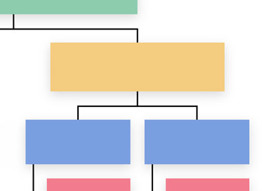
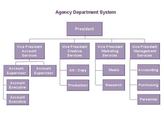
In previous tutorials we’ve learned how to create different types of charts including bar charts, thermometer charts, and donut charts. Today we’ll continue this journey by building a CSS-only organizational chart. Ready to test your CSS skills? The Organizational Chart We’re Building Here’s the CSS chart we’ll be creating: It consists of four levels and… Continue reading CSS Charts: How to Create an Organizational Chart
CSS charts: How to create an organizational chart
In previous tutorials we’ve learned how to create different types of charts including bar charts, thermometer charts, and donut charts. Today we’ll continue this journey by building a CSS-only organizational chart. Ready to test your CSS skills? The organizational chart we’re building Here’s the CSS chart we’ll be creating: It consists of four levels and… Continue reading CSS charts: How to create an organizational chart
Rethinking the design of the race and ethnicity question on surveys
[unable to retrieve full-text content] Image courtesy of NASA via Unsplash: https://unsplash.com/photos/Q1p7bh3SHj8 Note to readers: I wish I had more resources and funding to really do justice to a project like this. For the time being, however, this was just a design challenge born out of getting annoyed by race and ethnicity questions. This work… Continue reading Rethinking the design of the race and ethnicity question on surveys
Exciting New Tools for Designers, August 2020
The common theme in this month’s collection of new tools and resources is “things that help you show off your work.” Many of these tools are made to help you better web products or apps or showcase designs with others. Here’s what new for designers this month. Naturaltts Naturaltts is an online text to speech… Continue reading Exciting New Tools for Designers, August 2020
3 Essential Design Trends, May 2020
The state of the world around us can greatly impact website design. From emotional changes that correlate to the feel of a design to information and data to deliver, the impact of the worldwide COVID-19 pandemic is making its way into projects (intentionally or not). Here’s what’s trending in design this month. 1. “Unbalanced” Use… Continue reading 3 Essential Design Trends, May 2020
Best WordPress Magazine Themes for Blog and News Websites
When it comes to magazine and news websites, WordPress is top of the bill. Well-known news sites like The New York Times, TechCrunch, CNN, Reuters, Mozilla’s Blog, and many others use WordPress as their platform of choice, highlighting just how scalable WordPress blogs can be. Online News Consumption is Rising Precise digital circulation for online magazine and news is… Continue reading Best WordPress Magazine Themes for Blog and News Websites
How to Create Simple and Inexpensive Business Web apps with Great Design
Low-cost web solutions often have uninspiring or even, to put it mildly, primitive design. By looking at this kind of an interface, users would rather have a nap than commit themselves to work. Nevertheless, several decision-makers prefer to rely on the solution’s functionalities, which is surely wise. But at the same time, they miss the… Continue reading How to Create Simple and Inexpensive Business Web apps with Great Design
9 Best Bitcoin And Cryptocurrency Plugins For WordPress
Cryptocurrency has changed the vertical of currencies with maximum impact. Specifically, Bitcoin has managed to garner all the attention and market favoritism in recent times. Providing a new edge to currency exchange, Cryptocurrency is no more a hit and miss for the experts. With a lot of people getting on board with the idea of… Continue reading 9 Best Bitcoin And Cryptocurrency Plugins For WordPress

