

Note to readers: I wish I had more resources and funding to really do justice to a project like this. For the time being, however, this was just a design challenge born out of getting annoyed by race and ethnicity questions. This work was done on my own time (outside of work and grad school hours). My hope, by putting this Medium post out there in the world, is that the post itself will generate more conversation and feedback so I — and others — can continue to iterate on this in the future.
If you broach the topic of answering a question about race on a survey to anyone who identifies as mixed or multi-racial, they’ll likely have some sort of adverse reaction.
For as long as I can remember, I’ve been taking note of poorly designed surveys, specifically for this one question: What is your race?
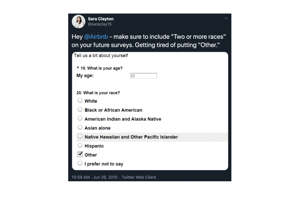
For example, the question below is from an Airbnb survey I took in 2015. Instead of checkboxes to offer multiple selections, the survey uses radio buttons so I’m forced to just choose one option. Not only does this exclude multiracial people and people who don’t identify with any of the other listed options, but “Other” also provides researchers — or whoever is leveraging the survey results — with inaccurate information.
Below is a recent example of the race question from the City of Los Angeles’s coronavirus test registration site. While I can appreciate the option to choose more than one race, this is perhaps not the most ideal design pattern to use.
On a more positive note, the Config Europe 2020 registration form used this for their race and ethnicity question. It was a lovely change of pace from the usual race and ethnicity question. However, on the data collection side of things, I’m sure it’s a little more difficult to parse through all the different combinations of words.
So I started thinking about this question: How could I best design the race question on surveys so that it’s 1) inclusive, 2) easy for data parsing and 3) simple enough to answer?
Research
To ensure that I could get survey answers without too much effort, I posted two questions about people’s experiences with the race + ethnicity question on three places: a Half (“Hafu”) Japanese Facebook Group, my cooking Instagram and my personal Twitter.
Initially, I went in targeting mixed race people on the former two platforms because I thought this was the demographic that could speak the most to the race + ethnicity question, but I was quickly proven wrong and had my bias as a mixed person checked. I eventually opened up the question to anyone that wanted to weigh in.
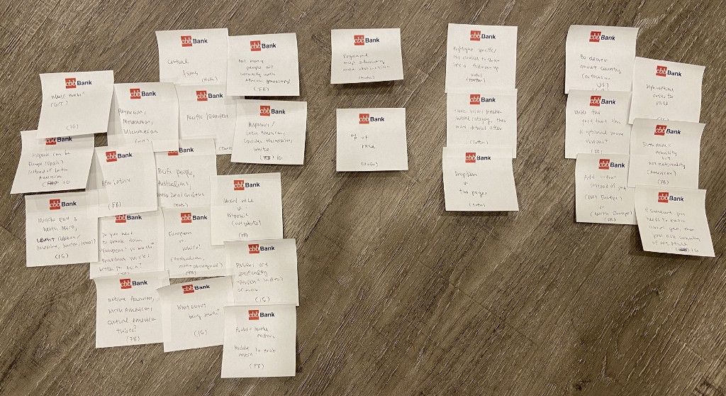
Over 24 hours, I received 25 total responses — 9 responses from Facebook, 12 responses from Instagram and 4 responses from Twitter. From there, I aggregated and anonymized the data I received, wrote answers onto post-it notes and sorted the post-it notes into different themes.
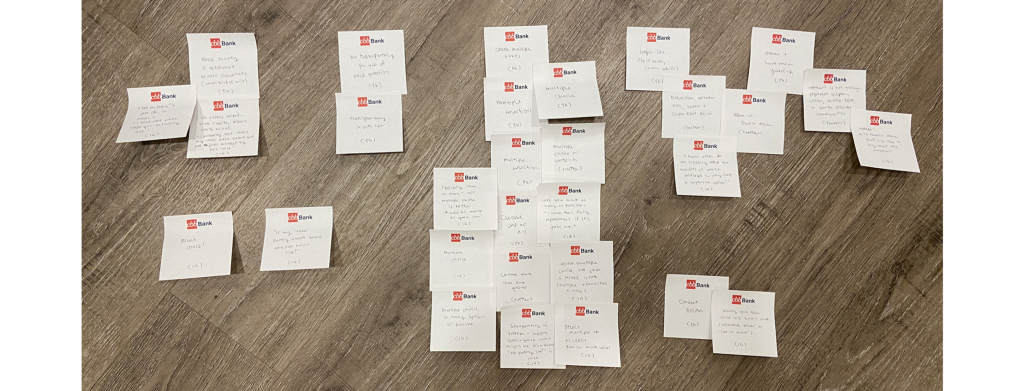
The middle column of post-it notes shown above — the most recurring theme — is related to allowing respondents to choose from multiple selections — for example, offering checkboxes instead of radio buttons.
“I never feel fully represented if it’s just one [selection].”
Other themes include respondents’ feelings about other options they’ve seen for this question such as “Other” or “Two or more races”.
While one person expressed that the option to pick “Two or more races” was fine, this person also felt that offering this choice makes it seem like the creator of the survey “[Doesn’t] care what race you actually are.”
There was a call for transparency in terms of what information this kind of question is actually looking for. For example, one person mentioned that if the race + ethnicity question is actually being used to get socioeconomic information, that’s just plain wrong!
Survey respondents also mentioned how “Asian” is a very broad term and the distinction between East, South and South East Asian should be made. Others also mentioned how people who identify as Middle Eastern usually have to pick “White” even though, as one respondent said, “Arabs often do not socially reap the benefits of white privilege.”
Another thing to note from these responses is that not all countries write this question the same way. Multiple people mentioned how the UK does a great job of writing this question for their census or school registration.
This is from the 2011 Census in England and Wales:
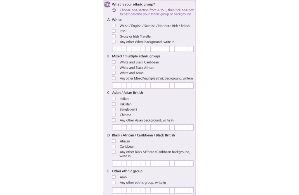
(Just as a side note, I dug into this and learned that quite a lot of research and planning went into this 2011 census question. You can learn more about this research here and you can even see the design pattern they suggest here).
Exploration
Before diving into my own visual explorations, there’s a lot to learn from all of the research that the UK government had conducted. These principles, in particular, aligned with the results I got from my own qualitative research.
For example…
- “Only collect users’ ethnic groups if you are going to use the data, for example, as part of your organization’s equality monitoring.”
- Make the question optional.
- Tell users how their data will be used
- Make sure the data is used and stored in line with data protection rules
There’s also this insight that’s mentioned that I found interesting:
“Research from the Office of National Statistics (ONS) found that presenting all of the ethnic group options on a single page caused some users to try and select more than one option. Splitting the question across 2 pages solved this problem in testing with more than 300 users.”
This is something I’ll keep in mind as I go explore different designs.
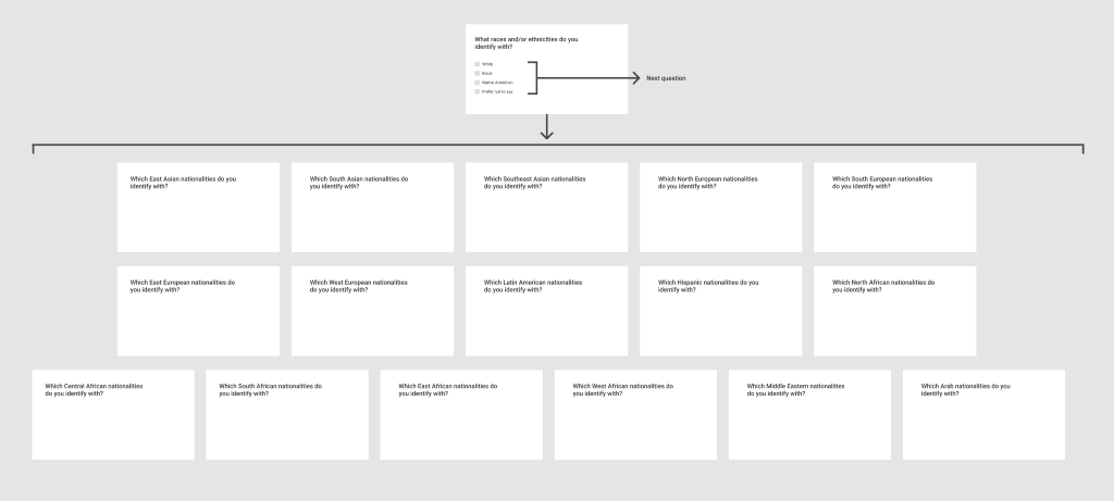
First iteration
After some sketching and research, I came up with this optional design. The user flow of this diagram is, to no surprise, similar to the one that the UK Government came up with, aside from the fact that it goes into a lot more detail.
The prototype below, based on the above chart, shows how I would fill this form out. Note that some word choice is not final until tested. For example, “Latin American” versus “Latinx”.
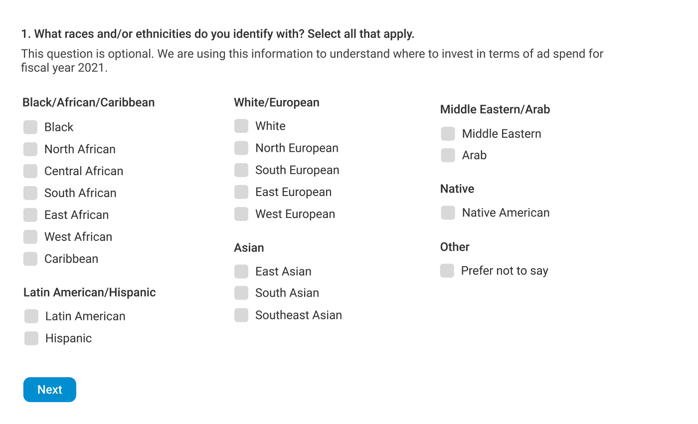
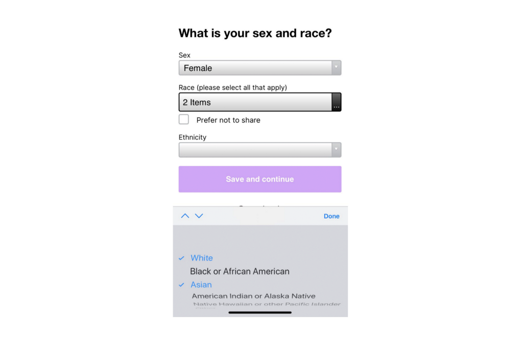
Of course, the elephant in the room for all of this is — what does this look like on mobile? I didn’t want to use the standard dropdown control for this because of all the different choices, so I looked at Google Forms to see what they do on mobile for a lot of multi-select options…
… and it turns out that they show all the options, unlike the example I showed above with the dropdown control.
So I designed a mobile version of my prototype so I could share it out again with people on social media to get their feedback, this time on 1) initial impressions of this version 2) any other suggestions.
Feedback on first iteration
In addition to the original three places (Facebook’s Hafu Group, Twitter and my Instagram) I posted to, I also threw my own personal Facebook into the mix to get feedback from. And it turns out that was a good call. This time, I received 30 responses, nearly half of which were from my personal Facebook while Instagram received 10 responses, the Hafu group received 4 and Twitter received 2 responses.
Probably to no surprise, people had the most to say about how to show certain nationalities, ethnicities, and races. Just to name a few…
The Middle East gets tricky just because there are a lot of nuances. As one respondent mentioned, Persians identify as Persian first then perhaps Middle Eastern. Turkey is the gateway between east and west, so while they are considered to be the “Middle East”, Turkey is a little bit of everything.
How would someone that’s Afro Latinx identify themselves on this survey? How would someone who is Hispanic but also half white identify themselves?
In addition to Native American tribes, what about North American or Cultural American tribes?
Do people in America who consider themselves white, black or both also identify with their European, African, Caribbean, etc. genealogy?
These are all great to think about and questions that I needed to dive deeper into before I could come up with another iteration.
Other feedback included exploring other patterns (i.e. interactive maps or showing identity with percentages), exploring different ways to format the survey (e.g. dropdown instead of two pages) and then other general UI or wording tweaks.
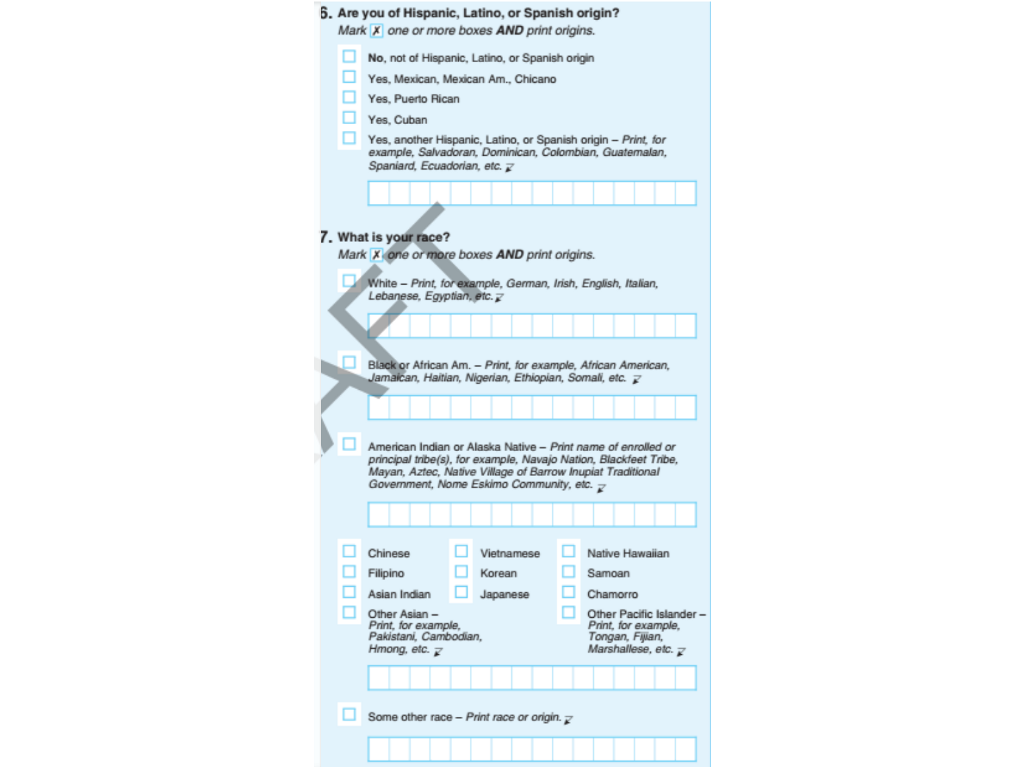
Another respondent also enlightened me by sending me the Obama administration’s proposed race and ethnicity question for the 2020 census, which looks like this and is really good:
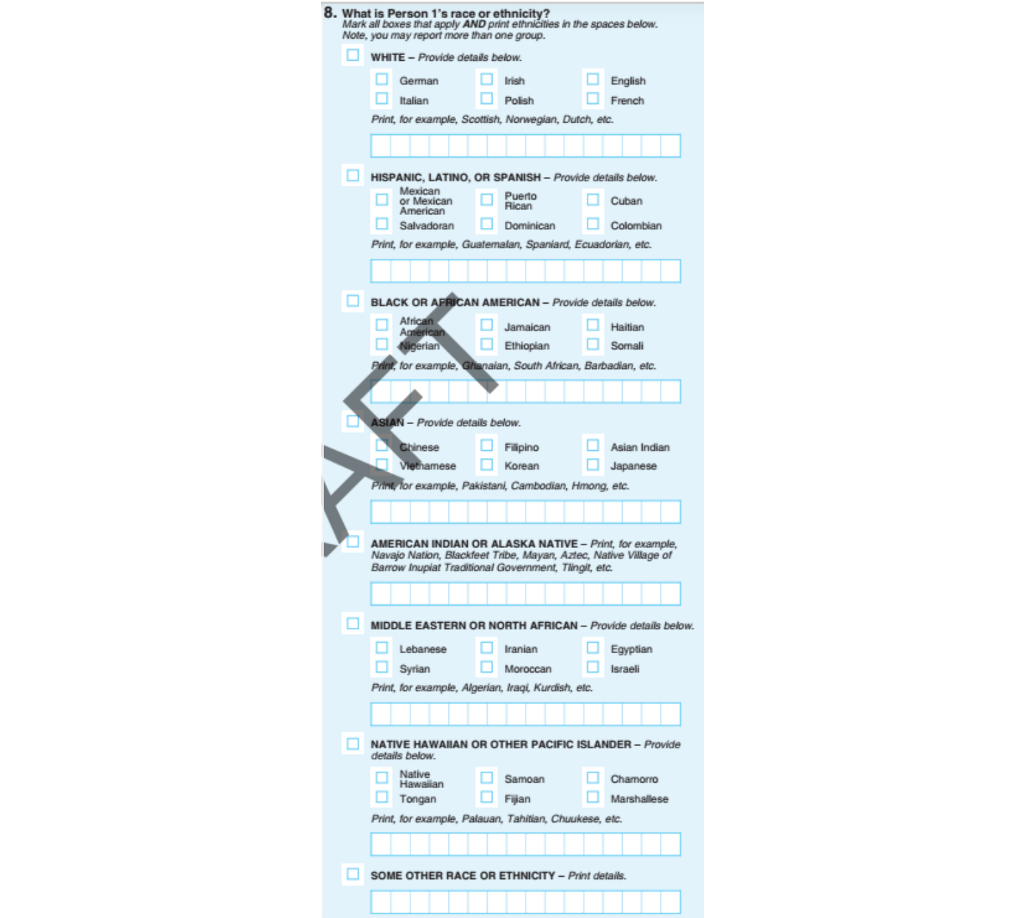
It’s a shame that this form never rolled out because, according to this NPR article from 2018, the form below rolled out instead, omitting not only years of great research and feedback from scientists, but also not alleviating the problem of “‘some other race’ as the third-largest racial group in census results from 2000 to 2010”:
So where do I go from here? First things first — scoping, scoping, scoping. At the onset of this challenge, I may have biased myself to looking at census surveys for inspiration. However, I should be designing for different kinds of scenarios. And because every country is different in terms of demographic makeup, I will design for scenarios for US audiences.
The next thing to consider is that the Obama Administration’s proposed solution to this question is really good but there is still room for improvements, particularly in making it more digitally-friendly.
I’ll also play around with some of the exploration suggestions I received too — I don’t want to settle on one design just yet.
Second iteration
While thinking through different designs, I came across this version of the question in a survey I was taking:
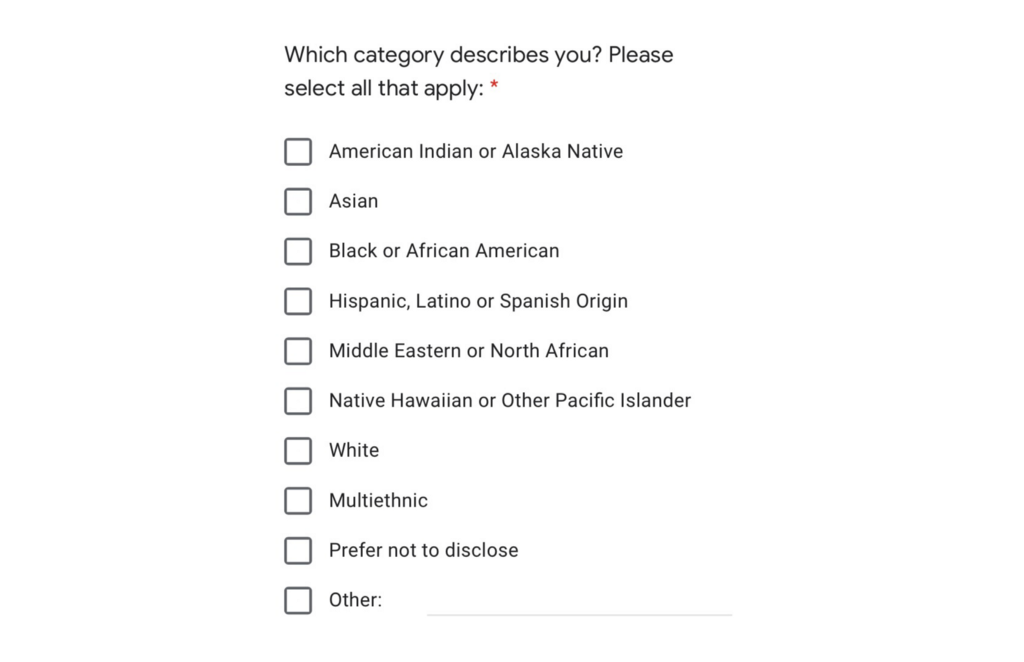
It’s not granular like the census questions, but it’s simple and covers the issues that my proposal brought up. It’s an especially good framing of the question when you need to use a survey that can’t be customized too much. The one way that I think it could be improved is perhaps adding two types of “white” — of and not of Hispanic, Latino or Spanish origin. But otherwise I would recommend surveys that 1) need race/ethnicity information and 2) are using survey platforms to follow this example.
So to reiterate everything I’ve said thus far:
- Census/government surveys: Should be very granular. Should be able to represent the majority of residents in a country using checkboxes — “Other” should be used very rarely.
- General research surveys: First, ask yourself if you even need need this question or are you just going with the flow of other surveys? What will you be doing with the answers to this question? If you won’t use race/ethnicity, don’t collect it. Otherwise, if you need the answers to this question, it’s probably ok to just use top-level categories, like the example shown above — especially if you’re constrained by the survey platform you’re using.
The Obama Administration’s proposal for the 2020 census was pretty good already, but I wanted to give it a digital makeover:
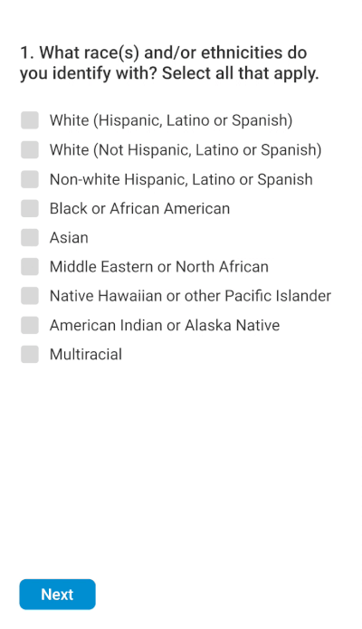
This still risks some messy data collection (e.g. typos), so if there’s an API or a database that truly has every single imaginable ethnicity/race identification, I’d use that and replace “+ Add new” with an in-context search bar instead. Though the downside of that might be decreased performance.
While the top-level categories are mostly encompassing, I realize that certain feedback (e.g. breaking down “Asian” between East, Southeast and South) is lost in this version. While this can be specified further, I do wonder if there could be an exception made in terms of granularity just for “Asian”.
I know this is a design that will never make everyone happy — and rightfully so — but I thought I’d put this post out there so that others who may not be as familiar with the frustrations of the race and ethnicity question can learn from this. It’s a very personal subject to many people so I’m grateful that all the people that gave me feedback along the way were so thoughtful, patient and insightful. I learned a ton from all of this feedback.
Speaking of feedback — if you have additional thoughts to add to this, I’d love to hear it in the comments. Better yet, I challenge you to think about other ways to improve the race and ethnicity question and other survey questions that could be better designed.
Thanks for taking the time to read this!

![]()
Rethinking the design of the race and ethnicity question on surveys was originally published in UX Collective on Medium, where people are continuing the conversation by highlighting and responding to this story.