 The state of the world around us can greatly impact website design. From emotional changes that correlate to the feel of a design to information and data to deliver, the impact of the worldwide COVID-19 pandemic is making its way into projects (intentionally or not).
Here’s what’s trending in design this month.
1. “Unbalanced” Use of Space
Space can be a huge influence on a design project. It impacts visual flow and can drive engagement.
As of late, many designs have taken a more balanced and symmetrical approach to using space, but that’s changing again with more websites that feature an “unbalanced” use of space. (And it’s quite nice.)
We are calling this trend “unbalanced” because open space may or may not use a counter-weight to keep the design from feeling lopsided. There are a lot of different ways to do it: with white space, in images, with layers and how elements are stacked, and with patterns. This can be a rather challenging technique because responsive breakpoints can dramatically change how space appears if you aren’t careful.
Each of these projects tackles “unbalanced” space in a different and equally neat way.
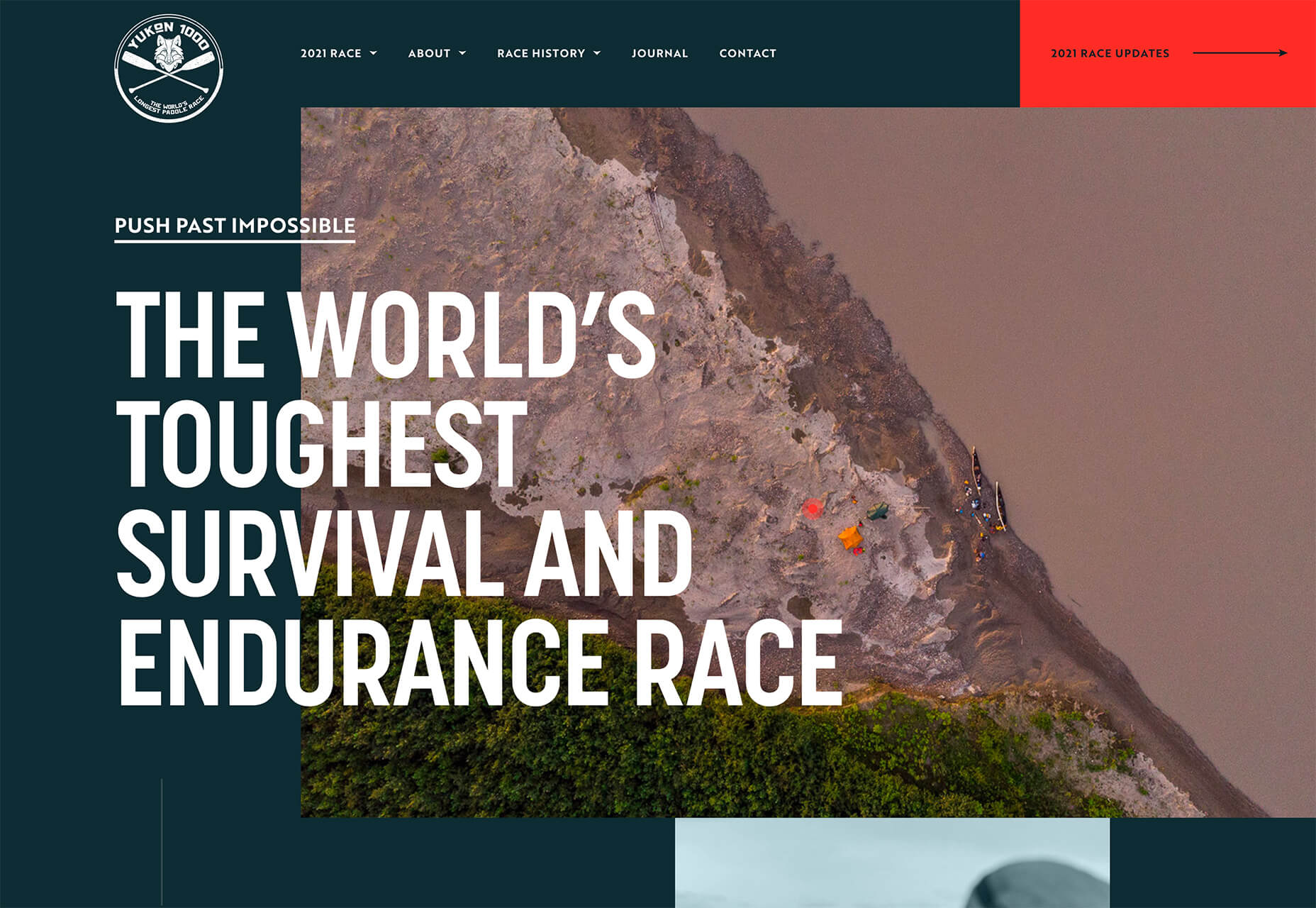
Yukon 1000 creates two different bits of unbalanced space in two different ways:
- On the left side of the screen with background white space that the image does not extend into and includes text layers.
- In the image itself with a distinct shape and plenty of open space on the water.
Both of the elements are unbalanced when they stand alone, but combined the open space on the left and open space in the image pull the eye back to the middle content area of the design.
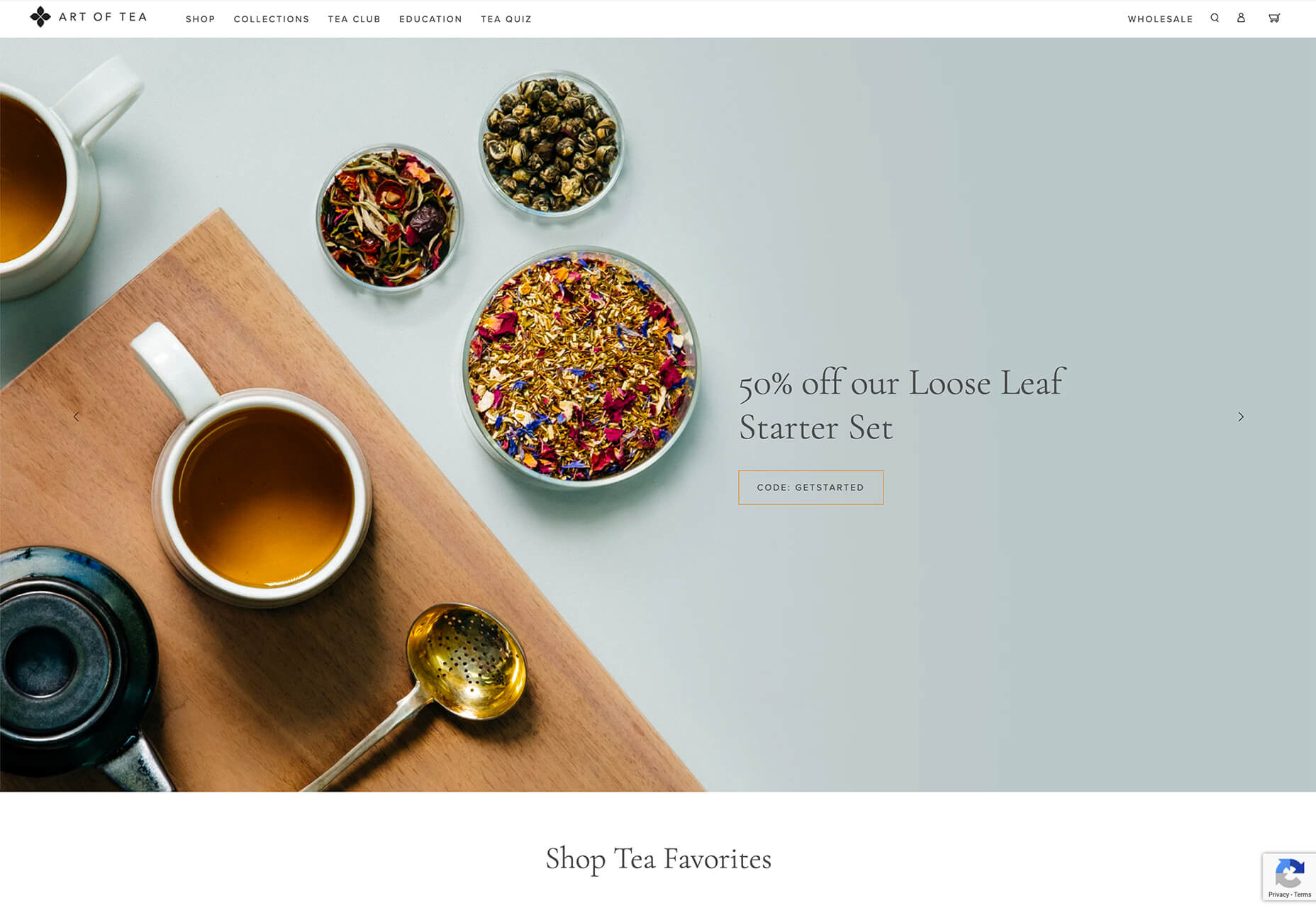
The Art of Tea website uses space in the image with nice stacking and the use of shapes in the positioning of objects in unbalanced space. Note how packed the left side of the image is compared to the bleakness of the right side. Even the text only extends partway across.
This aesthetic helps pull your eyes first across the screen to read the text, and then down past the scroll.
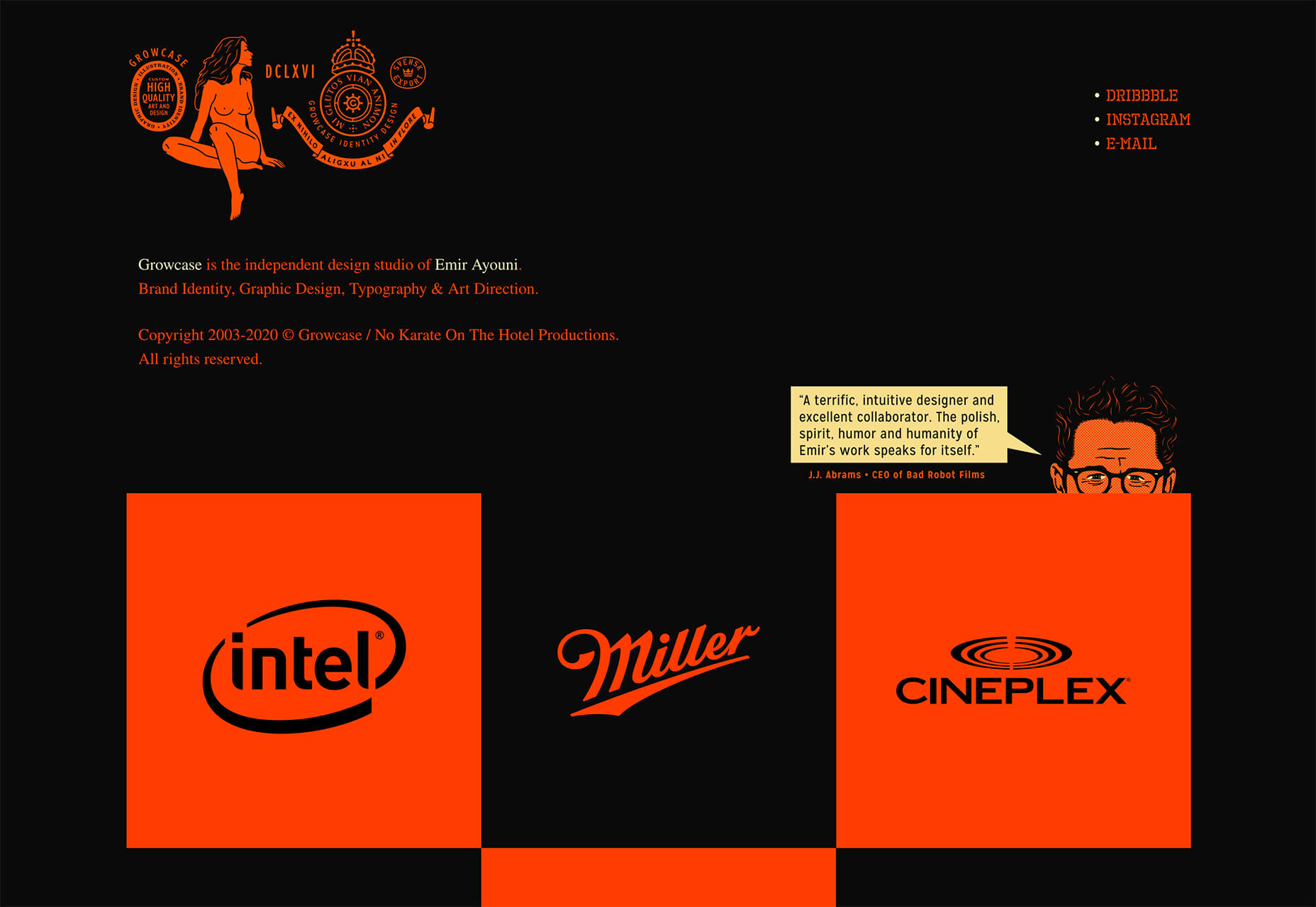
Growcase could be a case study in the use of space itself, but focus on the top of the screen. The brand identity stretches about one-third of the way across and is met by nothing other than a small social media/portfolio link trio.
There’s also a lot of space below it and negative spaces with each of the portfolio blocks. The black areas pull you through the design, whether you are ready to move through it or not.
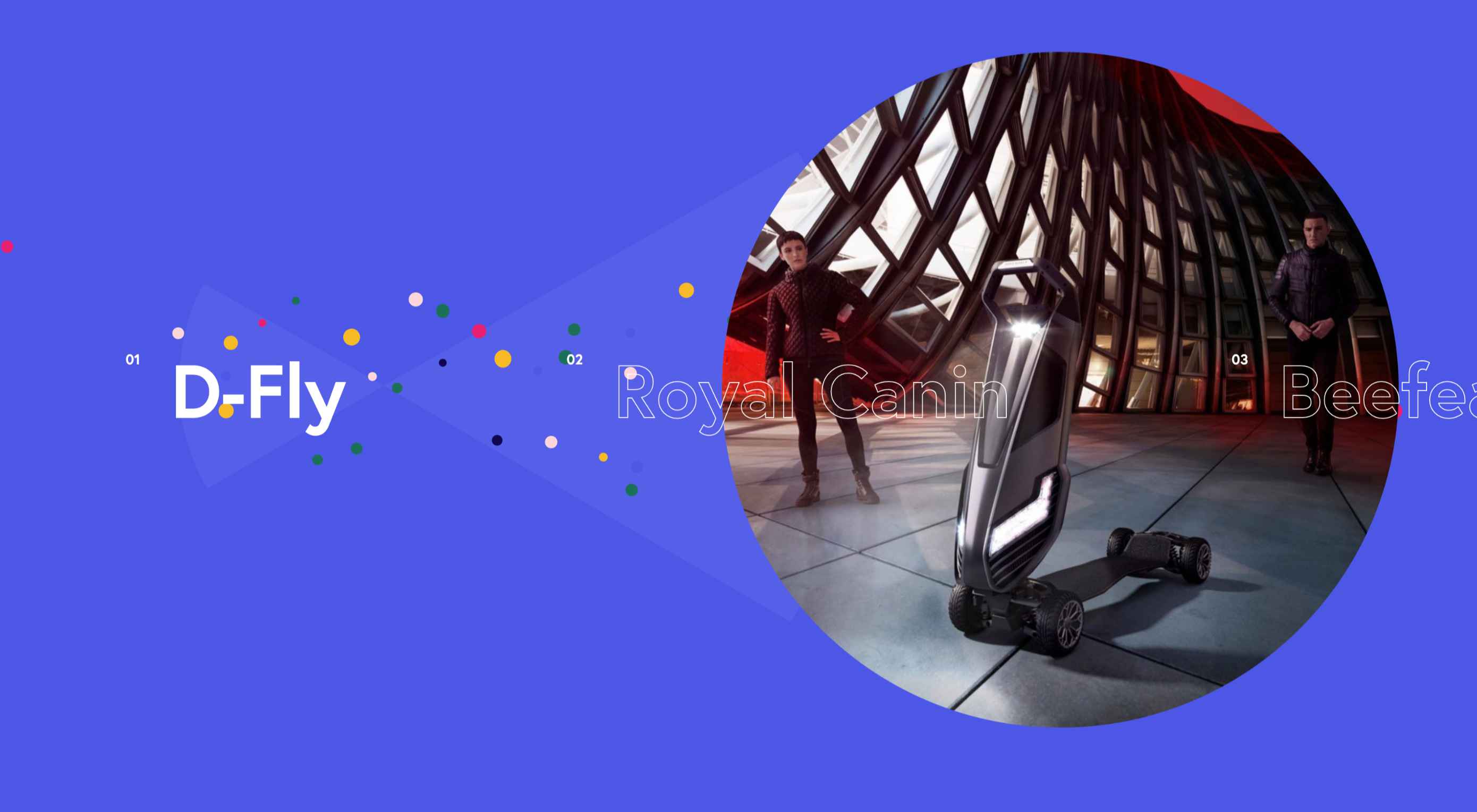
2. New Image Slider Concepts
It has been all that long ago that website designers had all but declared sliders to be dead.
They’re back.
But they look a lot different and are much more interesting.
Trending in slider design is using sliding elements with interesting animations and shapes that don’t look like sliders. What’s interesting is the commonalities between them – even though they look spectacularly different.
Each of these slider examples:
- Uses a circle pointer that expands when you hover on a click element
- Visual cues, such as navigation arrows, are present
- Each site features some type of portfolio content
- Slider images are allowed to stand alone and aren’t covered up with words or other elements
Additionally, each example has a few fun tricks of its own.
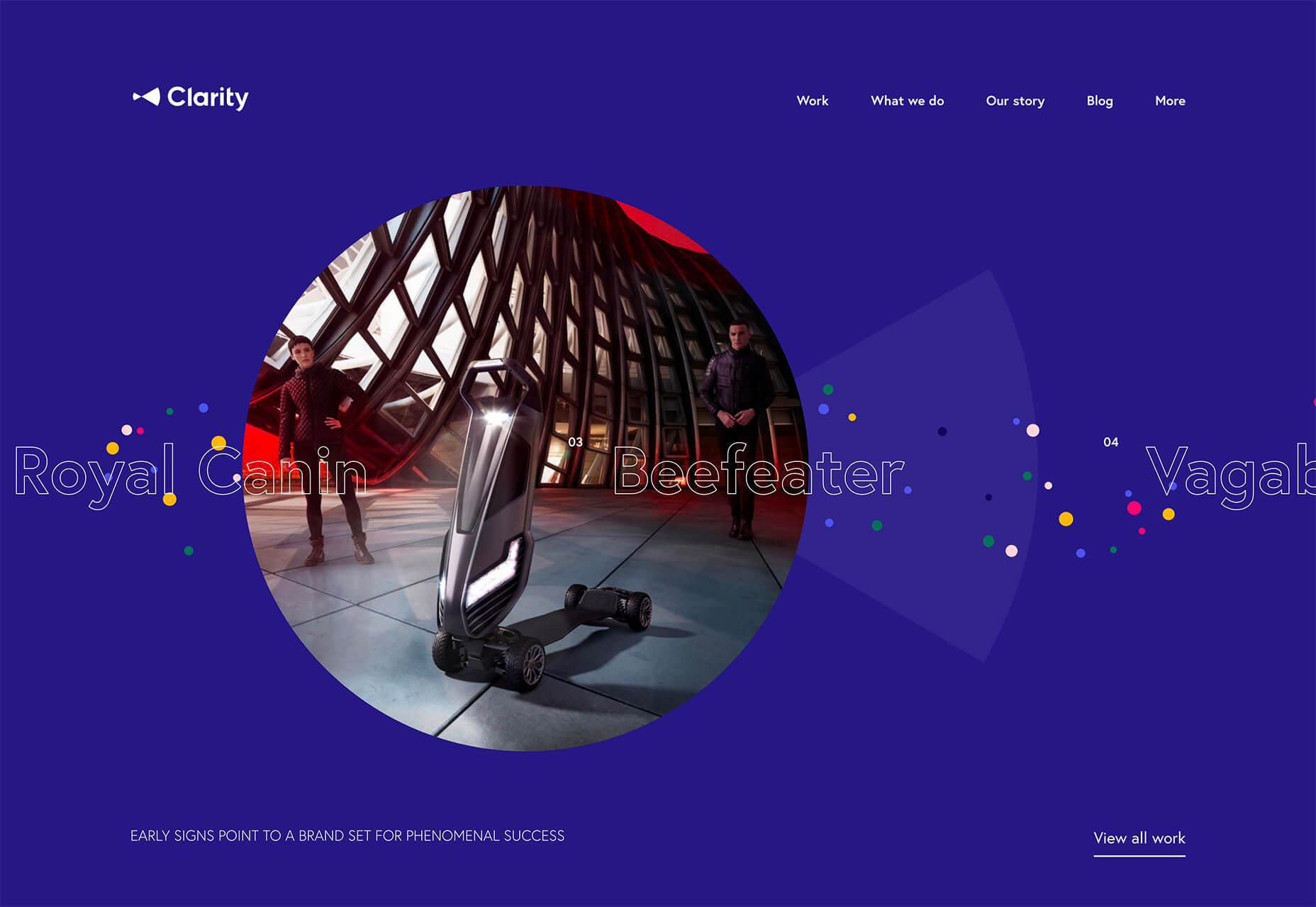
Clarity uses a slider that moves automatically based on mouse position and all of the images, appear within the circle frame.
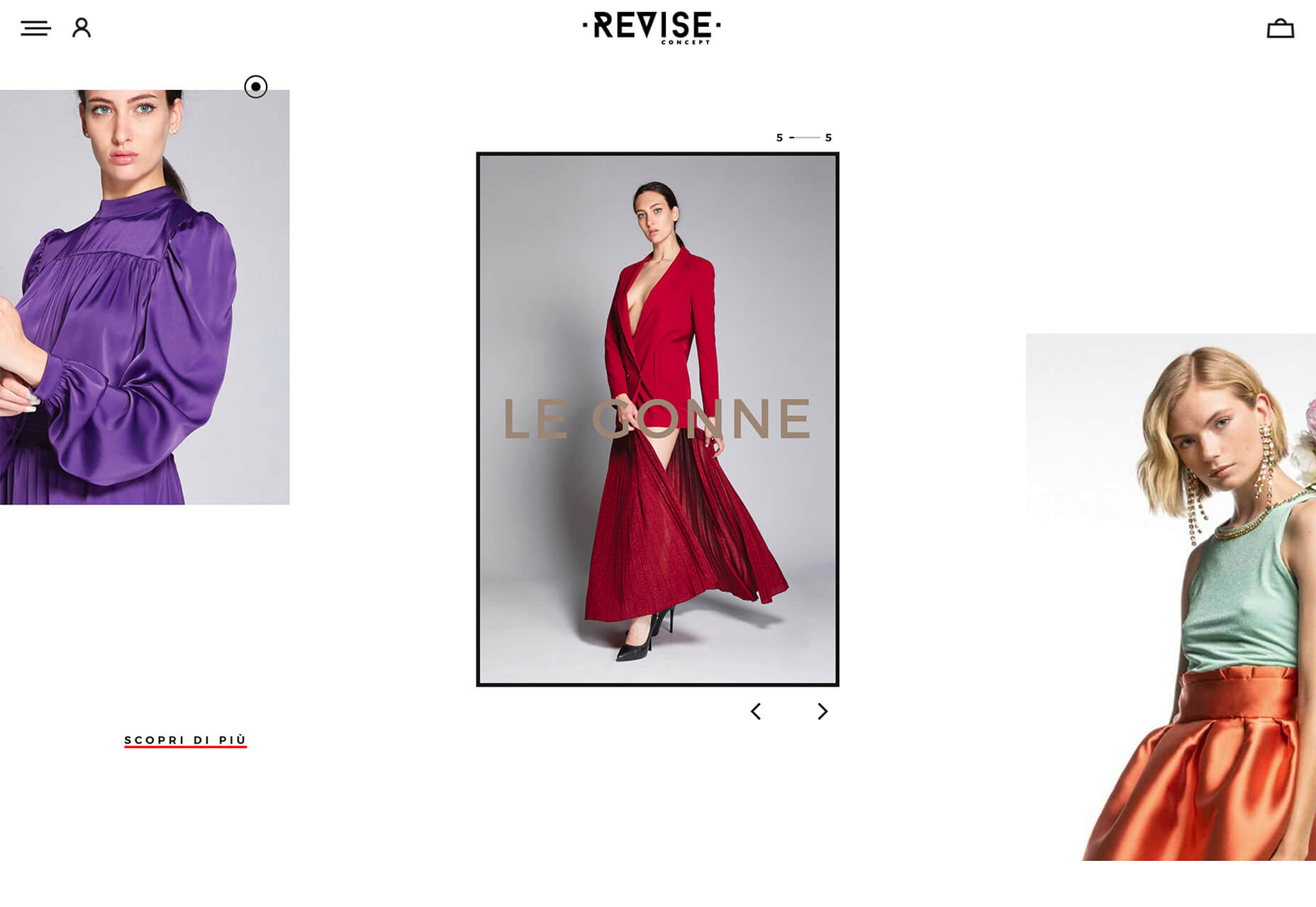
Revise Concept also uses an automatic scrolling slider with images that move in a diagonal fashion. You can also use the arrows to scroll forward and back on your own.
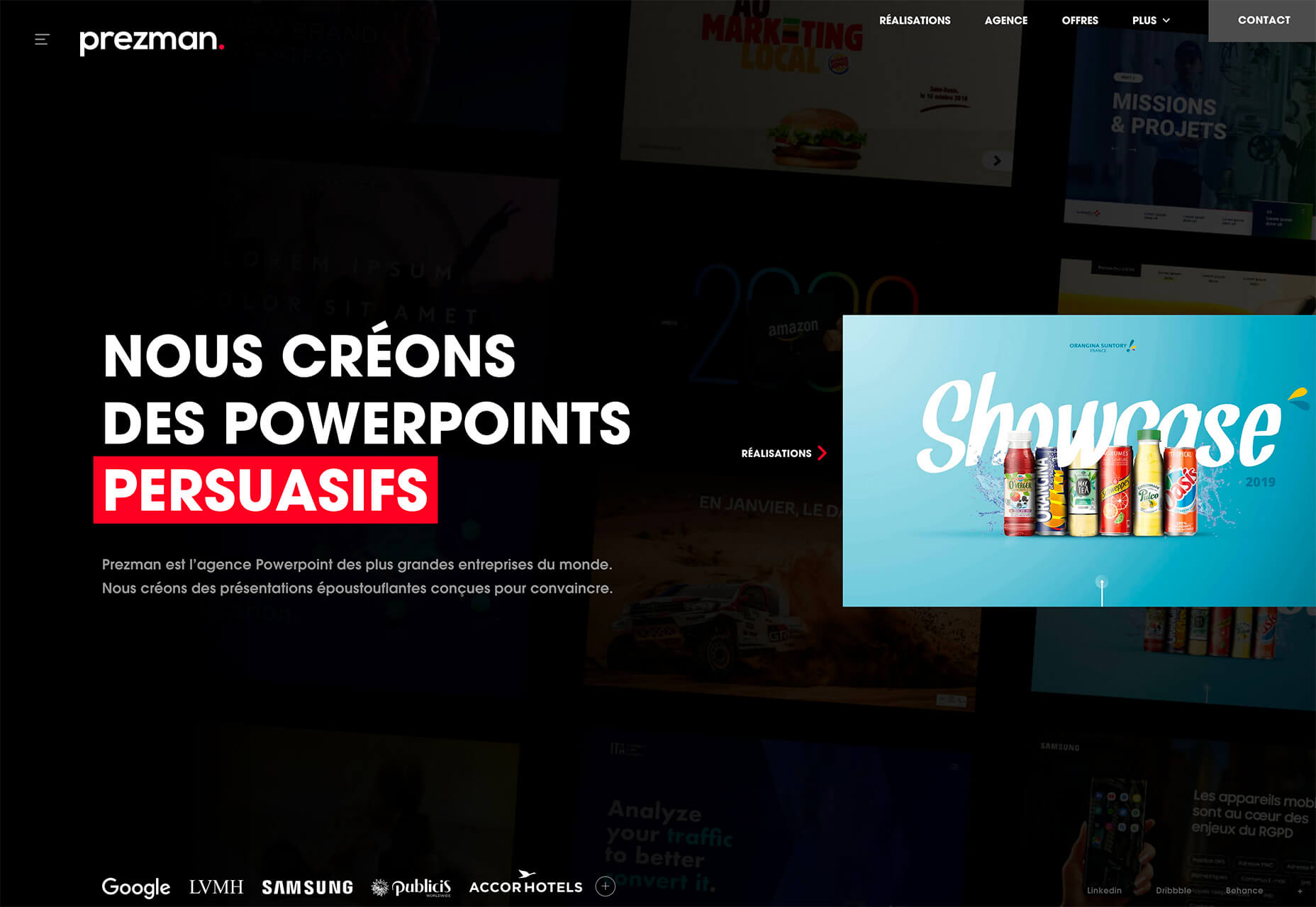
Prezman only previews the slider on the homepage, but click over and it expands to full screen to show a variety of portfolio pieces with simple, but neat, animation.
3. Coronavirus Data
The most obvious sign of the coronavirus on website design is in the number of websites that contain information about the virus. Trending seems to be website designs that provide different types of data visualizations about COVID-19.
Google has a page (that’s simple in true Google form), but these examples take the data to new visual levels. Data visualizations vary in data presented — local versus worldwide — and in how the information is put together.
While these sites all have distinct purposes, they provide nice examples of how to handle large amounts of data well in a visual format.
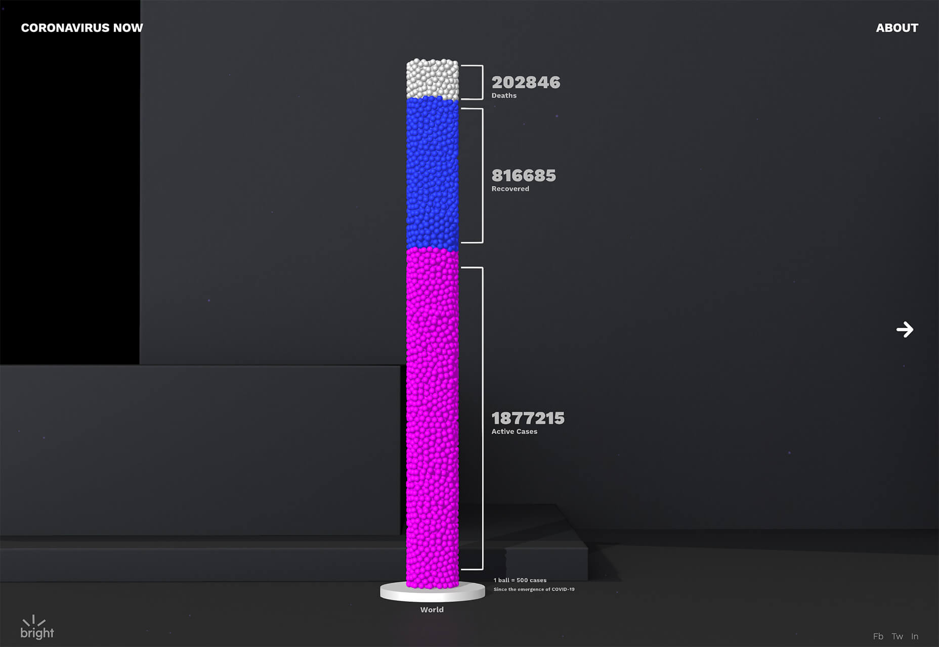
Coronavirus Now takes a variety of data and uses virtual jars of balls to show proportional relationships between three data points. What’s really neat about this design is the use of animation and labelling to make data understandable.
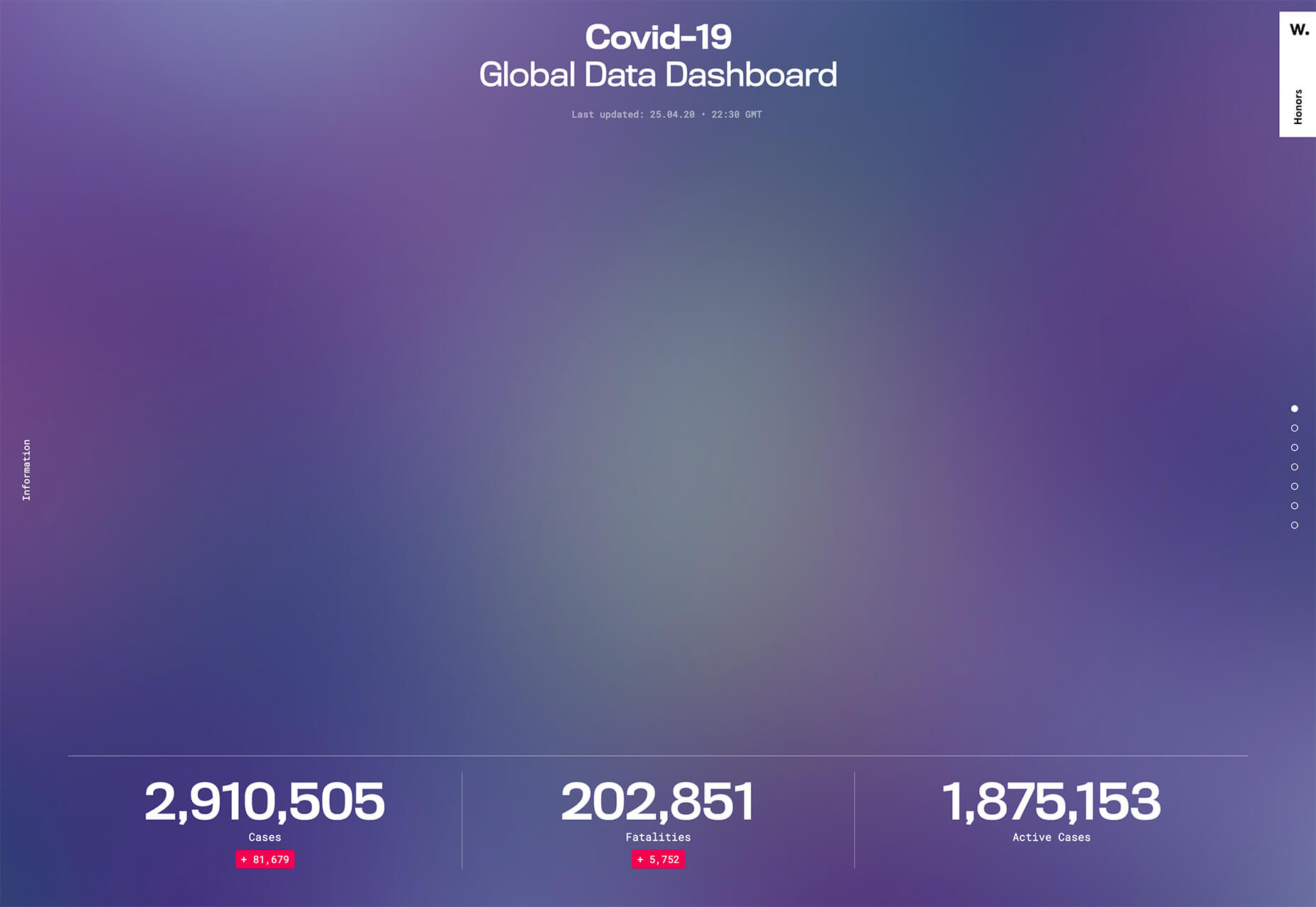
COVID-19 Global Data Dashboard breaks down different information and data points in a variety of chart types – bar, circle, and more. Using different visualizations can make it easy for people who understand and comprehend data in different ways better understand the information.
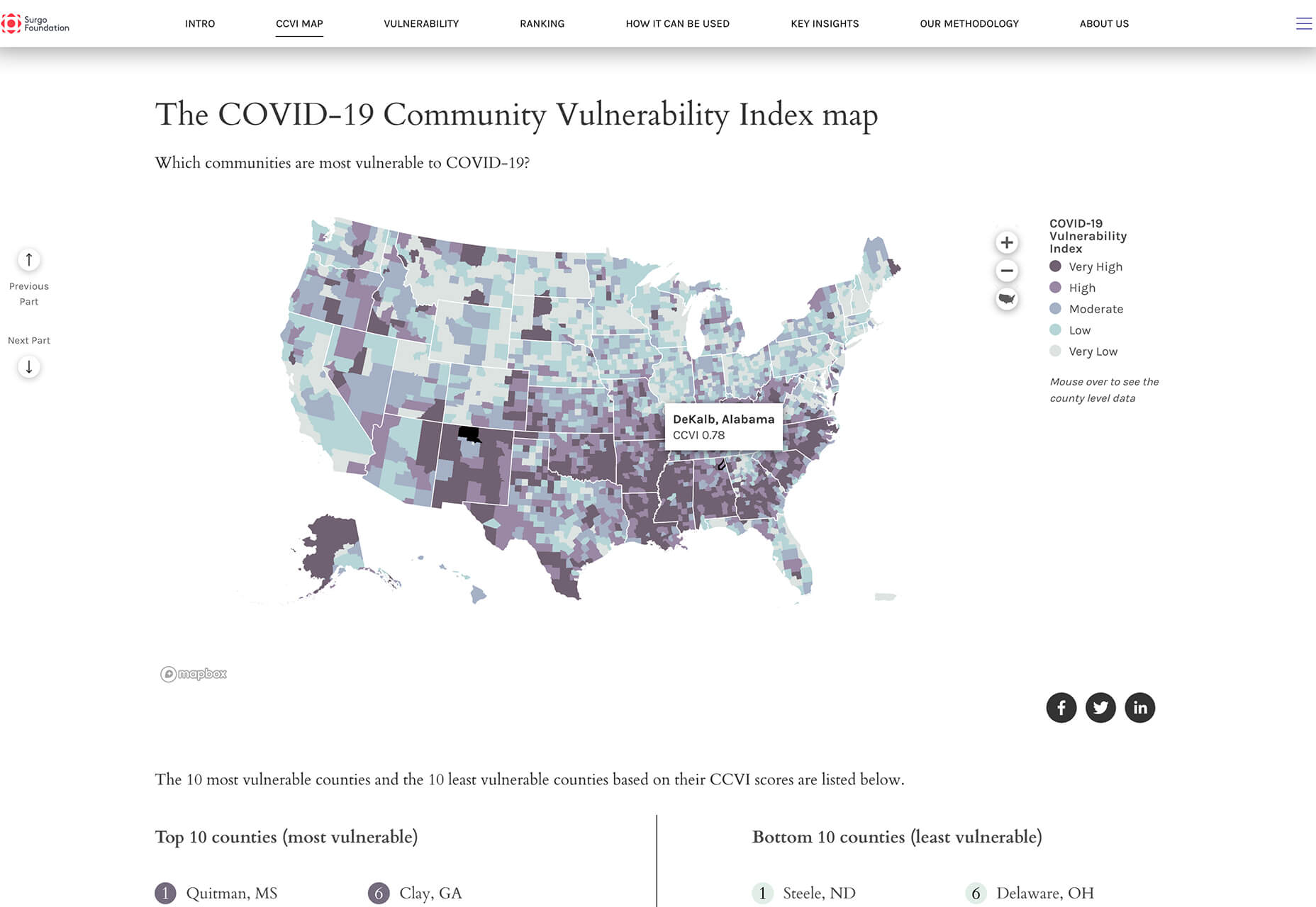
COVID-19 Community Vulnerability Index Map uses a mapping system to show where potential outbreaks could happen. Using map data can be a more understandable way to visualize complicated data.
Conclusion
While two of these website design trends have nothing to do with the coronavirus, we will start to see more things that are influenced by this worldwide health issue. Pay attention, and it’s likely that design will start to shift to elements with fewer large groups of people, face mask use and imagery will be more mainstream, and even colors might fade to more subdued hues. We are already seeing the impact on design and it is likely to continue to influence trends.
p img {display:inline-block; margin-right:10px;}
.alignleft {float:left;}
p.showcase {clear:both;}
body#browserfriendly p, body#podcast p, div#emailbody p{margin:0;}
![]()