In the mobile world that we live in, by next year, it is expected that as much as 80% of all internet traffic will be mobile. So anything from a dating site to an online pet store will need to be mobile friendly and so, it is now more important than ever before.
While desktop browsing is still popular, more people are opting to visit websites using mobile devices. Your users will have needs and you will need to keep up the rankings and so, being responsive just doesn’t cut it anymore. This highlights the importance of ensuring that your website is optimised in the right way and is ready for those who want to brows using a mobile device.
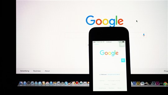
The rise in mobile traffic is a result of a huge change in the way in which consumers behave and that way in which they search. Google have encouraged this shift because they rolled out a ‘Mobile-First Index’ at the end of 2016 and that changed the way in which sites are ranked in the Search Engine Results Pages (SERPs).
Therefore, what is Mobile-First Index and why does it matter so much?
Essentially, Google looks at your website and then adds your pages to the index. A bot works its way through your website in the same way a visitor would and it also following any links that you have on your pages. In previous years, Google would do this using a bot that would trawl through your site as a desktop user, but the new Mobile-First Index is now set up to act as a mobile user. Google have made it exceptionally clear that any content that is not classed as mobile-friendly will simply suffer in the rankings.
However, Google have also stated that there are other factors that contribute to the mobile-friendliness of your site such as the time it takes to load pages as well as the user-experience. Google looks at the titles of pages, structured data, H1s and tags along with the content that is generated from the mobile site. All of this is then put together to rank your site above your desktop site.
What is the reason for this?
In a nutshell, mobile is now king. It is as simple as that.
There are now more mobile users than desktop users and so, there are more mobile searches than desktop searches across the globe. Therefore, it is easy to understand exactly why Google made the decision to use a bot to trawl through websites as a mobile user. Google still know that desktop still plays a part but as time goes on and as their confidence grows, they will phase out the desktop index completely and this will mean that the mobile index will stand strong on its own.
The reasons why your site needs to be mobile friendly
You will probably have a clear idea at this moment in time just how important it is to have a site that is mobile friendly and optimised but what are the other reasons?
Mobile users behave in a different way
Mobile users have a very different motive when compared to desktop users. Those who use a desktop are often happy to spend time browsing on dating websites like Flirt.com but mobile users want information quickly and in a format that is relevant and easy to digest. Purchases made on a mobile device or often impulsive and so, local searches see half of mobile users visit stores in one day. Therefore, mobile users have to be targeted at the right time of intent, which is when they are more likely to make a purchase.
Mobile users spend more
Tablet devices make up 8.58% of add-to-cart purchases, which is the highest rate on e-commerce websites, but reports suggest that mobile user often spend more on each purchase than those who use a desktop. Mobile-friendly sites should have a clear call to action and making a purchase should be easy which will help to increase conversion rates. However, 8 out of 10 shoppers have said that they will use a brand that offers them a superb mobile experience.
Decrease your bounce rate
Even if content looks great on a desktop it does not mean that it will look good on a mobile device. Those who use a mobile device want information and so, they do not want to have to zoom in on your site to get what they want. If they have to do this, they will simply lose interest and go elsewhere and this will result in a high bounce rate. This means that you need to provide your users with an experience that is engaging and will result in them enquiring or making a purchase.
Mobile-Friendly is here to stay
There is no denying that mobile-optimised content is here to stay. This makes it even more important for you to make a change today because you will be left behind. Make browsing an enjoyable experience for your users and you will soon find that your rankings improve, your conversion rates increase and your bounce rates drop all of which are a recipe for success.