Understanding why specific data visualization techniques work better than others may not be so simple.

We easily perceive a design that catches our attention, or elements that are out of place, but then we hardly know how to identify and evaluate them accurately, almost as if their effect acts at the unconscious level.
In order to have a comprehensive view of the phenomenon, we should consider to learn not only the full list of design principles but also a couple of methodologies and tools borrowed directly from the social sciences.
With this in mind, in this article we’re going to go deeper into the Gestalt psychology that can help us to identify a set of guidelines that allow us to understand how our minds process the visual elements, preferring certain patterns over others. We will see how to fully and consciously harness the power of visual stimuli, and then transfer and apply it in data visualization.
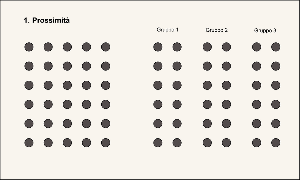
1. Proximity
The first principle of Gestalt is the Proximity.
Proximity: Things that are closer together seem to be more related than things that are far apart.
In the image below for example, it comes naturally to identify 3 distinct groups among the right points based on their proximity/distance.
While the points on the left, which are all equidistant from each other, are perceived as belonging to one large group.
Embracing and consciously applying the proximity principle in data visualization means knowing how to use spacing and empty areas to organize complex categories, assign labels without ambiguity between classes, or create precise and informative annotations, all without scattering attention with unnecessary and redundant elements.
2. Similarity and Focal Point
The second and third Gestalt principles introduce the concepts of Similarity and Focal Point.
Similarity: Objects with similar attributes such as color, shape, size and orientation are perceived as belonging to the same group.
In the example below left, the similarity in the shape and the color of point clouds highlights all the elements that make up a particular group belonging.
Focal Point: Anything that stands out visually receives priority attention from the viewer. In this case, exploiting the opposite concept of similarity, we focus on objects that are different from the rest.
For example, in the bottom right chart, the gaze immediately falls on the last bar.
This element is highlighted through the use of bright color and the addition of the reference value, in contrast to the dull tones and absence of textual notes of the other bars.

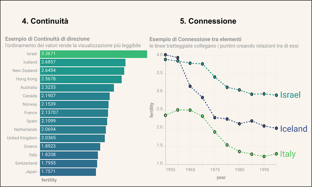
3. Continuity and Connection
The fourth and fifth principles are those of Continuity and Connection.
Continuity: Our eyes seek the most linear path and naturally create elements of continuity in what they see, even if these do not exist in explicit form.
For example, in the chart on the left, the ordering of observations create a continuous decreasing effect, improving readability and allowing immediate comparison between adjacent values.
In addition, the absence of Cartesian axes is implicitly compensated by elements of continuity, such as the alignment at the base of the rectangles and the space between them and the respective label.
Connection: We tend to think of physically connected objects as part of a group. the connection property typically has a stronger association value than color, size, or shape.
In the example on the right, the connection effect is given by the dotted lines that join the points in the series. In fact, without this type of connection it would be difficult to follow the trajectory of values in a single category based on color alone.
These are just some of the many principles that start from psychology and provide the insights needed to improve our data Visualization skills.
Seemingly, they may look like intuitive or marginal things, but ultimately it is the awareness and care of every single detail that determines the success or failure of the final result.
References and Resources
Books
- Storytelling with Data: A Data Visualization Guide for Business Professionals Paperback — by Cole Nussbaumer Knaflic
- Information is Beautiful — by David McCandless
Articles
- https://vizzendata.com/2020/07/06/utilizing-gestalt-principles-to-improve-your-data-visualization-design/
- https://www.topcoder.com/blog/gestalt-principles-for-data-visualization/#:~:text=It%20refers%20to%20the%20patterns,closure%2C%20connection%2C%20and%20enclosure.
![]()
Gestalt psicology for dataviz was originally published in UX Collective on Medium, where people are continuing the conversation by highlighting and responding to this story.