
Gathering feedback from your users is a crucial part of any design process. The way in which you can gather this feedback varies depending on what kind of questions you are trying to answer, the resources you have available for user research and what stage of the product life cycle you are currently in. Qualitative usability testing is widely considered to be one of the most effective user research methods for gathering feedback, due to the great amount of insight you can gather from such a small group of users. This method focuses on observing users behaviours and better understanding their decisions by asking a series of follow up questions. For this reason, having something for them to interact with (live product, prototype, wireframe, sketches) and representative tasks to complete, is essential. I won’t cover much more about the planning and facilitation of this kind of research, rather focus on the analysis and interpretation of the results. Something that receives a little less attention but is an equally important part of the process.
To conduct user research analysis you will need:
- Recordings of usability tests to playback
- A stack of post-its, ideally one colour for each user observed
- A large whiteboard or wall to map out insights
Here’s an example scenario that will give you some context for the steps ahead:
Usability testing has been carried out with five users to gather feedback on a new prototype for a mobile banking app. Users were asked to carry out typical tasks for this kind of app, such as logging in, checking their account balance, making a payment to a friend and contacting customer support. The user was recorded using the app, including their gestures and facial expressions.
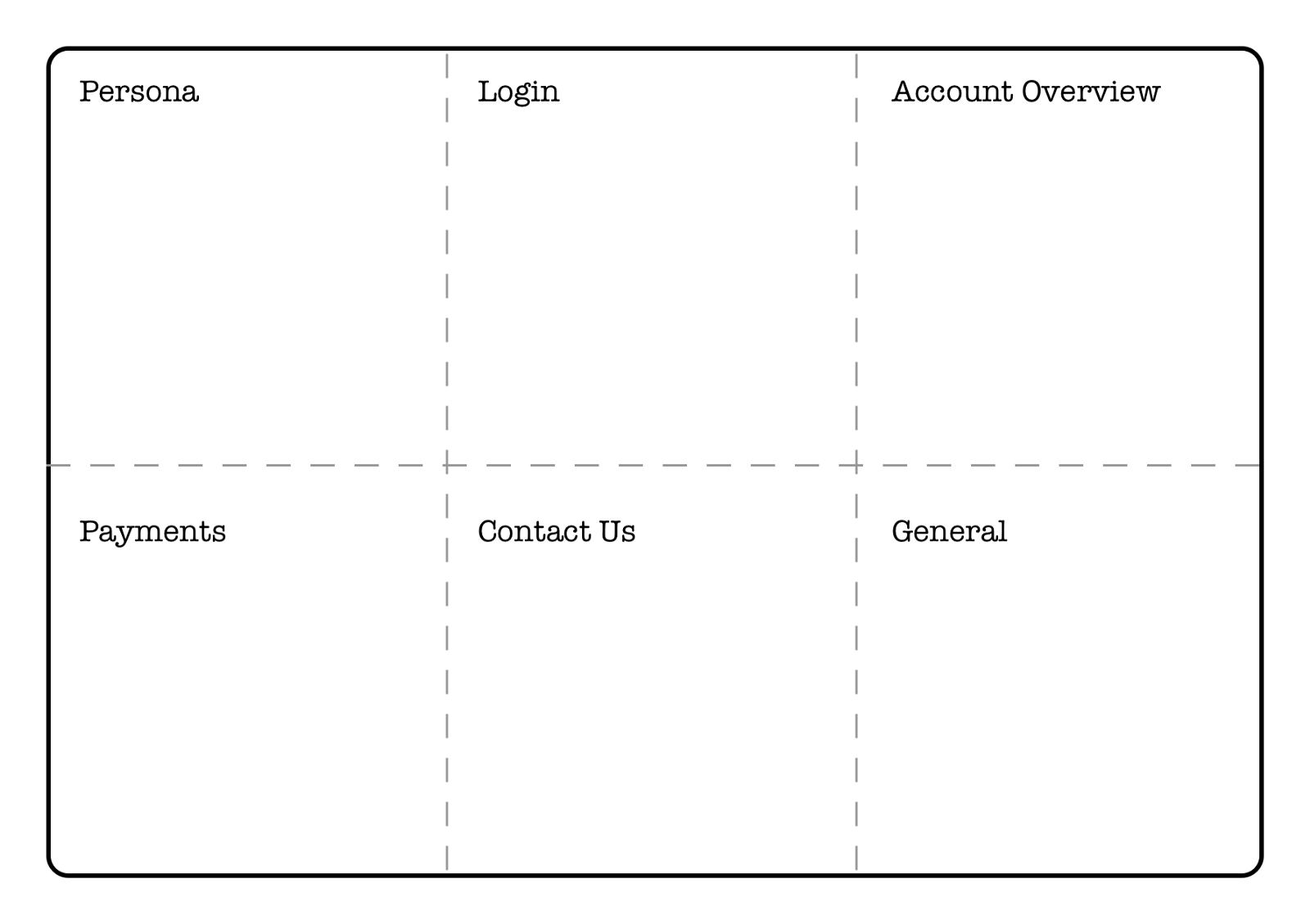
Step 1: Create categories to group insights under
Before you start listening to the recordings, you need to prepare your workspace. Think of distinct stages the user went through when using your prototype and divide your whiteboard (or wall) space accordingly. This will make insights easier to group later on and give you a snapshot of which areas received the most feedback. I also like to include a space for any general feedback not related to one specific area, and a space for insights about the user for persona creation or development later on.
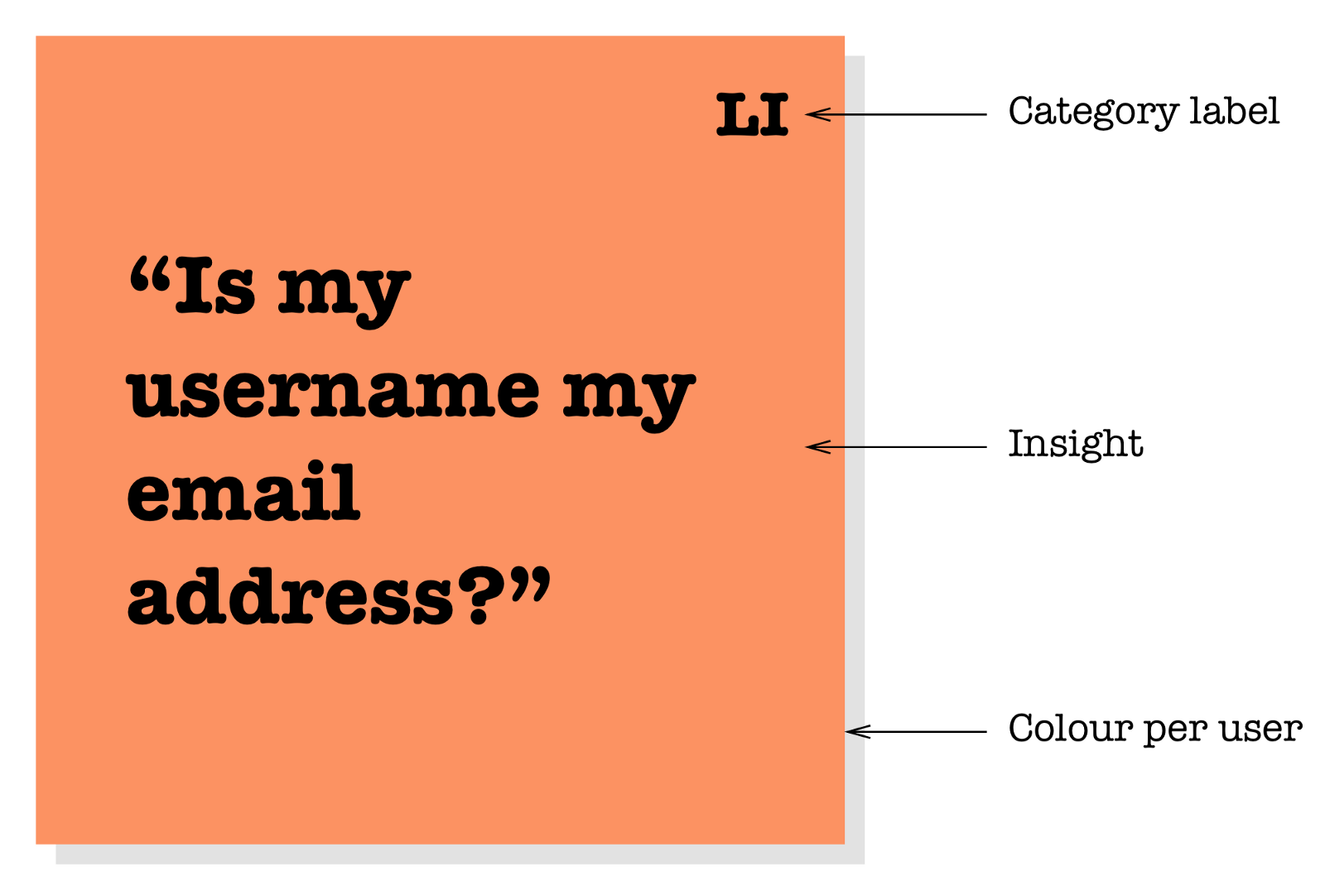
Come up with abbreviated labels for each category to write on each post it during your analysis (Login = LI, Account Overview = AO etc.). Users won’t always take a linear path through your design and it can be difficult to keep track of where the insight came from when quickly listening back to the recordings, so these labels will help a lot.
For this example we’ll divide the board into the following spaces and use the following labels:
- Persona (P)
- Login (LI)
- Account Overview (AO)
- Payments (PM)
- Contact Us (CU)
- General (G)
Step 2: Listen to your recordings and write down insights
I’ll keep it brief:
- Get your post-it notes at the ready (one colour per user)
- Start playing back the recordings, one user at a time
- Begin noting down insights (one insight per post-it)
- Add a label to each post-it (using your abbreviated labels)
- Place it down on your desk and get ready for the next one
Without sacrificing the accuracy of the insight, you want to get through this step promptly. Constantly stopping and starting video recordings and ensuring a high standard of penmanship will only drag this exercise out. For a test of eight users, each an hour long, with an extra 30 mins each for insight gathering is already 12 hours of analysis. It’s easy to burn out in this phase and quality of work can suffer, so set aside enough time and try to stay focused!
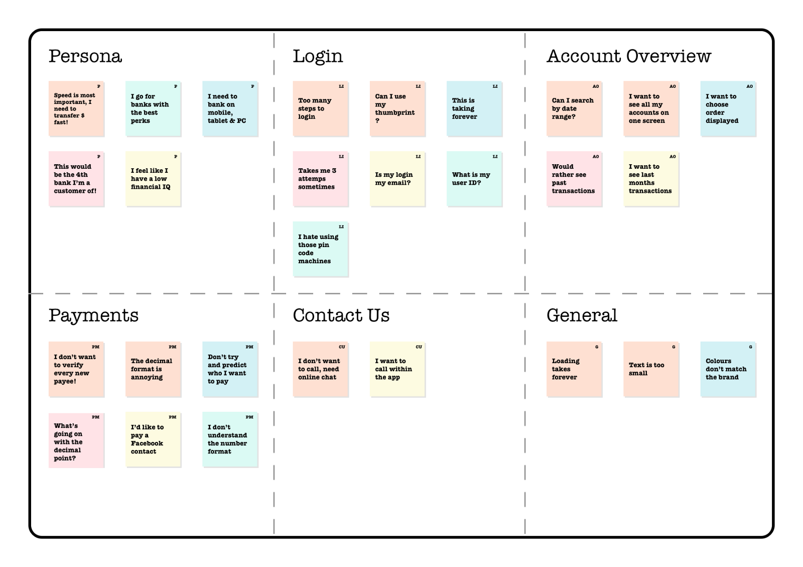
Step 3: Stick insights under their correct heading
With the hard part done you should now have a desk littered with post-it notes, though thankfully due to your colour coding and labelling, it doesn’t matter how chaotic it looks as they’ll be easy to organise.
Stick each post-it in its corresponding space on the whiteboard. Post-its with the LI label go in the Login section and so on. They can be in any order at this stage as long as they are in the right category.
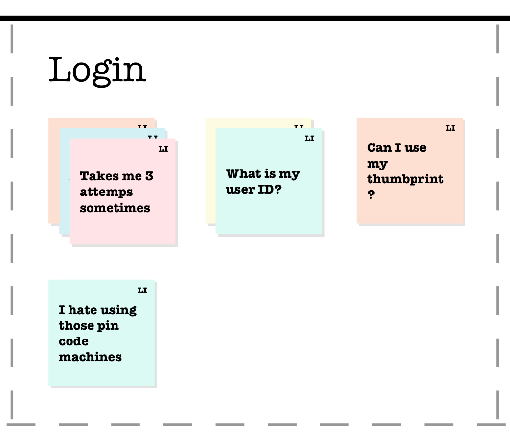
Step 4: Group similar insights
Grouping similar insights will help you visualise how often they occur and give them the correct level of priority when it comes to addressing them. If you’re able to show that all five users grew frustrated at the length of the login process, then it shouldn’t take much convincing to make addressing this a high priority.
Stack post-its with similar feedback on top of one another and you’ll quickly get an idea of which ones came up most often. Try and broaden the insight if it isn’t exactly the same as another, but still strongly related. For example, an insight that a user could not find a customer support phone number to call and another that couldn’t find an email address should be grouped together, summarising that all contact details were difficult to find.
Step 5: Adjust for perceived impact if solved
You should now have a whiteboard covered in post-its that are categorised into practical headings and prioritised based on number of occurrences. The last step is to adjust the priority of the insights based on the potential impact if solved. This might seem a very subjective and assumptive task, but having four users mention they don’t like the app’s logo shouldn’t be approached with more urgency than the three users that couldn’t confirm a payment. Use your knowledge of the users and their feedback during the sessions to adjust the priority of your grouped insights and reorder them accordingly.
Done!
With analysis complete, you will have a collection of grouped and prioritised insights that will help you communicate the results of your research. The way you communicate your findings can differ greatly depending on the stakeholders involved. Some may have joined you in your analysis and will be comfortable kicking off ideation from a short summary of your work. Others might require a more formal report, which also helps document your findings for related projects in the future. I think there is much less variation in approach when it comes to analysis, which is another reason why I thought this would be a more helpful topic to write about.