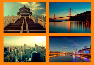
In this tutorial we’re going to take a bunch of ordinary thumbnail links and turn them into a responsive CSS grid gallery with a blurred hover effect. We’ll also use a great CSS trick to make sure touch screen users don’t miss out!
Here’s what we’ll be creating:
A Little Background
Recently, Rachel McCollin wrote a tutorial explaining how to add a gallery of thumbnail links in WordPress themes.

The links act as navigation for child pages of whichever page the user is on (or whichever page you specify) and the resultant plugin outputs something a bit like this:

Using the markup generated by Rachel’s plugin, we’re going to do the following:
- Arrange the thumbnails using CSS Grid, giving us a responsive gallery.
- Create a hover effect using CSS filters and transitions.
- Use a nifty CSS media query to make sure touch screen users can still see each thumbnail title, even without hovering.
1. Change the Markup (a Bit)
Let’s a have a quick look at the markup generated by Rachel’s code. When cleaned up it looks effectively like this:
<div class="child-page-listing">

  <h2>Our Locations</h2>

  <article class="location-listing">
    <a class="location-title" href="#">San Francisco</a>
    <div class="location-image">
      <a href="#">
        <img src="http://webdesign.tutsplus.com/image.jpg" alt="san francisco">
      </a>
    </div>
  </article>

  <!-- more articles -->

</div>
We have a parent <div>, which holds an <h2> and a few <article> elements. When we’re using CSS Grid we first define a grid container. In this case we could use the parent <div>, but that would make each direct child–including the <h2>–a grid item, so we need to change things a little.
We’ll wrap all the <article> elements in another <div> (feel free to use whatever element you feel most suitable) which we’ll imaginatively give a class of grid-container. Use this starter pen as a basis.
2. Responsive CSS Grid, in Three Lines
With just a few rules we can turn our thumbnails into a grid:
.grid-container {
  display: grid;
  grid-template-columns: repeat(auto-fill, minmax(300px, 1fr));
  grid-gap: 1em;
}
The easy lines here are the display: grid; (which turns all direct children into grid items and lays them out) and the grid-gap: 1em; (which defines our gutters).
The slight complexity comes from the value we’ve given to the grid-template-columns property, which defines our columns. You might normally expect to see something like repeat(3, 200px) which would give us three columns of 200px. In this case we’ve used the auto-fill keyword for repeat(), and then some values. This gives us as many columns with a minimum of 300px and maximum of 1fr as will fit in the grid container.

Resize your browser window and see how it behaves!
One last detail you’ll need to add:
img {
  width: 100%;
  height: auto;
}
This will make sure the images fill their containers properly (particularly necessary for use with Rachel’s demo, as we need to overwrite the inline width and height properties WordPress outputs).
3. Hover Effect
We’re going to use the titles as overlays for the thumbnails, revealing them on hover. We’ll also give the hovered images a red effect, and a slight blur to help readability of the overlaid text.
Overlay the Title
To overlay the title we need to position it, so we’ll begin by making the article position: relative; and the title position: absolute;. We’ll also give it a red background and make it fill the available space:
.location-listing {
  position: relative;
}

.location-title {
  position: absolute;
  top: 0;
  left: 0;
  height: 100%;
  width: 100%;
  background: rgba(90,0,10,0.4);
}
Good start!

There are one or two things to improve already, including that extra space at the bottom (the title is slightly larger than the thumbnail). This can be solved by removing any line-height on the image’s container:
.location-image {
  line-height: 0;
}
Style the Title
Some typographic styles will improve the look of our title, and three lines of flexbox magic will align it centrally for us:
.location-title {
  position: absolute;
  top: 0;
  left: 0;
  height: 100%;
  width: 100%;
  background: rgba(90,0,10,0.4);

  /* typographic styles */
  color: white;
  font-size: 1.5em;
  font-weight: bold;
  text-decoration: none;

  /* position the text centrally*/
  display: flex;
  align-items: center;
  justify-content: center;
}
Much better:

Hide the Title
Now let’s hide the title by removing its opacity so that we can only see it on hover. A couple more rules underneath the ones we’ve already added to our .location-title should do it:
  /* hide the title by default */
  opacity: 0;
  transition: opacity .5s;
Here we also set a transition rule so that when we do bring the opacity back it will happen gradually (over the course of 0.5 seconds). Let’s bring it back now:
.location-listing:hover .location-title {
  opacity: 1;
}
Great! Now our title appears again on hover:

Blurred Lines
We’ve created a great-looking hover effect already, but let’s take things a step further shall we? Let’s add a blur filter to the image too. We’ll begin by setting the blur filter on the normal state, in order to give us something to transition from. Then we’ll blur things by 2px for the hover state (make this number as extreme as you wish, but I think 2px gives us a great visual):
.location-image img {
  filter: blur(0px);
  transition: filter 0.3s ease-in;
}

.location-listing:hover .location-image img {
  filter: blur(2px);
}
Here’s what that gives us:

A couple of things to note:
- The title has disappeared because the browser is now rendering the blurred graphic over the top of it.
- The blurred effect looks good, but it gives us a blurred edge too (we can do better than that).
Fixing the hidden title is as simple as adding z-index: 1; to the .location-title.
Fixing the blurred edge is a little more involved. To begin with we scale the image to make it a bit larger, then we set overflow: hidden; on the image container (.location-listing) so that when the larger image blurs its edges are effectively cropped. Here are the finished properties for the two elements in question:
.location-image img {
  filter: blur(0px);
  transition: filter 0.3s ease-in;
  transform: scale(1.1);
}

.location-listing {
  position: relative;
  overflow: hidden;
}
The transform: scale(1.1); rule scales our image in all directions to 1.1 (where 1.0 would keep things exactly the same size). Here’s the much neater result:

4. The Problem With Touch Screens
So there we have it! A great-looking image grid with a blurred hover effect on each thumbnail. The only thing is that the titles are hidden to anyone who can’t hover over the images (a good number of tablets and smartphones don’t emulate hover with a prolonged “press”) which isn’t very accessible.
Fortunately, CSS has some very useful interaction media queries which can help us out (and they enjoy fairly decent browser support too). These queries will detect a browser’s input mechanism–the pointing device quality, the ability to hover, and some other special definitions–so we can fairly accurately determine if our thumbnails are being viewed on a touch screen device.
Take this media query for example (it does exactly what you might expect):
@media (hover: none) { }
Within these curly braces we’d put any styles we want to apply to a browser which can’t handle :hover. Let’s do that–we’ll state that for devices where hover is either impossible, or at least inconvenient, the thumbnail image will always be blurred and the title will always be visible:
/* for touch screen devices */
@media (hover: none) {
  .location-title {
    opacity: 1;
  }
  .location-image img {
    filter: blur(2px);
  }
}
Take a look:

Note: As mentioned, support for this is pretty reasonable, but discussions about the implementation of interaction media queries are still ongoing. There’s a good chance this spec will change, or have parts removed.
Conclusion
And we’re done! Thanks for following along, I hope you’ve learned one or two things and enjoyed playing around with CSS (who doesn’t enjoy that?). Here’s one more look at the final demo–enjoy adding it to the theme files created by Rachel in part one!