
If you want your site to be responsive (and who doesn’t?), then it’s important to make sure that your main navigation menu works well on small screens.
Large navigation menus can take up too much space on a mobile phone, or if they don’t, they can be too small to read or to reliably tap the correct link.
A burger menu is one way to get around this. It’s a menu that’s hidden until the user taps on it. The reason it’s called a burger menu is because the symbol that represents it is three horizontal lines one above the other, which looks a bit like a hamburger.
There are plugins that will turn your main navigation menu into a burger menu in WordPress (including those on Code Canyon), but what if you want to code one into your own theme?
In this tutorial, you’ll learn how.
What You’ll Need
To follow along with this tutorial, you’ll need:
- a development installation of WordPress
- a code editor
- a theme you can edit (if you’re using a third-party theme, you’ll need to create a child theme)
The Starting Menu
The code we’ll write will apply to the menu generated by WordPress using the navigation menu system. You don’t need to code a new or different menu for mobile. (It’s one of my pet peeves when sites have different navigation on desktop and mobile as it’s normally to the detriment of user experience on mobile.)
I’m going to demonstrate this technique with reference to the menu in my own site and add the code to the header.php file as well as the stylesheet and a new JavaScript file.
Here’s the menu on desktop:

It’s a horizontal menu beneath the banner image and header and above the content.
On mobile, the banner image isn’t visible. I want to remove the menu and replace it with a burger symbol. When the user clicks on that symbol, the menu will appear.
Here’s the code for the menu:
<nav class="menu main">
	<div class="skip-link screen-reader-text">
        <a href="#content" title="<?php esc_attr_e( 'Skip to content', 'tutsplus' ); ?>">
            <?php _e( 'Skip to content', 'tutsplus' ); ?>
        </a>
    </div>
	<?php wp_nav_menu( array(
        'container_class' => 'main-nav',
        'theme_location' => 'primary'
    ) ); ?>
</nav><!-- .main -->
It’s all wrapped in a div with the class of .menu.main. There’s a skip link for screen readers and then the wp_nav_menu() function which includes 'container_class' => 'main-nav', which adds an extra CSS class to the menu itself. We can use those classes to style the menu on mobile later.
So let’s get started.
Adding the Burger Symbol
The first step is to code the burger symbol into the header.php file and style it so it’s only visible on mobile.
In your header.php file, add this code inside the header element (not inside the navigation):
<a class="toggle-nav" href="#">☰</a>
In my case, it means the code for the header and navigation are like this (note that I’ve omitted the banner in the code below, although it is in my file):
<div class="header-bg">
<header role="banner">
<hgroup class="site-name three-quarters left">
<h1 id="site-title" class="one-half-left">
<a href="<?php echo home_url( '/' ); ?>" title="<?php echo esc_attr( get_bloginfo( 'name', 'display' ) ); ?>" rel="home"><?php bloginfo( 'name' ); ?></a>
</h1>
<h2 id="site-description"><?php bloginfo( 'description' ); ?></h2>
</hgroup>
<div class="right quarter">
<a class="toggle-nav" href="#">☰</a>
</div> <!-- .one-half right -->
</header><!-- header -->
</div><!-- header-bg-->
<!-- full width navigation menu - not on landing page -->
<nav class="menu main">
<div class="skip-link screen-reader-text">
<a href="#content" title="<?php esc_attr_e( 'Skip to content', 'compass' ); ?>">
<?php _e( 'Skip to content', 'twentyten' ); ?>
</a>
</div>
<?php wp_nav_menu( array(
'container_class' => 'main-nav',
'theme_location' => 'primary'
) ); ?>
</nav><!-- .main -->
So the burger symbol (which is shown using the ☰ HTML code) is in the header, and the navigation menu is below it.
Now to add some styling for the toggle-nav element.
Styling the Burger Symbol
First up, we need to hide the burger symbol on desktop.
In your stylesheet, add this to hide the burger symbol:
.toggle-nav {
    display: none !important;
}
But you do need to ensure it displays on mobile. So add a media query, using whatever maximum width you’re using for your media query generally. Here’s mine:
@media screen and ( max-width: 580px ) {
    .toggle-nav {
        display: inline-block !important;
    }
}
That will make the burger icon visible on smaller screens. I’ve used !important to ensure it isn’t overridden by any other link styling in my theme.
Now let’s add some additional styling for it. Edit the media query so it looks like this:
@media screen and ( max-width: 580px ) {
    .toggle-nav {
        display: inline-block !important;
        float: right;
        margin: 25px;
        font-size: 2em;
        transition: color linear 0.15s;
	}

    a.toggle-nav:link,
	a.toggle-nav:visited,
	a.toggle-nav:hover,
	a.toggle-nav:active {
        text-decoration: none;
        color: #fff;
    }
}
This adds color and sizing to the icon and also overrides any styling for links, whatever state they’re in.
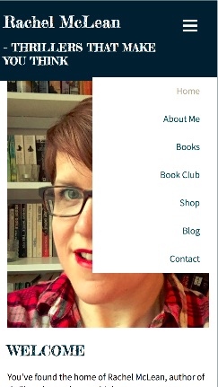
Here’s what the burger icon looks like on mobile now:

That’s the burger icon styled. Now for the navigation menu.
Styling the Navigation Menu
The navigation menu itself needs to be styled on mobile. Inside your media query, add this CSS:
.menu.main {
    display: inline-block;
    position: relative;
    background: #fff;
    text-align: left;
}

.menu.main ul {
    display: none;
    position: absolute;
    overflow: auto;
    top: 0px;
    right: 0px;
    z-index: 999;
    padding-right: 15px;
    background: #fff;
}

.menu.main ul li {
    float: none;
    display: block;
    position: relative;
    top: 0px;
    right: 0px;
    min-width: 200px;
    background: #fff;
    text-align: right;
}

.main.menu li:after {
    content: none;
}
Here are some key aspects of what that code does:
- It changes the colors and positioning of the main menu and aligns text left.
- It hides the list inside the menu, so that when the user first visits the site on mobile, the menu isn’t displayed.
- It changes floats and colors for the list items within the list.
- It gives relative positioning to the menu and absolute positioning to the list, so that it can sit on top of the content of the page and not push it down.
- It removes any elements after the list items which are in my theme on desktop.
Note that the tweaks you’ll need to do to your menu may be different, and will depend on how it’s styled on desktop. The important bits are hiding the menu and the positioning.
Adding JavaScript
To get it all to work, we need to add some JavaScript. This will make the menu slide down when the user taps on the burger icon.
Add a new file called burger-menu.js to your theme (I like to put mine inside a scripts folder).
Add this script to it:
jQuery(document).ready(function() {
    jQuery('.toggle-nav').click(function(e) {
        jQuery('.menu.main ul').slideToggle(500);

        e.preventDefault();
    });

});
This script will slide the ul within the .menu.main element down when the user clicks on the .toggle-nav element (i.e. the burger icon). Save the file and close it.
But it won’t work unless you enqueue the script. Open your theme’s functions.php file and add this:
function tutsplus_burger_menu_scripts() {

	wp_enqueue_script( 'burger-menu-script', get_stylesheet_directory_uri() . '/scripts/burger-menu.js', array( 'jquery' ) );

}
add_action( 'wp_enqueue_scripts', 'tutsplus_burger_menu_scripts' );
This will enqueue your script, which will make it work. Save and close your functions file.
Now if you visit your site on mobile (or in a desktop browser with responsive mode enabled) and click on that burger, the menu will slide down.

It’s sitting on top of the content, and not pushing it down, and it appears with a nice JavaScript-powered sliding action. Just what we wanted.
A Burger Menu Will Enhance UX for Mobile Visitors
A bulky, desktop-first navigation menu will take up too much space on a small screen and keep people from reading the content they came to your site for.
But you don’t want to prevent mobile visitors from accessing the same navigation as desktop visitors have.
By adding a burger menu like this, you can get the best of both worlds: a clean mobile layout with access to the same navigation as on desktop.
Other Posts About WordPress Menus
To learn more about WordPress menus, check out some of our other posts: