ART | DESIGN | CREATIVITY | MOTORCYCLE | DIGITAL ART
Yeah, we’re skipping the 100 level classes ’cause that’s just how we roll
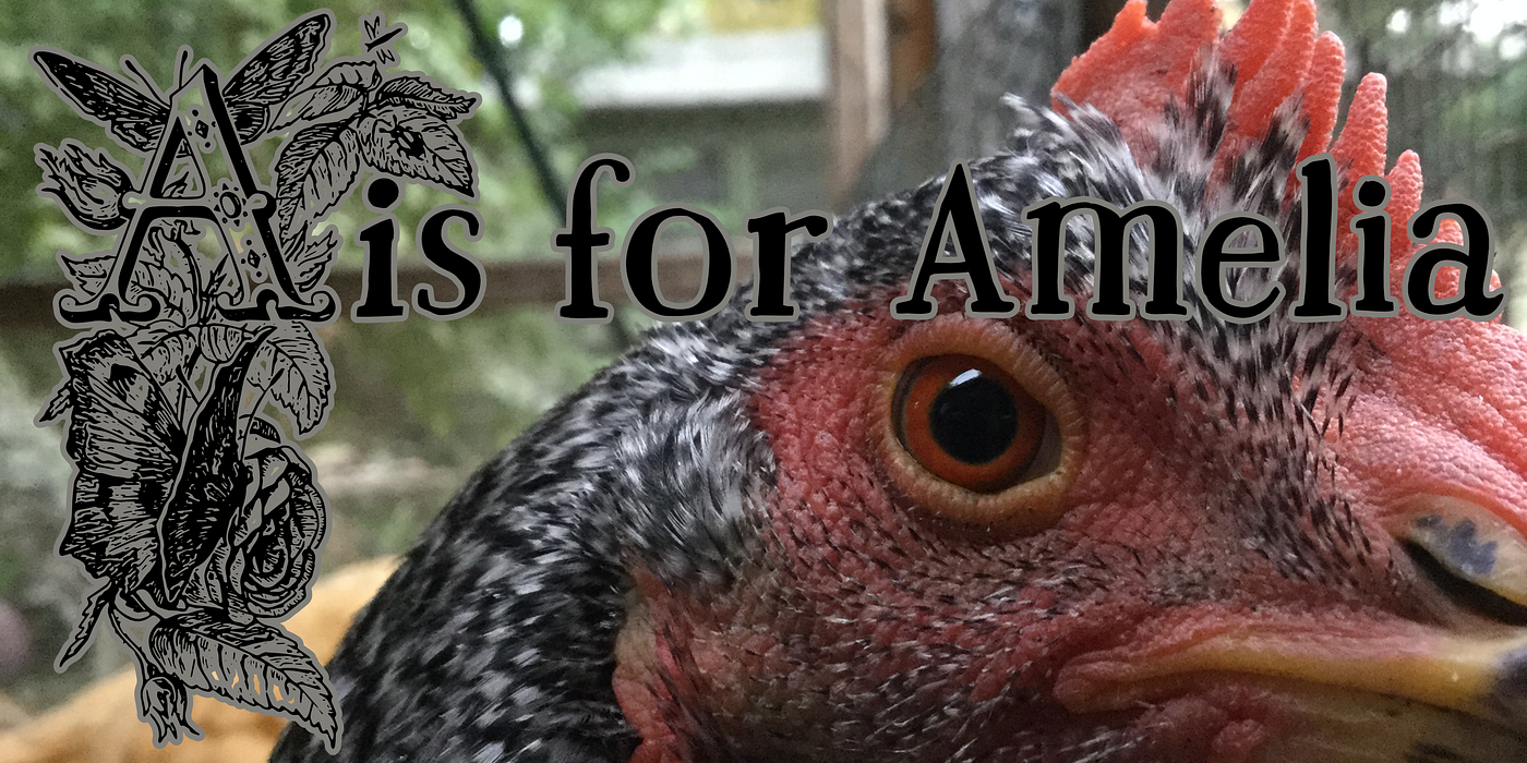
You know, Amelia has my whole heart even though I suspect she herself has a heart like a biker chick. She hopes in secret this article goes hugely viral.
If it does, we are using the extra cash to get her a real tattoo artist. (Notice I said “real tattoo artist,” not “real tattoo.” She is not getting a real tattoo!)
Of course, no one would see what she thought was her tattoo once the feathers grow back. But she would know it’s there. Yeah. She would know it’s there. You dig?
Biker chick fundamentals (for chickens, maybe not for people)
The single most important thing to know about being a biker chick is that you must be independent. You go your own way, and if anyone wants to come along for the ride, that’s cool. But you don’t beg to be in on anyone else’s ride.
Go your own way. It’s good for chickens. It’s good for artists, designers, and just plain folks.
Next, you might be that adorably cute chicken with fluff feathers that could stop traffic and have the sweetest little back toes ever, but you don’t let on to anyone that you know just how amazing you are. (And Amelia is amazing.) Biker chicks don’t beg for anyone else’s approval.
Don’t beg anyone to like you. Again, that advice is good for chickens and everybody else too.
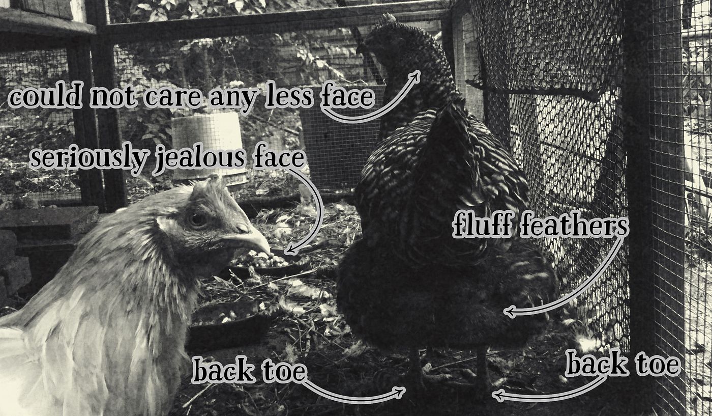
Maybe it’s just my imagination, but can’t you just see Amelia standing on her part of the king and queen seat of a hog and looking over the 6-bends?
Fun Facts: A king and queen seat has two saddles: one to the front for the driver and one to the back for the passenger. A hog is a large motorcycle. 6-bends are a kind of handlebar.
Lines
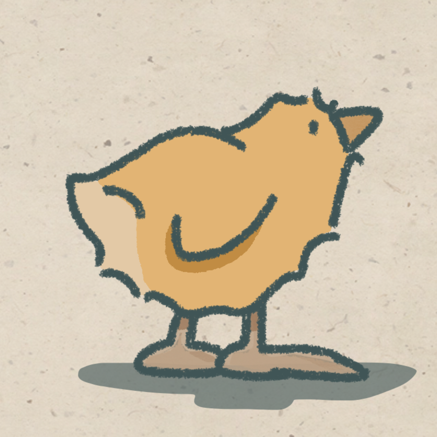
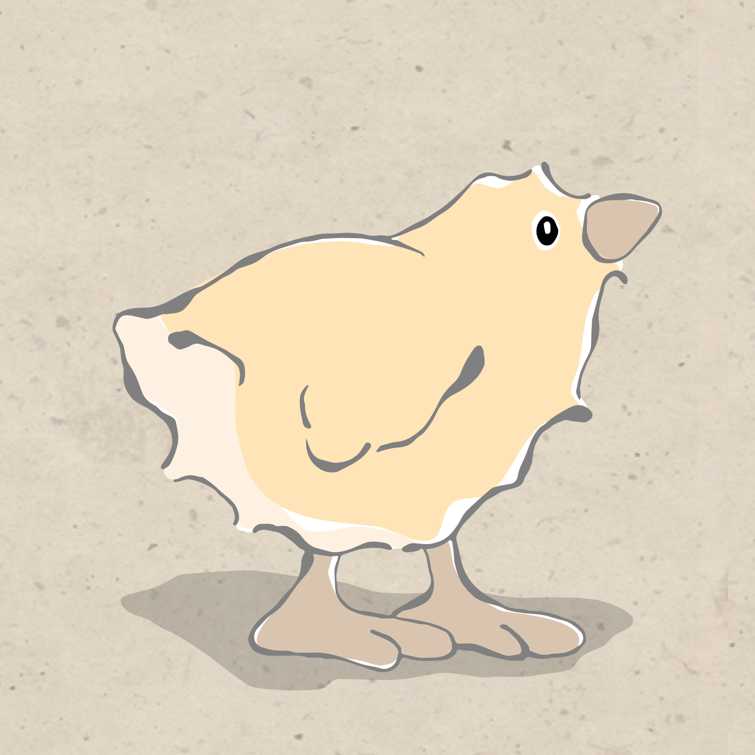
When we draw a line, we are really drawing a shape. Sometimes it’s a really thin shape, but it’s still a shape. In digital design, there are two kinds of lines or shapes: vector and raster. A vector line is made from a mathematical formula. A raster line is made of little squares.
It’s often difficult to see the difference — like on the mirror image of these butterfly wings.
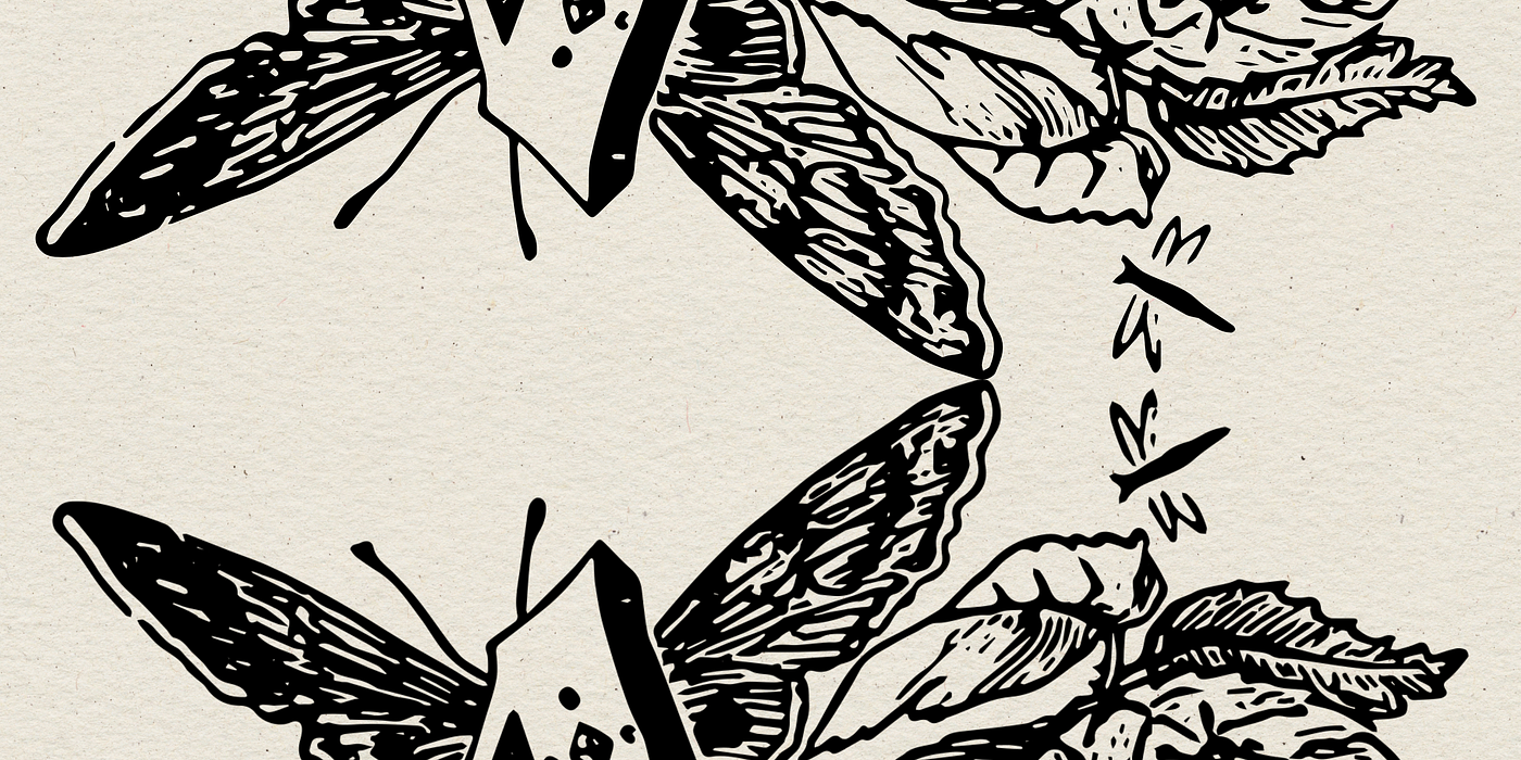
But once you zoom in, they are clearly different. Those little squares are not always a good thing. You’ll see why shortly.
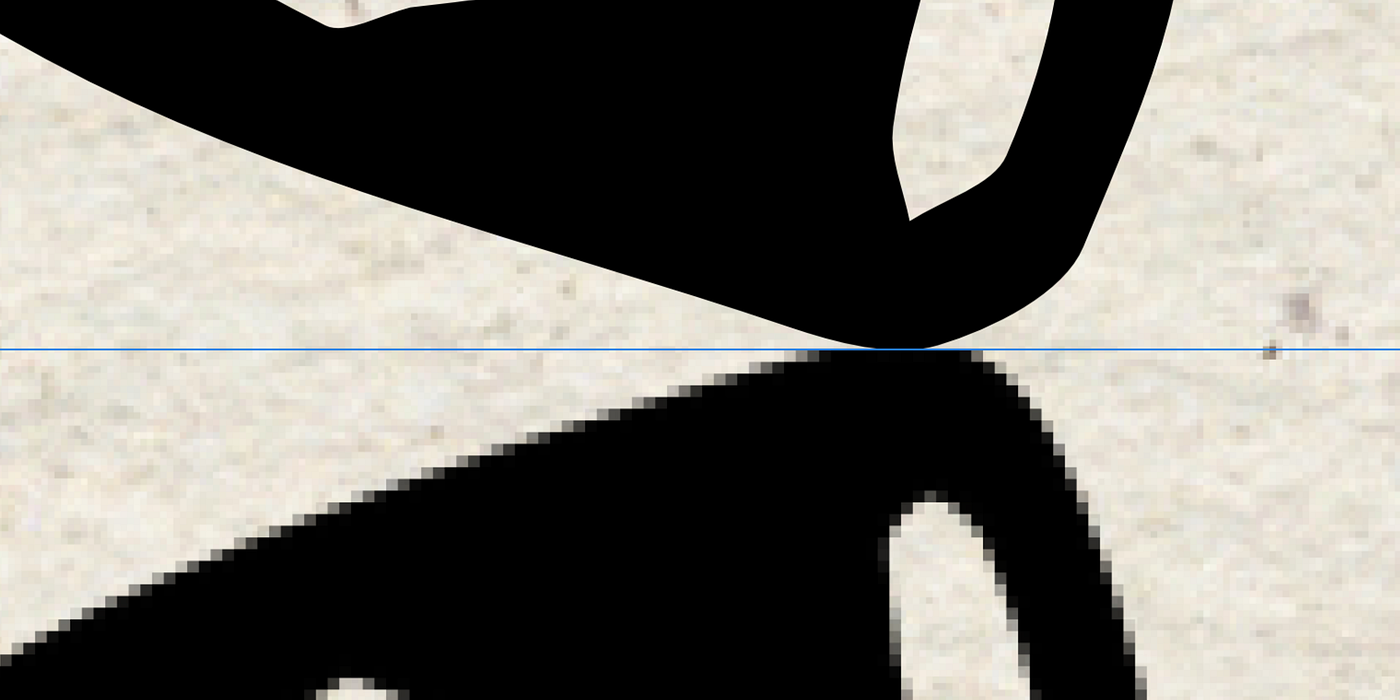
Both vector and raster have their advantages even though some say making a vector drawing is not really drawing. Why do I like drawing with vectors? They are much easier to modify, and their details are not lost when the size is changed.
Practical application
We are creating t-shirts to help fund our next book project. If we use a raster image, we can’t get the clear and simple beauty of screen printing without sacrificing some of our image. All of those squares in Amelia’s digital photo limit our printing choices. (We even switched it to a black-and-white photo.)
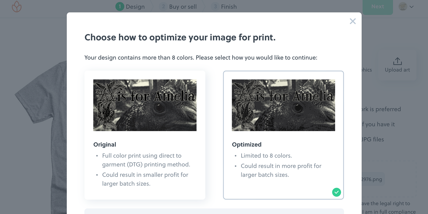
When we take out the photo portion of our design, we have nothing but beautiful vector graphics left that are going to be screen-printed with awesome results.
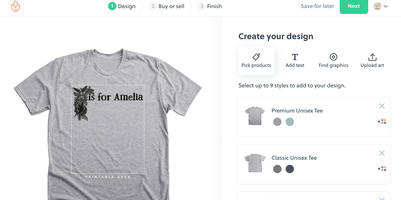
The final design uses only two colors and so Bonfire would need only two prepared screens.
Our 1-kicker
So we are going to start right in like on our 1-kicker and create line art. We are going to do our best to make it simple for anyone willing to try — whether they have artistic training or not. We are also going to avoid the cagers.
Fun Facts: A 1-kicker is a well-tuned motorcycle that starts on the first kick. A cager is a person in a car, truck, or van.
This should be easier than teaching Amelia to ride a motorcycle. Seriously.
Time to head out
For now, Amelia and I are going to follow the advice of Steppenwolf in their song Born to Be Wild.
Get your motor runnin’
Head out on the highway
Looking for adventure
In whatever comes our wayYeah, darlin’ gonna make it happen
Take the world in a love embrace
Fire all of your guns at once
And explode into space
Who knows? We might just end up at Jollity Farm with the Bonzo Dog Doo-Dah Band.
Fun Fact: The original version in black-and-white aired on Do Not Adjust Your Set in the first episode of the first season. The series helped launch the careers of Eric Idle, Terry Jones, and Michael Palin. They soon became members of the Pythons. (Not a motorcycle gang, but the guys behind Monty Python’s Flying Circus!)
So why that song instead of “Born to Be Wild” ?
Partly because we are waiting for the next time Easy Rider comes on television. Mostly because it’s a fun song video and combines many different elements. It fits with what I believe about art.
Art and design and creativity should be for everyone and should be fun. It’s okay to go your own way.
Did you notice that a person didn’t have to play a musical instrument to be in the Bonzo Dog Doo-Dah Band?
You don’t have to go to art or design school to be a artist or a designer.
Before Amelia’s next article about line as a design element, you might want to check out Pearl’s articles about color as a design element.