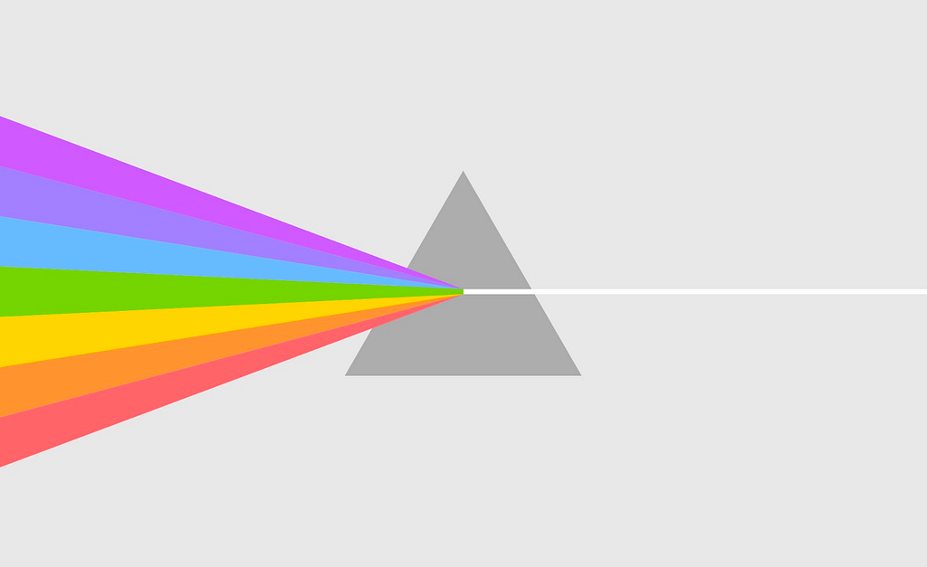
Like a backwards prism, design systems focus the energy of many teams into a single beam. They spread efficiency and consistency, but they also shape culture and hone brand expression. They’re about bringing it all together, across disciplines, to form alignment and a cohesive outcome.

What’s the big deal about design systems, anyways?
You might have heard differing opinions about design systems, how they unify customer experience, how they limit creativity, or how they can result in rigid standards that block product evolution. All of these concerns are very valid, and do happen if teams are not intentional and empathetic. It’s crucial for teams owning a system to be listening to their direct users — designers and developers in their organization.
I want to focus mostly on the optimistic, sunny side of systems and the evidence I’ve seen of positive impact on culture and collaboration. They bring brands to life and build a new layer of personal connection in more moments. They scale up every contributor to do more impactful work. And like any product, they’re extremely tricky to get right.
But first, an analogy
To help frame up what a design system is and how it can flex and grow for product teams, let’s take a look at the world of music.

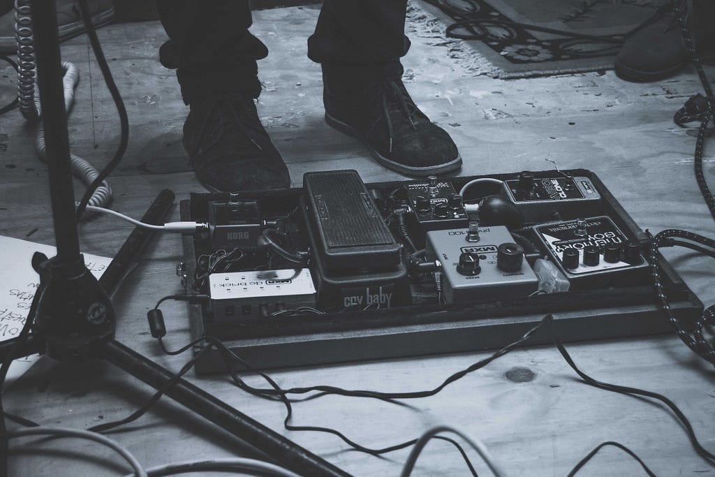
If you look at a pedalboard for an electric guitar, what you see is a collection of components. Designers, musicians and engineers have worked to make the best individual components possible. Musicians can create their own setups to find the sound they want. That setup varies from one musician to the next with nearly unlimited possible results.
At the end of the day, this is a system of components that can be arranged creatively within set logic and function to produce the desired outcome.
It’s also possible to explore and tinker or test out different approaches with potentially surprising results. The science behind the construction of the component is combined with the artistry of the musician exploring new applications. The result is much greater than the sum of the individual parts. A good system multiplies art and science to create magic.
How do you get there?
There are a lot of common paths organizations take to get from no structure to a genuine design system. The journey can vary from a grass-roots effort led by passionate individual contributors to top-down investments in better ways of building products championed by executives.
Regardless of the engine behind the progress, there are a few levels of maturity that fit different needs for organizations. Some teams might not need to level-up all the way. The right level can vary for each team. It’s all about finding the right tool for the job.
Level 1 — Styleguide
Consistency is the core need behind a styleguide. It is made up of primarily visual and content details that are meant to bring teams in to alignment on the surface level. Examples of content include color theory, type, spacing, form elements and buttons.
Level 2 — Pattern library
Efficiency is the core driver behind a pattern library. It combines design assets and code to create deeper cohesion between teams and more consistent implementation that’s easier to maintain. Examples of content include reusable code, token structure, reusable flows and data visualization.
Level 3 — Design system
The core need for a design system can adapt to the key results an organization wants to see. It can drive innovation or broaden the impact contributors through better reusability. A design system goes beyond reusable elements and captures strategic decisions made across the organization that impact customer experience. They include reusable assets to improve speed, but also common toolkits that shape culture and guide how teams collaborate. They enable more teams to contribute and share across the organization with components and experiences built on a common and flexible foundation. Examples of content include design principles, clear contribution models, ways of working and best practices for designers & developers. The scale of what a design system contains is described nicely by Hayley Hughes:
“Design systems are any set of decisions governed across the organization.” (Trust Between Teams, Config 2022)
Who owns the system?
Just like the common paths to a design system, the structure of ownership can also vary and be tailored to the needs and resources of an organization. Each approach has strengths and weaknesses — it’s not one size fits all.
These team structure models are from Mark Boyes-Smith’s fantastic article, Supercharging your design system contribution model.

Centralized
A centralized team puts direction and delivery on a specific, core team. This results in clear ownership, clear direction and clarity in vision. But it can also result in slow velocity, a lack of community contribution and a high level of investment. As a team grows in size, this model might not be able to keep pace with growing demand.
Decentralized
A decentralized model is entirely owned by the community. It relies on passionate contributors across an organization and requires teams to pass the baton and self-regulate to grow and maintain the system. The investment is low and initial contribution can be exciting, but the vision is very muddled and maintenance over time can become a blocker.
Hybrid
A hybrid team relies on a central team for ownership, maintenance and vision, but it also relies on the broader community for ongoing contribution and guidance. It creates a two-way street as product teams learn better reusability practices and the design system team learns how to better support the community (Hey there, empathy). Pace can be moderate and the vision can shift frequently, but the team is able to be nimble and community-focussed.
How can a design system address unique team culture problems?
When defining a vision for a design system, the first step is to understand the key problems your organization is facing. Once those problems are defined and agreed on, the design system becomes your core set of tools that teams are given to combat painpoints and turn them into delight. Here are a few examples:
Let’s say your team has a lot of designers who create static designs that lack definition of state changes or richer interaction design. Your design system team can play a crucial part in teaching true interaction design to help increase skill levels, open minds and ramp up education.
If there’s a lot of inconsistency in file structure, naming and organization, the way components are structured can set the standard for the rest of the team in how things are designed and built.
If voice and tone differ throughout separate experiences from the same brand, crafting brand voice within a design system allows a common approach to language from start to finish.
The product the design system team creates is a toolkit to help teams move faster, but it also sets the bar for how designers and developers should be working to improve standards and collaboration across an organization.
How does a design system power innovation?
Your experience might be that these types of standards limit creativity and back teams into a corner. And that’s an all-too-real reality for a lot of teams. But with the right structure in place, design systems can be a driver for creativity and allow organizations to spend more time tinkering, testing and building empathy.
It’s all about faster, stronger connection with our customers.
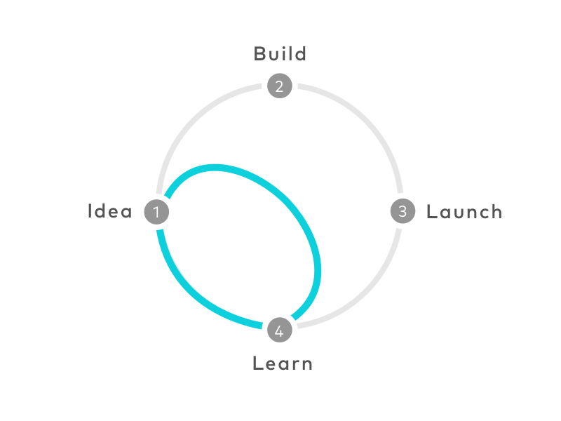
If you look at common structures for design sprints, you can see the emphasis is on getting products into the hands of customers as fast as possible to gather feedback and adjust while change is cheap and time invested is low. This type of a workflow is extremely difficult without a solid system to quickly build on. The time crunch within this condensed process is immense for designers and developers who are expected to put together a prototype for testing in a matter of days, sometimes hours. But, if most of the key decisions are already made and the work is largely reusing what has been created in the past, a few hours can feel like a leisurely walk in the park instead of a mad dash across town.

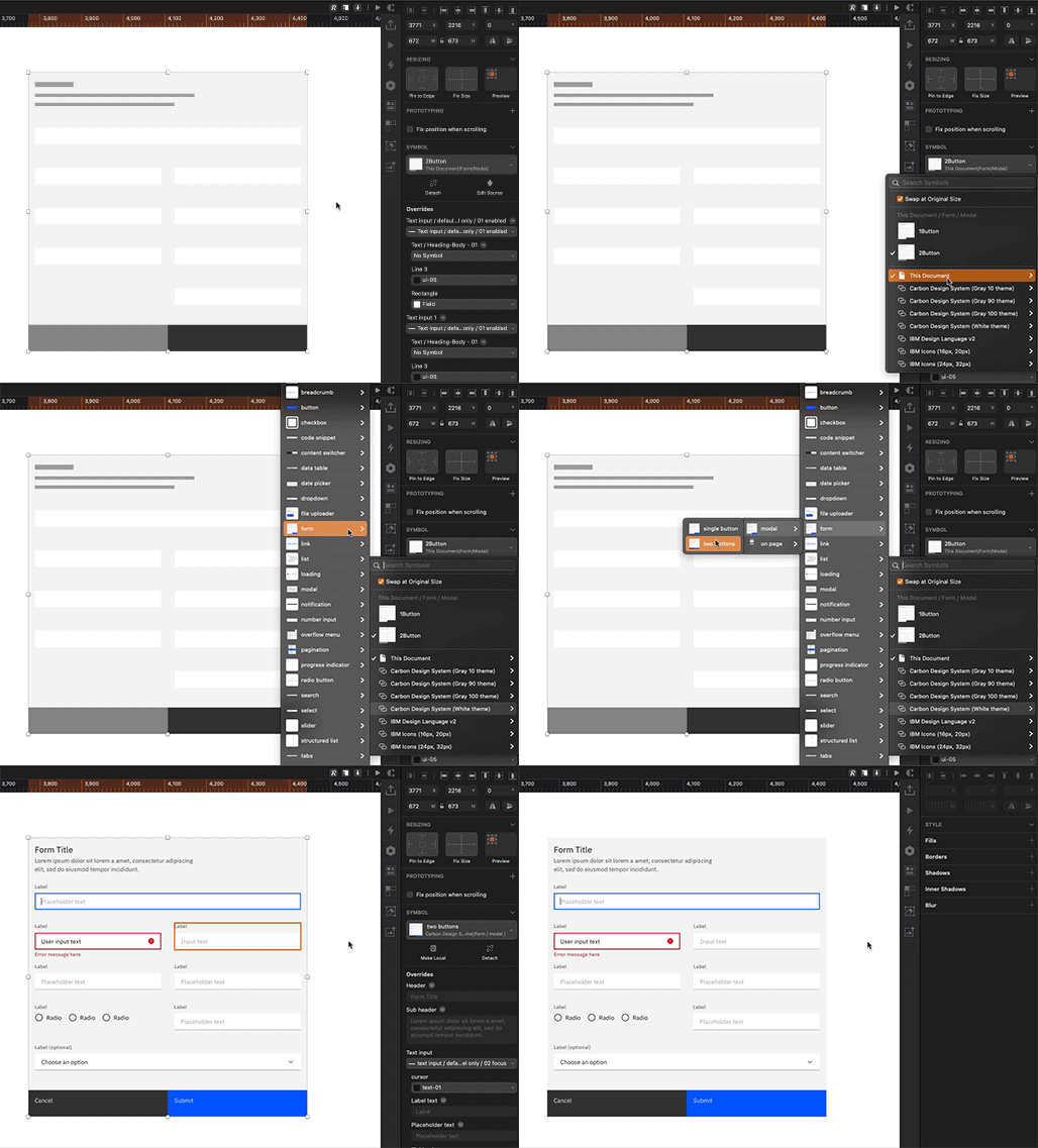
Another example of increasing the speed of prototyping and learning comes from the IBM Carbon team. Their wireframing kit allows teams to illustrate ideas faster and move to high-fidelity designs almost with the flip of a switch. This not only speeds up ideation, but it increases the speed of delivery.

Beyond design process and faster paths to empathy, design systems can also help organizations become more future-proof by creating better tools to make products on new platforms. Google Material adapted to foldable devices, Pokemon expanded from digital to virtual with Pokemon Go, and we’ll see many more companies exploring applying their brands for customers in augmented reality. Design systems expand the impact of direct contributors and also the effectiveness of brands at engaging with customers. Or as Tobi Lutke, Shopify Founder and CEO said in an interview with Alison Harshbarger:
“Design systems are incredible at raising the floor. They can be problematic if they lower the ceiling.”
Design systems can be fantastic fuel for maturity and innovation when created thoughtfully. They can also become a ceiling and restrict creativity when mis-managed. When empathy guides the team, the system can spread efficiency and consistency, shape organizational culture and hone brand expression.
P.S. this article was adapted from a talk I gave at World Information Architecture Day 2022, Minneapolis. Thanks for reading!
Design systems; the great connector was originally published in UX Collective on Medium, where people are continuing the conversation by highlighting and responding to this story.