What does your design cause which is undesirable or unintended or at odds with the design intent? How does one ask and answer these questions?
In these next few posts I’m going to propose some ways of answering these questions that build up in complexity and propose some ways of thinking about causality and modeling effects that are relevant for thinking about ways to capture what’s most important in a design.
Measuring Design
Experimentation and modeling causality aren’t anything unique to design. In fact, pretty much everything that I’m going to borrow is from economics and quantitative social sciences rather than design. And it isn’t always important: some design work involves far more complexity than others. I’ve been in many of the little nooks and crannies of designing things and systems and services and some are quite simple and some are nightmarishly complex. On the simple side you might have the widget: you made it, someone distributed it, and consumers bought it. If more widgets were bought, the design was validated. If less widgets were bought, the design was scrapped or redone or you were fired. Your design should cause people to buy widgets. Simple! However much of what design is supposed to do these days is far more complex. Design is supposed to help a user journey across a wide spectrum of touchpoints and experiences. Design is supposed to build a coherent story of a relationship with a user across multiple interactions and perhaps even multiple services. Design builds trust and allows for growth on both side of the interaction. There are plenty of times we want to know now only what a design does, but the degree to which it does it. And there are times where the thing that we want to measure isn’t exactly measurable.
We might want to design for trustworthiness. And part of the way that we do that is to figure out whether something is trustworthy. There’s a few ways that we can do that: ask people if they think something is trustworthy or see whether they act as though it’s trustworthy. It’s the second of these that’s pretty hard but also just as, if not more, important. We generally can’t design for experiences unless we know what it looks like to hit the mark. Most services these days are designed to either make you do something within a certain amount of time (assumption: faster is better), get you to buy something (assumption: more is better), or to use a service a lot (assumption: more screen time or interaction is better). These things can be designed for because they can be measured. Here’s my bold proposition: if you can’t measure something, you can’t really design for it. You can hit the mark certainly, you can successfully design something with certain characteristics without ever measuring whether you got there, but you can’t say “we’re designing for ease of use” if you have no way of knowing whether something is in fact easy to use.
What I’m going to do in this little series is look at what a redesign might cause. Now, that might seem to break a cardinal rule that you’ve probably heard in statistics, which is that correlation does not imply causation. But that’s a bit of a dead end. If we can’t think about causation, we can’t do anything in the world. I could say: “sure, my alarm clock and the time I wake up have a correlation coefficient of 1, but that doesn’t prove that my alarm clock works”. We do in fact think a lot about causality in the real world and it’s totally fine to think about causality in modeling too. We use statistics like correlation and other statistics to show causation if we do our homework right. Of course, there’s a lot more to causal analysis than I can show in my little article series here, but I want to touch on some of the basics of it and talk about what it can mean for understanding UX design and understanding user experience more broadly.
Bringing causal analysis to UX lets us ask some pretty important questions.
Will it work? Does a proposed change to a system improve people’s outcomes?
Why did it work? What led to a change in a system’s outcome?
What should we do? What changes to a system are likely to improve outcomes for people?
What are the overall effects? How does the system interact with human behavior? What is the effect of a system’s recommendations on people’s activity?
Our Experiment
Ok, we need an example and to make an example we’re going to need a pretend experiment and some data from that experiment. Let’s imagine an organization that we’ll just call AnyOrg that has a fairly complicated set of things that it enables users to do: Task A, Task B, Task C. This organization knows that these tasks aren’t well designed. The interface isn’t great, the overall interaction model isn’t well thought out, the instructions are full of confusing jargon, and the overall service design needs a lot of work too. Users don’t like doing these tasks very much but they have to do them and there isn’t really any competition to drive change or innovation. Imagine that they’re something like a government site for drivers licensing or for paying taxes or licensing fees. Or perhaps they’re some internal review process or booking travel and accommodation at a company. These aren’t the kinds of tasks that can get simple metrics assigned to them like “design for longer engagement” or “design for more purchases”. These are the kinds of tasks that need “design for ease of use”, that vague and hard to measure bugbear of design affordance. Luckily for AnyOrg, they have a design team who worked tirelessly on the interfaces. They did a few key things in redesigning the tasks: new webpages for the three tasks, improved help functionality, rewritten instructions, improvements to the automated phone service. Once the redesign was done it’s now time to see if the new designs work. There are 3 touchpoints to AnyOrgs service: a website, an automated phone service, and a service representative. Here’s all the ways that a user might experience the redesigned service:
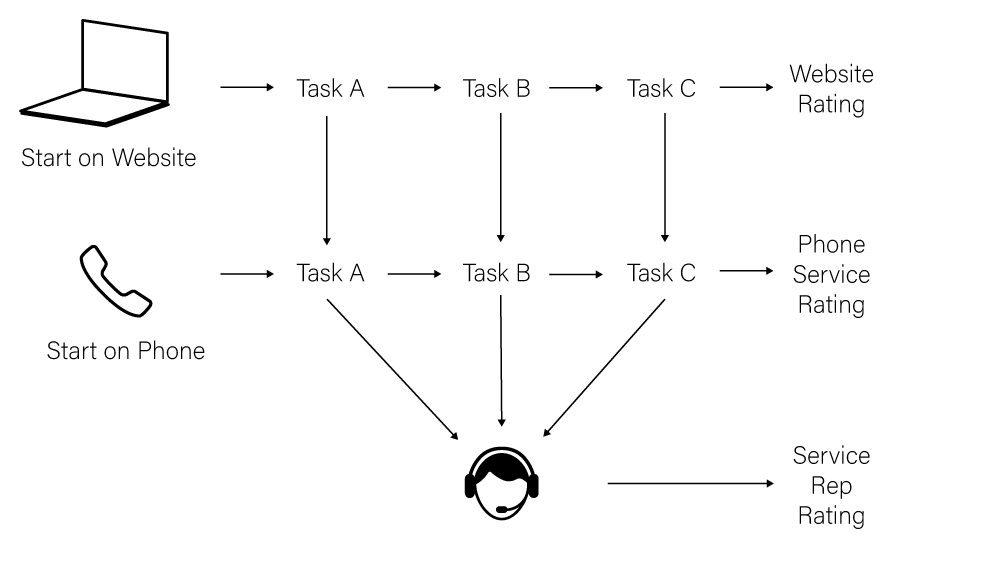
Before we start looking at the data, let’s talk a little about the study design that our data represents. We want to do an A/B test but we have multiple tasks that are all inter-related so we shouldn’t just A/B test all of them at the same time. There’s other arguments for not doing just straight A/B testing but fundamentally what we’re interested in for this example is whether a redesign across the service is going to improve user experience. (It’s also to make the analysis more fun, because a true A/B test is really simple to assess). AnyOrg wants to know whether redesigning tasks in general makes them easier to use, so we want to have a comparison across not just tasks but the number of tasks that we’ve redesigned. The design team is trying to show that we should be doing service design across the service, not just picking one or two sections to redesign piecemeal. We can’t (and shouldn’t) redesign Tasks A-Z just to test them but we can redesign and test each task and see whether redesigning more services makes the site generally easier to use. So to do this, we’ll randomly assign users to get the redesigned Tasks A, B, and C independently. We want to make sure that our sample randomly selects for the redesign in each task independent of the other tasks so that we get an accurate picture of each task as well as of the cumulative effect of our tasks. We also want to make sure that our sample has the same distribution of users who use the website versus the automated phone service as our population, so we’ll assign even users who don’t start on the website some of the redesigned service. We’ll assume that we’re getting an adequate sample size (and since it’s a fake study, we’ll have 10,000 users). There’s a few factors that we want to capture here:
- How long does it take each user to do each task?
- How likely is the user to transfer from the website to our automated phone service?
- Does the user use the new redesigned Help feature in each task?
- For whatever path they take to completing all the tasks (website, automated phone, or service rep), how would they rate their experience?
- Is there an effect to having a mixed website experience where a user sees some tasks in the old format and some tasks in the new format?
Now, generally speaking you want to keep your experimental design as clear as possible. Five questions is a lot of questions to ask and this might get muddy but with some curiosity and clear thinking and some clever causal inference, while we may not get the perfect answers for our data, we might get reasonable results and we’ll certainly have some excellent evidence for subsequent experiments that we might want to run.
We’re going to randomly assign our users to be assigned a redesigned Task A, B, or C, or any combination therein. Also, and this is important for reasons that you’ll see later, we’re also going to toss any users that don’t leave a rating with their experience, be that through the website, phone service, or representative. We’ll track how long it takes them to do each of those tasks, whether they transfer from the website to the phone service or phone service to a representative, whether they used the newly redesigned help menus, and whether they had previously used the website or phone service.
Ok, so let’s take a look at the data that we get back from our pretend AnyOrg experiment.
https://medium.com/media/67cab551a36d4568970d42ca4b25ab87/href
So that’s what’s in the data, and here’s the data itself. The notebook written in R to run to create all of the figures and the equations lives at first_notebook.Rmd. Ok, off we go!
Analysis
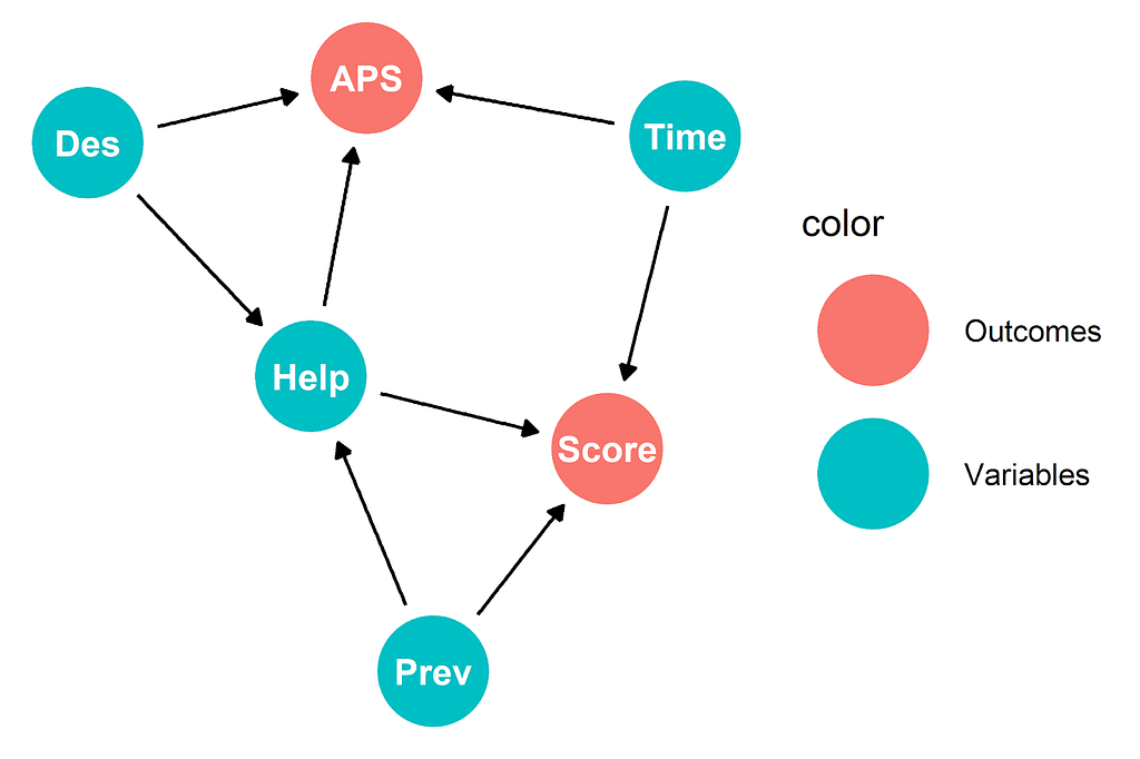
The main metric that AnyOrg has used up to this point is time to complete a task. Typically we use a Directed Acyclic Graph to represent causal relationships. The most basic way to represent our causal relationships looks like this:
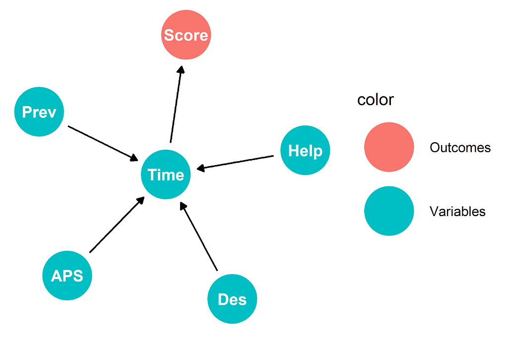
Score is our satisfaction score, Time is how long the tasks take, Prev is whether the user was a previous website user, Help is how many times they used help, APS is whether they transfer to the phone service, Des is how many redesigns they see. We could call this the “all that matters is time” model. Our effects cause the length of time it takes a user to do the tasks and the length of time causes them to change their satisfaction rating. Simple and elegant, but is it true? Do more redesigns help people do tasks faster?
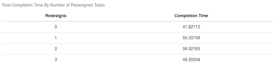
Well that’s not great, more redesigns does not equal completion times. Experiment failed? Well, not quite yet. An important part of causal inference is thinking about why things are happening and looking for proof that those causes are real and valid. We’ve redesigned the interface. Does it make sense that it might take people longer to do something that they haven’t done before? Do more redesigns help people do tasks faster if they haven’t done them before?
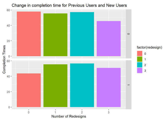
So we can see that while more redesigns doesn’t help users who’ve previously used the website, it does help users who have never used the website. It also helps make the case that all tasks redesigned is better than just some tasks redesigned. This is helping us zero in on how we might make the argument that our designs did in fact cause something. It’s important to look for heterogeneity in your population that can help uncover causal effects. In this case, people who already knew how to use the website were probably a little more confused than people who had never seen it before. In fact, the fastest group is previous users with no redesigns. When we look at previous website users who got all 3 redesigns, they seem to do about the same as our users who’ve never seen the website before. So why are previous website users so much faster overall?
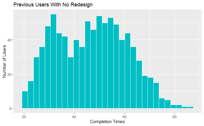
It looks as though some of them have just gotten very efficient at using the previous version of the site. What about when we look at how having 3 redesigned tasks is different for previous users and new users?
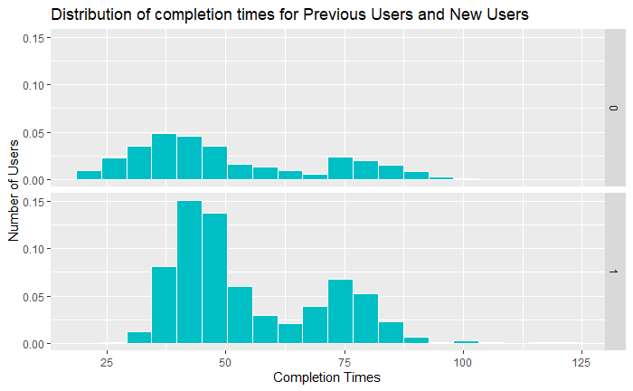
Still bimodal, but this should give us a little bit of confidence that with a new system our new users and experienced users aren’t all that different. New users are no longer significantly slower overall than previous users.
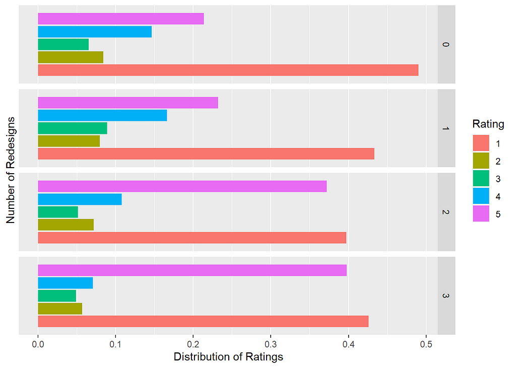
Now onto another weird feature of our dataset, which is that our data only includes users who leave a review. The problem should be obvious: not everyone leaves a review and the folks who do leave reviews tend to be those who are most fired up about their experience either for the good or for the bad. When we look at the distribution of our reviews, they’re also bimodal:
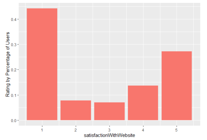
So it certainly seems as though people don’t like the website all that much. Doesn’t look great if we don’t account for the heterogeneity in our population, but what happens if we do?
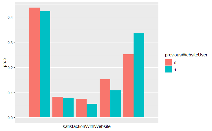
So we see something of a difference between our previous users and our current users. Let’s make sure that they’re statistically significant with a Kolmogorov-Smirnov test:
ks.test(df[df$previousWebsiteUser == 1,]$satisfactionWithWebsite, df[df$previousWebsiteUser == 0,]$satisfactionWithWebsite)
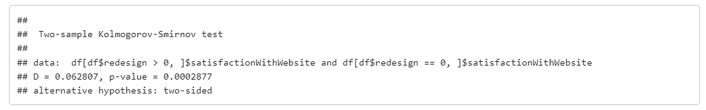
So it certainly seems as though our previous users are less harsh reviewers than our new users, we might want to guess at reasons for this but more important than our guesses, we have some real heterogeneity between people who have used the website before and those who haven’t and people who got more redesigns than people who didn’t.
Let’s see how our number of redesigns affects our overall ratings for users who finished everything on the website:
Again, not exactly a resounding endorsement, but it does show that perhaps there’s a correlation in the number of redesigns and how users rate the website overall. Again, remember that the data here is showing something that users have to do, not something they want to do. Their feelings, like those many of us have when we’re battling through filing out taxes, aren’t exactly warm. But making these tasks better designed does seem to make more people like them, even if it is begrudgingly.
So we’re seeing one of our metrics disagree with another: completion time seems to be better with the original website, particularly with previous users but the satisfaction rating seems to be better with the redesign. This is where the art side of analysis comes in: how do we think about what’s important to our users? How do we measure what’s important to them and how can we think about what our experiment tells us?
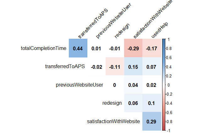
So let’s look at a correlation matrix. There’s a few things that look great but are just a function of how our data or our system is structured. For instance, transferring to the phone system slows down total completion times and since total completion time is longer for people who use the phone system, that completion time now correlates with a -1 or no rating for the satisfactionWithWebsite. But there are some interesting things we see: the redesign doesn’t seem to affect total completion time significantly. It does seem to affect how likely users are to use the help and that significantly reduces the completion time and the satisfaction with the website.
Using help seems much more strongly correlated with completion times and satisfaction than redesigns but do users use the help more in the redesign?
mean(df[redesign > 0]$usedHelp) - mean(df[redesign == 0]$usedHelp)
This gives us back:
0.1462112
Might this be a sign that we should update our causal diagram to something a little more complex?
We could call this the “it’s complicated model”. We might want to argue that in searching for this elusive “ease of use” we’re better off looking at whether people rate the website higher or transfer to the phone system than looking at the time to complete the tasks. Is that entirely true? This isn’t a simple question to answer because there’s many reasons that people might rate the website higher or lower or reasons that people might jump to the phone service that we can’t capture. In econometrics this is referred to as a confounder. In causal analysis we call this a confounder affecting our effects a backdoor. Whichever you call it, there’s something (or lots of somethings) unobserved that affects our outcomes. But I’m going to argue that in this case (but certainly not in all cases) we have enough samples that we can assume that one person switching to the phone service because their laptop died and another leaving a great review because they hit the wrong button are outweighed by enough other people doing those things for reasons that were caused by the website itself.
Nick Huntington-Klein refers to this as Causal Identification: the process of examining the statistics that seem to have the most effect in order to understand the causal mechanisms there. Or, as Andrew Gelman and Guido Imbens put it:
The statistical and econometrics literature on causality is more focused on “effects of causes” than on “causes of effects.” The search for causes can be understood within traditional statistical frameworks as a part of model checking and hypothesis generation…it can make sense to ask questions about the causes of effects, but the answers to these questions will be in terms of effects of causes.
You do want to proceed cautiously with this kind of causal identification, or “cause of effect” because it can easily turn into a fishing expedition rife with p-hacking, confounders, backdoors, and Type 1 errors. But this is also how we go from the blunt instrument of a A/B test to a more sophisticated kind of analysis that allows us to look at things like “ease of use”, even when we can’t directly measure it.
Estimating a treatment effect
So, what does the redesign in fact cause? Since we ran an experiment, we have a treatment effect that we can measure. In fact, we’ve got two: an Average Treatment Effect and a Conditional Average Treatment Effect and they’re especially important in our case because they’re going to let us see some important features of our design changes. The CATE is the treatment effect in a subgroup of the population. In our case that’s going to be the people who have used the website before (e.g. previousWebsiteUser = 1), and those who haven’t used the website before. Remember that they had some key differences in how likely they were to use the help and how the redesigns changed their completion times. The ATE is the treatment effect in the population at large. Since our populations are different, the CATE will not equal ATE. Let’s look at our treatment versus control groups for each population:
mean(df[redesign > 0 & previousWebsiteUser == 1,]$satisfactionWithWebsite) — mean(df[redesign == 0 & previousWebsiteUser == 1,]$satisfactionWithWebsite)
mean(df[redesign > 0 & previousWebsiteUser == 0,]$satisfactionWithWebsite) — mean(df[redesign == 0 & previousWebsiteUser == 0,]$satisfactionWithWebsite)
This gives us:
[1] 0.4250136
[1] 0.08822554
So yes! We do have an effect. For our previous users, using the redesign has them reporting 0.42 points higher satisfaction. Perhaps more importantly, for our new users, using the redesign has them reporting 0.08 points higher satisfaction. What about how often users transfer to the phone system?
pmean(df[redesign > 0 & previousWebsiteUser == 1,]$transferredToAPS)
   — mean(df[redesign == 0 & previousWebsiteUser == 1,]$transferredToAPS)
mean(df[redesign > 0 & previousWebsiteUser == 0,]$transferredToAPS)
   — mean(df[redesign == 0 & previousWebsiteUser == 0,]$transferredToAPS)
This gives us:
[1] -0.1201038
[1] -0.03188731
This means that with redesigns, previous users transfer 12% less than with no redesigns, while new users transfer 3% less. Improvements!
But wait, that’s not really telling us the whole story, because we hypothesized that the number of redesigns affects the satisfaction through the number of times a user used help. Let’s take a look at some simple linear models to see if we can get some better understanding for what might be going on:
satisfactionModel <-
   lm( satisfactionWithWebsite ~ usedHelp + redesign + as.factor(previousWebsiteUser),
       df[satisfactionWithWebsite > 0,] ) # only users who rated
So this gives us a model with some solid looking p-values but a very weak r-squared.
Call:
lm(formula = satisfactionWithWebsite ~ usedHelp + redesign +
    as.factor(previousWebsiteUser), data = df[satisfactionWithWebsite >
    0, ])
Residuals:
    Min      1Q  Median      3Q     Max
-2.8059 -1.6803 -0.3856  1.7836  2.7285
Coefficients:
                                Estimate Std. Error t value Pr(>|t|)
(Intercept)                      2.27155    0.04877  46.579  < 2e-16 ***
usedHelp                         0.29473    0.02479  11.889  < 2e-16 ***
redesign                         0.17870    0.02168   8.241  < 2e-16 ***
as.factor(previousWebsiteUser)1  0.11403    0.04079   2.796  0.00519 **
---
Signif. codes:  0 ‘***’ 0.001 ‘**’ 0.01 ‘*’ 0.05 ‘.’ 0.1 ‘ ’ 1
Residual standard error: 1.734 on 8463 degrees of freedom
Multiple R-squared:  0.02816, Adjusted R-squared:  0.02782
F-statistic: 81.74 on 3 and 8463 DF,  p-value: < 2.2e-16
Our best guess at this point is that, for our website satisfaction, each time someone accesses the help it causes an increase of 0.29, each redesign causes an increase of 0.18, and being a previous website user causes an increase of 0.11. Those guesses aren’t great yet though because our data doesn’t fit a line particularly well. Our confidence intervals look a little better:
                                2.5 %      97.5 %
(Intercept)                     2.17595714 2.3671488
usedHelp                        0.24613543 0.3433209
redesign                        0.13619073 0.2212027
as.factor(previousWebsiteUser)1 0.03407817 0.1939814
Why so wonky? Well, remember that our satisfaction data is bimodal, that is, it has two peaks. The ratings have a spike at 1 and at 5 and trough in the middle. That’s not a recipe for a particularly good linear model. If we want to know how our variables interact with our measurable outcomes and how those things we can measure interact with things we can’t measure, we’re going to need to get more clever.
What about our users transferring to the phone service? We think that having redesigns, using help, and being a previous website user all affect whether someone will transfer:
transferModelLM <- lm( transferredToAPS ~ redesign + usedHelp + as.factor(previousWebsiteUser), df[startedOnWebsite == 1,])
The R-squared is again pretty bad but at least the confidence intervals for the redesign is more narrow:
                                 2.5 %       97.5 %
(Intercept)                      0.41700568  0.467327100
redesign                        -0.07918999 -0.056814930
usedHelp                        -0.03050542 -0.004926305
as.factor(previousWebsiteUser)1 -0.05260927 -0.010522920
This isn’t great but it’s a little better than the satisfaction model. The redesigns and using help both seem reduce the likelihood that someone will transfer, but we’ve got some work to do. One problem here is that transferring isn’t really linear, it’s binary: you transfer, or you don’t. The way that we model this should reflect that.
This might seem like we’re ending on a downer but really we’re not: we set up a complex experiment, and it showed an effect! We’re just very curious, so we want to know more. But to wrap up this article and prime the next one: we’ve talked about why causal modeling matters in UX, what kinds of experiments we right run to test changes in UX, how we can do some initial explorations on our data, and how to look and see whether there’s an effect to our treatments. But we also ran into a wall: we don’t really know how much our treatments did because our data was non-normally distributed data. We also came up with a causal diagram that had the rating as one outcome and transferring to the phone service as another. In the next post in this series we’re going to dig into how to work with dependent variables that are binary, how to combine our satisfaction and transfer outcomes, and how to work with non-normally distributed data.
![]()
What does your design cause? was originally published in UX Collective on Medium, where people are continuing the conversation by highlighting and responding to this story.