In a previous tutorial, we learned how to create a CSS-only vertical organizational chart. Today, as some folks requested, we’ll go through the process of building its corresponding horizontal one.
And here’s the twist; we’ll create this new chart without changing a single line of markup from the original, we’ll only modify the styles.
Keep in mind, as the concept remains the same, we’ll be grabbing some parts from the other tutorial. Ready to test your CSS skills again?
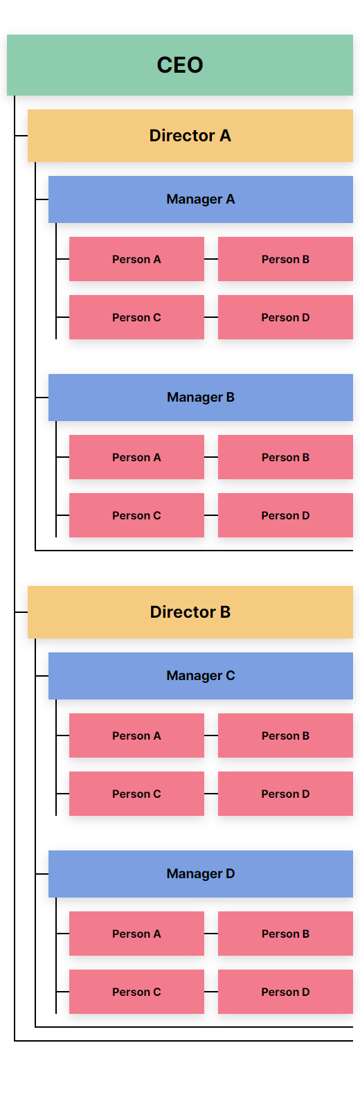
The Organizational Chart We’re Building
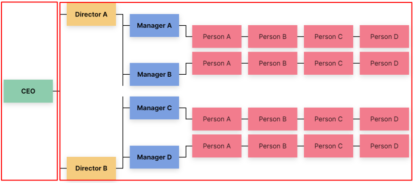
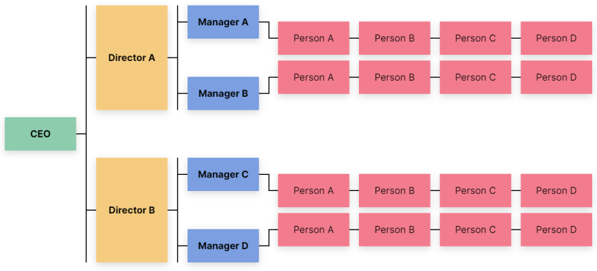
Here’s the CSS chart we’ll be creating:
On screens up to 1300px wide, the chart will appear in a vertical layout. On larger screens, its data will appear horizontally. Be sure to check this behavior by opening the demo on a large screen and resizing your browser window.
1. Specify the Container
Our chart will live inside a container:
<div class="container">
  <!-- Chart goes here -->
</div>
2. Define Some Basic Styles
Before examining its levels, we’ll set up a few reset rules and helper classes:
:root {
  --level-1: #8dccad;
  --level-2: #f5cc7f;
  --level-3: #7b9fe0;
  --level-4: #f27c8d;
  --black: black;
}

* {
  padding: 0;
  margin: 0;
  box-sizing: border-box;
}

ol {
  list-style: none;
}

body {
  margin: 50px 0 100px;
  text-align: center;
  font: 20px/1.5 "Inter", sans-serif;
}

h1,
h2,
h3,
h4 {
  font-size: inherit;
}

.container {
  max-width: 800px;
  padding: 0 10px;
  margin: 0 auto;
  display: grid;
  align-items: center;
  justify-content: center;
  grid-column-gap: 20px;
  grid-template-columns: auto auto;
}

.rectangle {
  position: relative;
  padding: 20px;
  width: 200px;
  box-shadow: 0 5px 15px rgba(0, 0, 0, 0.15);
}
Notice the rectangle class. We’ll append this to every node/element of our chart.
Additionally, keep an eye on the container styles. Thanks to CSS Grid, we can divide the chart into two parts. The first one will include the first level, while the second one all the others. Plus, we’ll give the container a maximum width that will affect only on smaller screens.
Note: for simplicity, I haven’t optimized the CSS. This will help you get a better understanding of the styles of each level.
3. Specify the Levels
At this point, we’ll have a closer look at the chart levels. As you might remember from the previous tutorial, we’ll have four of them:
Level #1
The first level will only include a single node:
HTML
To describe it, we’ll use an h1 tag as it’s the most important part of our chart:
<h1 class="level-1 rectangle">...</h1>
CSS
We’ll use its ::before pseudo-element to create a relationship between the first and second levels:
/*CUSTOM VARIABLES HERE*/

.level-1 {
  background: var(--level-1);
}

.level-1::before {
  content: "";
  position: absolute;
  top: 50%;
  left: 100%;
  transform: translateY(-50%);
  width: 20px;
  height: 2px;
  background: var(--black);
}
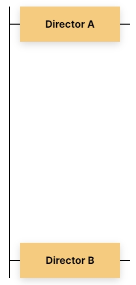
Level #2
The second level will consist of two nodes:
HTML
To describe it, we’ll use an ordered list with two list items. Each list item will contain an h2 element:
<ol class="level-2-wrapper">
  <li>
    <h2 class="level-2 rectangle">...</h2>
  </li>
  <li>
    <h2 class="level-2 rectangle">...</h2>
  </li>
</ol>
CSS
Each list item will act as a grid container that will contain two columns. We’ll position the contents of its first one on the top edge of the column axis, while the contents of its last one on the bottom edge of the column axis.
We’ll also define the ::before and ::after pseudo-elements of the h2 elements. Their job will be to create the associations between the adjacent levels:
/*CUSTOM VARIABLES HERE*/

.level-2-wrapper {
  position: relative;
  padding-left: 20px;
  border-left: 2px solid var(--black);
}

.level-2-wrapper::before {
  display: none;
  content: "";
  position: absolute;
  top: -20px;
  left: 10px;
  width: 2px;
  height: calc(100% + 40px);
  background: var(--black);
}

.level-2-wrapper::after {
  display: none;
  content: "";
  position: absolute;
  left: 10px;
  bottom: -20px;
  width: calc(100% - 10px);
  height: 2px;
  background: var(--black);
}

.level-2-wrapper > li {
  position: relative;
  display: grid;
  align-items: flex-start;
  grid-column-gap: 20px;
  grid-template-columns: auto auto;
}

.level-2-wrapper > li:last-child {
  margin-top: 100px;
  align-items: flex-end;
}

.level-2 {
  background: var(--level-2);
}

.level-2::before {
  content: "";
  position: absolute;
  top: 50%;
  right: 100%;
  transform: translateY(-50%);
  width: 20px;
  height: 2px;
  background: var(--black);
}

.level-2::after {
  content: "";
  position: absolute;
  top: 50%;
  left: 100%;
  transform: translateY(-50%);
  width: 20px;
  height: 2px;
  background: var(--black);
}
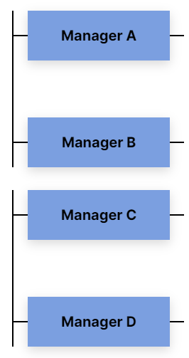
Level #3
The third level will include four nodes.
We’ll associate the first two nodes with the first node of the second level, while the last two with its second node:
HTML
Still, inside the initial list where the second level lives, we’ll define two new lists. Each one of them will contain two list items. For each item will specify an h3 element:
<ol class="level-2-wrapper">
  <li>
    ...
    <ol class="level-3-wrapper">
      <li>
        <h3 class="level-3 rectangle">...</h3>
      </li>
      <li>
        <h3 class="level-3 rectangle">...</h3>
      </li>
    </ol>
  </li>
  <li>
    ...
    <ol class="level-3-wrapper">
      <li>
        <h3 class="level-3 rectangle">...</h3>
      </li>
      <li>
        <h3 class="level-3 rectangle">...</h3>
      </li>
    </ol>
  </li>
</ol>
CSS
Similarly to the previous level, we’ll consider each list item as a grid container and split it into two columns.
In the same way, we’ll set the ::before and ::after pseudo-elements of the h3 elements for creating the required connections:
/*CUSTOM VARIABLES HERE*/

.level-3-wrapper {
  position: relative;
  top: 34px;
  padding-left: 20px;
  border-left: 2px solid var(--black);
}

.level-3-wrapper::before {
  display: none;
  content: "";
  position: absolute;
  top: 0;
  left: 10px;
  width: 2px;
  height: 100%;
  background: var(--black);
}

.level-3-wrapper::after {
  display: none;
  content: "";
  position: absolute;
  left: 10px;
  bottom: 0px;
  width: calc(100% - 10px);
  height: 2px;
  background: var(--black);
}

.level-3-wrapper > li {
  display: grid;
  grid-column-gap: 20px;
  grid-template-columns: auto auto;
}

.level-3-wrapper > li:last-child {
  margin-top: 80px;
}

.level-2-wrapper > li:last-child .level-3-wrapper {
  top: -34px;
}

.level-3 {
  background: var(--level-3);
}

.level-3::before {
  content: "";
  position: absolute;
  top: 50%;
  right: 100%;
  transform: translateY(-50%);
  width: 20px;
  height: 2px;
  background: var(--black);
}

.level-3::after {
  content: "";
  position: absolute;
  top: 50%;
  left: 100%;
  transform: translateY(-50%);
  width: 20px;
  height: 2px;
  background: var(--black);
}
Note: if your text nodes span onto a separate line, you have to change the following hardcoded values: top: 34px and top: -34px.
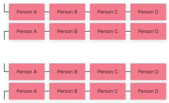
Level #4
We’ll need sixteen nodes for the fourth level. These will equally be distributed into four lists.
Each third-level node will include one list:
HTML
Still, inside the initial list where the second level lives, we’ll define four new lists. Each one of them will contain four list items. For each item we’ll specify an h4 element:
<ol class="level-2-wrapper">
  <li>
    ...
    <ol class="level-3-wrapper">
      <li>
        ...
        <ol class="level-4-wrapper">
          <li>
            <h4 class="level-4 rectangle">...</h4>
          </li>
          ...
        </ol>
      </li>
      <li>
        ...
        <ol class="level-4-wrapper">
          <li>
            <h4 class="level-4 rectangle">...</h4>
          </li>
          ...
        </ol>
      </li>
    </ol>
  </li>
</ol>
CSS
Once again, we’ll do the same actions. Firstly, we’ll use the CSS Grid to create the layout for the fourth-level nodes. Then, we’ll specify the required pseudo-element of target elements for establishing the connections:
/*CUSTOM VARIABLES HERE*/

.level-4-wrapper {
  position: relative;
  top: 34px;
  display: grid;
  grid-template-columns: repeat(4, 1fr);
  grid-column-gap: 20px;
  padding-left: 20px;
}

.level-4-wrapper::before {
  content: "";
  position: absolute;
  top: 0;
  left: 0;
  width: 2px;
  height: 50%;
  background: var(--black);
}

.level-3-wrapper > li:last-child .level-4-wrapper {
  top: -34px;
}

.level-3-wrapper > li:last-child .level-4-wrapper::before {
  top: auto;
  bottom: 0;
}

.level-4 {
  background: var(--level-4);
}

.level-4::before {
  content: "";
  position: absolute;
  top: 50%;
  right: 100%;
  transform: translateY(-50%);
  width: 20px;
  height: 2px;
  background: var(--black);
}
Note: if your text nodes span on a separate line, you have to change the top: 34px and top: -34px hardcoded values.
4. Going Responsive
As you have already guessed, we follow a desktop-first approach for our styles. Generally speaking, I prefer building for large screens first and then going down to smaller, less complicated ones.
On screens between 1301px and 1650px, the chart will still be in horizontal mode, yet its nodes will have a smaller width (200px instead of 150px).
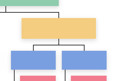
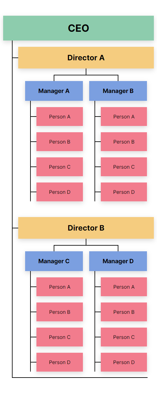
On screens up to 1300px wide, all chart nodes will appear vertically, like this:
Unlike the horizontal layout, here the width and typography of the text nodes differ depending on their level. The higher the level, the larger the width and typography.
Of course, feel free to change these breakpoints depending on your content.
It’s worth noting that this design is slightly different compared to the responsive layout of the vertical chart:
In case you’re wondering, there isn’t any specific purpose behind this new implementation. I just wanted to show you two different responsive layouts. Feel free to use any of these in your pages.
Here are the responsive styles:
@media screen and (max-width: 1650px) {
  .rectangle {
    width: 150px;
  }
}

@media screen and (max-width: 1300px) {
  body {
    font-size: 16px;
  }

  h1,
  h2,
  h3,
  h4 {
    font-size: revert;
  }

  .rectangle {
    padding: 20px 10px;
    width: auto;
  }

  .container {
    display: block;
  }

  .level-1 {
    margin-bottom: 20px;
  }

  .level-1::before,
  .level-2::after,
  .level-3::after {
    display: none;
  }

  .level-2-wrapper::before,
  .level-2-wrapper::after,
  .level-3-wrapper::before,
  .level-3-wrapper::after,
  .level-2-wrapper > li,
  .level-3-wrapper > li {
    display: block;
  }

  .level-2-wrapper {
    padding-left: 30px;
    border-left: none;
  }

  .level-2-wrapper > li:last-child {
    margin-top: 50px;
  }

  .level-2-wrapper > li:last-child .level-3-wrapper,
  .level-3-wrapper > li:last-child .level-4-wrapper,
  .level-3-wrapper,
  .level-4-wrapper {
    top: 0;
  }

  .level-3-wrapper {
    padding: 20px 0 20px 30px;
    border-left: none;
  }

  .level-3-wrapper > li:last-child {
    margin-top: 50px;
  }

  .level-4-wrapper {
    padding: 20px 0 0 30px;
    grid-template-columns: repeat(2, 1fr);
  }

  .level-4-wrapper > li:first-child {
    margin-bottom: 20px;
  }

  .level-4-wrapper::before {
    left: 10px;
    height: 100%;
  }
}
The Revert Keyword
From the styles above, keep an eye especially on the new revert CSS keyword that we apply to the headings. That will help us restore their default browser styles. Merrily enough, its browser support is growing every day.
Conclusion
That’s all for today, folks! At this point, you have everything you need to build your own CSS-only organizational charts.
Indeed, in a real scenario, you might prefer to use a powerful JavaScript library like Highcharts.js for creating such a chart. However, pushing the limits of CSS without ignoring its limitations is always a great way to learn and expand your knowledge. Moreover, with the combination of tools/features like the CSS Grid and pseudo-elements you can accomplish really neat things.
Let’s remind ourselves of what we built:
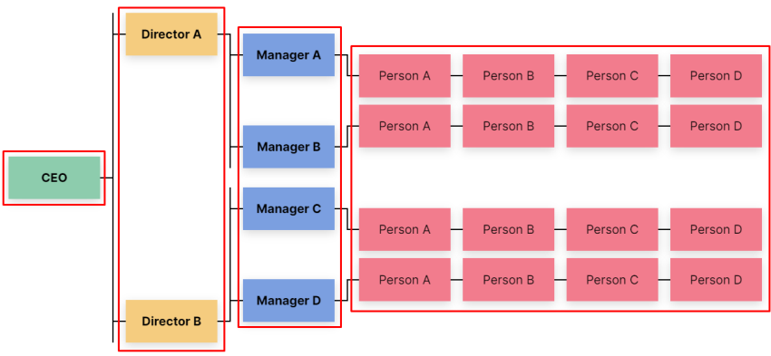
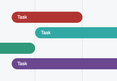
Go ahead, fork the demo and get your hands dirty. Don’t be afraid to destroy and experiment with it. You can achieve different variations without putting in too much effort. For example, here’s another quick alternative for desktop screens:
Last but not least, here at Tuts+ there are a lot of detailed tutorials showing how to implement different kinds of CSS charts (sometimes with JavaScript). Be sure to have a look, and as always, thanks a lot for reading!
 CSS ChartsHow to Build a Simple Gantt Chart With CSS and JavaScript
-
CSSHow to Build an Animated CSS Thermometer Chart
-
CSSBuild a Static Portfolio With Advanced CSS Bar Chart
-
CSSCSS Charts: How to Create an Organizational Chart
-
CSSHow to Build a Static Portfolio Page With CSS & JavaScript
-
CSSHow to Build a Semi-Circle Donut Chart With CSS
