
Color is often used to evoke emotions and emphasis. That’s one of the reasons why designers see color as an important element in their work. Colors communicate messages on both psychological and visual level. The importance of color is undeniable, but is basing the message solely on color the right thing to do? This post is a humble attempt to answer that question and explain the reasoning behind my opinion.
This may be obvious, but everyone is different. Intellectually and physically, we all have different abilities. And, if we are different from what is considered “the norm”, does that mean that we should be excluded from the experience that all others are having? Not at any level! We need to think inclusively when it comes to designing experiences. I am not saying that you cannot or should not use color, but rather that color should be used along with other ways of conveying the information.
Some Background on Color Perception and Color Blindness
Many people have difficulty identifying or seeing colors. In fact, statistics prove that men are more prone to be color blind than women and that one in twelve men are color blind. Now, for everyone’s benefit, color blindness is not the inability to see colors, but more to differentiate between colors. For instance, color blind people may see the world in browns or yellows. This is an important reason why we should not rely on colors alone to convey information.
Three Common Mistakes: Who gets affected?
When we use only color to convey important information, it affects people who are color blind, visually impaired and, to some extent, elderly users. In the image below, we assume that everyone can see that carrots are orange and beans are green. But to a person without color blindness, everything may be green—all beans. This would result in a very different recipe! Providing the information conveyed with color through other means such as text or descriptions on the page, ensures users who cannot see color can still perceive the information.

What are the most common mistakes that we make?
We commonly use color only in graphs and charts to differentiate between data points, but there are other examples. Let’s look at some of these examples.
Mistake 1 – Graphs and charts
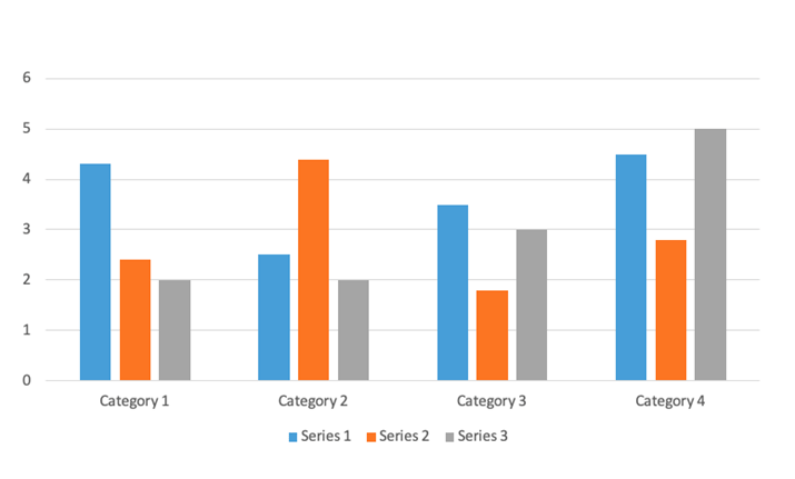
It’s very common to use different colors to differentiate between segments of data. A legend would explain the colors and what they represent under the graph or chart, but the only way to correlate the data series to the values in the graph is through color. No visual text alternative is available. Even if a text alternative for the image is available programmatically, that is useful only for visually impaired users, not for sighted color blind users.
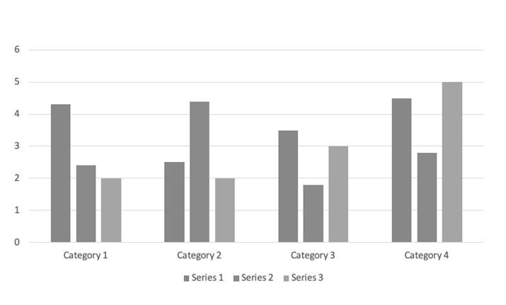
In the first image below, blue, gray and orange color bars are used to convey the three data segments, and the differences would be clear to most people. But people with color blindness might see the second image with the bars in shades of gray, making it impossible to understand the data.
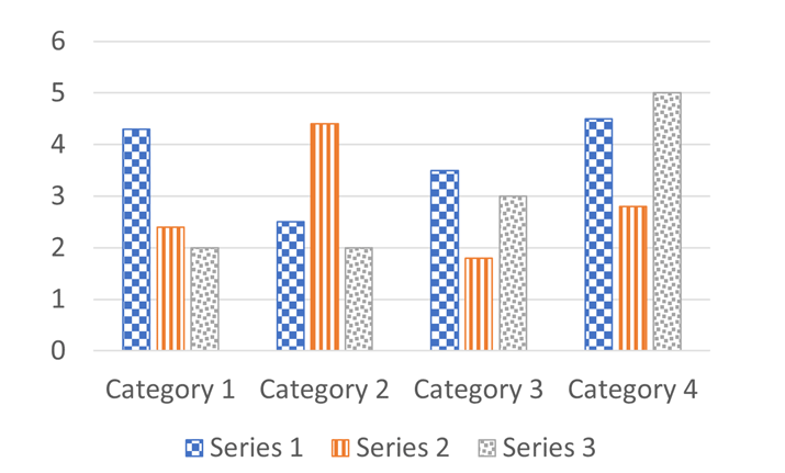
Does this mean that we cannot use colors at all? No! It means that we have to provide alternative means of conveying information. One way is by providing a textual alternative via a table or a complete description of the chart. Another way is to use patterns to convey the series. Pattern usage is shown in fig 4 where both color blind and non-color-blind users can consume the information due to the use of patterns in the chart.
Mistake 2 – Errors being conveyed using color
Another common scenario is when errors are identified on a page. Any page that has form fields is enabled with a validation mechanism to see if the form field input has the information to meet the form’s requirements. When that doesn’t happen, the form fields must display the errors so that the user is given the context and information to correct the error and submit the form.
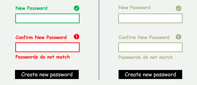
I often come across scenarios where errors are identified either via “fields in error are marked in red” or just red borders around the form fields with errors and green borders around those that are validated successfully. In the below example, you see that a sighted person without color blindness will be able to identify that the “Email” field has an error, where a color blind user will see all the form fields highlighted in the same color and so, will not be able to identify the field with the error.

An easy fix to this would be to describe the error in words right below the form field as an “inline” error message. A better way to fix it is to provide the error message and an icon representing the error or success state of each form field as illustrated below.
Mistake 3 – Links being identified using color alone
Another scenario that we often encounter is identifying links within paragraphs using color alone with no other visual indication. Now, users without color blindness can identify the different colors and their meaning as in example one below. But for a person who cannot differentiate the colors, the link is completely invisible, as in the example two:


A good way to address this is to increase the font size along with color and/or to underline the link so it is clear that it has a functionality associated with it. Another option would be to change the font style and size.
Conclusion
We see all of these scenarios far too often on web pages. And this is nowhere near a comprehensive list, just the most common. The good news is that all of the fixes described here are fast and easy. As content authors and designers, we must provide other ways to convey the meaning of content in addition to color to ensure that we enable our entire audience. Understanding the pain of the many people who cannot differentiate colors will give us the needed empathy to make conscious decisions around color use and implement alternatives.