In this tutorial, you’ll learn how to create a CSS-only theme switcher by taking advantage of the “CSS checkbox hack technique” and CSS variables.
Ready for another CSS challenge?
Note: This tutorial assumes that you’re familiar with this particular CSS technique along with advanced CSS selectors (e.g. general sibling combinator). If you haven’t heard of these before, or need a refresher, check out the resources at the end of this tutorial.
Our CSS Theme Switcher
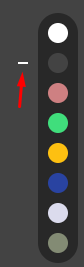
Here’s the theme switcher that we’re going to create during this tutorial:
Click on any of the colors at the top right corner to see how the page appearance changes. You can also use the arrow keys of your keyboard to switch color schemes.
1. Begin With the HTML Markup
We’ll start with eight radio buttons that will represent the available theme colors. By default, the first radio button will be checked.
Then, we’ll define a wrapper element that will control the page colors. Inside it, we’ll place:
- The associated labels for these radio buttons and
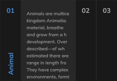
- the page’s main content. This page will present a few things about 🐧🐧.
Here’s the page structure:
<input type="radio" id="white" name="colors" value="white" checked>
<input type="radio" id="dark" name="colors" value="dark">
<input type="radio" id="red" name="colors" value="red">
<input type="radio" id="green" name="colors" value="green">
<input type="radio" id="yellow" name="colors" value="yellow">
<input type="radio" id="blue" name="colors" value="blue">
<input type="radio" id="purple" name="colors" value="purple">
<input type="radio" id="olive" name="colors" value="olive">

<div class="page-wrapper">
  <div class="color-palette">
    <label for="white"></label>
    <label for="dark"></label>
    <label for="red"></label>
    <label for="green"></label>
    <label for="yellow"></label>
    <label for="blue"></label>
    <label for="purple"></label>
    <label for="olive"></label>
  </div>
  <article class="post">
    <div class="container">...</div>
  </article>
</div>
2. Define Some Basic Styles
As usual, we’ll continue with some common reset styles.
Most importantly, pay attention to the following things:
- We’ll use custom properties to define eight different color schemes. Each scheme will include two color definitions that will represent the page colors for a specific theme.
- We’ll visually hide the radio buttons by moving them off-screen. We’ll give them
position: fixedbecause, in the layout, the color palette should remain fixed as we scroll. Keep in mind, that if we give themposition: absolute, each time we click on a theme color, the browser will jump to the top of the page.
Here are the reset styles:
:root {
  /*WHITE*/
  --white-bg-color: #fff;
  --white-text-color: #000;

  /*DARK*/
  --dark-bg-color: #434343;
  --dark-text-color: #fff;

  /*RED*/
  --red-bg-color: #ce8082;
  --red-text-color: #020202;

  /*GREEN*/
  --green-bg-color: #40de7c;
  --green-text-color: #020202;

  /*YELLOW*/
  --yellow-bg-color: #fdc011;
  --yellow-text-color: #110d02;

  /*BLUE*/
  --blue-bg-color: #2943a1;
  --blue-text-color: #d4cbcd;

  /*PURPLE*/
  --purple-bg-color: #dbdbed;
  --purple-text-color: #29262e;

  /*OLIVE*/
  --olive-bg-color: #838b74;
  --olive-text-color: #f7f5e4;
}

* {
  padding: 0;
  margin: 0;
  box-sizing: border-box;
}

a {
  color: inherit;
}

img {
  max-width: 100%;
  height: auto;
}

[type="radio"] {
  position: fixed;
  left: -9999px;
}

label {
  cursor: pointer;
}

body {
  font: 300 20px / 1.5 "Ubuntu", sans-serif;
}
3. Set the Main Styles
Moving forward, we’ll set up the main styles.
Most importantly:
- As described above, the color palette will always stay in the top right corner as we scroll.
- Each label/theme color will look like a circle, and its color will depend on the value of the
*-bg-colorCSS variable of the related color scheme. - We’ll add a bit of transitioning when the page colors change.
Here are the crucial styles:
/*CUSTOM VARIABLES HERE*/

[id="white"] ~ .page-wrapper [for="white"] {
  background: var(--white-bg-color);
}

[id="dark"] ~ .page-wrapper [for="dark"] {
  background: var(--dark-bg-color);
}

[id="red"] ~ .page-wrapper [for="red"] {
  background: var(--red-bg-color);
}

[id="green"] ~ .page-wrapper [for="green"] {
  background: var(--green-bg-color);
}

[id="yellow"] ~ .page-wrapper [for="yellow"] {
  background: var(--yellow-bg-color);
}

[id="blue"] ~ .page-wrapper [for="blue"] {
  background: var(--blue-bg-color);
}

[id="purple"] ~ .page-wrapper [for="purple"] {
  background: var(--purple-bg-color);
}

[id="olive"] ~ .page-wrapper [for="olive"] {
  background: var(--olive-bg-color);
}

.page-wrapper {
  padding: 30px 0;
  transition: all 0.3s ease-in-out;
}

.color-palette {
  position: fixed;
  top: 30px;
  right: 15px;
  display: grid;
  grid-row-gap: 10px;
  padding: 10px;
  border-radius: 20px;
  background: rgba(0, 0, 0, 0.4);
}

.color-palette label {
  position: relative;
  width: 20px;
  height: 20px;
  border-radius: 50%;
}

.color-palette label::before {
  display: none;
  content: "";
  position: absolute;
  top: 50%;
  left: -30px;
  transform: translateY(-50%);
  width: 10px;
  height: 2px;
}
4. Checkbox Hack: Switch Between Themes
Now for the interesting part! Each time a label/theme color is clicked (i.e. becomes active), the following things will happen:
- The
::beforepseudo-element of the active label will appear. Additionally, its color will depend on the value of the*-text-colorCSS variable of the related color scheme.
- The page colors will smoothly change based on the active color scheme.
Here are the related styles:
/*CUSTOM VARIABLES HERE*/

[type="radio"]:checked ~ .page-wrapper label::before {
  display: block;
}

[id="white"]:checked ~ .page-wrapper {
  color: var(--white-text-color);
  background: var(--white-bg-color);
}

[id="white"]:checked ~ .page-wrapper [for="white"]::before {
  background: var(--white-text-color);
}

[id="dark"]:checked ~ .page-wrapper {
  color: var(--dark-text-color);
  background: var(--dark-bg-color);
}

[id="dark"]:checked ~ .page-wrapper [for="dark"]::before {
  background: var(--dark-text-color);
}

[id="red"]:checked ~ .page-wrapper {
  color: var(--red-text-color);
  background: var(--red-bg-color);
}

[id="red"]:checked ~ .page-wrapper [for="red"]::before {
  background: var(--red-text-color);
}

[id="green"]:checked ~ .page-wrapper {
  color: var(--green-text-color);
  background: var(--green-bg-color);
}

[id="green"]:checked ~ .page-wrapper [for="green"]::before {
  background: var(--green-text-color);
}

[id="yellow"]:checked ~ .page-wrapper {
  color: var(--yellow-text-color);
  background: var(--yellow-bg-color);
}

[id="yellow"]:checked ~ .page-wrapper [for="yellow"]::before {
  background: var(--yellow-text-color);
}

[id="blue"]:checked ~ .page-wrapper {
  color: var(--blue-text-color);
  background: var(--blue-bg-color);
}

[id="blue"]:checked ~ .page-wrapper [for="blue"]::before {
  background: var(--blue-text-color);
}

[id="purple"]:checked ~ .page-wrapper {
  color: var(--purple-text-color);
  background: var(--purple-bg-color);
}

[id="purple"]:checked ~ .page-wrapper [for="purple"]::before {
  background: var(--purple-text-color);
}

[id="olive"]:checked ~ .page-wrapper {
  color: var(--olive-text-color);
  background: var(--olive-bg-color);
}

[id="olive"]:checked ~ .page-wrapper [for="olive"]::before {
  background: var(--olive-text-color);
}
It might take you some time to understand how the aforementioned styles work. If this is the case, the browser inspector along with the other similar tutorials are your best friend!
Conclusion
That’s it, folks! In this short tutorial, we combined the power of the “CSS checkbox hack technique” and CSS variables to build a page with dynamic color themes. Hopefully, you enjoyed this exercise and you’ll try it in one of your upcoming projects.
Here’s a reminder of what we built:
If you also want to build a more advanced theme switch that persists the selected theme color on page load, be sure to read this tutorial.
Have you ever developed something similar with pure CSS for a project? Let us know via social media. As always, thanks for reading!
Further Reading
Check out these tutorials to learn more about things you can build with the CSS checkbox hack technique:
 CSS SelectorsHow to Build a Simple Toggle Switch Component With the CSS Checkbox Hack
-
CSS SelectorsHow to Build a Simple Slideshow With the CSS Checkbox Hack
-
CSS SelectorsHow to Build an Accordion Component With the CSS Checkbox Hack
-
CSSQuick Tip: How to Create an Off-Canvas Feedback Form With Pure CSS
-
CSS SelectorsHow to Build a Filtering Component in Pure CSS


