Have you ever worked with the UIkit front-end framework? Its current version at the time of writing is 3.9.4, and in the next few months, YOOtheme (the team behind it) plan to release v4.
This isn’t the first time I’ve written about UIkit; some years ago, while still at v2, I introduced you to its powerful features. Today I’ll cover a more specific topic; in this tutorial you’ll learn how to extend its super useful lightbox component by adding a dot navigation thanks to its dotnav component.
Our UIkit Lightbox Extension
Without further ado, here’s what we’ll be creating (click an image to reveal the lightbox):
Notice the dot navigation that sits at the top center position of the lightbox.

1. Include the Required Assets
As happens with any third-party framework or library, to use it we first have to install its required files.
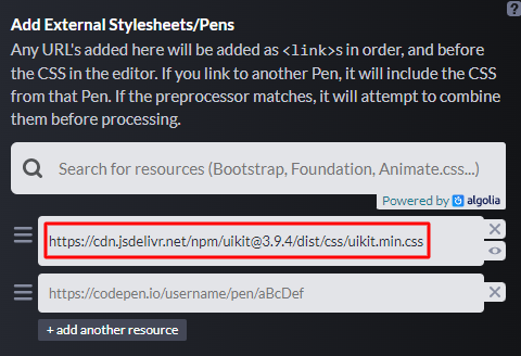
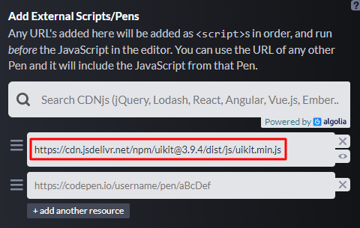
UIkit requires at least two files: a CSS and a JavaScript file. Optionally, you can include another JavaScript file if you want to use the UIkit icons.
With that in mind, if you look under the Settings tab of our demo pen, you’ll see that there’s one external CSS file and one external JavaScript file.


2. Create an Image Grid
To begin with, we’ll take advantage of UIkit’s grid system to build a simple image grid.


Let’s take some notes:
- The
articleelement will behave as the lightbox container. All links inside it will be lightbox links. Each one of them will have adata-captionand adata-altattribute. Their job will be to add a caption and analtattribute to the relevant lightbox image. - We’ll initialize the lightbox through JavaScript later.
- For images, we’ll use some Unsplash photos taken from a recent tutorial.
- We’ll lazy load the images thanks to the image component.
Here’s the required markup:
<article class="post">
  <div class="uk-container">
    <div class="uk-child-width-1-2@s" uk-grid>
      <div>
        <figure>
          <a href="http://webdesign.tutsplus.com/ireland1.jpg" data-caption="Ring of Kerry, County Kerry, Ireland" data-alt="Ring of Kerry, County Kerry, Ireland">
            <img width="1920" height="1280" data-src="http://webdesign.tutsplus.com/ireland1.jpg" alt="Ring of Kerry, County Kerry, Ireland" uk-img>
          </a>
        </figure>
      </div>
      <div>
        <figure>
          <a href="ireland2.jpg" data-caption="Fintown, Ireland" data-alt="Fintown, Ireland">
            <img width="1920" height="1280" data-src="ireland2.jpg" alt="Fintown, Ireland" uk-img>
          </a>
        </figure>
      </div>
      <div>
        <figure>
          <a href="ireland3.jpg" data-caption="Anne Street, Dublin, Ireland" data-alt="Anne Street, Dublin, Ireland">
            <img width="1920" height="1280" data-src="ireland3.jpg" alt="Anne Street, Dublin, Ireland" uk-img>
          </a>
        </figure>
      </div>
      <div>
        <figure>
          <a href="ireland4.jpg" data-caption="Doonagore Castle, Doolin, Ireland" data-alt="Doonagore Castle, Doolin, Ireland">
            <img width="1920" height="1280" data-src="ireland4.jpg" alt="Doonagore Castle, Doolin, Ireland" uk-img>
          </a>
        </figure>
      </div>
    </div>
  </div>
</article>
3. Create the UIkit Lightbox
Although there’s the option to activate a UIkit lightbox by adding the uk-lightbox attribute to the .post element, let’s do it through JavaScript as we want to call later its show() method:
const postLightbox = UIkit.lightbox(".post");
As you can see in the demo below, with just one line of code, we’ve managed to create a fully functional UIkit lightbox.
About UIkit Events
At this point we’re ready to go a step further and extend the lightbox as we wish. To achieve this task, we’ll use lightbox’s available custom events. Let’s make a short stop here and explain a few things.
UIkit uses a special syntax for capturing events as documented here that looks like this:
UIkit.util.on("#offcanvas", "show", function () {...});
In our case, the lightbox isn’t part of the initial DOM, so something like this won’t work:
UIkit.util.on(".uk-lightbox", "beforeshow", function () {...});
Instead, we should do this:
UIkit.util.on(document, "beforeshow", function (e) {...});

// or more specifically this
UIkit.util.on(document, "beforeshow", ".uk-lightbox", function (e) {...});
Notice that we take advantage of the event delegation and attach the event to the document element. Then, via the target property of the specific event, we’ll check the elements on which the event occurred.
We’ll see them in action now!
Create the Dot Navigation
As a first step, we have to create the dot navigation and append it to the lightbox. To do this, we’ll listen for the lightbox’s beforeshow event and perform the following actions:
- Build the dot navigation markup based on the number of lightbox items. Again, this markup will come from the dotnav component.
- Append the dot navigation to the lightbox and place it at the top center position via the
uk-position-top-centerutility class. - Add the
uk-lightutility class to the lightbox that will give a light (white) color to the dot indicators.
Here’s the required code:
UIkit.util.on(document, "beforeshow", function (e) {
  // 1
  const target = e.target;
  const lightboxItems = target.querySelectorAll(".uk-lightbox-items li").length;
  let markup = '<ul class="uk-dotnav">';
  for (let i = 0; i < lightboxItems; i++) {
    markup += '<li><a href=""></a></li>';
  }
  markup += "</ul>";
  // 2
  const dotNav = document.createElement("div");
  dotNav.setAttribute("class", "uk-position-top-center");
  dotNav.innerHTML = markup;
  target.appendChild(dotNav);
  // 3
  target.classList.add("uk-light");
});
Set the Active Dot Item
As a second step, we have to declare the active dot navigation item. To do this, we’ll listen for the lightbox’s itemshown event and perform the following actions:
- Remove the
uk-activeclass from the (pre-existing) active dot item, if there’s any. - Find the index of the current active lightbox item (image).
- Assign the
uk-activeclass to the dot item whose index matches the index of this lightbox item.
Here’s the required code:
const ukActiveClass = "uk-active";

UIkit.util.on(document, "itemshown", function (e) {
  const target = e.target;
  const dotNav = document.querySelector(".uk-dotnav");
  // 1
  const dotNavActiveItem = dotNav.querySelector("li.uk-active");
  if (dotNavActiveItem) {
    dotNavActiveItem.classList.remove(ukActiveClass);
  }
  // 2
  let index = [...target.parentElement.children].indexOf(target);
  // 3
  dotNav.querySelector(`li:nth-child(${++index})`).classList.add(ukActiveClass);
});
Click on Dot Links
Lastly, the dot links should reveal the corresponding lightbox item upon click. To do this, each time such a link is clicked, we’ll perform the following actions:
- Prevent its default action.
- Find its index.
- Show the associated lightbox item by using the available
show()method.
Here’s the required code:
document.addEventListener("click", function (e) {
  const target = e.target;
  if (target.tagName.toLowerCase() === "a" && target.closest(".uk-dotnav")) {
    // 1
    e.preventDefault();
    // 2
    const parentListItem = target.parentElement;
    const index = [...parentListItem.parentElement.children].indexOf(
      parentListItem
    );
    // 3
    postLightbox.show(index);
  }
});
Conclusion
That’s it, folks! Today we extended the functionality of a UIkit component by taking advantage of another existing one. Hopefully, if you are a UIkit lover, you might find some usefulness in this extension. For those who haven’t used UIkit in the past, I hope this little exercise has helped you get to know a small piece of its powerful features.
What I really like about this framework is that it’s easy to embed common UI elements in your sites/apps without having to install separate plugins for carousels, scroll animations, lightboxes, etc. More UIkit tutorials will follow shortly—stay tuned!
Lastly, if you have questions regarding any of the UIkit components, be sure to join the UIkit community on Discord.
Once again, here’s what we built:
As always, thanks a lot for reading!