In this video I’ll show you how Figma’s new and improved Auto Layout features make designing responsive components and layouts easier than ever!
Figma’s original Auto Layout features were introduced in December 2019–and now, almost a year later, Auto Layout has been completely reimagined, rebuilt and is (in my opinion) much better.
Watch the Video
What is Auto Layout?
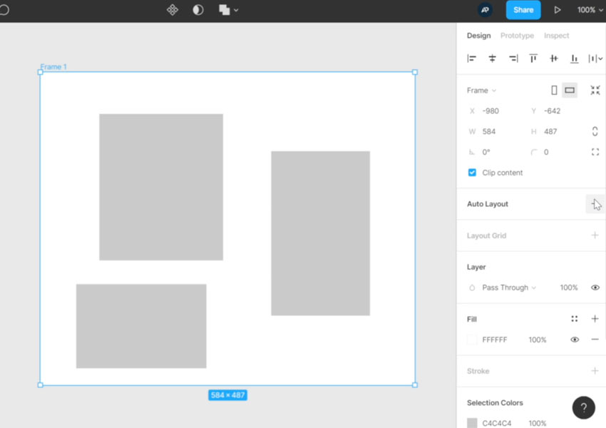
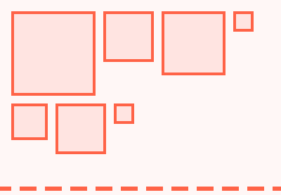
Figma’s Auto Layout allows you to create dynamic frames which adjust to their content. Here, for example, is a simple frame which contains some shapes:
By selecting the frame, then clicking the Auto Layout button in the sidebar, the shapes within the frame are arranged more efficiently and the frame itself adjusts in response to the area they occupy:
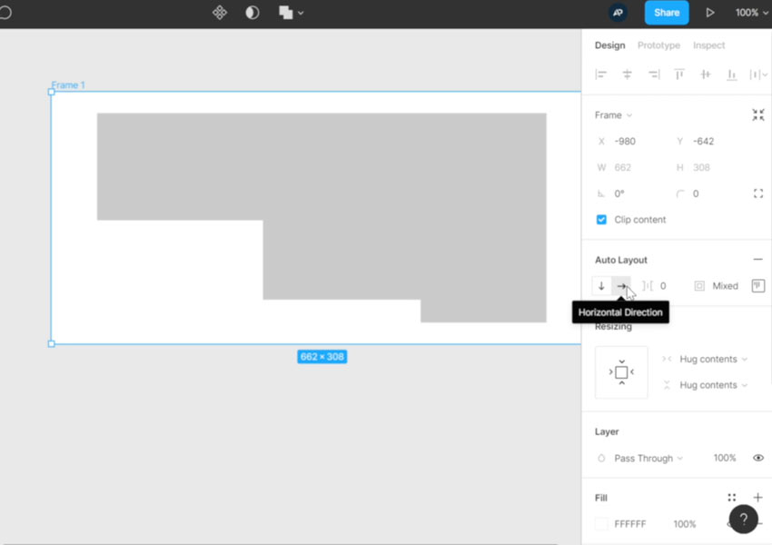
You’ll notice in the Auto Layout properties that we have Horizontal selected. This arranges the shapes horizontally within the frame. We can also choose Vertical and apply a number of other settings giving us great levels of control over alignment, distribution, and spacing.
This is a very basic demonstration, but with Auto Layout features we can create buttons which resize according to their content, or menus which do the same, even whole layouts which shift and adjust responsively. It’s without doubt my favorite feature within Figma.
New Auto Layout Features in Figma
As I mentioned earlier the concept of Auto Layout is nothing new to Figma, but this recent incarnation of it comes with plenty of new features. Check out the video above for complete demonstrations of these features—here’s a quick summary:
Padding
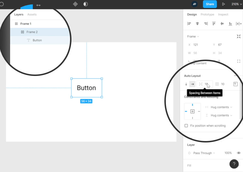
Imagine you create a text object for a button. You add the text to the workspace, then right-click > Auto Layout. Doing so immediately creates a frame around the text object (see the layers panel), applies a default 10px of padding between the items (we’ll get to this in a moment) and a default 10px of padding around the object (see the properties panel):
These values can be changed by entering different numbers. In the old version of Figma Auto Layout you could apply padding by specifying horizontal and vertical values, but in this new Auto Layout you can enter values for top, bottom, left, and right, all within the Alignment and Padding panel:
Resizing
We also have some exciting new options for resizing. For example, we can apply Auto Layout to a button (just like above) then in the Resizing properties we can apply Hug Contents both vertically, and horizontally. This makes the parent frame “hug” the button by resizing itself depending on how big the button is
Alternatively we can set this resize value to Fixed Width and Fixed Height. As you might expect, this allows you to enter a fixed value for the width and height of the button.
The last possible value here is Fill Container, which will make the button as wide or as tall as the available space in the parent container allows.
These three approaches to the sizing of objects, especially as you can use any combination you like on one object, allow total control when dealing with whole page and component layouts.
Alignment
The new Figma Auto Layout offers us some new alignment control too. In the old version of Auto Layout you would perform any alignment at the “child level”, ie. on the objects themselves. Now, you apply alignment properties to the parent container.
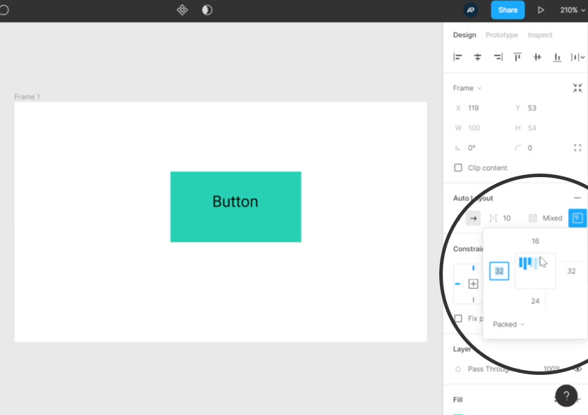
You can see the how alignment is impacting the child objects in the Alignment and Padding panel we looked at earlier:
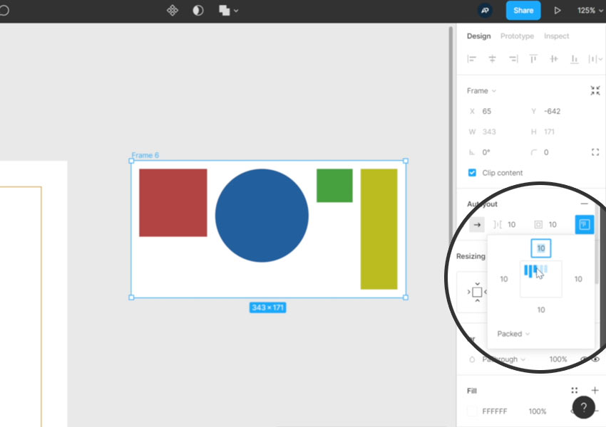
In the image above you can see that objects within this frame are aligned to the top left. The space between the items is specified in the Spacing Between Items box we saw earlier. You can also see that the mouse cursor is hovering above what would be top center alignment. You can click anywhere in this space to change the alignment visually.
Personally I quite liked the older version where I could align objects individually, but I can see how this approach makes sense. If you’ve ever looked at Flexbox and how it applies alignment in CSS, you’ll see common elements in its behavior.
The layout shown above used the Packed distribution, but there are other forms of distribution too. Space Between, for example, effectively distributes the objects across the whole width or height of the parent container (depending on the alignment direction), with equal space between each one.
Learn More About Figma Auto Layout
That completes this introduction to Figma’s new Auto Layout features! I created a course a short while ago explaining the “old” Auto Layout features in Figma in greater detail. The features have been completely rethought since then, but the principles and best practices I cover are still perfectly relevant. Check it out!
Useful Resources and Figma Tutorials
 Figma20 Figma UI Kits for Designers
-
FigmaHow to Turbocharge Your Components with Figma Variants
-
FigmaCreating a Figma Design System: Typography, Spacing, and Sizing
-
Figma4 Ways to Resize Elements in Figma
-
FigmaHow to Create a Medical Website Design in Figma


