Alignment is probably the most confusing aspect of flexbox. The flexbox layout module has a handful of alignment properties that behave differently under different circumstances, and when using them you might not necessarily understand what is happening or why.
However, if you know what to pay attention to, alignment is less complicated than it first appears. This tutorial will help you understand flexbox alignment perfectly.
This Flexbox Guide
In this guide to flexbox we’ll cover the following things:
- Video Explainer: Flexbox Alignment
- A Tale of Two Axes (How to use the main and cross axes in flexbox)
- Begin by Defining the Main Axis
- Flexbox Alignment Properties
- Alignment Along the Main Axis
- Alignment Along the Cross Axis
Explainer: Flexbox Alignment
Check out this video explainer if you prefer things to be visual; read on for the written version below!
A Tale of Two Axes
When using flexbox we work with two axes: the main and cross axes. As their names suggest, these axes form a hierarchical relationship, the main axis being superior to the cross axis.
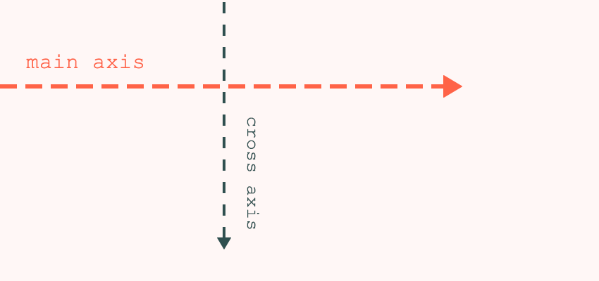
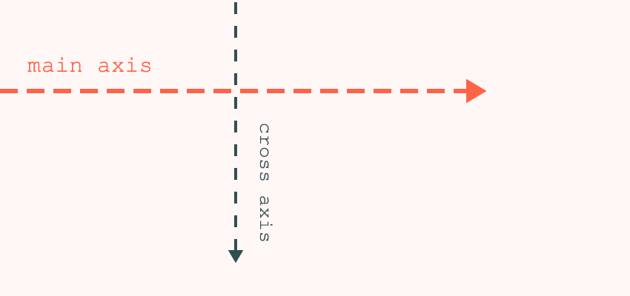

This hierarchical relationship constitutes the main difference between flexbox and CSS Grid Layout. By design, CSS grid has two non-hierarchical axes: the row and column axes. This is because the creators of web standards intended CSS grid to be used as a two-dimensional layout model. Flexbox, on the other hand, has one primary and one secondary axis, as its purpose is to be a one-dimensional layout model. The cool part about flexbox is that you can define the direction of that one dimension by setting the position of the main axis, therefore you can create both row-based and column-based layouts.
To avoid being confused by alignment properties, always keep in mind that when you use flexbox, you are working with a one-dimensional model. Even if your layout looks like it has two dimensions (i.e. rows and columns), flex items can only flow in one direction, along the main axis. You can justify the flex items in that one direction and align the spacing between the individual items along the cross axis.
Begin by Defining the Main Axis
The direction of the main axis is determined by the flex-direction property–there are four possible values:
-
flex-direction: row;– main axis runs from left to right (this is the default) -
flex-direction: row-reverse;– main axis runs from right to left -
flex-direction: column;– main axis runs from top to bottom -
flex-direction: column-reverse;– main axis runs from bottom to top
Let’s see how this looks in the browser. I’ll use very simple HTML markup, just nine boxes stacked upon one other:
<div class="container">
      <div class="item item-1">1</div>
      <div class="item item-2">2</div>
      <div class="item item-3">3</div>
      <div class="item item-4">4</div>
      <div class="item item-5">5</div>
      <div class="item item-6">6</div>
      <div class="item item-7">7</div>
      <div class="item item-8">8</div>
      <div class="item item-9">9</div>
</div>
The outer div with the .container class will be the flex container and the inner divs with the .item class will be the flex items.
1. Left to Right: row
As mentioned, the default flex direction is row; if you set nothing else this will be the value used. As you can see below, I’ve only added flexbox-related properties to the flex container. Flex items have been given some properties for decorative purposes:
.container {
  display: flex;
  flex-wrap: wrap;
  flex-direction: row;
}
When flex-direction is row, the main axis runs horizontally, from left to right. This is therefore the direction along which flex items are laid out. The cross axis runs perpendicularly, from top to bottom, and when items wrap they do so in this direction.
2. Right to Left: row-reverse
When flex-direction is given the value row-reverse, the position of the axes stays the same, meaning that the main axis will still run horizontally and the cross axis vertically. However, the row direction will be reversed: from right to left along the main axis.
.container {
  display: flex;
  flex-wrap: wrap;
  flex-direction: row-reverse;
}
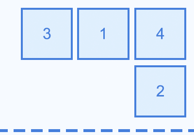
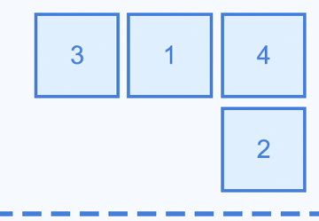
If you look at the numbering of the flex items you can see that now, each row is numbered from right to left, but the items still wrap vertically downwards.
If you also want to reverse the direction of the cross axis you need to use wrap-reverse on the flex-wrap property. Spot the difference:
3. Top to Bottom: column
When the flex-direction is set to column, the main and cross axes change their positions. The main axis will run vertically (from top to bottom) and the cross axis will run horizontally (from left to right).
.container {
  display: flex;
  flex-wrap: wrap;
  flex-direction: column;
  max-height: 35rem; /* so that items wrap */
}
Now you’ll see the numbering of flex items doesn’t follow rows, but columns. This is where the one-dimensional nature of flexbox is probably the most visible. The items will wrap only if the container is given a fixed height.
4. Bottom to Top: column-reverse
I expect you’re seeing a pattern developing here. When flex-direction is set to column-reverse, the main axis is still vertical and the cross axis is still horizontal, just as we saw in the previous example. However, the column direction is reversed so the main axis points from bottom to top.
.container {
  display: flex;
  flex-wrap: wrap;
  flex-direction: column-reverse;
  max-height: 35rem; /* so that items wrap */
}
As you can see below, the numbering of flex items begins at the bottom left, moving upwards and to the right.
Again, to change the direction of the cross axis, you need to use wrap-reverse on the flex-wrap property.
Flex-flow Shorthand
The flex-flow property is a shorthand for flex-direction and flex-wrap. For instance, you can use:
flex-flow: column wrap;
instead of:
flex-direction: column;
flex-wrap: wrap;
Flexbox Alignment Properties
Flexbox alignment can happen along both the main and cross axes.
One of the properties (justify-content) belongs to the main axis, while the other three (align-items, align-self, align-content) belong to the cross axis.
As you might expect, the behaviour of the alignment properties depends on the flex-direction property. For instance, justify-content aligns the items horizontally if flex-direction is row or row-reverse, but vertically if flex-direction is column or column-reverse. This is the real beauty of a flexible box.
Alignment Along the Main Axis
The justify-content property aligns flex items within the flex container along the main axis. It distributes the extra space left after the browser has calculated the necessary space for all items in the flex container. The justify-content property can take five values:
-
flex-start– flex items are justified towards the start of the main axis (this is the default) -
flex-end– flex items are justified towards the end of the main axis -
center– flex items are justified around the center of the main axis -
space-between– flex items are distributed evenly along the main axis, from flex-start to flex-end -
space-around– flex items are distributed evenly along the main axis, but half-size spaces are added to each end
To use justify-content properly, you need to pay attention to the directions of your axes. For instance, the justify-content: flex-start; rule always squeezes flex items to the start of the main axis. This is the left end when flex-direction is row, the right end when it’s row-reverse, the uppermost point when it’s column, and the bottommost point when it’s column-reverse.
The following pen shows how the different values of the justify-content property align flex items when flex-direction is row.
Alignment Along the Cross Axis
Time to take things to the next level. You can use three CSS properties to align items along the cross axis. Two of them (align-items and align-self) are for single-line alignment, while align-content is for multi-line alignment.
Single-Line Alignment
The align-items and align-self properties define how space is distributed between flex items along the cross axis. In actual fact, both do the same thing, but while align-items aligns all items inside the flex container, align-self overrides this default alignment for individual flex items.
Both can take the following values:
-
auto– makes the align-self property inherit the value of align-items (default for align-self) -
flex-start– flex items are aligned towards the start of the cross axis -
flex-end– flex items are aligned towards the end of the cross axis -
center– flex items are aligned around the center of the cross axis -
baseline– flex items are aligned such that their baseline alignment lines up -
stretch– flex items are stretched along the cross axis to fill the flex container (default for align-items)
The pen below shows how the align-items and align-self properties behave when flex-direction is row. The cross axis by default runs from top to bottom. The items have different amounts of padding so as to change their heights and baselines. You can see, for instance, the flex-start value aligns the items to the start of the cross axis, while flex-end aligns them to the end.
Naturally, when flex-direction is column or column-reverse, you’ll be working with a column-based layout so the align-items and align-self properties will align items horizontally instead.
Multi-Line Alignment
The align-content property makes multi-line alignment possible along the cross axis. It determines how flex items in multiple lines are spaced apart from each other. The align-content property has no effect on a single-line flex container (for instance, when the content doesn’t wrap). It can take six different values:
-
flex-start– flex items are aligned to the start of the cross axis -
flex-end– flex items are aligned to the end of the cross axis -
center– flex items are aligned around the center of the cross axis -
space-between– flex items are distributed evenly along the cross axis, between flex start and flex end -
space-around– flex items are distributed evenly along the cross axis, but half-size spaces are added to each end -
stretch– flex items are stretched along the cross axis to fill the flex container (this is the default)
Below, you can see various pens showing how the different values of the align-content property work. As with our other demos, default axis directions apply.
These first two examples don’t have a single-line property (align-items) defined, so you’ll notice all the items stretch by default. In this next example we’ll set align-items: flex-start; so that the items align towards the start of the cross axis, but we’ll set align-content: flex-end; so that the content is aligned towards the end of the axis:
If you’ve grasped everything that we’ve gone over so far, you’ve done very well! You now have a solid basic understanding of flexbox alignment.
Conclusion
We’re done! To recap; the most important thing to remember is that you need to keep the directions of the main and cross axes in mind. Always begin your alignment by setting up the flex-direction property. To learn more about flexbox alignment and put your knowledge into practice, you can take a look at the following resources as well:


 FlexboxA Comprehensive Guide to Flexbox Ordering & Reordering

 FlexboxFlexbox Align: When to Use Auto Margins Instead of Flexbox Center

 CSS Grid LayoutFlexbox vs. CSS Grid: Which Should You Use and When?

 FlexboxA Comprehensive Guide to Flexbox Sizing
- Official W3C docs for flexbox alignment Heavy-going, but a useful read; also the go-to docs for flexbox.
- How to align items in a flex container An MDN docs page with interactive demos and code examples.
- Flexbox Cheatsheet by Joni Trythall A neat PDF cheatsheet for download, with grapes, pears, and oranges.
- Flexbox Froggy An online game to learn flexbox, with frogs and lily pads. If you want to pick up flexbox alignment intuitively give this game a try (you can practice everything we covered in this tutorial).
