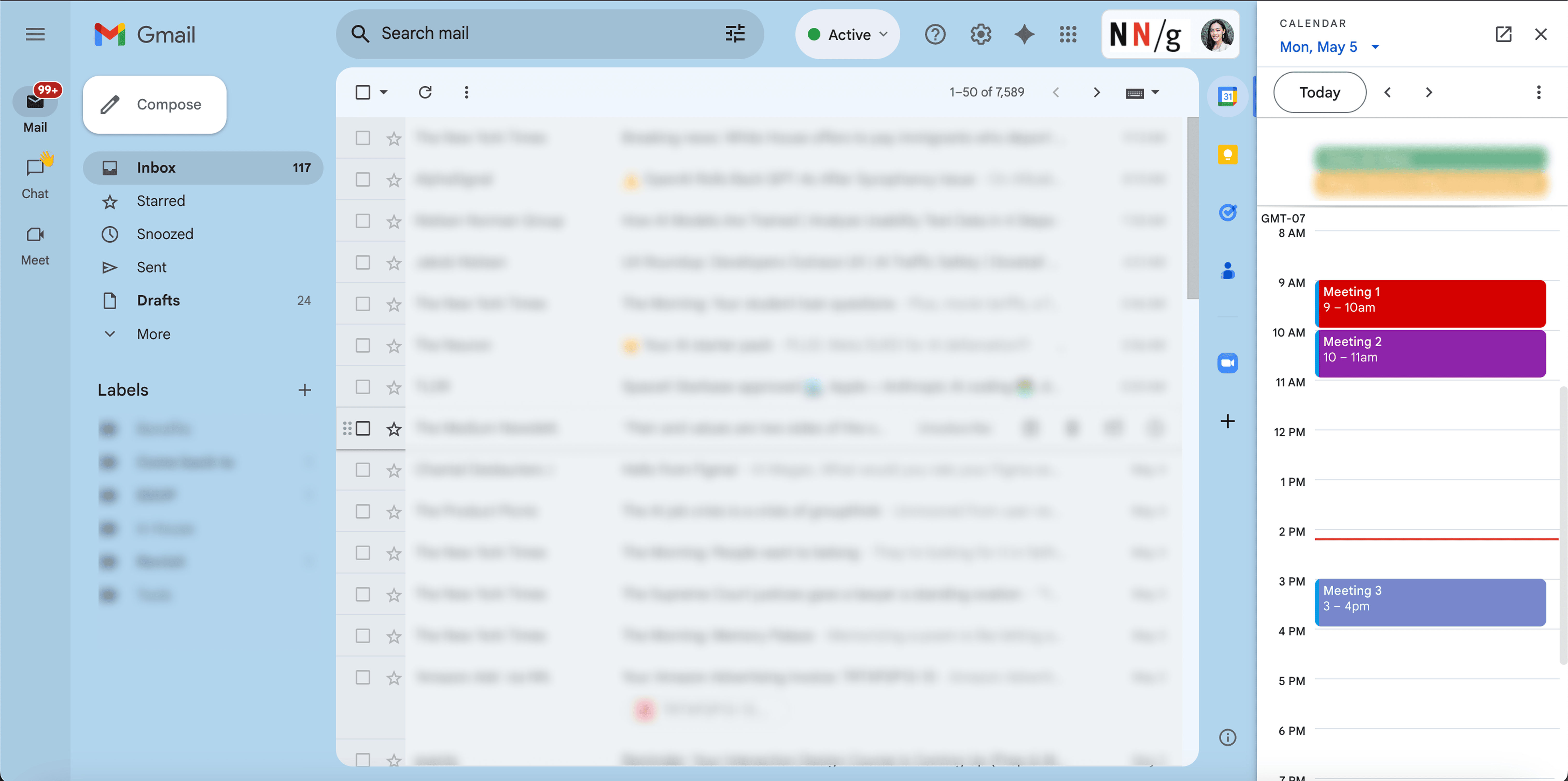
Summary: Serial task switching, or rapidly shifting attention between tasks, is a natural user behavior that lowers productivity and increases stress and the chance of errors. Be honest. How many tabs do you have open right now? If you’re like me, it’s probably more than you’d like to admit. Serial task switching is a natural… Continue reading Designing for Serial Task Switching
Tag: Interfaces
Card sorting with visually impaired participants: how to overcome accessibility barriers
A guide to conducting card sorting with participants who are visually impaired. Photo by Author; generated using Stable Diffusion. Card Sorting is a UX research method used to understand how users categorize and organize information, which reflects how they expect information and content to be organized on a user interface. In this method, participants are… Continue reading Card sorting with visually impaired participants: how to overcome accessibility barriers
Popular Design News of the Week: November 25, 2019 – December 1, 2019
Every week users submit a lot of interesting stuff on our sister site Webdesigner News, highlighting great content from around the web that can be of interest to web designers. The best way to keep track of all the great stories and news being posted is simply to check out the Webdesigner News site, however,… Continue reading Popular Design News of the Week: November 25, 2019 – December 1, 2019
Ouch: free illustrations for websites and interfaces
How to build a product that people will love? Just give them what they need. This is the basic principle behind Ouch, a library of interface illustrations created by Icons8 team. It’s not a secret that most websites and interfaces need to have a face. When a user is engaging with a project, they want… Continue reading Ouch: free illustrations for websites and interfaces
4 Examples of Bad UI and How to Avoid Them
The easiest way to observe bad user interfaces is by keeping your eyes open. Every time you order something online, every time you visit a new website, every time you fill in a form, purchase a product or publish a post, think about how you’re being asked to perform that task. Where are the buttons… Continue reading 4 Examples of Bad UI and How to Avoid Them
Beginner’s Guide to Angular: Components
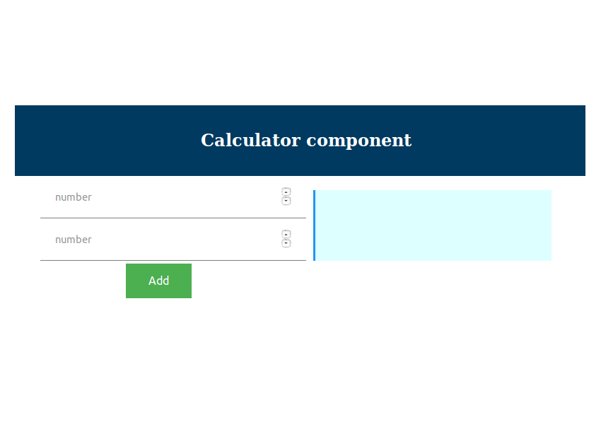
Building single-page applications is an art, with many impressive frameworks to choose from. One of the most intuitive and widely used frameworks for building both web and mobile applications is Angular. Today, Angular 10 is out, and there are many impressive features. However, you need to master components before you dig deep. First Things First:… Continue reading Beginner’s Guide to Angular: Components
Popular design news of the week: December 26, 2016 – January 1, 2017
Every week users submit a lot of interesting stuff on our sister site Webdesigner News, highlighting great content from around the web that can be of interest to web designers. The best way to keep track of all the great stories and news being posted is simply to check out the Webdesigner News site, however,… Continue reading Popular design news of the week: December 26, 2016 – January 1, 2017
22 Circular Icon Designs for Websites and User Interfaces
Various styles have been adapted over recent years pertaining to icon design. Websites and mobile apps utilize their fair share of icons to convey a much clearer meaning in regards to a user interface. Those with perspicacity recognise the importance of symbolic pictograms. But how do you decide on a theme among the many various… Continue reading 22 Circular Icon Designs for Websites and User Interfaces
How To Design Interfaces from a User Experience Perspective
Both web design and mobile app design share many similar features. One of the most important features is that they’re both created for an audience, whether young kids or teens or adults or some kind of mix. The end user should be your most important priority when it comes to brainstorming new ideas. For this… Continue reading How To Design Interfaces from a User Experience Perspective
Elegance and Refinement of Mobile Interfaces based on Blurred Backgrounds
Being a basic photo effect for a long time, blurred backgrounds only recently have become a quite popular tool among web designers that had noticed its remarkable ability to help elements to stand out. Such approach rather readily, unobtrusively and quite naturally gives due prominence to content, icons and graphics that are placed on a… Continue reading Elegance and Refinement of Mobile Interfaces based on Blurred Backgrounds
The Future of User Interfaces
We are web designers and developers. As obvious as our work is (we build interactive media applications) there’s a deeper meaning to what we do. We analyze design problems and explore different concepts to solve them. This also means that we think of the communication between a device and the user. We develop that communication.… Continue reading The Future of User Interfaces
Use of Flat Design in Mobile App Interfaces, Best Examples
Emphasis on typography, roomy widgets, muted color palette, one-colored or blurred background, grid or horizontal stripe layout, inornate graphics, 2d illustrations – all these can be easily attributed to flat style, that recently got its second rebirth. Microsoft’s “Metro” aesthetic has captured the minds of a great deal of designers, pushing them on eschewing shadows,… Continue reading Use of Flat Design in Mobile App Interfaces, Best Examples
32 Free Icon Sets for Building Unique Web Interfaces
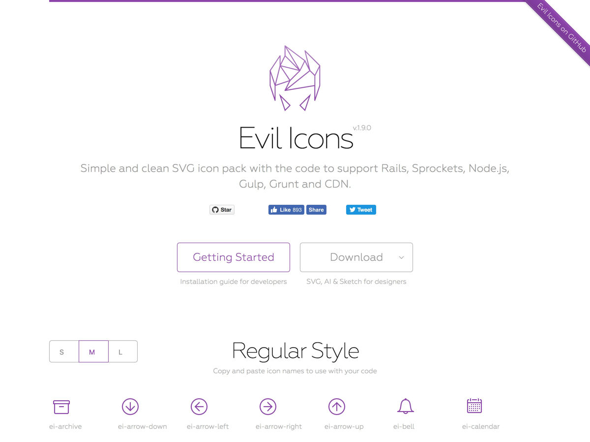
Recently I was searching the web for some newer icon sets to build into a layout. There are so many freebies released every month that it can be tough to keep track of it all. But I know that icons are some of the most useful resources for structuring menus, links, buttons, and similar… Continue reading 32 Free Icon Sets for Building Unique Web Interfaces
