Both web design and mobile app design share many similar features. One of the most important features is that they’re both created for an audience, whether young kids or teens or adults or some kind of mix. The end user should be your most important priority when it comes to brainstorming new ideas.
For this reason I’d like to share a few tips related to interface design for creating a beneficial user experience. UI design focuses more on elements like composition, rhythm, balance, colors, and legibility. UX design focuses more on interactions, animations, swipe or click effects, and how elements come across to a first-time user. When you blend these fields together it makes the job of a designer more straightforward by focusing on a deeper set of extrinsic guidelines.
Managing Priorities
First and foremost it helps to get a small list of ideas related to the design. Which interfaces are expected to be used the most? Out of those interfaces which items would get the most attention? Problem solving is about creative thinking and learning how to make a game plan(or change plans at the last minute).
If you can have a list of priorities it’ll force the layout to fall into place. You’ll see a general roadmap between interactions that get the most attention from users. A small list of features is almost essential to help organize the design process.
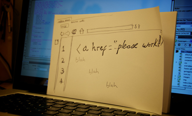
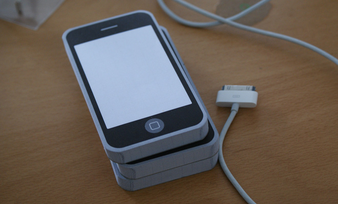
When you have a pretty good understanding of the overall interface then try to design some quick wireframes. These could be hand-sketched or created in a wireframing program but the end result should be a low-fidelity concept which can be translated into a simple mockup.
Make Stuff Easy
People have an obvious appreciation for beautiful design. But when it comes to user experience most people just want the easiest possible method. Regardless of your design strategy it’s crucial to implement user experience right from the beginning. Think about the easiest, simplest way to accomplish something and follow that path.
At first you might need to really ponder and think what exactly people need to do. A website settings page could use a multitude of different interfaces like text input fields, dropdown menus, on/off switches, checkboxes, and similar items. Would it be possible to auto-save once a user changes any of their settings? Grow acclimated to asking yourself tough questions because it’s part of the discovery process.
Keep yourself focused on the easiest thought patterns and you’ll naturally gravitate towards those solutions. Oftentimes as designers we like to think of the prettiest or most unique method for creating an interface. While this does have an upside, the downside is that we’re not focused on the design from an experiential point-of-view. And digital interfaces from websites to mobile apps are meant to be experienced – pretty design is just an added bonus.
Prominent Elements
If there’s an important element on the page be sure to make it stand out from surrounding items. Using large text, icons, or expansive color choices will help to create something that quickly captures attention.
Internet marketers use these same techniques when designing a call-to-action button. There are oftentimes many elements that require a call-to-action from the visitor. This could be a registration button, or a tabbed content area or maybe even dynamic movable page elements. Regardless of whatever needs to be prominent the same design techniques can be applied to make such elements stand out.
Icons and graphics are one big aspect to creative design. When something looks like it should capture attention it’s meant to stand out from the more bland, simplistic page elements. But don’t get too detailed with graphics during the brainstorming stage – a rough idea is usually enough to work with. Also try experimenting with color and size on the page. Experimentation is a great way to learn and quick A/B tests can offer informative results.
Offer a Helpful Nudge
It’s not always possible to simplify an interface which requires a lot of interaction. A signup form could be simplified to just a couple fields, but a dynamic user profile might need to handle avatar uploads or editing/deleting status updates. You can’t always dumb down the interface but instead try to explain things with little tips & tricks.
Since some users may not understand a complex interface it could be useful to create a guided tour with tooltips. Many popular networks like Twitter and Pinterest have these guided tours for newly registered users. It just helps to get acquainted with an unfamiliar interface so that everyone can learn about the most common features without guessing.
A helpful nudge in the right direction is always appreciated. For the folks who don’t need the info it’s just as easy to add a “disable” link right in the tooltips. Or alternatively you might build a separate page dedicated to a tour so it doesn’t interfere with the actual website or mobile app.
Test Similar Interfaces
Whenever you need some good ideas take a look at other websites or apps to see how they handle the UI/UX interaction. This is a brilliant way to gather some insight because you’ll actually become the user. In this way you have the right to judge an interface to see what’s good and what’s not-so-good.
You’ll also learn about competing websites or applications that may end up with a similar market of users. It’s not helpful to recreate an existing app, so take what’s good and try to expand it with your own design work. Generally speaking users want something that’s new yet still feels comfortable and familiar.
Even if you aren’t building anything at the moment it can still be fun to check out different sites or apps you’ve heard about. Take them for a test ride and see how they handle. Any specific problems you notice? Jot those down or make a mental note for your next design project. Keep the most inspiring links bookmarked or save a screenshot of the UI for reference.
Although these tips can get you started in the right direction you have to be in control and maintain focus during a design project. Creating good UX design requires a constant focus on the possibilities. You have to be willing to question yourself and your ideas, without fear, and be willing to change when necessary.
If you can always hold this mentality with an open mind your interface designs will gradually improve with practice. During the initial stages keep yourself thinking from a user’s perspective and not a designer’s perspective. Eventually the right ideas will come and it’s your job to implement them in a way that benefits every user.


