We know that the customer is always right. However, this motto is often neglected costing website operators a lot of money that could have been better spent. No matter what industry your company is in, the customer should come first in each marketing strategy. You can optimize your sales only with satisfied clients. But customer satisfaction is very fragile, especially in the digital world; your competitors are only one click away. This requires a stronger focus not only, but especially on customer satisfaction and service. The same applies to online shops and any other web-based businesses. Not only products, processes, etc. have to be optimized, but also the user experience design. We’ll tell you what is meant by that and how to do it…

What is User Experience Design?
The concept of user experience design focuses on the interaction between the website and the customer ensuring a fast and pleasant process. The success of a website largely depends on user experience (UX) design, which is not surprising really. Only if customers have a good experience with a website, they’ll develop the confidence to take the next step.
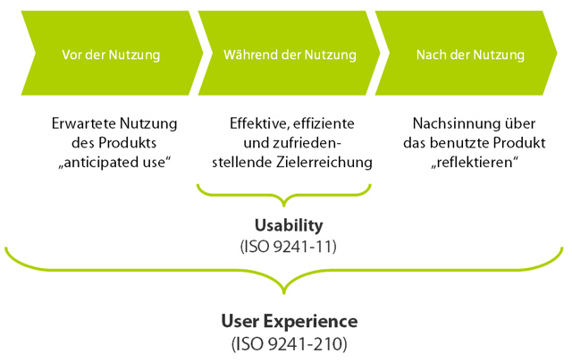
The User Experience ISO 9241-210
The term user experience is defined in ISO 9241-210 that was introduced in 2010.

© Copyright Karsten Nolte – http://www.karsten-nolte.de
ISO 9241-210 describes user experience as follows:
“Person’s perceptions and responses resulting from the use and/or anticipated use of a product, system or service.
Note 1 to entry: User experience includes all the users’ emotions, beliefs, preferences, perceptions, physical and psychological responses, behaviors and accomplishments that occur before, during and after use.
Note 2 to entry: User experience is a consequence of brand image, presentation, functionality, system performance, interactive behavior and assistive capabilities of the interactive system, the user’s internal and physical state resulting from prior experiences, attitudes, skills and personality, and the context of use.
Note 3 to entry: Usability, when interpreted from the perspective of the users’ personal goals, can include the kind of perceptual and emotional aspects typically associated with user experience. Usability criteria can be used to assess aspects of user experience.”
User Experience Cut to the Chase
User Experience Design provides an easy, clear, intuitive, and elaborate design. All essential elements are exactly where visitors expect them to be. In short: Usability should be as high as possible. To get the best out of your site, conduct surveys, tests, and study your target group and competitors.
Service and Support
Service and support are often underestimated, but they have a great influence on customer loyalty. This is your chance to create a unique selling proposition.
An Example of a Good User Experience Design
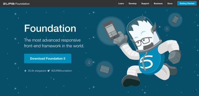
The Foundation Framework website is a good example of a well-made UX design. It has a simple and clear flat design and draws the visitor’s attention to two areas by using sound contrasts: the call-to-action button for the download and the menu bar on top of the site. You’ll quickly get your bearings. The website loads fast encouraging the visitor to stay on the site. Images are used to support the actual content and don’t distract.
Use images only to support content and guide users through your website.
Develop Your Design Strategy

Start With the Color
When you develop a design strategy for an ideal user experience design, it might be a good idea to begin with the color. A minimalist theme, for example, looks beautiful with a monochromatic layout without crushing contrasts.
Trichromacy is currently the most popular combination. A neutral background in white or bright gray is combined with a highlight color for tabs, buttons, and elements you want to stand out. This is how a modern website could be designed in black and white with a colored header or a hero graphic area that doesn’t distract.
Run some tests with users or heat maps to find out how to direct the user’s view to the relevant areas of the website. To get an optimal UX design, it’s important to understand your users, so you can give them what they want or expect.
A small splash of color on a white background certainly draws attention. This works well for forms and product images. Combined with contrasting call-to-action buttons, you’ll create a calm and clear overall impression.
Effects and Menus
Once you’ve chosen a color scheme, think about the effects you want to build into your website. And keep in mind: less is more! Effects can be used for validating data in forms, which brings a real plus in terms of usability. If applied correctly, icons can also improve the usability.

The menu should stand out from the content and catch the user’s eye. Take your time with labeling the menu items and try out different versions. Again, heatmaps and test persons can be helpful. Critical menu items can be highlighted with a different color as call-to-action buttons. This makes it easy for users to understand what they are expected to do.
Minimalist designs are getting more popular. They work equally well on desktops, smartphones, and tablets. Some of the biggest brands have switched to a minimalist flat design. What works well for big names should also work well for you.
Important:
Keep in mind that a computer monitor only reflects a part of the overall experience. You want to provide the best possible service within a short time to users. But an optimized website is only the beginning. Only when users can navigate quickly and intuitively from the homepage to the filled-out and sent payment form, you have an optimally structured website.
But user experience doesn’t stop with that. Service and support are vital factors for customer loyalty. We can learn a lot from Americans who are said to be the champions in terms of friendliness and service.
Conclusion
A superb user experience design is nothing you can realize in no time. It requires extensive tests, research, and continuous improvement of the status quo to get optimal results. But the hard work will be rewarded with more sells because the better users get their bearings, the more likely it is that they will buy something.

