Building single-page applications is an art, with many impressive frameworks to choose from. One of the most intuitive and widely used frameworks for building both web and mobile applications is Angular. Today, Angular 10 is out, and there are many impressive features. However, you need to master components before you dig deep.
First Things First: Setting Up Dependencies
Before you venture into Angular, you need to make sure that the following dependencies are successfully installed:
You can install the Angular CLI globally with NPM.
npm install -g @angular/cli
Now, you can kickstart an Angular project in a few different ways:
- create it by hand, manually
- use the Angular CLI
- clone and run a project from GitHub
Here’s how you create a new project with the Angular CLI:
ng new my-project-name
cd my-project-name
That’s it! Now your journey into Angular has started. In this post, we’ll build a simple calculator for adding two numbers using Angular.
What Is an Angular Component?
In Angular, we work with directives. There are three types of directives: structural, attributes, and components. In the next few sections, we will dig into everything about components.
Components in Angular are the elements which we design and build to render UI items. These UI items will allow users to interact with the application and access its functionality.
By the end of this tutorial, you will be able to build components in Angular. More importantly, you’ll understand every step along the way.
Components will be used from day one in any Angular project. At a certain level, you can think of any Angular project as a tree of many connected components. Every component will have a specific functionality and a template which will render it. A single template can be reused in several components. A collection of components forms an Angular application, which is finally seen in the browser.
A component is like a class, where the element’s behaviour and its view are encapsulated. The behavior includes the data that is loaded or rendered and the ways a user can interact, and its view is a template which defines how the data gets rendered.
Building the Calculator Component
Let’s learn about components by creating an Angular component for adding two numbers. We won’t create the component step by step in this tutorial, but you can find the complete code for this application in our GitHub repo.
Defining a Component With the Component Decorator
The Component decorator is used to define a component in Angular. The metadata for defining a component is as follows:
@Component({
  selector: 'calculator',
  templateUrl: './calculator.component.html',
  styleUrls: ['./calculator.component.css']
})
export class Calculator{

}
In the above definition, the selector tells the application which elements of the app’s HTML the component needs to be used for. The templateUrl tells the application what can be rendered. Everything else in the above decorator is optional.
What Is a Selector?
selector is an important attribute in Angular. It helps the application identify where to place components. The selector is always a string. Selectors can be defined in three different ways, each with a unique use case:
-
selector: 'calculator'can be used when the component is going to be specified as a<calculator>element in the HTML. -
selector: '.calculator'can be used if the component is going to be used as a CSS element, which would look like<div class="calculator">in the HTML. -
selector: '[calculator]'can be used when the component ought to be used as an attribute, which would look like<div calculator>.
Selectors can be simple or complex, but the golden rule is to make the selector as simple as possible.
What Is a Template?
The templateUrl is used to identify the template a component will use. The path to the template should be relative. For a template in the same folder as the component source code, you could use templateUrl: './calculator.html' or templateUrl: 'calculator.html'.
Don’t use the absolute URL to the HTML file on your server. If you do, the application will not compile. Why? Angular 2+ always precompiles the code and makes sure that the template gets inlined during the build.
You can also choose to replace the templateUrl option with an inline template using the template option. This is useful in simple components, where the TypeScript code and HTML don’t have to be in different files.
This approach does not have any impact on the final application. Why? Regardless of the approach, a single bundle is generated.
What Is a styleUrl?
A component is never plain; it is always loaded with multiple styles. The role of the styleUrl attribute is to help you include component-specific CSS. Just like for templates, you can use inline styling with the styles attribute. But if the code has a significant amount of styling, this needs to be separated into a different file.
Note that styleUrl always takes an array, so you can add multiple stylesheets.
Style Encapsulation
Angular components always encourage the isolation of styles and complete encapsulation. This means the styles in a child or parent component won’t affect other components in the UI hierarchy.
To control style encapsulation, Angular offers an attribute called encapsulation in the Component decorator. Encapsulation can have one of the following values:
-
ViewEncapsulation.Emulatedis the default. It creates shimmed styling to emulate shadow roots and DOMs. -
ViewEncapsulation.ShadowDomis the fastest if your browser has native support for shadow DOMs. -
ViewEncapsulation.None, as suggested by its name, makes use of global styling and avoids any form of encapsulation.
The syntax for using the encapsulation property in our calculator component is as follows:
import { Component, ViewEncapsulation } from '@angular/core';
@Component({
  selector: 'calculator',
  templateUrl: './calculator.component.html',
  styleUrls: ['./calculator.component.css'],
  encapsulation: ViewEncapsulation.None
})
export class Calculator{}
In the above example, we have opted for ViewEncapsulation.None. This is definitely the best way to apply common styles to both parent and child components.
Angular Components and Modules
Before we drill into the component lifecycle, let’s see how the components and modules are linked to each other. The modules for our calculator application will be as follows:
import { BrowserModule } from '@angular/platform-browser';
import { NgModule } from '@angular/core';

import { AppComponent } from './app.component';
import { CalcComponent } from './calc/calc.component'

@NgModule({
  declarations: [
    AppComponent,
    CalcComponent
  ],
  imports: [
    BrowserModule
  ],
  providers: [],
  bootstrap: [AppComponent]
})
export class AppModule { }
If you create a component, it has to be included as a part of a module.
To add a component to a module, you must first import it. First the imported file has to be added to the declarations array. Now, the component will be visible throughout the application and can be used by other components.
Let’s look at what each of the arrays inside the @NgModule directive represents:
-
declarationsmakes sure that the directives and components are made available within the module’s scope. The Angular CLI comes with a feature where directives and components will be added automatically to the module. -
importsis used to import and access other modules. This allows developers to include third-party modules within the application. -
exportsare used if your project creates a library or several modules. If a component is not exported, it cannot be used elsewhere.
Component Lifecycle
We are now ready to learn about the lifecycle of components and directives. Remember, every component has a lifecycle, right from creation to destruction. The moment a component is rendered, its lifecycle begins for the component and its children.
Knowing the lifecycle events is very useful in Angular applications—it helps developers observe and respond to events correctly.
Here are the lifecycle hooks of an Angular component in the order each hook would be invoked.
- component constructor
ngOnChangesngOnInitngDoCheckngAfterContentInitngAfterContentCheckedngAfterViewInitngAfterViewCheckedngOnDestroy
When a component is created, the constructor gets called. Next, various hooks are called in the above order. Certain hooks like OnInit and AfterContentInit will be called just once. Meanwhile, other hooks will be called whenever content gets altered in the component. Finally, onDestroy gets called once.
The above lifecycle hooks have an interface. To use the hook, you should implement the interface. Often, the interface comes with functions, starting with ng. For instance, if you want to make use of the ngOnInit function, the component has to implement the OnInit interface. Here is a quick summary of the commonly used Interfaces and Methods from the lifecycle hook in Angular Components. Once again, the table is sorted based on which method gets called first when implemented.
| Interface | Method | Purpose |
OnChanges |
ngOnChanges |
Called after the constructor, and whenever the value of an input changes. |
OnInit |
ngOnInit |
Called only once. Very specific to a component or directive. It is the best place for loading data from a server. |
DoCheck |
ngDoCheck |
When a change or binding cannot be checked by Angular automatically, this method is used. It notifies the component of any change. |
AfterContentInit |
ngAfterContentInit |
Called only once. It is triggered with component initialisation. |
AfterContentChecked |
ngAfterContentChecked |
Called with every change to the component’s contents. |
AfterViewInit |
ngAfterViewInit |
Once every child component is initialised, this lifecycle hook is called. The view might not be completely rendered, but the internal views will already be prepared by Angular. |
AfterViewChanged |
ngAfterViewChecked |
Once every child component is verified and updated, this hook gets called. |
OnDestroy |
ngOnDestroy |
If a component is ready to be removed or destroyed from the UI, this hook is called. It is a great place for keeping listeners which would unsubscribe and de-register observables or timers. |
Now, if you wanted to add a lifecycle hook into our calculator component, it would appear as follows:
import { Component, OnInit } from '@angular/core';
@Component({
  selector: 'calculator',
  templateUrl: './calculator.component.html',
  styleUrls: ['./calculator.component.css'],
  encapsulation: ViewEncapsulation.None
})
export class Calculator implements OnInit {

  constructor() {}

  ngOnInit(): void {
    console.log('Component - On Init');
  }

}
Creating the Calculator Component
The UI of the calculator application we are building will look as follows.
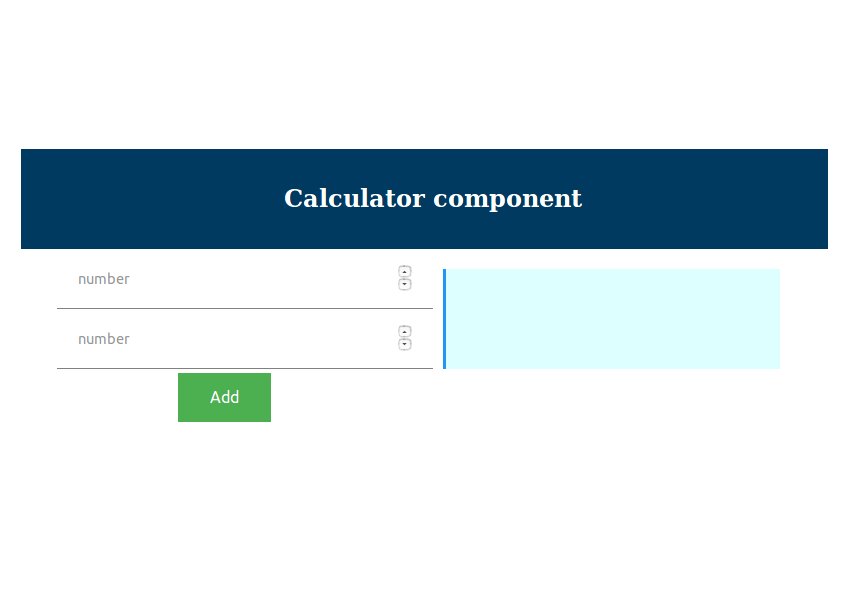

Here’s the HTML we’ll add to the component’s template:
<div class="row">
    <div class="col-12">
    	<input [(ngModel)]="number1" type="number" name="" placeholder="number">
	</div>
</div>
<div class="row">
	<div class="col-12">
		<input [(ngModel)]="number2" type="number" name="" placeholder="number">
	</div>
</div>
<button (click)="add()" class="button">
    Add
</button>
<div class="result">
    <span>
		Result : {{result}}
	</span>
</div>
The Interactions
Once the UI is rendered, users will perform operations on the application. Now, the application has to respond accordingly. For example, when a user enters two numbers and clicks on Add, our calculator has to add. The simplest way to connect the input boxes with this functionality is through ngModel. In the HTML template file, every input can be linked to an ngModel variable. You can see in the HTML above that we have a number of ngModel attributes to link HTML elements to our TypeScript code. These variables will be declared and used in the calculator component source code.
Let’s see how the ngModel variables are used in the TypeScript code for our calculator.
//the component
import { Component } from '@angular/core';

@Component({
  selector: 'calc',
  templateUrl: 'calc.component.html',
  styleUrls: ['calc.component.css']
})
export class CalcComponent {
  public number1 : number;
  public number2 : number;
  public result : number;

  public add(){
      this.result = this.number1 + this.number2
  }
}
Every time the user enters values in the input boxes, this.number1 and this.number2 will be updated accordingly. Why? ngModel is used to capture input.
When the user clicks on the Add button, the add function gets called. How? We make use of the (click) control to connect the button to the add method.
When add is called, this.result gets updated based on this.number1 and this.number2. Once this.result is updated, the UI gets updated. How? {{result}} is linked to this.result.
And That’s a Wrap!
I hope this tutorial was useful. Now, you should understand the basics of an Angular Component. You just saw how to define a component, leverage the various lifecycle hooks, and finally engage in user interactions. This is just the beginning. There is so much more to Angular components.
The fully functional source code from this tutorial is available on GitHub. Take a look, and try creating your own Angular projects—it’s the best way to learn!