Summary:
Use this glossary to quickly clarify key terms and concepts related to visual design.
Visual design requires knowledge and understanding of many jargon terms. Use this glossary as a reference as you delve into visual and user interface design.
Jump to a definition in the table or review the complete glossary.
Aesthetic-Usability Effect
Users’ tendency to perceive attractive products as more usable. People believe that things that look better will work better — even if they aren’t actually more effective or efficient.
Brightness
The proportion of light versus dark colors that an element has or the density of light colors within an image. Increasing the brightness of an image means that more light is perceived as being reflected by that image.
Change Blindness
Peoples’ tendency to ignore changes in a scene when they occur in a region that is far away from their focus of attention.
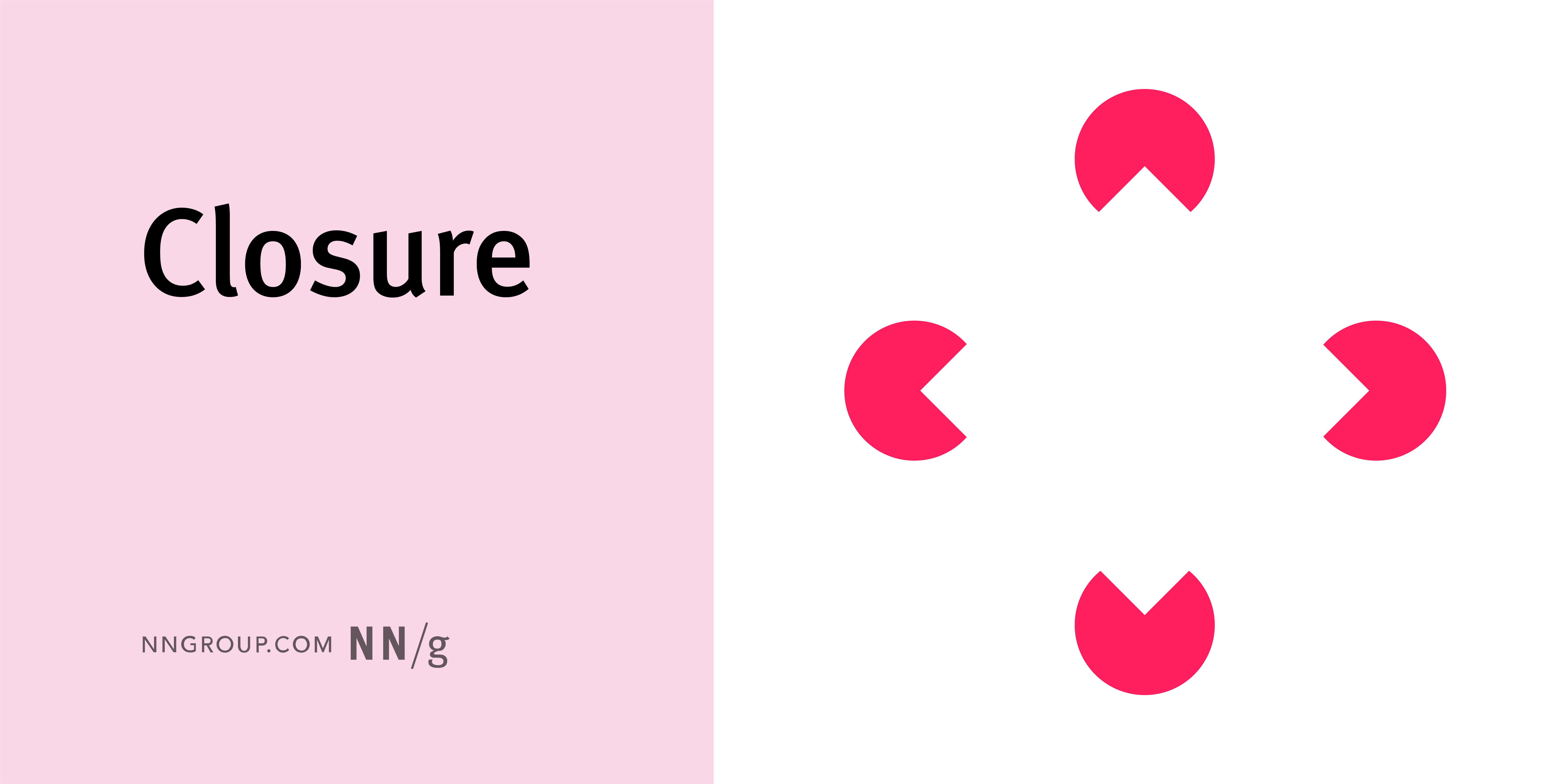
Closure
A Gestalt principle that states that people will fill in blanks to perceive a complete object whenever an external stimulus partially matches that object.
Clutter
Visual elements that are unnecessary or excessive, making it difficult for the viewer to focus on important aspects of a design.
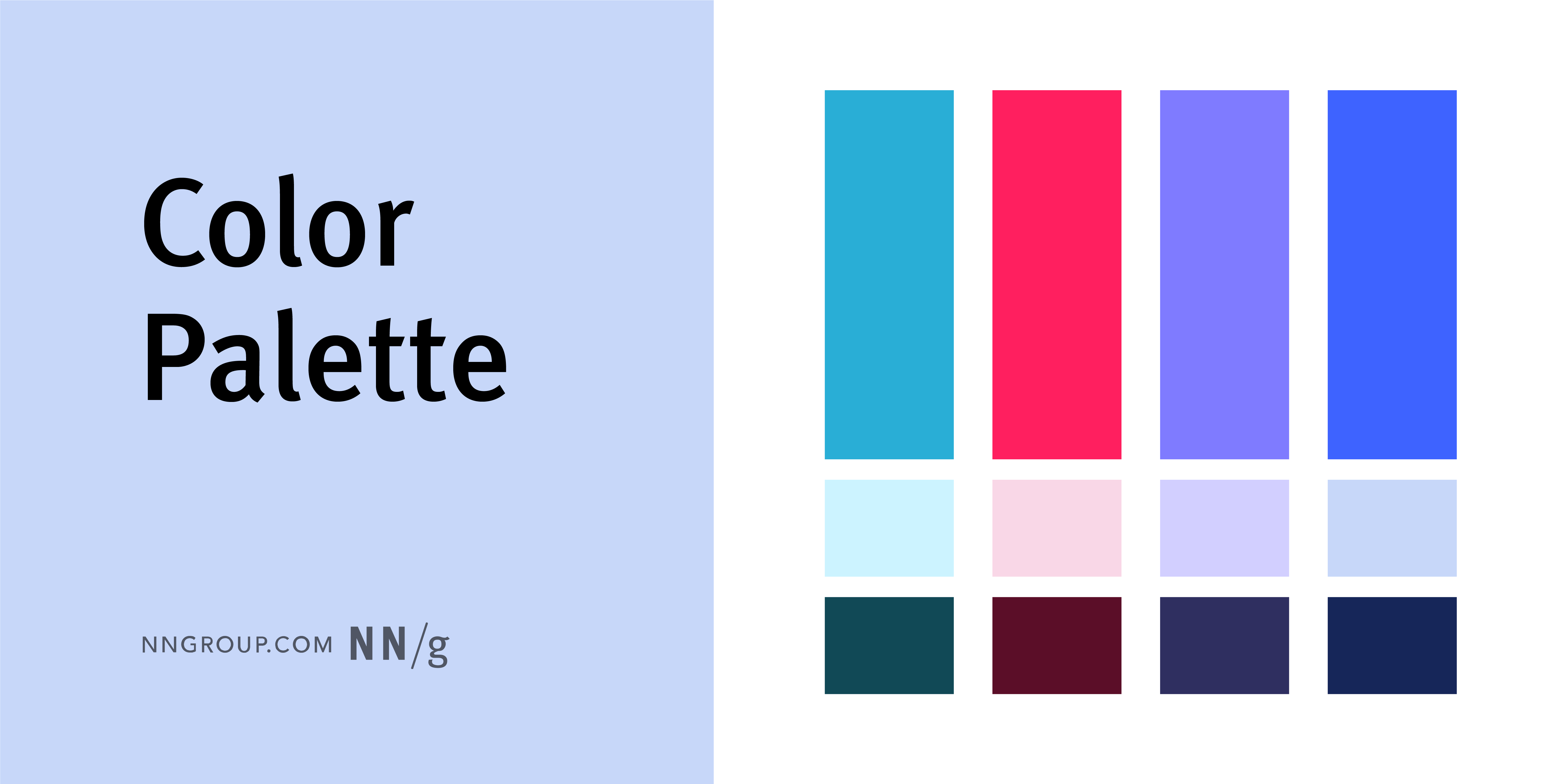
Color Palette
A defined set of colors used in a design to maintain consistency and create harmony.
Common Fate
A Gestalt principle stating that things that move in synch are perceived as belonging to the same group, while being different than other screen elements that stay put or move differently.
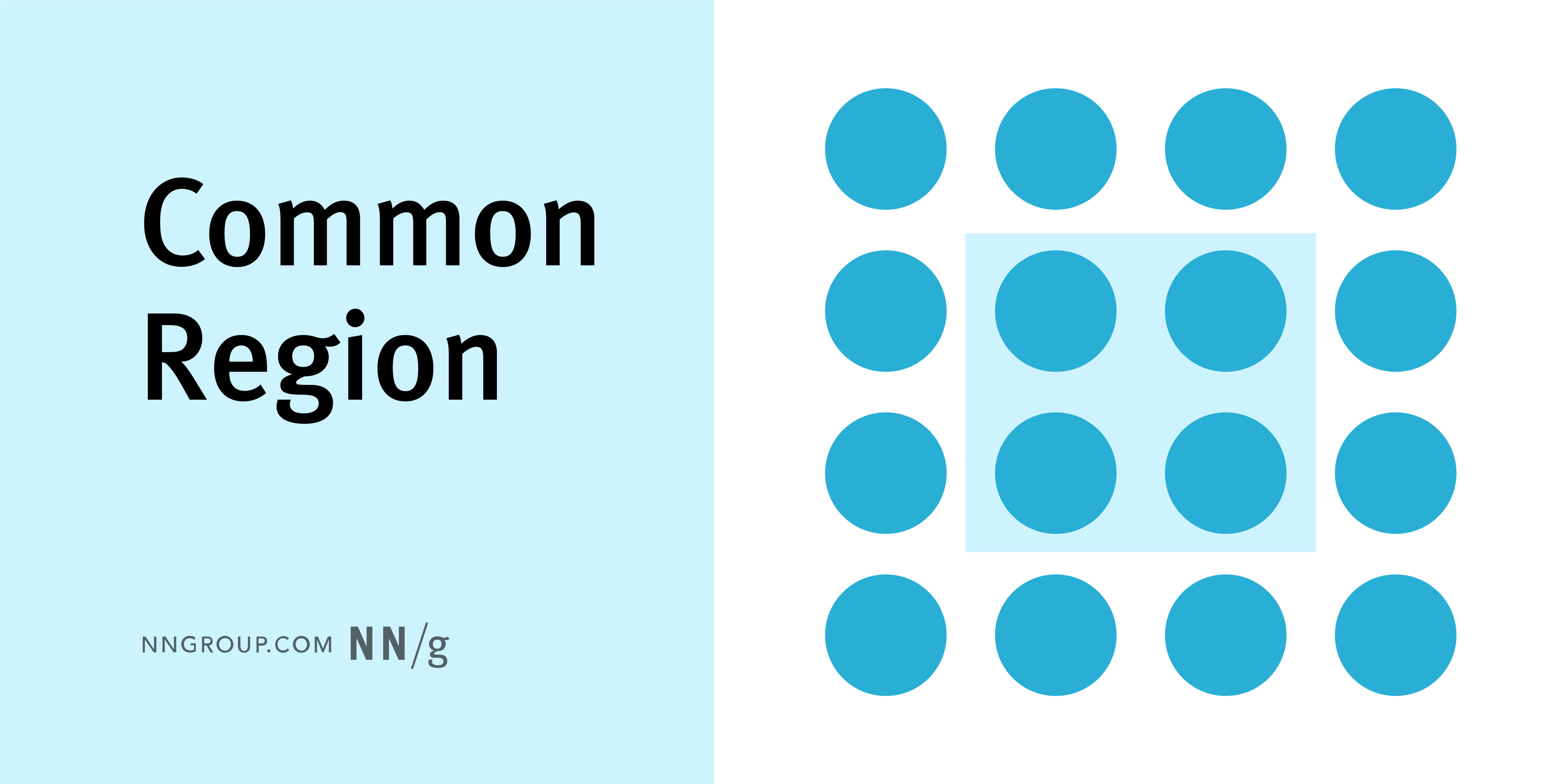
Common Region
A Gestalt principle stating that items within a boundary are perceived as a group and assumed to share some common characteristic or functionality.
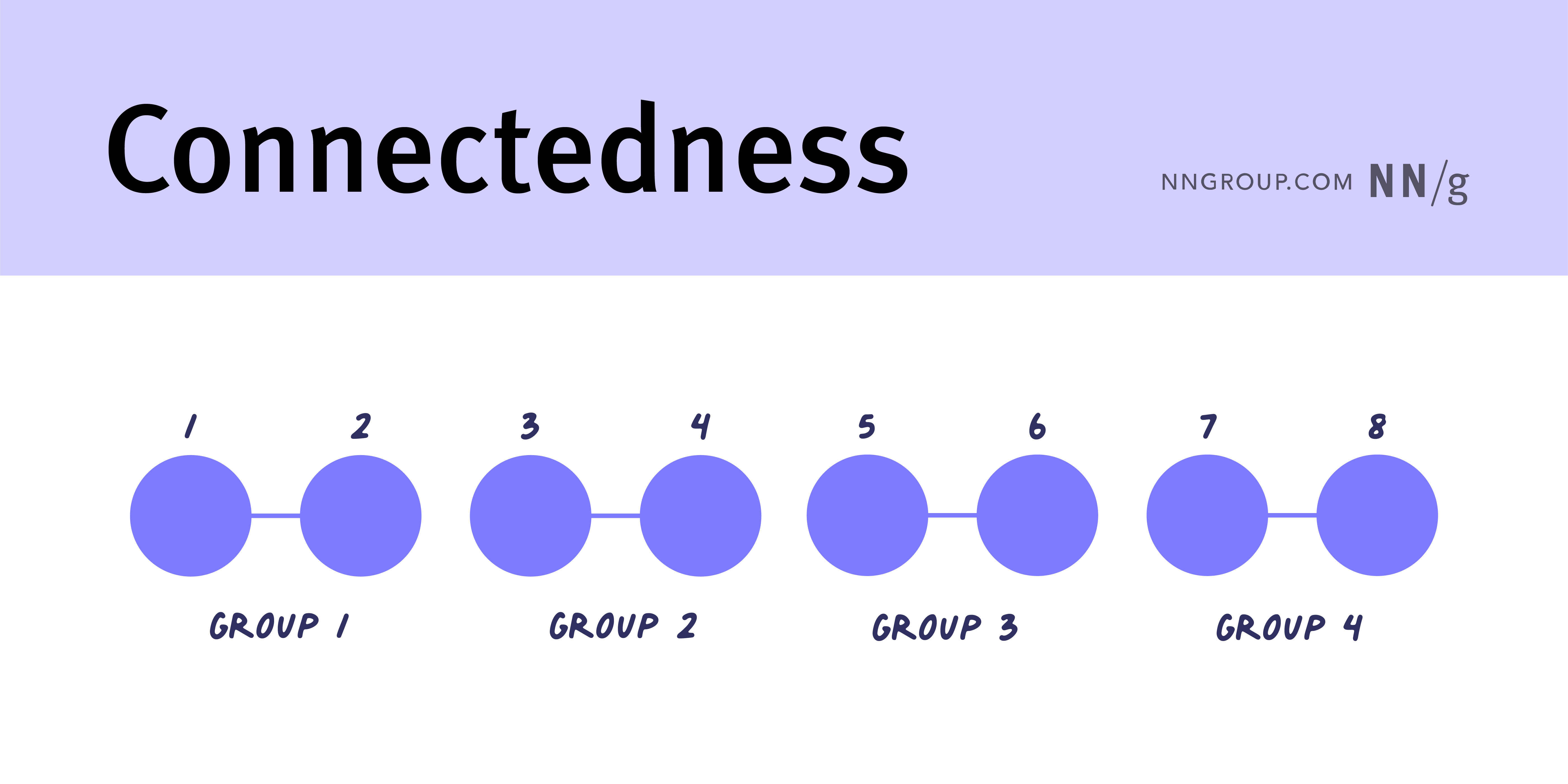
Connectedness
A Gestalt principle referring to the tendency to perceive elements that are connected by lines or other visual cues as belonging together. This principle is strong enough to overrule small differences between the items.
Consistency
Using similar characteristics and patterns in design elements — in layout, typography, and color palettes — to provide coherence and predictability to users.
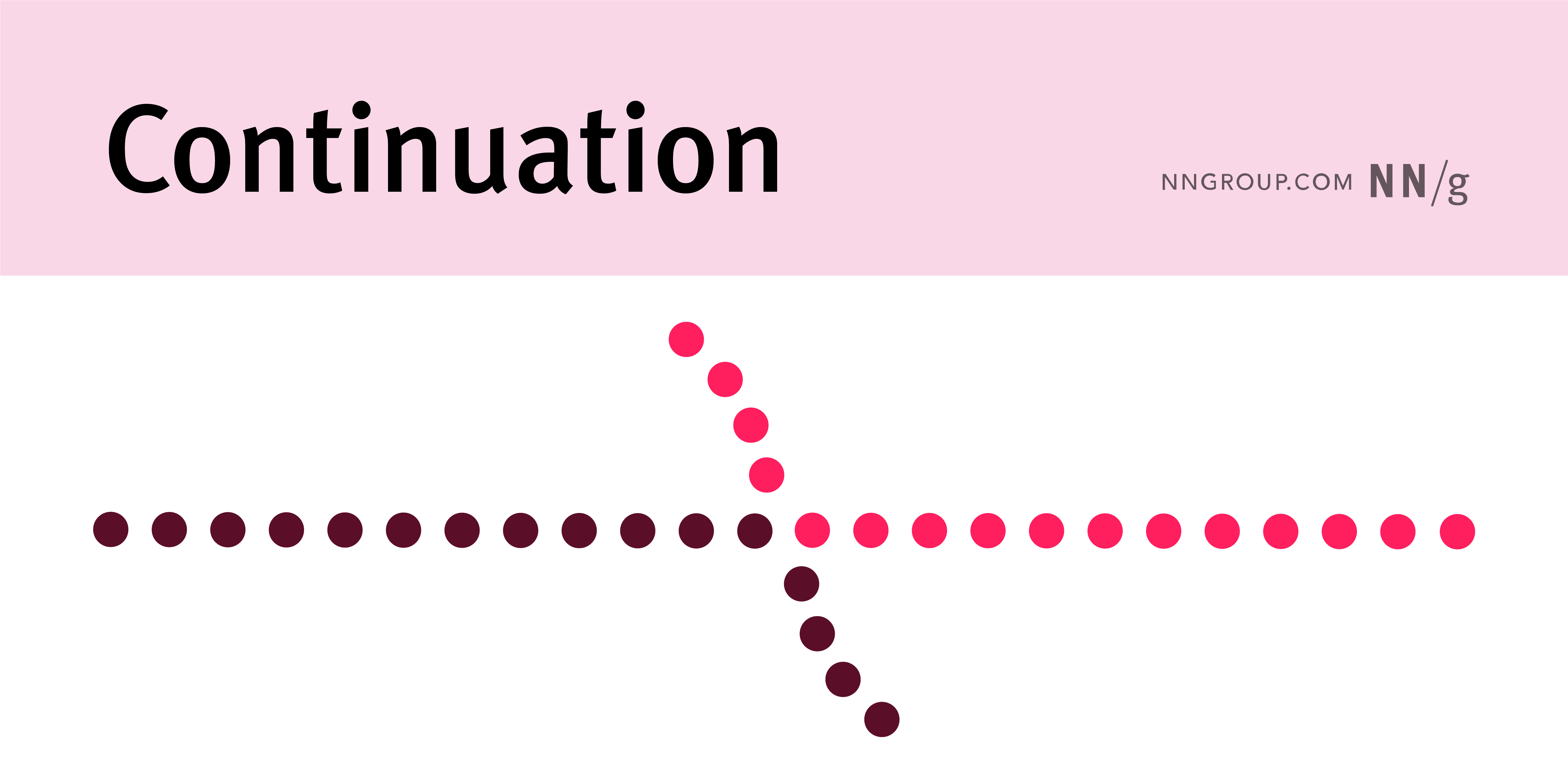
Continuation
A Gestalt principle stating that the eye automatically follows lines and curves, continuing them. Continuation guides users along desired paths in a user interface.
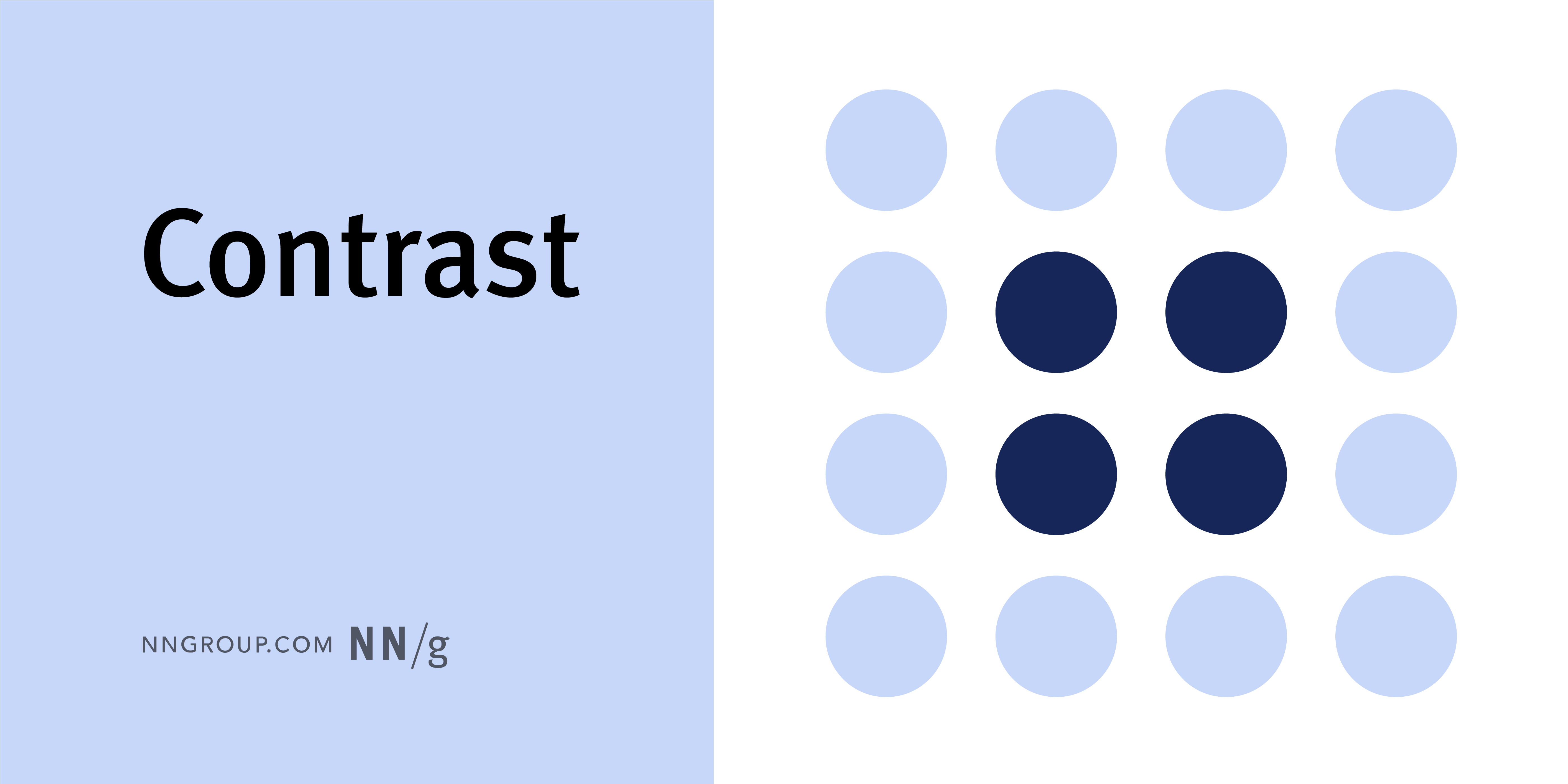
Contrast
The difference in visual properties — including color, brightness, or size — that makes an object distinguishable from its surroundings.
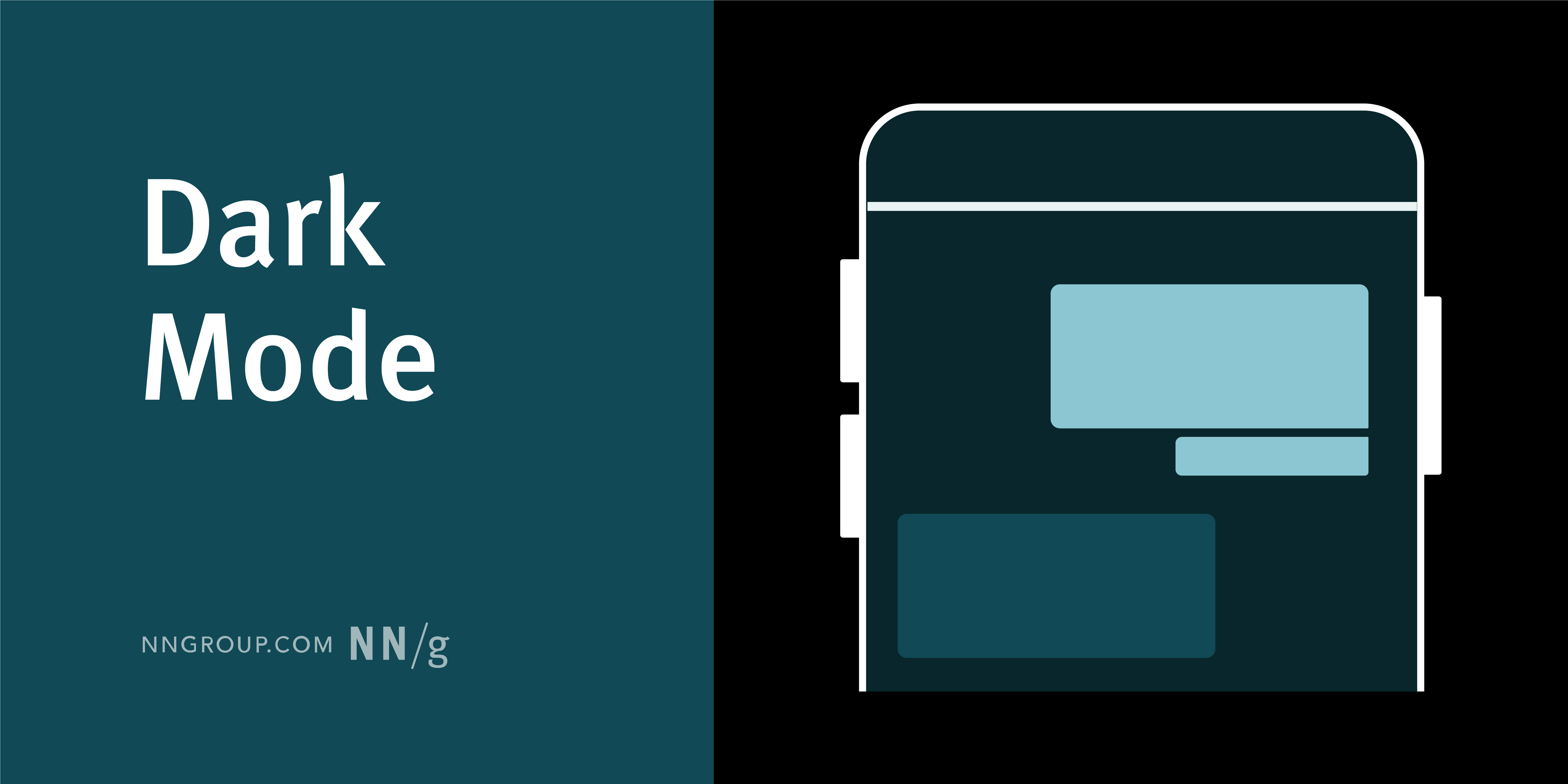
Dark Mode
The combination of light text on a dark background; also known as negative contrast polarity.
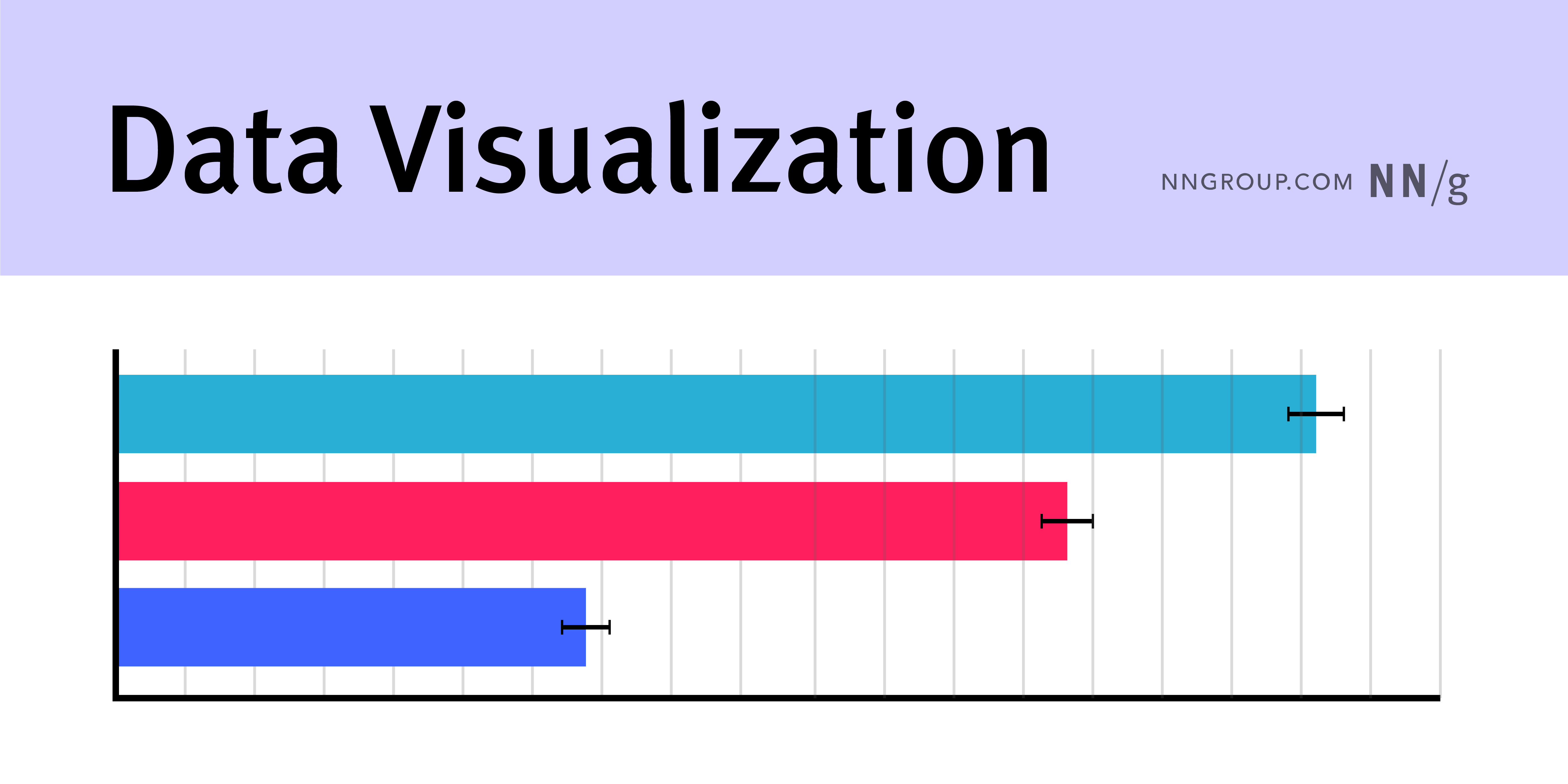
Data Visualization
The representation of data through visuals, such as charts, plots, infographics, and animations. These visualizations are used to communicate complex data relationships and data-driven insights in a way that is easy to understand.
Density
The number of visual elements in a given area or space. High-density designs are sometimes referred to as cluttered, busy, or crowded. Low-density designs use whitespace and few components. Low-density designs are sometimes referred to as “minimalist.”
Design Principles
Value statements that guide designers in making the right tradeoffs in UX designs.
Design System
A complete set of standards intended to manage design at scale using reusable components and patterns.
External Consistency
Established design conventions in an industry or on the web at large, beyond one application or family of applications.
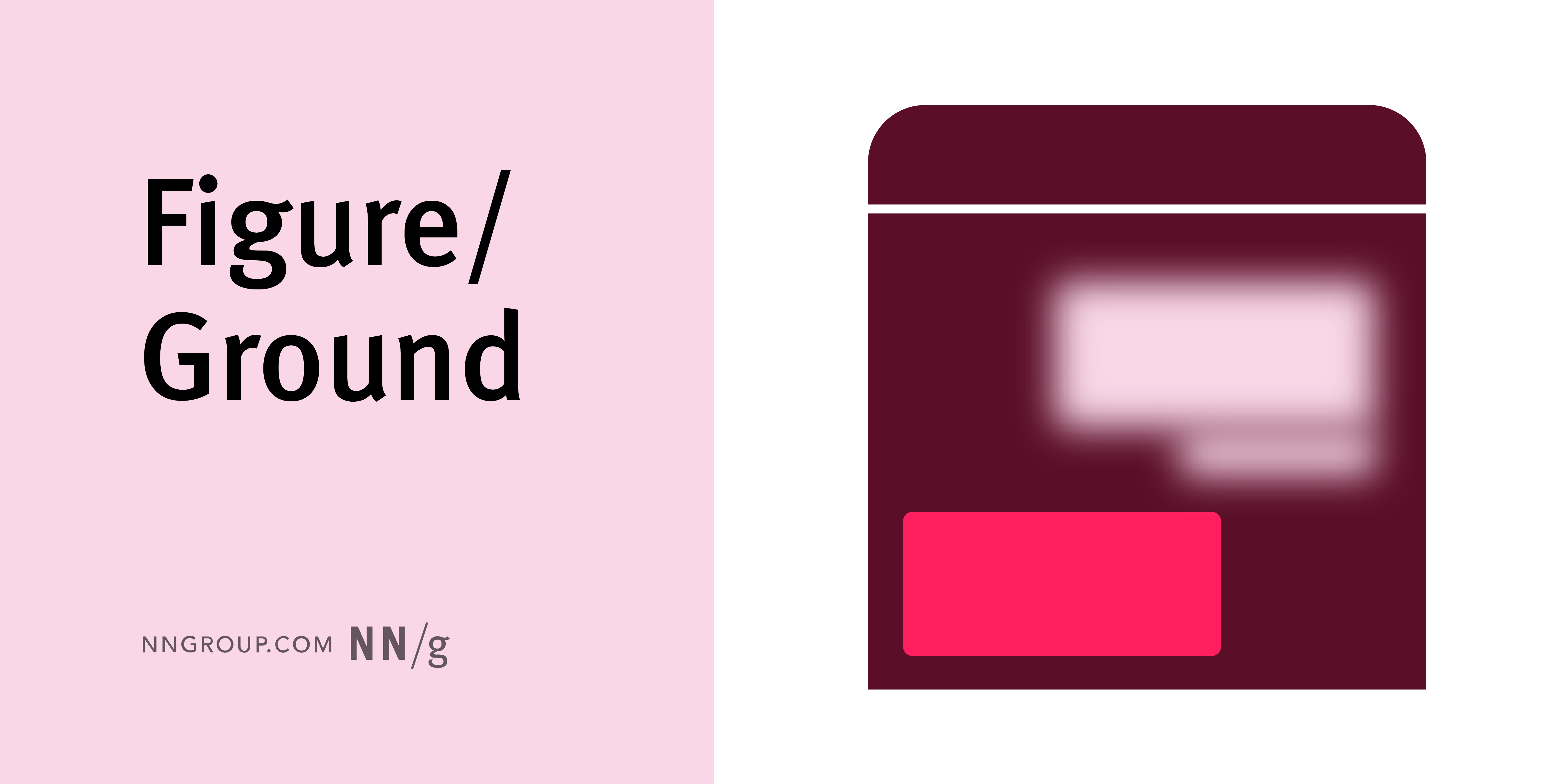
Figure/Ground
A Gestalt principle stating that people divide a scene into foreground and background and focus their perception on elements in the foreground.
Fitts’s Law
Describes how long it takes a user to move a pointer (such as the mouse cursor or a finger) to a target in a graphical user interface (GUI) or other design, as a function of size and distance.
Flat Design
A design style characterized by minimalist use of visual elements such as gradients, shadows, and textures to create a clean and simple interface.
Gestalt Principles
Principles that explain how humans simplify and organize complex images that consist of many elements, by subconsciously arranging the parts into an organized system that creates a whole, rather than interpreting them as a series of disparate elements. Gestalt principles capture our tendency to perceive the whole as opposed to individual elements.
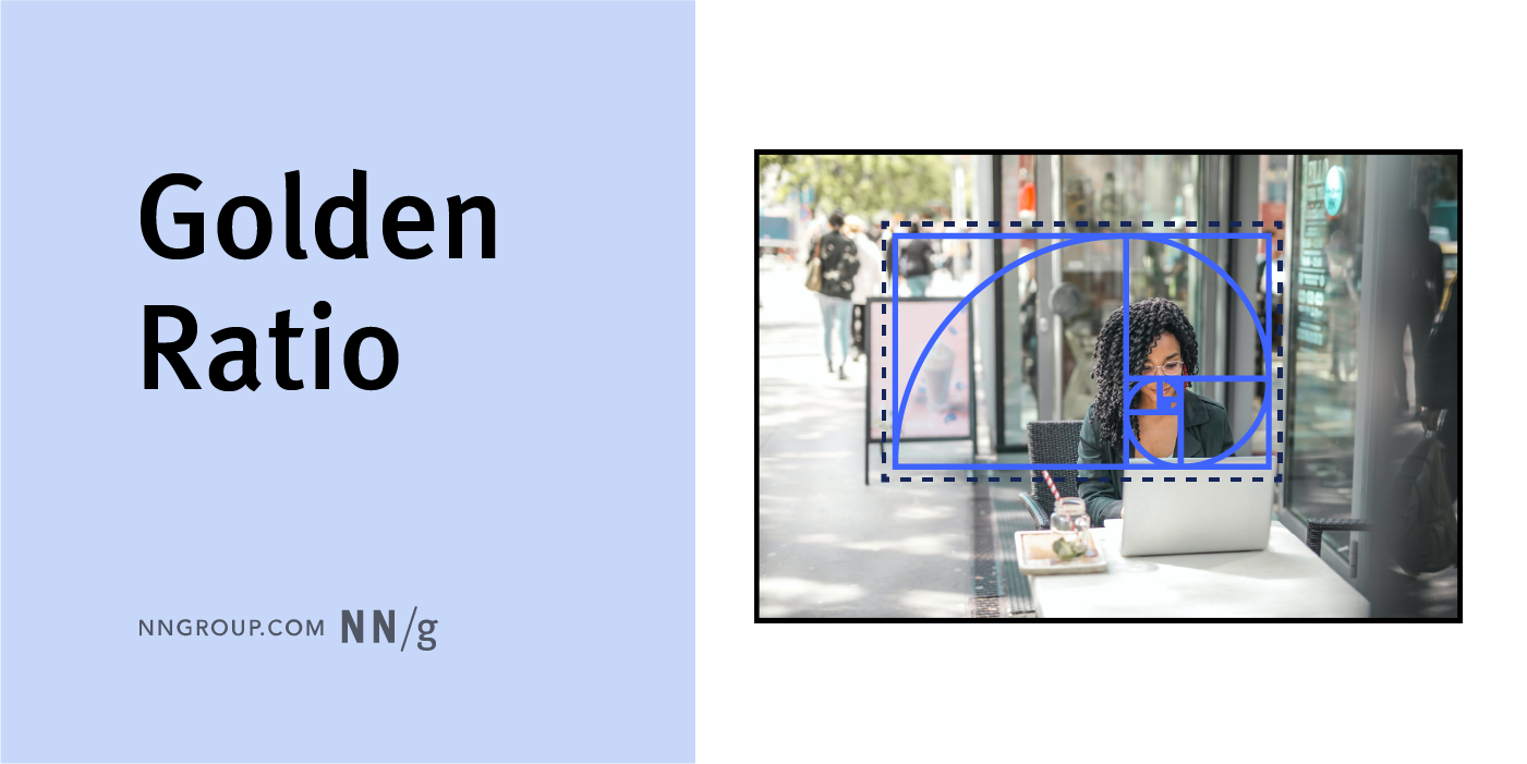
Golden Ratio
A mathematical ratio used in design to create organic, balanced, and aesthetically pleasing compositions, thought to be favored by the human eye. This ratio is found in design, nature, photography, and architecture. In UX, use the golden ratio to harmoniously adjust font sizes, highlight focus areas of images, and create balanced layouts.
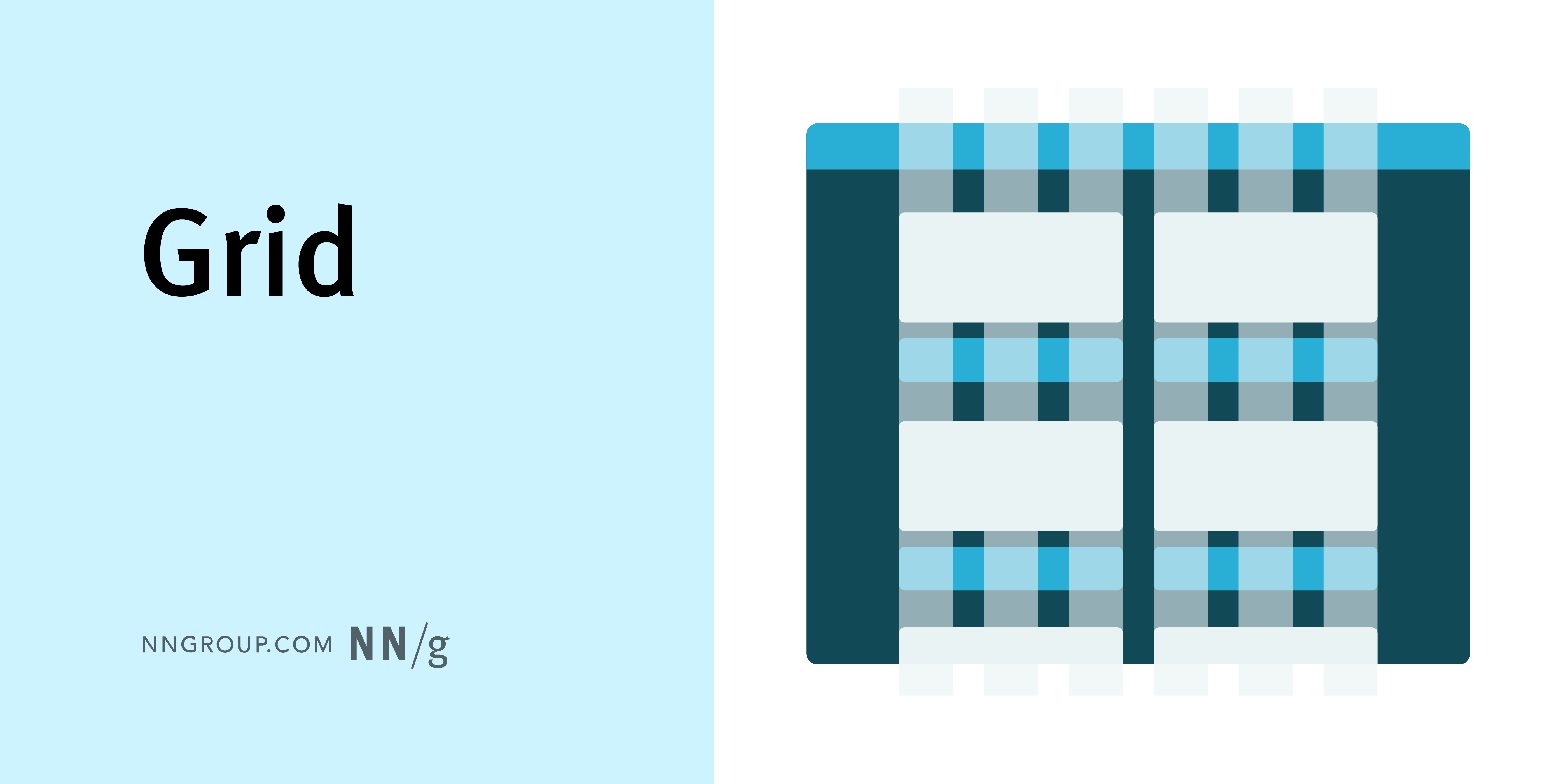
Grid
A visual made up of columns, gutters, and margins that provide a structure for the layout of elements on a page. Common grid structures include column, modular, and hierarchical grids.
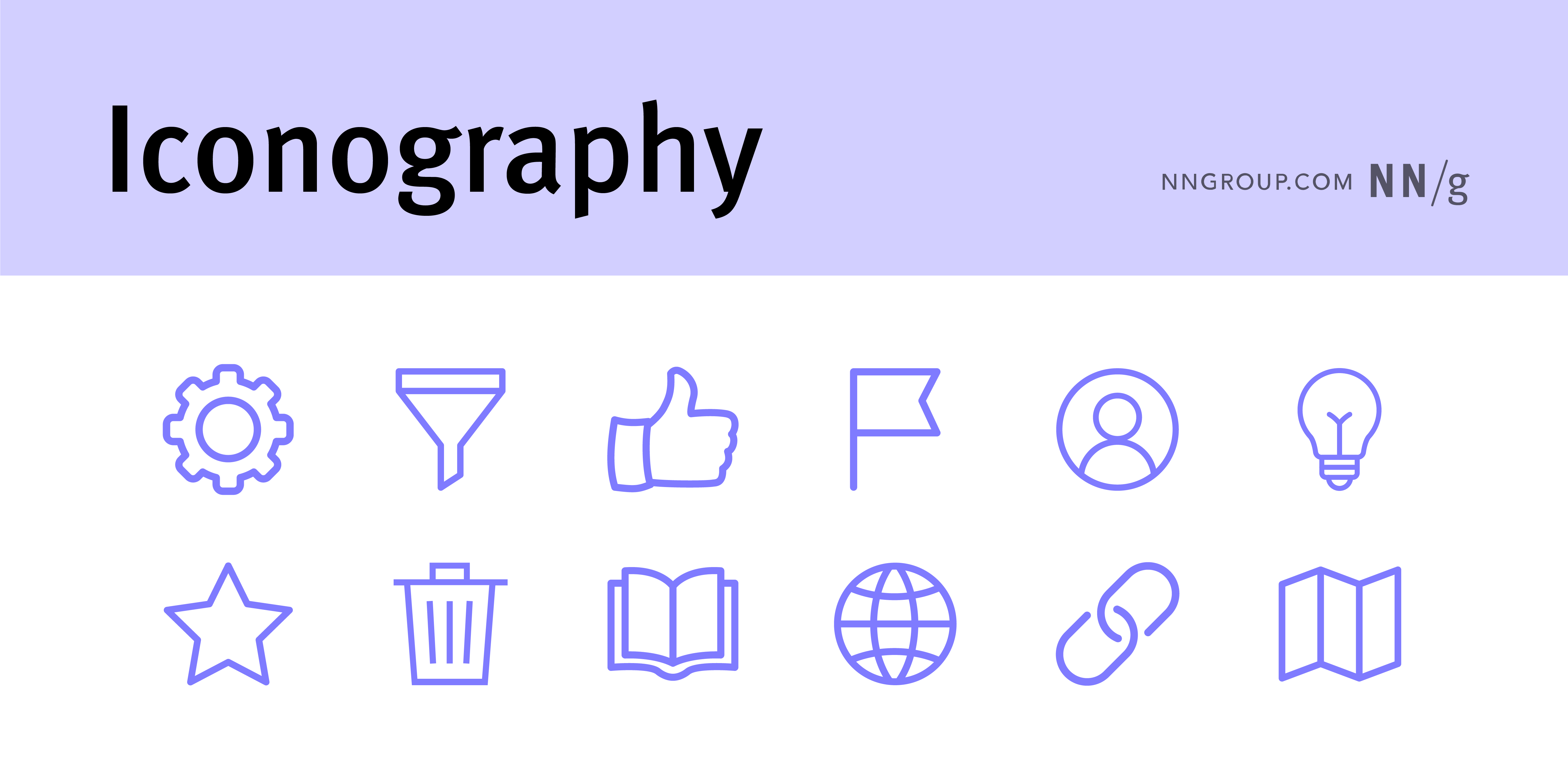
Iconography
The use of symbols or icons to represent concepts, actions, or ideas.
Infographic
A multimedia graphic aiming to present complex information and data in a way that is easy to understand. Infographics often include data or (more rarely) information visualizations but must also provide context in the form of illustrations, facts, quotes, and captions. Thus, an infographic can stand on its own as a separate piece of content (though it can also be shown in the context of an article with additional text).
Internal Consistency
Consistency within a product or family of products, either within a single application or across a family or suite of applications.
Minimalism
A low-density aesthetic style in which a design provides the bare minimum components needed to fulfill some purpose.
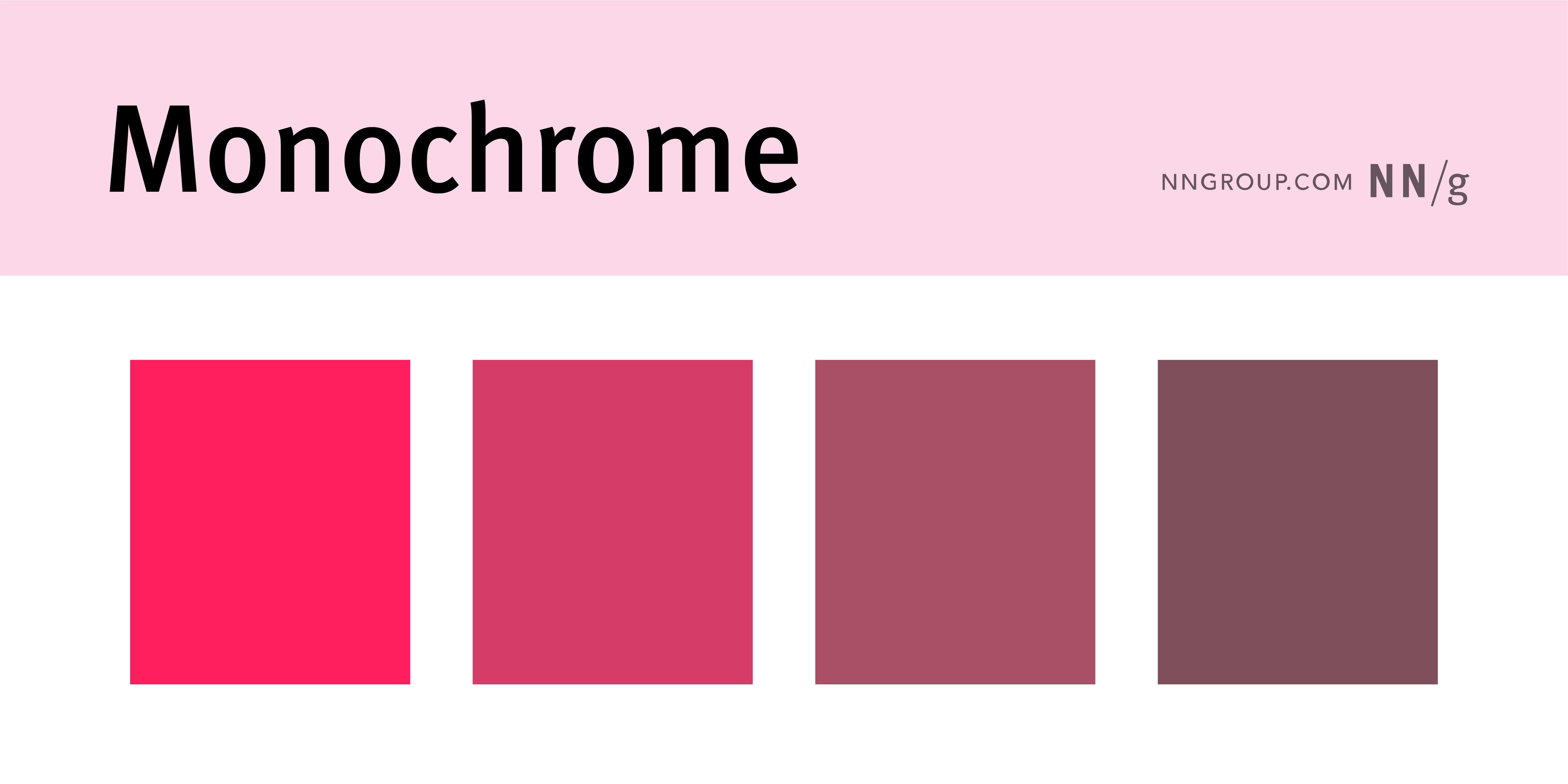
Monochrome
A color palette composed only of different shades of a single color, with no other colors present. Monochrome palettes can be centered around any color, as long as every color in that palette is a lighter or darker shade of that one color.
Prototype
An early version of a design used to test and validate ideas, interactions, and functionality.
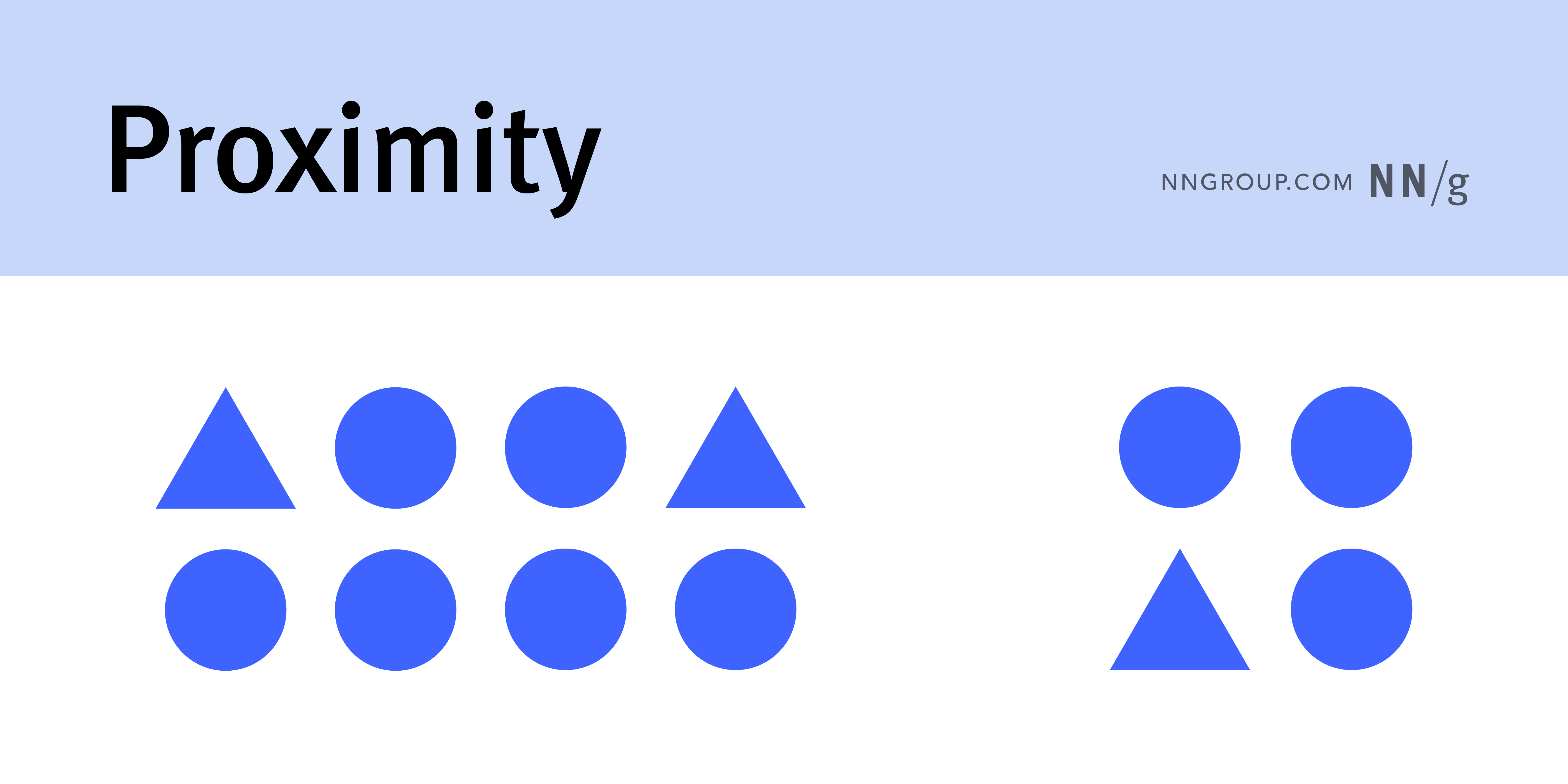
Proximity
A Gestalt principle stating that design elements near each other are perceived as related, while elements spaced apart are perceived as belonging to separate groups.
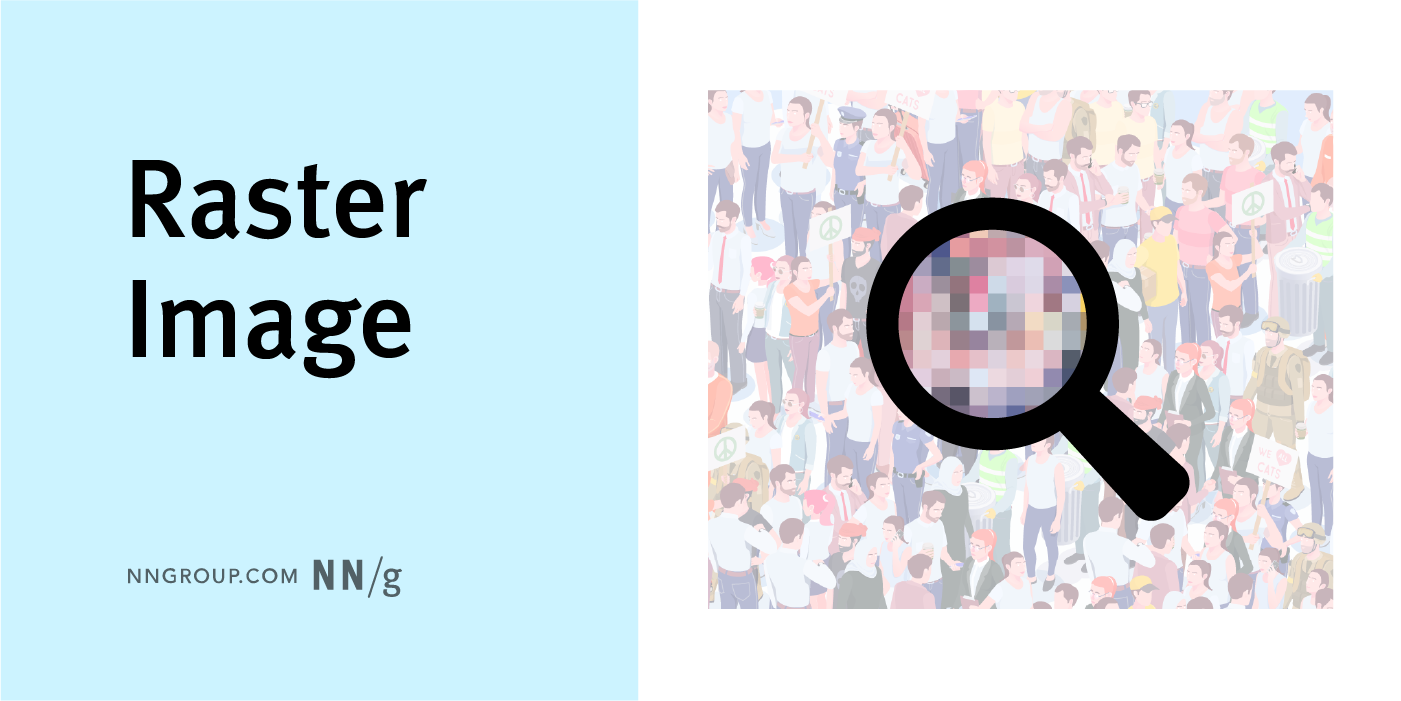
Raster Image
An image whose size is static and is composed of pixels (as opposed to vectors). When a raster image is zoomed in on or stretched, the pixels are more defined or visible. Raster images are also known as bitmap images, including JPG, PNG, or GIF files.
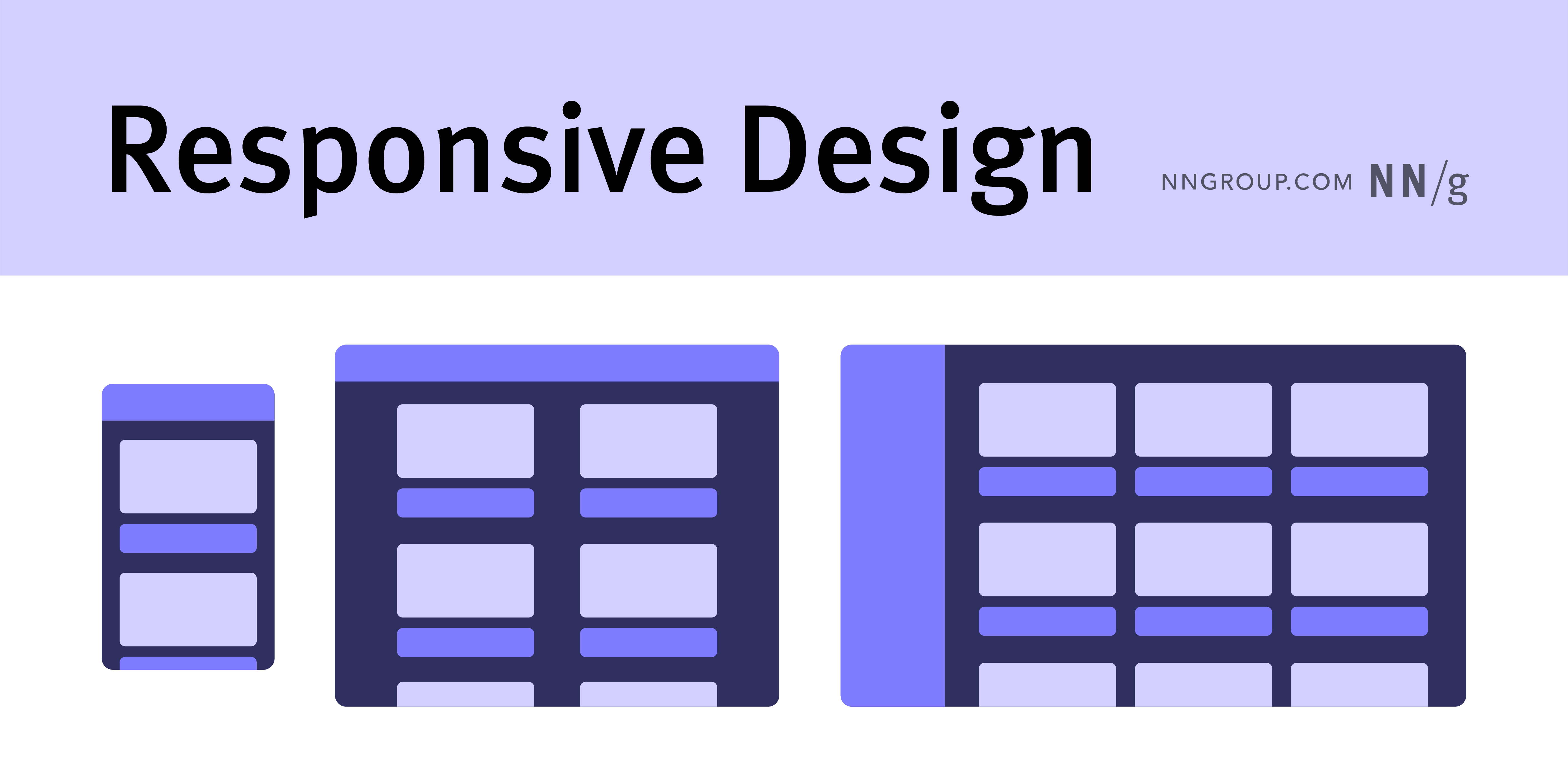
Responsive Design
An interface that adapts and responds to different screen sizes and devices, providing an optimal user experience across various platforms.
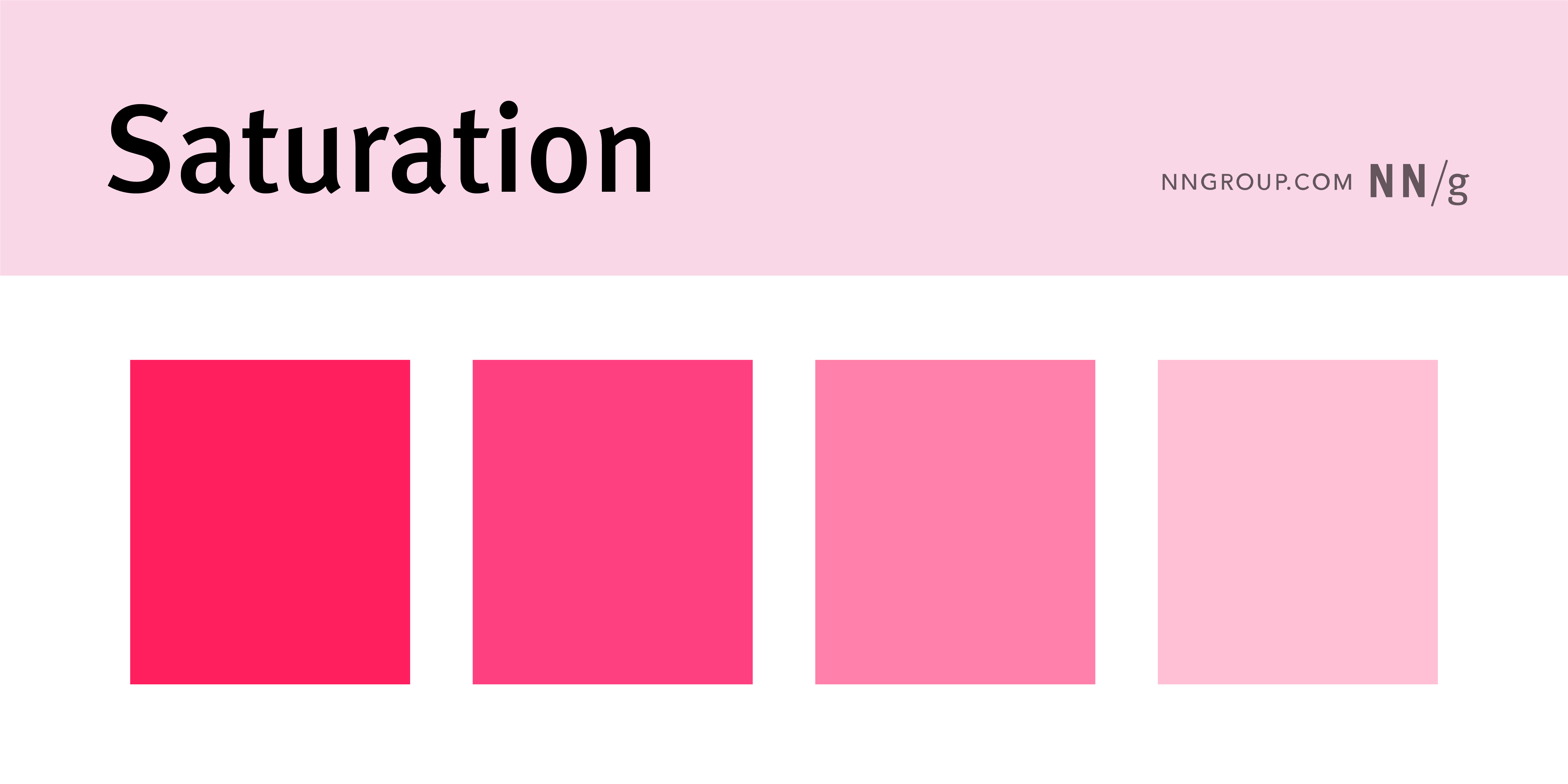
Saturation
How intensely colors appear in any given element. Highly saturated elements use bright, bold colors, while less saturated elements use neutral tones or muted colors.
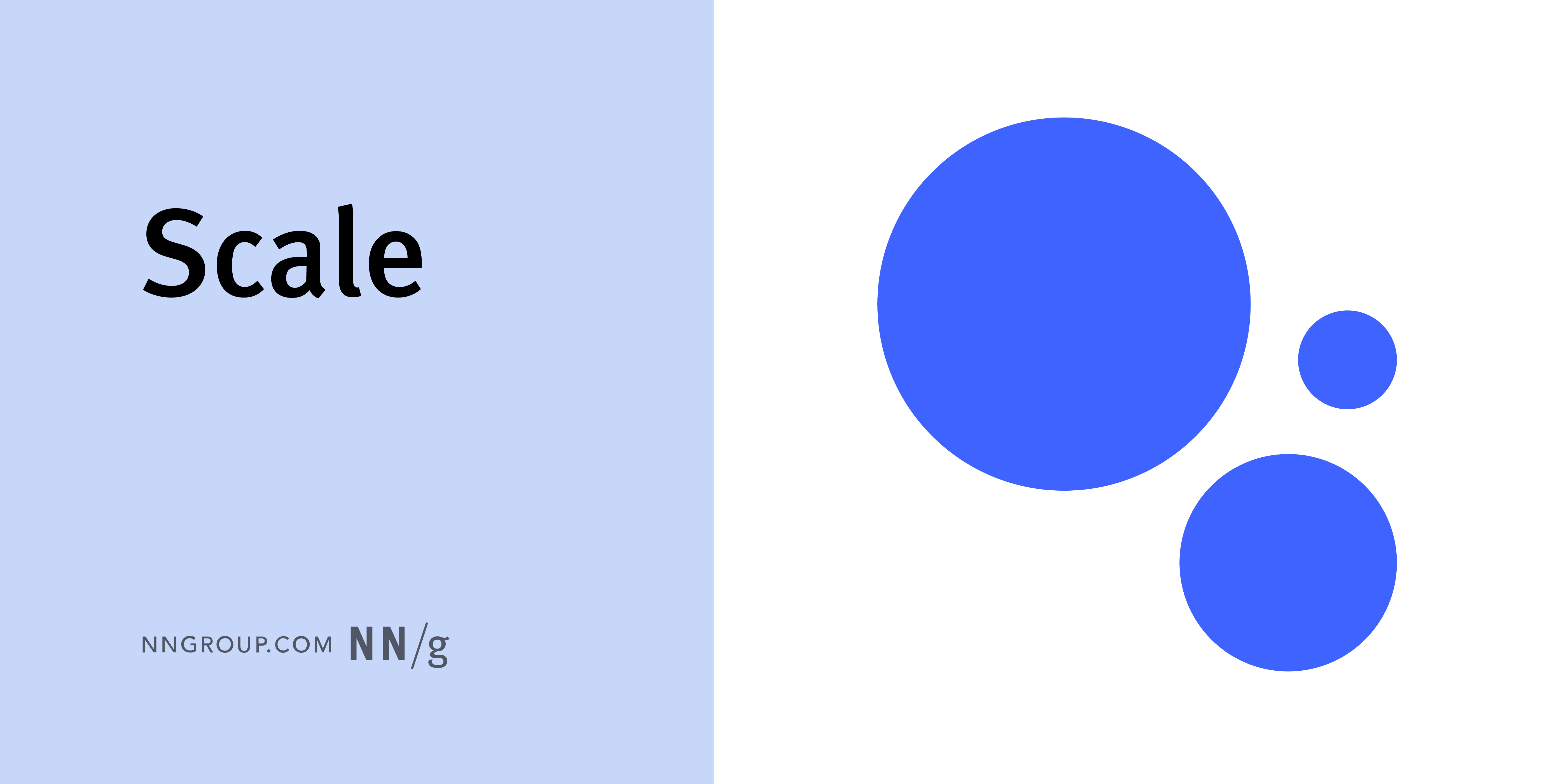
Scale
A design principle that uses relative size to signal importance and rank in a composition.
Signal-to-Noise Ratio
The ratio of relevant to irrelevant information in an interface or communication channel.
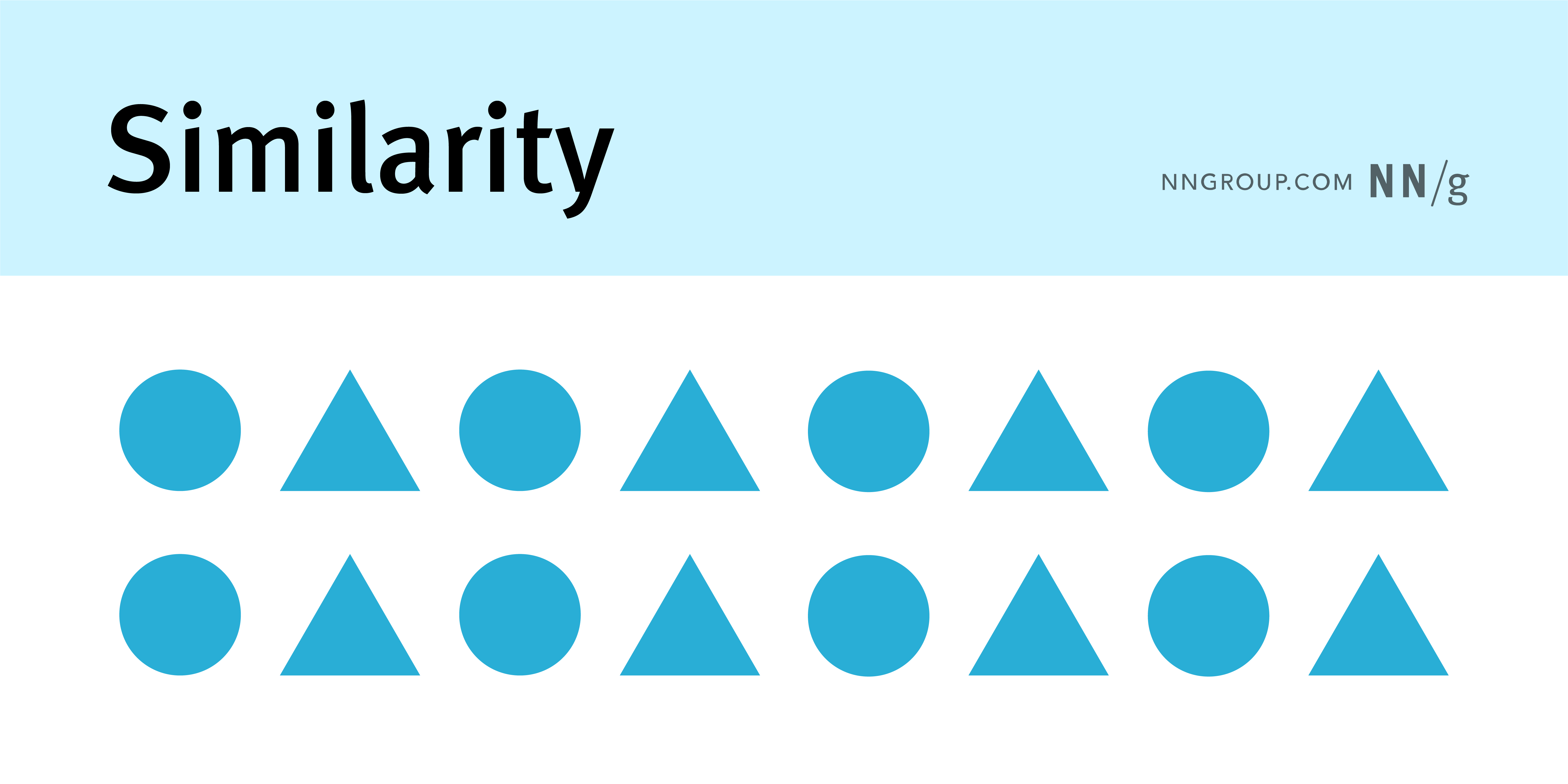
Similarity
A Gestalt principle stating that user-interface elements that share one or more traits (such as shape, color, size, etc.) will be seen by users as being similar and belonging together.
Skeuomorphism
A design practice incorporating real-world elements into digital interfaces to create a sense of familiarity with these interfaces.
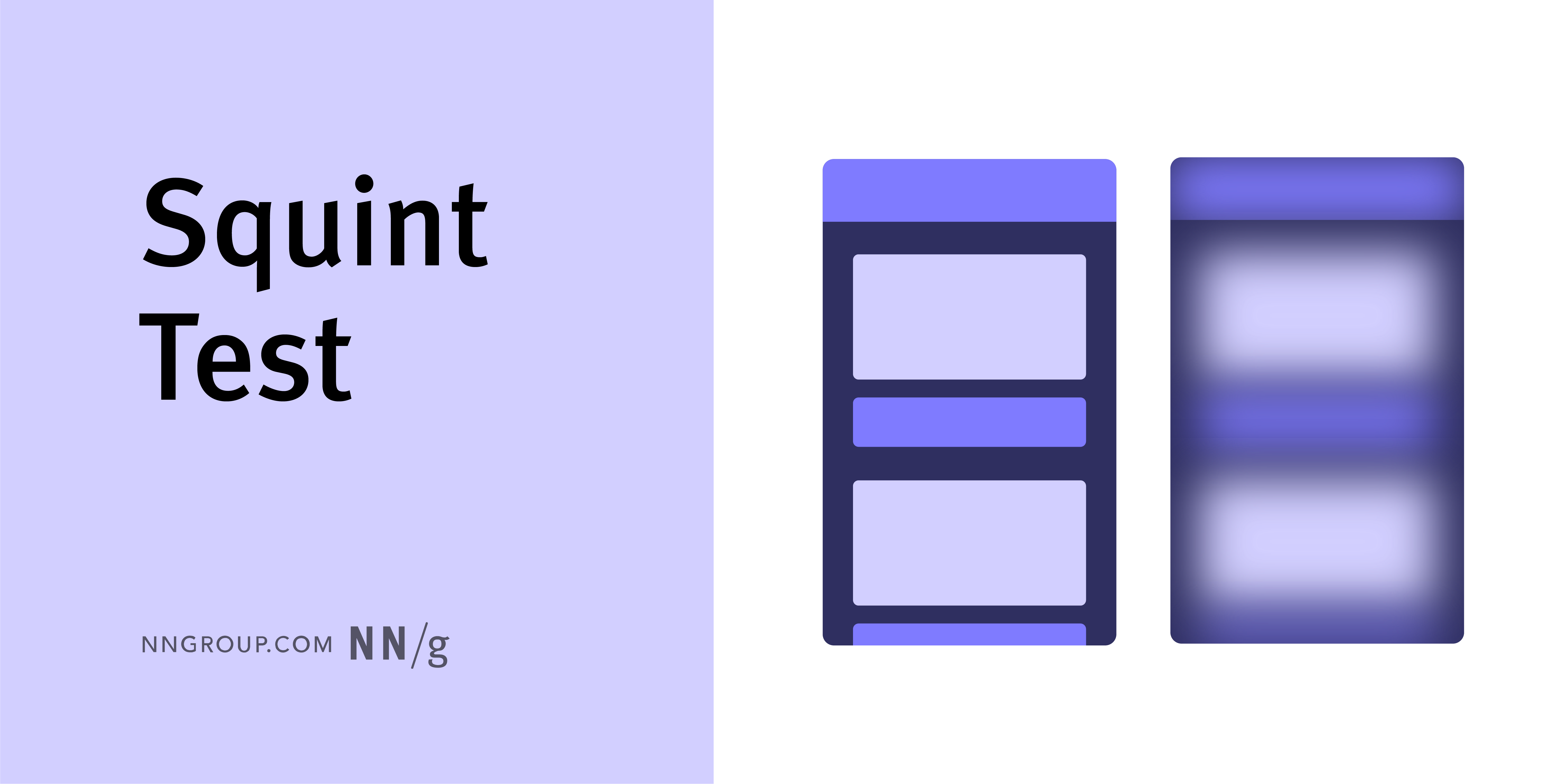
Squint Test
A technique used to evaluate visual designs by narrowing the eyes to reduce detail and focus on overall composition and visual hierarchy.
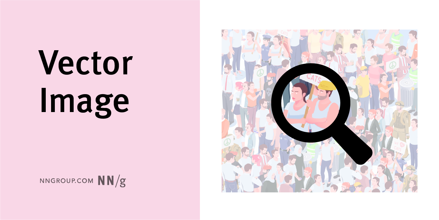
Vector Image
An image that can be easily scaled or modified because the file contains mathematical calculations for every shape in the image. Vectors are typically used for images that are not photographs, such as logos, icons, diagrams, or other graphics.
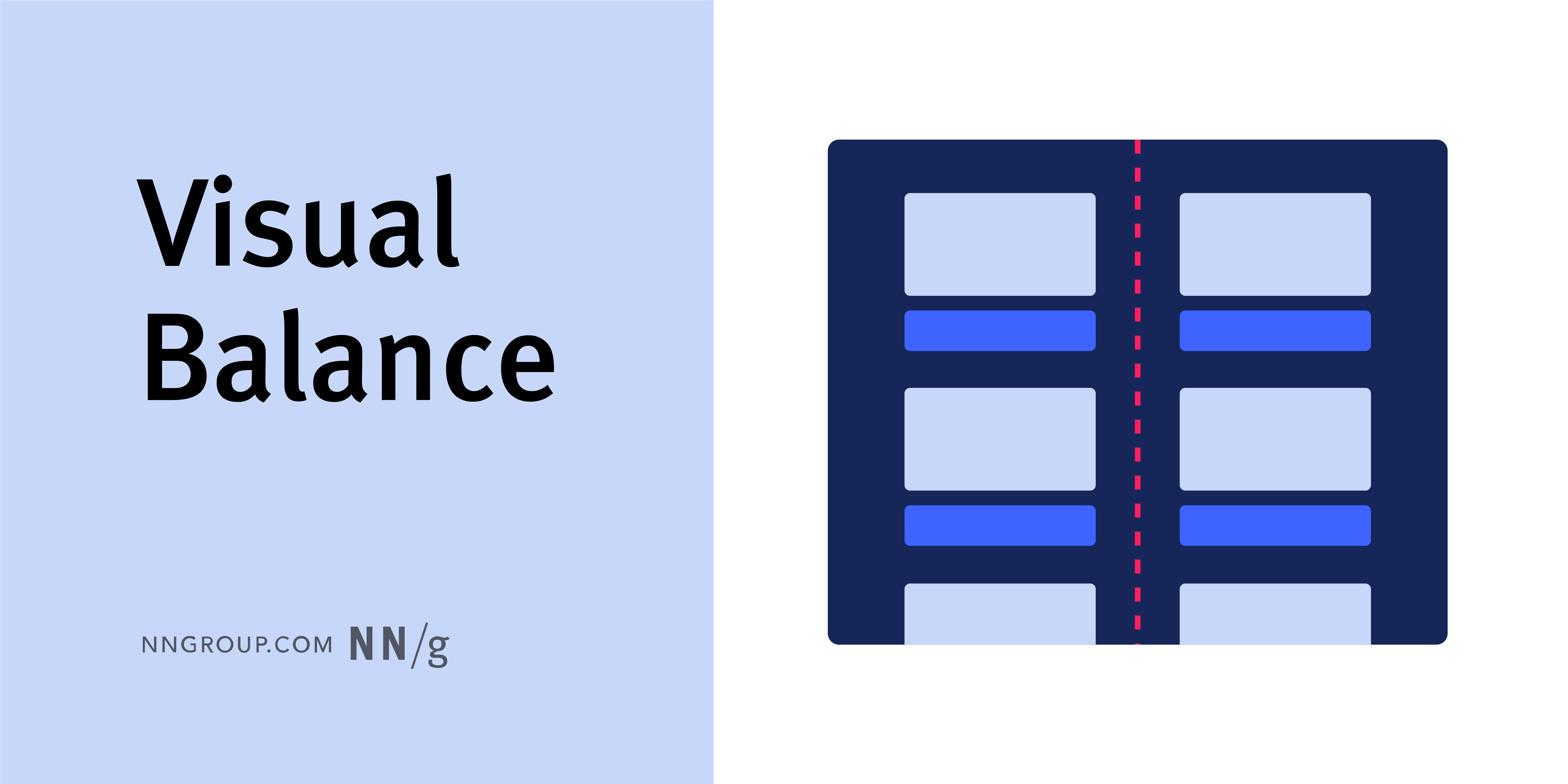
Visual Balance
A satisfying arrangement or proportion of design elements. Balance occurs when there is an equally distributed amount of visual signal on both sides of an imaginary axis going through the middle of the screen. This axis is often vertical but can also be horizontal. A design can have symmetrical, asymmetrical, or radial balance.
Visual Hierarchy
The organization of design elements on the page so that the eye is guided to consume each design element in the order of intended importance. Visual hierarchy can be created through color and contrast, scale, and grouping of elements.
Visual Weight
The perceived importance or prominence of a design element based on its size, color, contrast, or placement. Objects that are bigger in size, similar in shape, use dark colors, or have high contrast appear visually heavier.
Whitespace
The empty space between design elements used to achieve a balanced design, making it easier for users to scan and read.
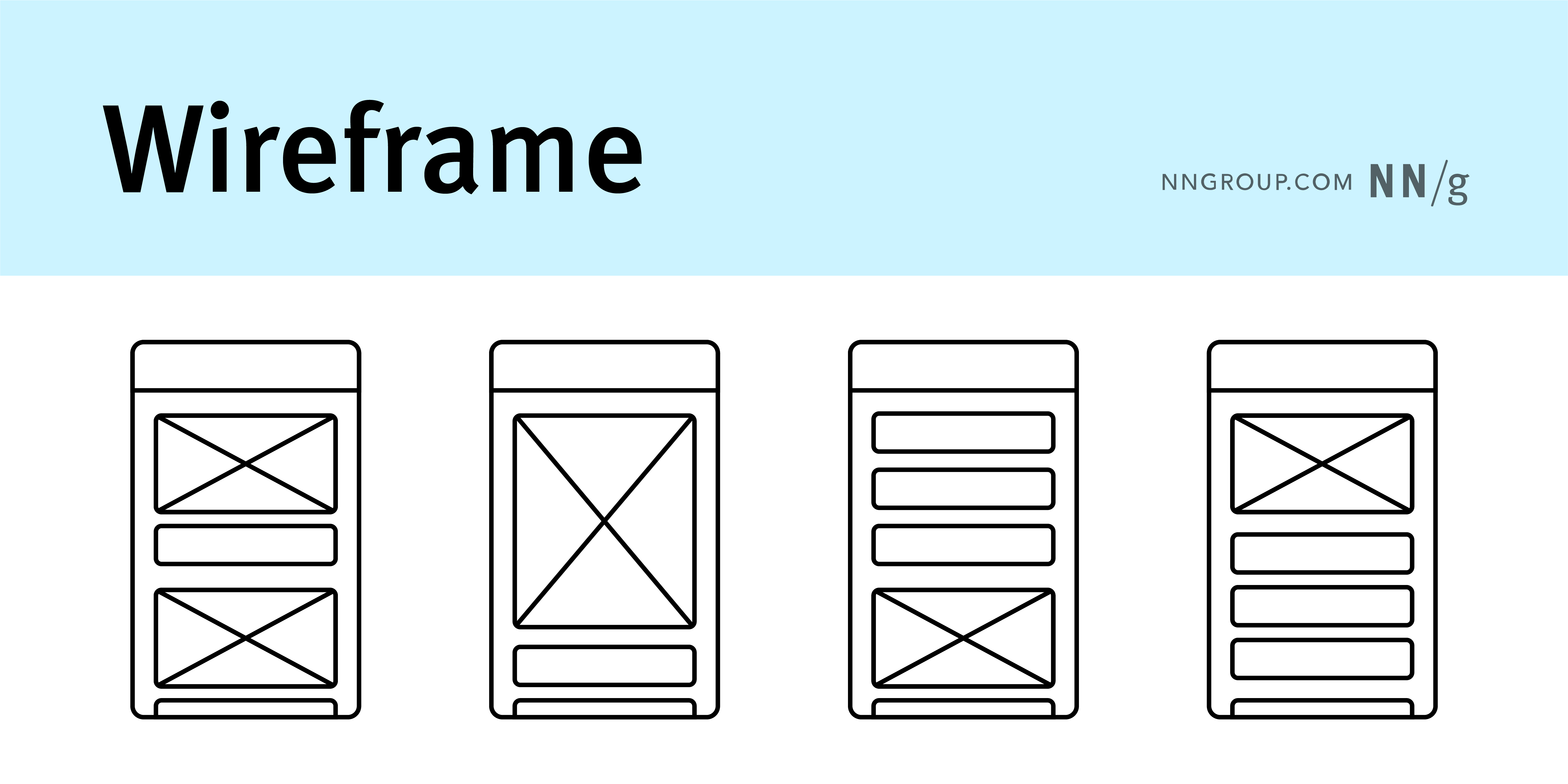
Wireframe
A skeletal outline of a design layout used to represent the structure and functionality of an interface before visual design is considered.