Photo by Climate KIC on Unsplash
I am sure, every UI and UX Designer knows that kind of problem: You have received a briefing for a new project. Everybody is on fire and is going to do some fancy stuff for it. But how to start? How to create innovative ideas? How to set your mind free and let your creative-you come out?
It is easy: Turn your computer off. Get out of your digital comfort zone. Tools like Sketch, Invision, Balsamiq, Axure, Adobe XD and stuff like this are great to produce wireframes, click-dummys, prototypes and design languages, but they hamper you from getting really creative in the first step.
Here are my three favorite methods to push your output to the next level
MindMaps
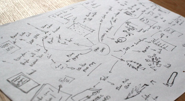
Grab a piece of paper and just write and scribble down all your ideas based on your briefing. It is so helpful to see your thoughts and notions on paper, written by hand. The whole process of ideation is fixed visually. The whole process of a ideation will be fixed visually. Another advantage of a mindmap is that you can easily show your teammates your ideas and how you got there.

Photo by: Steffi Kieffer
Crazy Eights
It is not just the name of the method which is pretty nice. ItThe kinds of ideas you get out of it are also unexpected. And the best: It is time boxed.
How to do Crazy Eights?
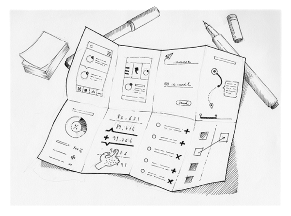
It is a simple thing. Grab a big piece of paper. Fold it to get 8 squares out of it. That is your playground. From now on you will have 60 seconds per square to sketch down your idea. It is possible to sketch 8 variations of one idea into the squares or to draft 8 different ideas into the boxes. It is about creating various ideas in a visual way within a time boxed frame. Pressure of time is your booster to draw your ideas quick & dirty. — The essential thing of this technique is the strict time limit. And it does not matter if your sketches are beautiful or ugly as f**k.

Photo by: Sarah Regli
Use physical Objects
a few days ago at COBE we received a brief from a client asking to manage and sort several content items simultaneously through using a maximum of 3 physical buttons.
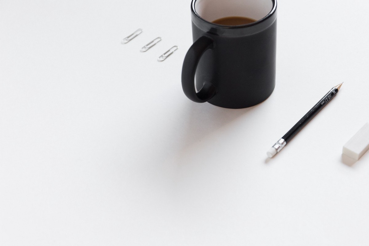
So we turned off our laptops and rebuilt the existing interface using pens, yes pens. Every pen represented a content item. We tried to move the objects from point a to point b through using 3 kinds of taken actions, like up or down. We found that a cup became a good representation of a container. So we added a cup to our interface rebuild.
Our solution was the following:
Select pens in order to move them into the cup
Moving the cup up or down to define the new positions of the pens
Taking pens out of the cup and into the new position
The best thing of this method is, that you can easily explain your idea to all of your team mates and discuss your idea by having a visual and haptic prototype of your thoughts.

Photo by Bench Accounting on Unsplash
Thanks for reading my article. I would love to get feedback from you, just leave a comment below!
