This typographic style, characterized by its extended letterforms and impactful presence, is not just a fleeting fad. It’s a revival of a classic style, now intertwined with the boldness of neubrutalism, a design movement known for its raw, unfiltered aesthetic. But more on that in a moment.

First, let’s thoroughly describe what wide fonts are.
What Are Wide Fonts?
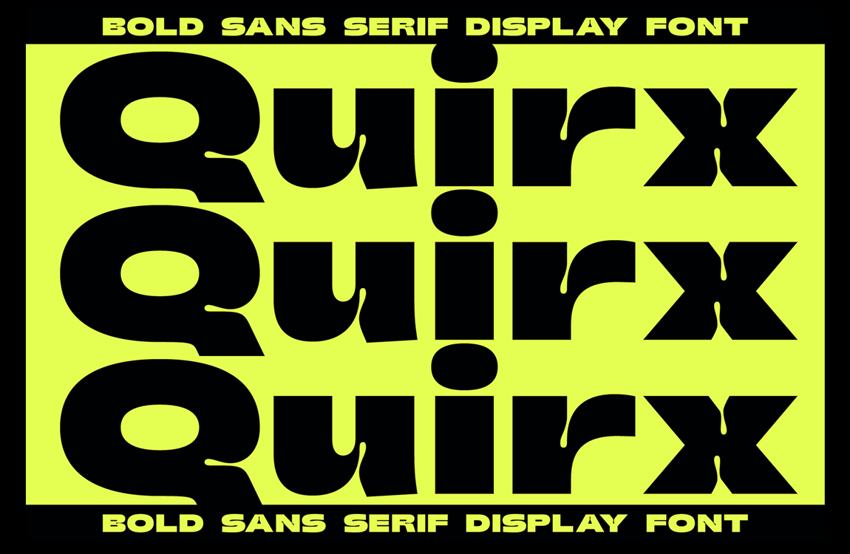
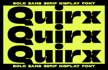
Wide fonts (or wide type), as the name suggests, involves typography with extended, often exaggerated, horizontal proportions. It’s a bold statement in the design world, reminiscent of the mid-20th-century typesetting, but with a modern twist. These fonts are not just wider though. They also carry a personality that is often loud, assertive, and unapologetically present.


Historically, wide type has roots in the advertising and print media of the 50s and 60s. It was a way to capture attention, to shout louder in a world bustling with new products and ideas.
Today, its resurgence is not just a nod to nostalgia but a response to the cluttered digital space. In a world where grabbing and holding attention is more challenging than ever, wide type is hard to ignore.
Neubrutalism in Web Design
Neubrutalism, the rebellious child of the design world, finds harmony with wide fonts. Originating from the architectural movement of Brutalism, neubrutalism in web design is all about raw, unrefined, and utilitarian aesthetics. It’s a pushback against the sleek, overly polished designs that have dominated digital designs for years.
Wide fonts complement this aesthetic perfectly. Their boldness aligns with the straightforward, “function over form” philosophy of neubrutalism. And together, they create a design language that is both striking and grounded, a visual storytelling method that’s honest and direct.

Wide Fonts in Action
Exploring real-world examples offers invaluable insights into how wide fonts are being utilized in contemporary web design. Let’s take a look at several notable websites, fonts, and designs that capture the wide font trend well!
USSR Design Almanac
The USSR Design Almanac website is a fascinating showcase of wide type in action. The site uses bold, stretched letterforms that grab attention immediately. It’s not just about size though. This text makes a statement.
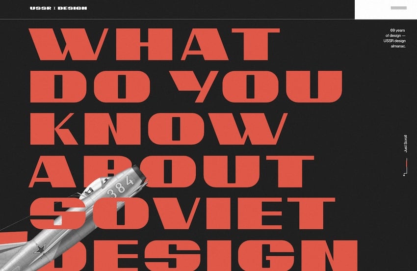

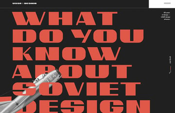
The typography here acts as a central design element, guiding the user’s eye and setting the tone for the browsing experience. The wide type, combined with a minimalist layout and stark color contrasts, encapsulates the essence of neubrutalism as well.
DEMO Festival
DEMO Festival’s website offers another intriguing example. Here, wide type is used to create a sense of movement. The typography stretches across the screen in multiple ways, breaking traditional boundaries and creating an immersive experience.

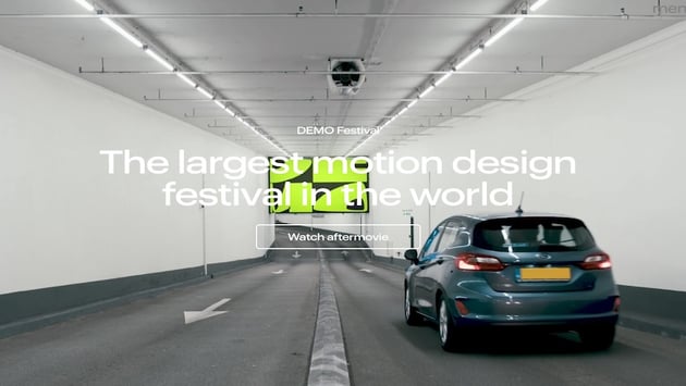

It’s a blend of art and function, where the wide font reflects the festival conceptually: it pushes creative boundaries.
Gumroad

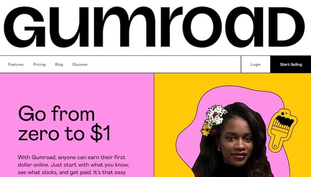

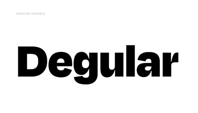
Gumroad’s branding, though not using wide type in the strictest sense, aligns with the trend through its use of geometric fonts with unique details. The Degular font, for example, while not wide, shares the overall feeling of a geometric font with funky details.


This style complements wide fonts by offering a visually interesting contrast — the structured geometry plays off the extended forms, creating a balanced yet dynamic visual hierarchy.
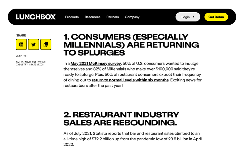
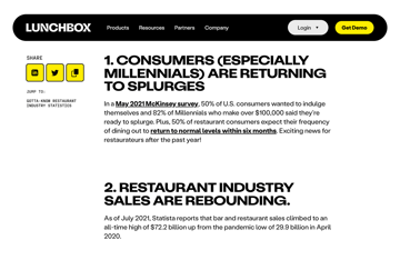
Dropbox’s Sharp Grotesk
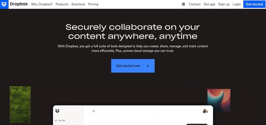

Dropbox’s use of Sharp Grotesk is a prime example of an extended font in a corporate context. This font choice marked a significant shift in Dropbox’s brand identity, moving from a friendly, approachable look to something more mature and versatile.
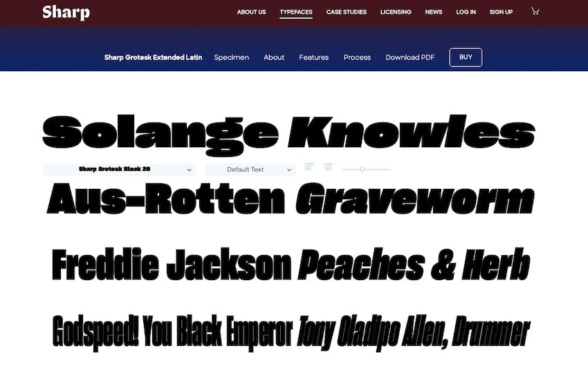
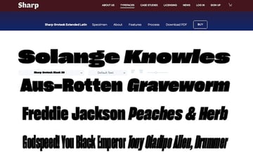
Sharp Grotesk’s wide range of widths and weights allows for a flexible yet cohesive visual language.
Streamline Shopify Theme
Another example can be found in the Streamline Theme on Shopify. This theme, designed for impactful visual storytelling, makes good use of wide, bold typography to create a sense of immediacy and modern style.


The wide font here is prominent on the website’s headers and important call-to-action areas, both attracting attention and conveying a message of confidence.
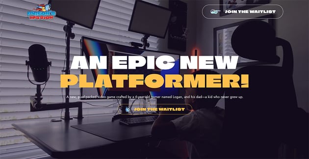
FATES World
FATES World’s website is a striking example of how wide fonts can be blended with sci-fi and retro-futurism designs. The site uses wide, bold fonts that encapsulate the essence of sci-fi narratives — vast, unexplored, and forward-looking.
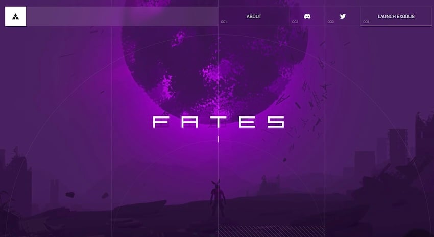


This typography choice complements the site’s thematic content, which revolves around space exploration and futuristic concepts.
Claud
Our last example comes from the Claud project on Behance, which showcases a masterful integration of wide fonts within a futuristic design. The bold, stretched typography complements the project’s theme, which appears to be rooted in a blend of digital art, character design, and crypto-brand identity.


The wide fonts in Claud make it feel modern, enhancing the narrative on display. It appears on trend and relevant.
Designing with Wide Type
Incorporating Wide Type into web design is not just about selecting a bold font. It’s about crafting a brand story and creating a visual impact that resonates with the audience.
Here are some best practices to follow when looking to incorporate wide fonts into your web designs:
- Balance is Key: Wide fonts are inherently bold. Balancing it with negative space and more subdued design elements ensures that the typography stands out without overwhelming the design.
- Legibility Matters: While extended fonts make a statement, they should not compromise readability. Careful consideration of spacing, sizing, and contrast is a must.
- Contextual Use: Wide Type works best when it aligns with the brand’s identity and message. It should enhance the content, not distract from it.
- Responsive Design: With varying screen sizes, ensuring that wide type scales appropriately is essential. It should maintain its impact without breaking the layout on smaller screens.
Incorporating wide fonts in your web design can add depth, impact, and character to your layout. When used effectively, it can elevate the overall visual appeal of your website and enhance the user experience.
The Future of Typography in Web Design
As the design world embraces the overall boldness of wide fonts that have been inspired by or coincide with neubrutalism, the question arises: what’s next in the world of web typography? Here’s a quick rundown of what we think comes next:
- Continued Evolution: Just as wide type has made a comeback, we can expect other historical typography styles to be reimagined in modern contexts.
- Experimentation with Color and Texture: The interplay of bold typefaces with innovative use of color and texture could be the next step in pushing this trend forward.
- Accessibility Focus: A growing emphasis on accessibility will influence how wide fonts are used, ensuring that designs are not only impactful but also inclusive.
Wide Fonts and Extended Fonts Are Here to Stay—For Now
Wide type is a trend, yes, but it’s also a reflection of a broader shift in web design toward authenticity, boldness, and expressiveness. Its use of neubrutalism marks a departure from the safe and familiar, challenging designers to think outside the conventional box.
Will you be using wide fonts in your next design? They might be just the thing your design needs to make an impact.