Emojis are frequently called the universal language, or lingua franca, of the 21st century. They help break down barriers between people from different cultures and languages (and they’re good fun). However, accessibility experts point out some important issues related to emoji accessibility, and localization experts share their concerns.
In this article, we’ll look into emoji accessibility and see how web designers and content creators can prevent the most common issues.
Who is Affected by Emoji Accessibility Issues?
Overall, emoji accessibility is an aspect of website accessibility that is overlooked. If used without care, emojis can make it harder to access and understand web content for:
Now, let’s see the accessibility issues the aforementioned groups encounter and how you can mitigate them.
Jump to our emoji accessibility tips:
1. Don’t Overuse Emojis
As screen readers and text-to-speech tools read the built-in alt text of emojis aloud, overusing them can overwhelm people who rely on these assistive technologies.
As a rule of thumb, don’t add more than three emojis after each other and only add a new one if it carries extra information. For example, adding three different types of laughing emojis (e.g. 😃😆😄) harms the user experience for people who access your website with a screen reader or text-to-speech tool.
2. Resort to the Default Yellow Smileys and Hand Gestures
For the same reason mentioned above, try to use the default yellow smileys and hand gestures, unless skin tone adds extra meaning to your message.
The default smileys always have a shorter alt description than the modified ones — for example: waving hand sign vs. medium-light skin tone waving hand sign.
While using skin tones can add important information to the emoji, skin tone emojis make text-based content longer, which can become overwhelming for people who access web content with screen readers and text-to-speech tools, especially when they are overused — e.g. if you add more than one or all the skin tones of the same emoji like 👋👋🏻👋🏽👋🏾👋🏿.
3. Avoid Using Emoticons
Emoticons are similar to emojis as they intend to express emotion in textual content. They consist of a group of letters, punctuation marks, and/or numbers which when placed next to each other more or less look like a facial expression (e.g. :-) for smiling) or express an emotion (e.g. <3 for a heart or ¯_(ツ)_/¯ for a shrug).
However, unlike emojis, emoticons don’t have a built-in alt text, so screen readers and text-to-speech tools list the characters after each other when reading them aloud — e.g. “colon hyphen right round bracket” for the smiling emoticon.
To improve emoji accessibility, always use emojis instead of emoticons unless they are not available (e.g. in older email clients).
4. Test Your Emojis in Different Color Modes
By default, emojis are designed for light mode, however people with different types of vision impairments frequently browse the web using dark or high contrast mode.
In addition, dark mode is also often used by regular web users, especially if you have added a theme switcher to your website or application. However, even if you don’t have a theme or dark mode switcher, it’s still recommended that you test the emojis you use in your content or design for dark and high contrast modes, as people frequently set these accessibility modes from their operating system.
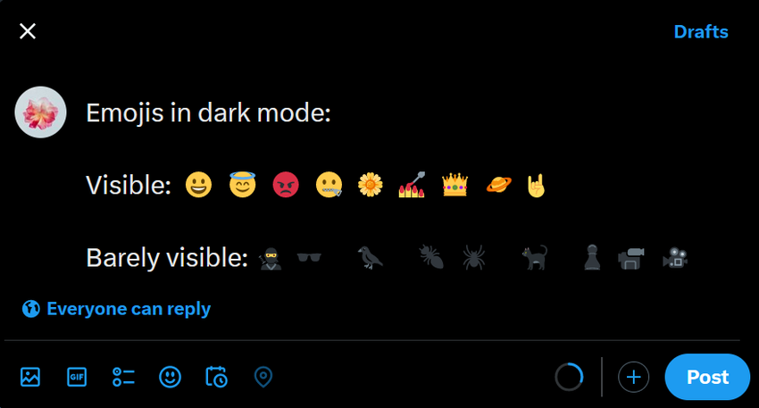
Below is an example of what some emojis look like in dark mode in Twitter’s post editor (set from the operating system as this is how most people with vision impairments use their computers, however the emojis look the same when we set Twitter’s own dark or dim mode in its web interface).
As you can see, some emojis are barely visible, and the issue becomes even more obvious when they are compared to emojis that still have high visibility in dark mode (this is also a good example of why it’s a good idea to use the default yellow emojis if you can):


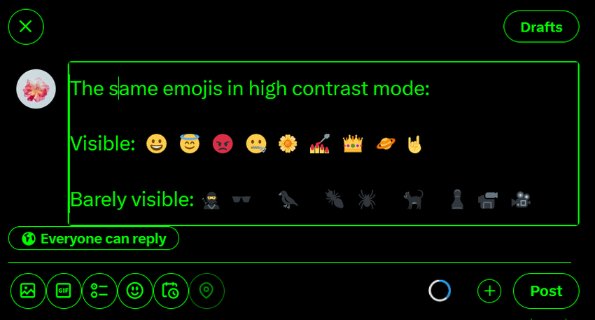
Here are the same emojis in high contrast mode (also set system-wide) — as the screenshot above shows, they pose the same invisibility issue as in dark mode:

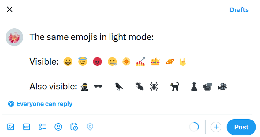
For reference, here’s what the same emojis look like in light mode — as you can see, the emojis that are barely visible in dark and high contrast modes are highly visible in light mode (however, some of the yellow emojis become less visible, e.g. the hand gesture at the end):
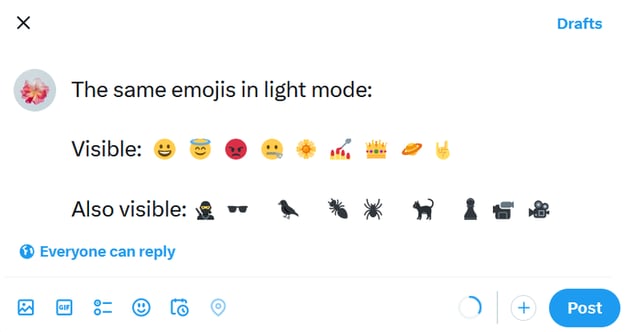

You can further improve emoji accessibility if you choose an emoji design that adds an outline around the emojis, as emojis with a dark outline have higher visibility in light mode (while in dark and high contrast modes, the outlines are barely visible):


You can also quickly check the visibility of your emojis using the color blindness emulator of Chrome DevTools (you can do it in just 4 clicks).
5. Avoid Using Animated Emojis
While animated emojis are not the norm, they do exist and can cause issues for people with vestibular disorders who may experience dizziness, headaches, nausea, and seizures when looking at excessive or irregular motion on the screen for a longer period of time.
Generally speaking, the same rules apply to animated emojis as to animation accessibility overall — avoid using them unless they carry specific meaning. Even if you want to add them to your design or content, don’t overuse them because multiple animated emojis next to each other, potentially each moving at a different speed, can harm user experience even for non-disabled viewers.
6. Don’t Use Emojis to Convey Meaning
Similar to color in web design, it’s not recommended that you solely rely on emojis to deliver a message, as your intended audience won’t necessarily be able to consume them. Emojis can be a nice addition and enhance your text with extra meaning, but they shouldn’t be used as a primary means of communication.
In other words, avoid using emojis to replace functional words in sentences — for example, this is not an accessible message: your 🏠 is on 🔥, 📞 the 🚒. People don’t always read for fun, textual content can also be important and urgent, thus following the best practices of emoji accessibility can sometimes save lives.
Inconsistently used emojis also harm readability and can pose issues for people with cognitive disabilities because it will take them more time to navigate and understand your content.
7. Think About Whether Your Emojis Need to Be “Translated”
If you have a multilingual website, you also need to think about whether the emojis you use in your content or design need to be localized.
Translated content is not the same as original content written for a specific culture, language, and audience because text and design have many other aspects beyond grammar and words. While overall, emojis constitute a universal language, sometimes they can mean different things to people from different cultures.
Emoji localization can be hard if you don’t know both languages you translate between well, not just at a linguistic but also at a cultural level.
This Online Social Networks and Media study (2021) lists multiple examples of how emojis are used and meant differently in various countries and languages, but as a rule of thumb, treat emojis as any other part of a language, and don’t forget to localize them for a wider cultural context. This means that you may need to use a different emoji to express the same sentiment or meaning in another language.
Summary
Emoji accessibility is an often-overlooked aspect of website accessibility that impacts multiple users with or without disabilities — including people with vision, vestibular, and cognitive impairments; the users of dark and high contrast modes, screen readers, and text-to-speech tools; and the international audience of multilingual websites and applications.
In this article, we looked into seven best practices that web designers, developers, and content creators can use to improve emoji accessibility.
While there’s definitely a trade-off between design, aesthetics, and the fun factor of emojis versus emoji accessibility, it’s still worth considering the issues above and implementing some or all of the best practices because they are relatively easy ways to help your visitors to access, use, and understand your design and the content you publish on your website.