The logo represents the very identity of a brand. Basically, it functions as the face of the brand and it makes the first impression upon customers. Hence, its design is mandatory.
The execution of a logo design needs to be perfect, succinct and has the ability to arrest the attention of the potential customer. It operates as a robust asset to your brand such that it will cater to your target demographic. Naturally, the expertise of a graphic designer is required to construct such an effective logo when it comes to visual representation.
However, this line of work requires more than just basic graphic design. It will require experience, knowledge and practice to ensure that the logo is rendered a success.
This is why we will focus on 12 important rules to adhere to when constructing a logo.
1. Take Inspiration from Other Designs

There is a stark difference between taking inspiration from other designs and outright copying a design. You must make it a strict policy that you never copy off from another designer’s work. It is not morally wrong but legally wrong as well. You can easily become prone to a lawsuit pertaining to plagiarism or copyright infringement. Plus, it will reflect badly on your brand with respect to your potential consumer base.
There are a number of gallery websites operating online that can allow you to vector images free of cost. You can gain them under the Creative Commons License. But it is strongly recommended that you avoid adopting this strategy and going this route.
The websites can serve as an example for getting distinct ideas of your own especially when undergoing your brainstorming stage. But it is safer and preferable that you kickstart your design on your own and ensure that it is an original in and of itself.
2. Take it Easy with Effects
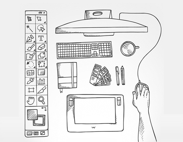
There are a myriad of graphic design programs available online. They include the likes of Photoshop, Adobe Illustrator and Freehand. They can provide you with the instrumental tools you need to have many effects and filters at your disposal. That said, it is important that you remain reserved when it comes to their usage and not get carried away.
You can utilize these tools at the right time but they should not be used to design a logo in its entirety. You can use them to make the necessary modifications to enhance a logo. But just take this into consideration, simplicity is the best way to go.
3. Simplicity is Key

As mentioned, prior, simplicity is the best path forward. A logo should be designed in such a way that it is easily recognizable or memorable to its target consumers. Take the example of the Nike Swoosh, it serves as a simple logo and is one of the most
For example, the Nike swoosh is an extremely simple logo and is also one of the most recognizable logos in the world. Adopt the same rule when creating your own logo. It does not need to be robust.
However, when you are brainstorming and initially start off with a more complicated logo design, you can modify it into a much more simpler version. Just ensure that you scratch off the unnecessary elements until it reaches simplification.
4. Be Different

Much like graphic design services, logos compete with one another to stand out from their competition. It is imperative that you distinguish your logo from the others and ensure that it has the ability to outshine its rivals. Instead of copying designs of successful logos, you can trust your own instincts and use your innovative skills to create something different.
Never underestimate yourself. It is normal to be intimidated at first. Once you get the hang of it, challenge yourself and break the designing rules. Don’t hesitate to take risks.
Create a wide variety of logo styles and decide on the one which best reflects on your brand. Use excess of different colors until you decide upon the one that complements your logo.
Keep tweaking your logo design until you feel it has been perfected.
5. The Endgame Should be Recognition

The main purpose of a logo is to ensure that your brand has the face to be recognized. It all depends on making the first impression such that it is etched into the minds of the consumer.
The question is how can you make this possible?
The modus operandi in making this a reality tends to vary. But the aim is to call attention to the average person’s mind.
Some of the more recognizable logos include Nike, Coca Cola, McDonald’s and Pepsi.
It only takes a glimpse of these logos for you to instantly recognize their brands. You need to incorporate all the components required in the construction of a logo that range from size, style and color. Ignoring any one attribute will make the quality of your design dysfunctional.
6. Typography is Everything
Selecting the right type of font and size can be a bit challenging especially for beginner designers. If your design logo includes textual phrase or a tagline, then you need to sort out different font types and test them out before making a final decision.
Try both serif fonts and sans-serif fonts as well as script, italics, bold, and custom fonts.
Consider a custom font for your design. Avoid using the font such as Comic Sans which is commonly used. It will make you look like an amateur. One font is better than two. Look to the examples of Yahoo! Or Twitter as an inspiration for your font.
7. Design Should Reflect the Company

You can use a diverse range of design styles when constructing your logo. In order to create the right one, you need to do some vetting pertaining to your brand.
Your logo presented the essence of your brand to your clients. Your company will discombobulate your target demographic if your logo does not complement your company’s identity. Before you begin your logo work, you need to give ample time in researching your consumer base and audience. This will give you an idea how to approach your design. The work may be repetitive but it is worth the struggle.
8. Begin with Preliminary Work
Preliminary work serves as the first step in designing a logo. Effective graphic designers invest more of their time on preliminary work than any other step in the logo designing process.
Preliminary sketches make for an essential initial step in designing an impressionable logo. The process is rather simple very much similar to a paper and pencil drawing. Or you can create some drafts using programs such as Illustrator. You can utilize this process by creating any number of designs or ideas you want and narrow them down in the end. If it doesn’t work you can always start over.
9. Maintain Balance

Balance is key to designing a perfect logo. It has the appeal and grandeur to persuade the minds of thousands of people. The best way to keep your logo balanced is by ensuring that the size, colors and graphics are proportional to one another.
You need to remember that your logo will be visible to a populace among who will have an eye out for aesthetically pleasing artwork. In order to secure their interest, the balanced approach is the best way forward.
10. Size is Everything

Size matters when it comes to logo design. A good-looking logo comes in all sizes. Nothing is off the table in this regard.
A scaled down logo will not have as much of an effect on its target consumers. A logo will be displayed on posters, billboards, TV, Online and any other large formats.
The best way to determine if the size fits the logo is by testing it yourself. Imprint the logo is different sizes. The smallest size is the hardest. The trick is to imprint the logo in an envelope or letterhead to see it meets the size flexible criteria.
You can also experiment your logo on larger formats by imprinting the logo in a poster.
11. Use Basic Color Rules
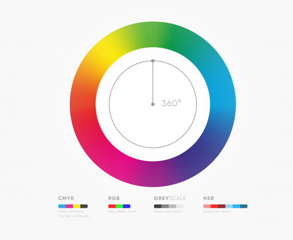
The coloring aspect of logo design can be complex. Which is why it is necessary for designers to understand the basics of using coloring to their advantage. Here are some of the mentioned basic rules of coloring.
The logo must look desirable in black and white. You can also use some grayscale and other two colors.
Don’t use colors that are so bright that the audience avoids looking at it.
There is no harm in breaking the rules now and then. Just ensure that there is a good reason behind in doing so.
Utilize colors near each other on the color wheel. In case of a warmer outlook, use yellow, red or orange colors
Colors have the ability to stimulate and evoke feelings and emotions in people. For example, red can invoke emotions pertaining to love, anger or warmth.
Make sure to take this into consideration when you try out various colors for your logo design. Try and match colors that best reflect the feel and tone of your brand.
You can also take a chance in trying out colors individually on their own. There are some brands present that are limited to being recognized by their distinct color.
12. Create Your Own Design “Assembly Line”
In order to produce top notch logos, you need to establish your own individual design process. Or rather an assembly line which you can follow as your logo design schedule. You need to adhere to the following steps.
- Brainstorm first
- Generate Ideas
- Do your own Research
- Do Preliminary Sketches
- Create Vector Designs
- Send the Design to Client
- Receive Feedback or Critique from the client.
- Remove or Add anything from the Design that the client wants.
- Finalize the Design
- Submit the Final Design to the Client.
- Repeat the Process if the Client is not Satisfied.
These basic steps will ensure that you create state of the art logos. However, there are no strings attached when it comes to additional modifications to the final design. This will enable you to be prepared, organized, maintain focus and construct logos with better quality. You can enter the first phase of the logo designing process with a fresh and proactive mind.
These rules will prove beneficial for you when you begin your first logo design testing. Do not be afraid or underestimate yourself. It is normal to feel intimidated in the beginning. But once you follow the mentioned steps, you will grow in confidence and trust your own abilities. You will also gain a better insight to the client’s mindset as to what attracts them.
Instead of pursuing this time-consuming process, you can avail the services of an unlimited graphic design company that has implemented these rules and enforce them diligently. Designster is among those companies and follow the logo rules religiously. It is far more preferable to acquire their services and place your trust in their expertise.
