Let me be stupid — Creating experiences that are effortless
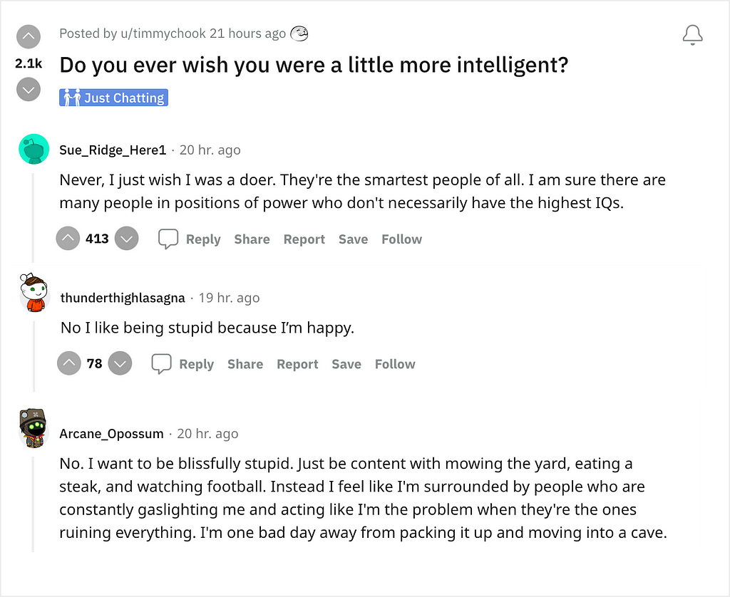
While browsing Reddit the other day I stumbled upon this thread.
The question asked was simple: ‘Do you ever wish you were a little more intelligent?’
I clicked on the thread expecting answers to range from ‘Duh’ to ‘HELL YES’, but I was extremely surprised when I saw quite a few responses wishing otherwise.
One particular comment said — “No. I want to be blissfully stupid. Just be content with mowing the yard, eating a steak and watching football.”
This sentiment was echoed by another person who commented, “I wish I was dumber. I’ve discovered that most people are ok with someone else doing the thinking and they are simply told what they need to do.”

Basically, in line with what Steve Krug said in his book, not only do people (and thus users) not want to think, they also don’t want to do.
Which makes absolute sense because there are aspects of life and work where we need to use 100% of our brain. A lot of problems need us to think things through and work out a solution.
So as designers we should aim to create solutions that don’t put our users in a situation that makes them struggle with effort or thought. Not only should we create experiences that are effortless, we should strive to create solutions that are thoughtless as well.
To design functional and seamless experiences, we should keep 2 aspects of user behavior in mind –
1. Do my work for me (Effortless experiences)
Most of us have gone through the frustrating experience of applying for a job at various companies’ portals. Most companies ask for the same details — work experience, educational qualifications, contact details, etc. As a potential employee, we’d need to fill out all the details in every single portal; the details that were already present in the CV we were uploading.
Then came the ground-breaking user flow that would auto-fill all the fields in the huge form once you uploaded your CV.
This made the process of applying for a position incredibly easy since all one had to do was upload a file they’d already created, and the machine did the rest for them. It literally did all their work.

Automation is another example of how advancement in technology has been used to do users’ work for them. It literally eliminates humongous portions of a certain human-workflow and replaces it with computer generated outcomes.
Doing users’ work for them makes them value an experience tremendously. Because not only was their goal achieved, it was achieved with barely any effort at their end.
2. Tell me what to do, and I’ll do it (Thoughtless experiences)
At some point or the other, all of us have looked up recipes on the internet. So presumably, everyone is aware of the paragraphs and paragraphs of filler content that we scroll past in a jiffy to reach the very bottom of the page where the recipe resides.
The very impatient thought in our heads is, “Just tell me what the recipe is. I don’t need to read through this jazz”.

This is exactly the behavior we need to keep in mind when creating experiences where we need our users to go through a certain workflow.
If a user begins a workflow with an end goal, they are most likely not interested in anything else apart from getting the task done. To reach their destination, they’ll want the shortest path possible.
In such scenarios, it is extremely important to cut to the chase and tell the user exactly what they need to do before they lose either interest, or patience. Reducing time reduces effort as well; thus accounting for a better experience.
While creating mindless and thoughtless experiences might not sound challenging to us designers, it is always important to remember who are users are and what is it that they want. It is okay to spoon-feed your users if that is what helps them achieve their goal.
So, if it works for them, let your users be blissfully unaware and create experiences that bring them joy!
Some great reads along similar lines —
1. Steve Krug’s book ‘Don’t make me think’
2. Don Norman’s evergreen — Design of everyday things
3. Designing for the impatient user
Let me be stupid — Creating experiences that are effortless was originally published in UX Collective on Medium, where people are continuing the conversation by highlighting and responding to this story.