
As this was an open brief to help redesign any mobile application currently in the market, we felt that it would be much more meaningful to choose an app that would benefit the public.
We threw out many ideas about apps that we could redesign; from transport to second-hand goods market, food delivery as well as health. Even though this was a school project, we felt it was only appropriate to work on something meaningful; that would speak to the masses.
We ultimately decided upon working with something related to health, because it would be something that would directly impact as well as empower the user, which in this case is the general Singaporean.
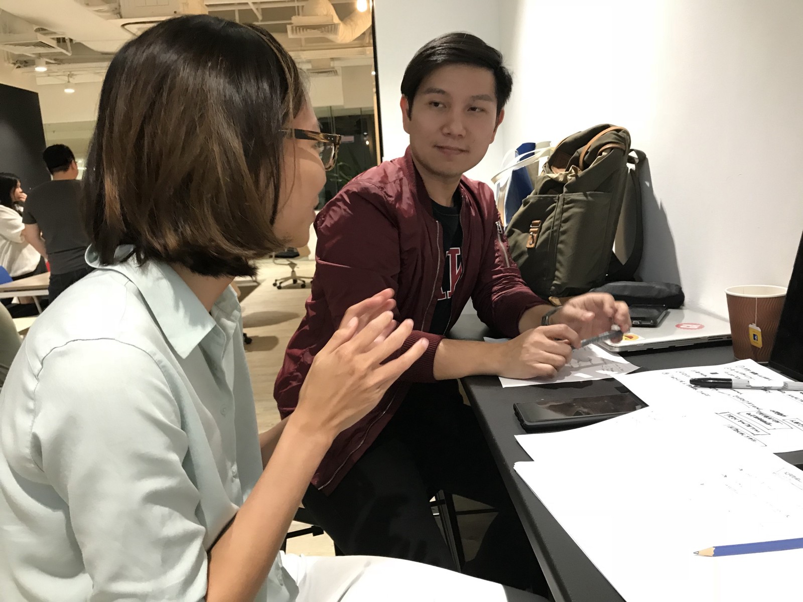
First Meet
When we were first assigned to our groups, we took the first day to plan the timeline, assigned tasks, as well as set the expectations that we had for each other.
About HealthHub
HealthHub was developed by the Ministry of Health and the Health Promotion Board to empower citizens to view and keep track of their own health. This would include making and viewing of medical records, checking up on lab test results, vaccinations, prescriptions and most importantly, to keep track of loved ones’ health records as well.

Individual
Using technology to connect citizens with healthcare institutions
The primary function of HealthHub for users would be to easily access their personal health records as well as upcoming and past medical appointments.
Empower citizens with information
The health and wellness information has been localised for the Singapore context, to allow users to have said information at their fingertips, making it easily digestible with key visuals accompanying each article.
Gamification of learning
The games section of the app allow users to accomplish tasks to win exclusive discounts to health, fitness and dining establishments, to feature the healthier options available. These incentives help to drive across the notion of healthy living as well as being mindful of one’s vitality.
“As of end January 2017, the HealthHub website has had 8.5 million page views — and over 84,000 Singaporeans have downloaded the app”
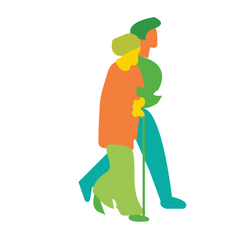
Caregiver
Policy intentions
Health Hub was built to support a variety of caregiver roles; to check on a loved one’s upcoming appointments and vaccinations, as well as to view a loved one’s lab test results, to check on their prescriptions and hospitalization records.
The HealthHub app empowers the users to keep track of their loved ones, otherwise known as the care receivers.
Targetted user groups
Individuals
Individuals can access personal health records from any public health institutions, as well as to manage their own appointments across said institutions. This would help to ease the process of visiting a doctor or going to the clinics to collect their health records.

Parents
The parent can now access their children’s health records as well. This would include finding out about upcoming immunizations, checking on dental health records and checking on referral letters. Managing a child’s health records would greatly reduce the load of the parents, who have a tough time managing if they have two or more children.
Caregivers
The primary role of the caregiver would be to track upcoming appointments of the care receivers, as well as to support and perform administrative tasks, such as record keeping and monitoring of the care receivers health with functions of checking on test results and prescriptions.
The additional feature within this app, unbeknownst to many would actually be that one is able to pay for their own, or their loved ones medical bills as well.
Personas
In reality, these roles are played by people of different age groups with varying proficiency in using technology
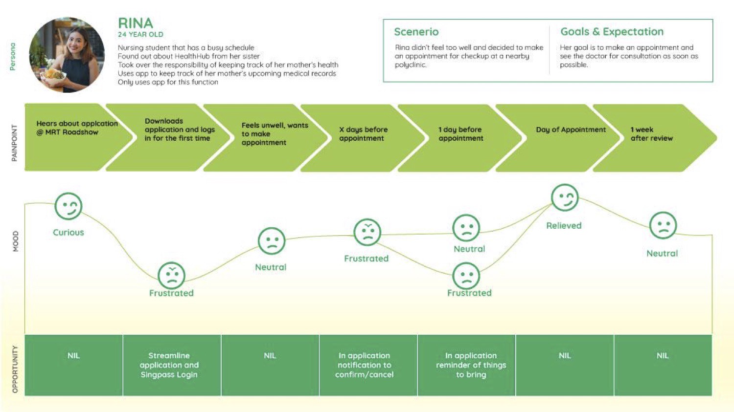
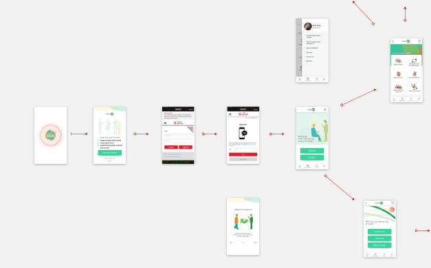
Rina
Take Rina for example, who is a 24 -year old nurse who uses the app only to manage her own medical appointments, with her tech savviness level being most proficient amongst the three personas.
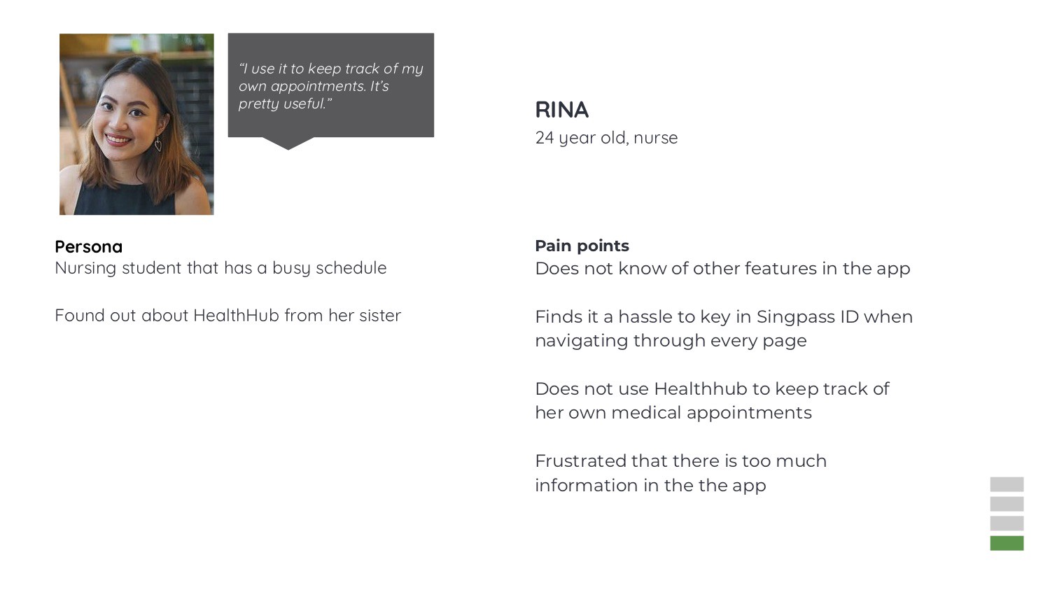
The diagram listed below would be the customer journey map of how Rina would go about using the HealthHub app.
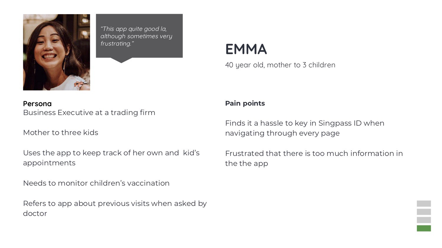
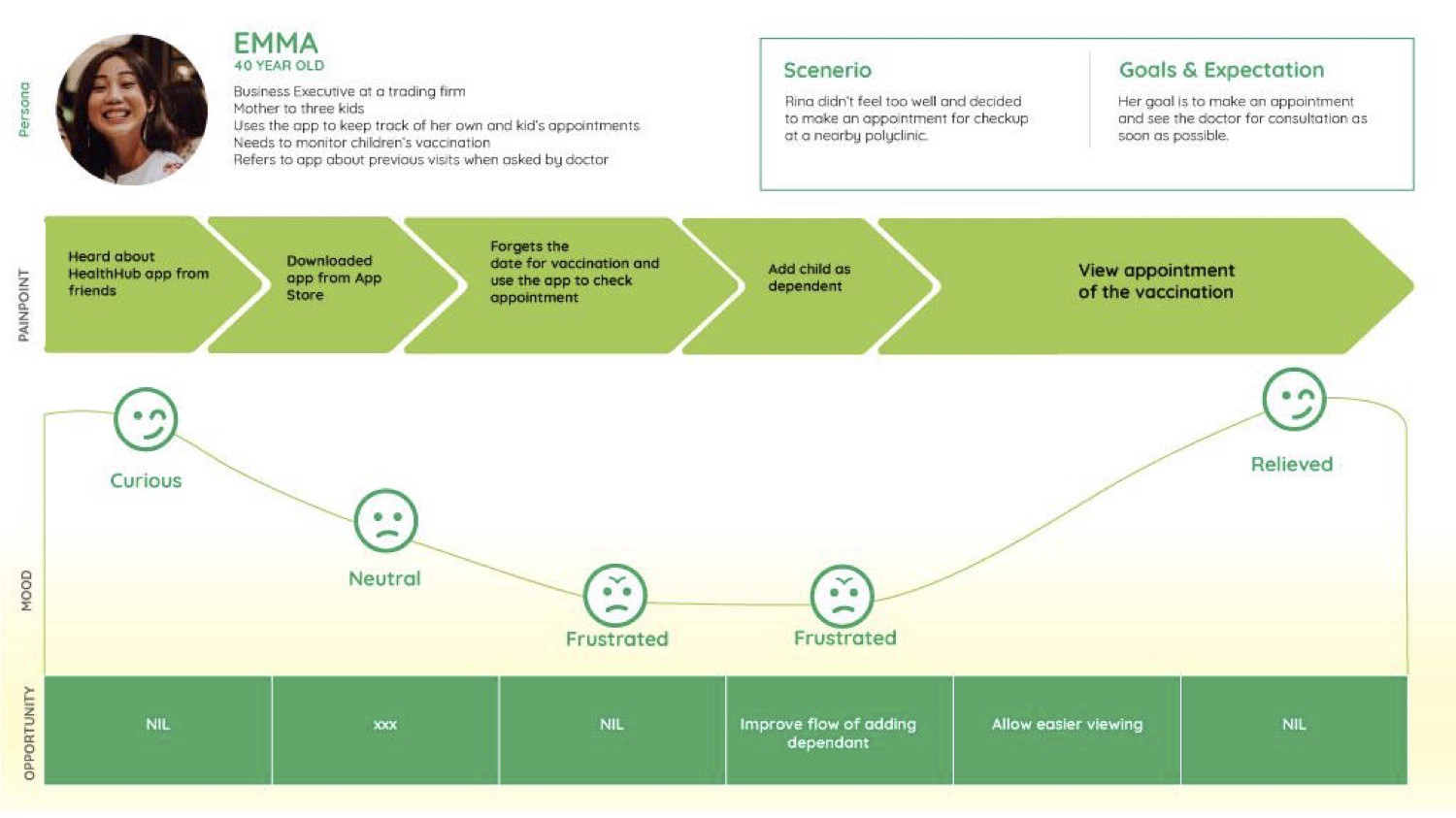
Emma
Emma is a 40-year old business executive who is also a mother to three kids. She uses the app to keep track of her own medical appointments, as well as to keep track of her children’s vaccinations and upcoming check-ups. Her proficiency with technology would be lesser compared to that of Rina.
The diagram listed below would be the customer journey map of how Emma would go about using the HealthHub app.
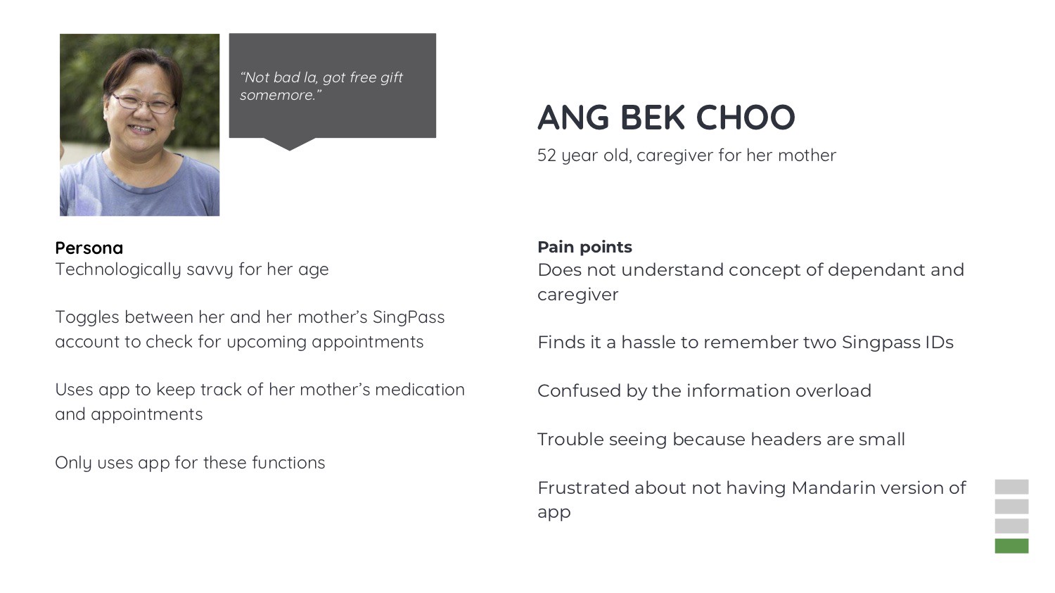
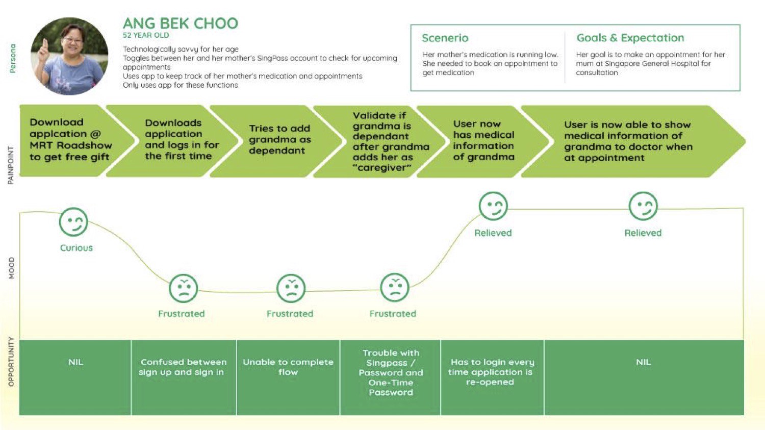
Bek Choo
Bek Choo is 52-year-old hawker stall owner, who manages her own medical appointments and also uses the app to take note of her mother’s upcoming screenings and medications. She toggles between her own account as well as her mother’s account because she did not realize that there was the function of having her mother add her as a caregiver. Her level of savviness with technology ranks the lowest among the three personas.
The diagram listed below would be the customer journey map of how Bek Choo would go about using the HealthHub app.
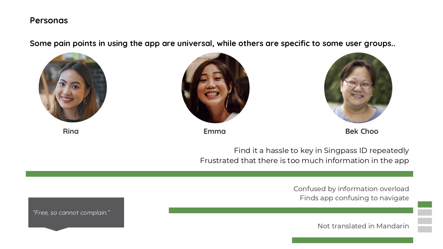
Some pain points in using the app are universal, while others are more specific, depending on the varying level of savviness the personas have with technology.
Pain Points
All three personas find it a hassle to log in twice, once with the Health Promotion Board account and second with the Singpass ID. This has caused them to be constantly frustrated.
Another universal pain point would be that there are too many features in the app.
The pain point faced by Bek Choo and Emma is that they often get confused by the information overload provided, most prominently on the landing page of the app.
They also find the app difficult to navigate because there are too many features happening on the same page, all at once.
The pain point faced only by Bek Choo would be that the app has not been translated in Mandarin, which gives Bek Choo a tough time to use.
We will showcase the methods we used to identify these pain points in the following paragraphs.
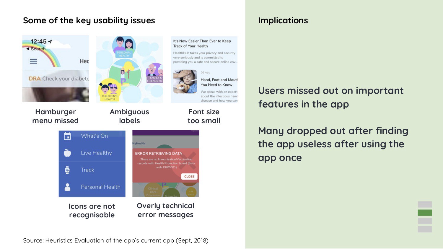
Insight 1
Users struggle to accomplish their goals because of significant usability issues, with an overwhelming number of features within the app.
We used the LEMErS heuristic evaluation to test the app’s primary function and we realized that there were many user-interface problems, as well as user-experience issues.
Some of the main user-interface problems faced by users are listed below
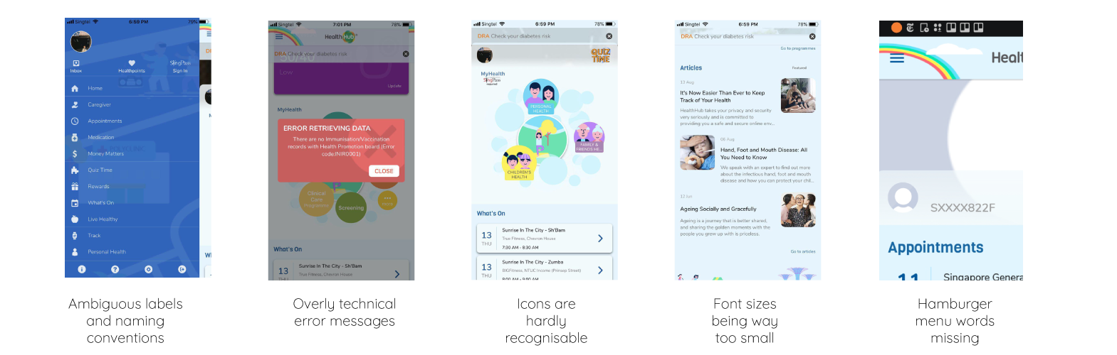
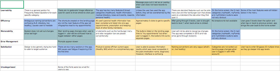
Key usability issues
There are other health apps based in Singapore. However, they are all complimenting because they are designed for the general public by the government. As there are no other competing health apps available on the market, it would not be purposeful to draft a competitive analysis chart for HealthHub.
Implications
Users actually missed out on important features in the app, such as viewing/making appointments, being able to check lab test results and vaccinations, and most importantly, having the dependant feature to manage loved one’s health records.
Another implication of the usability issue would be that many users actually dropped out after using the app once and finding it frustrating.
What users have said
“There are too many things going on in this app”
Father, 42
“I only use it to see my appointments, and lab test results” Customer Service Executive, 55
“I used the app once or twice, but I never log in after that” Homemaker, 52
User interviews
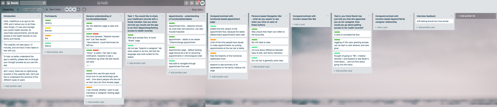
We actually went to the polyclinic to interview users and got users to test out the app if they have not heard of it, as well as to hear the woes and pains of existing users. We pulled money together to provide supermarket vouchers for our users as an incentive. In total, we interviewed six users before we were chased out by the staff.
Our recommendations
This app suffers from a classic case of featuritis, most likely because the development team has to answer to different groups of stakeholders. Our recommendations for proceeding with the redesign of this app would be to trim down the number of features found within and to bring the focus back to the key features.
“There are too many things going on in this app”
Father, 42
“I only use it to see my appointments, and lab test results” Customer Service Executive, 55
“I used the app once or twice, but I never log in after that” Homemaker, 52
Because this app suffers from featuritis, our recommendation for the app would be to trim down the number of features found within, to bring the focus back to the key features to allow for a concise app.
Insight 2
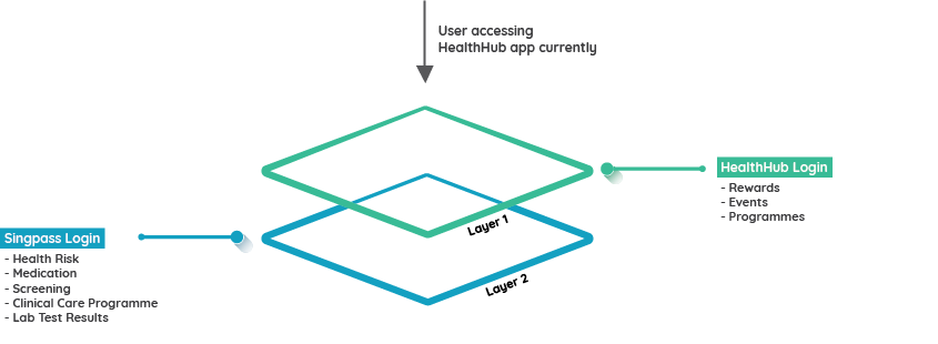
Users face high barriers when accessing many of the app’s services.
What users are saying
“This app is not good for me.
My brother is 80 years old and don’t have One Time Password for the Singpass leh”
Homemaker, 52
Healthhub app requirements
To use the app, these are the prerequisites one must first have.
- A smartphone to download the HealthuHub app
- A Singpass username and login password
- A registered mobile phone to receive One-Time Passwords from
- An email address to create the Healthhub account
Implication
You would not expect an elderly patient to readily have access to their Singpass login or for them to have a smartphone or just a regular mobile phone for that matter. This complicates the process of actually using the app. Patients who are likely to actually require caregivers’ support are least likely to meet these requirements.
What users are saying
“Huh? How come after I login, I still need to login again with Singpass?” Father, 42
Implication
There often is confusion for the users who need to first login with their HPB account, and proceed to login with their Singpass account, which is exclusive for each user, receive a One-Time Password from the users mobile phone and only then are they able to access the features within the app. This would greatly increase the probability of users dropping out because of fatigue.
For the users that actually persist, the HealthHub app causes much frustration when they are trying to get to the primary features such as making appointments and checking test results.
Insight 3
A guided process to sharing health information with caregivers will greatly increase completion rates for a task flow.
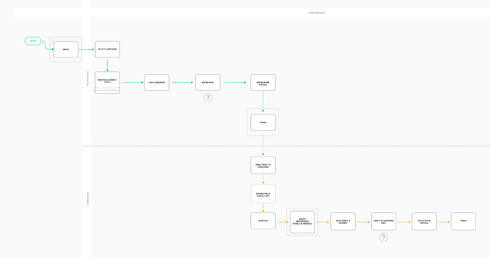
A quick walk-through of the current Healthhub process flow of sharing access to health records shows that there is a great disconnect between the roles of an individual as well as the caregiver. Many steps need to be taken before one has access to loved ones’ medical records.
Our recommendations
To allow both individuals and caregivers to start the process of sharing their own health records. This would help to allow for initiation for the younger generation, to allow them to start caring for the loved ones’, instead of having the care receiver to make contact first which is a hassle for them with the research that we have gathered.
The second recommendation would be to provide an in-app walkthrough to give users a preview of the whole process, as well as to provide a refresher for infrequent users who only use the app once every few months.
And lastly, to empower the customer service centers, for individuals and caregivers to set up health records sharing in-person. This would greatly reduce the need for toggling back and forth within the app, to share their medical reports instantly.
Our hypothesis
We believe that by focusing on the user experience of HealthHub, we will be handing health back into the hands of users and the people. This will greatly empower the citizens as they can now manage their health records much more with the redesigned app.
It would also cater to users with low levels of tech savviness, with in-app walkthroughs, clearer headers, and labels, as well as reducing the confusion to have a loved one view your medical records.
We hope to achieve 200,000 quarterly active users, along with 30% more active users who care for at least one other person.

Overarching mobile app redesign considerations
Users are guided to complete key processes within the app. The app will take on a nurturing tone, to help allow users to better understand these features, as well as remind them if they are not able to remember.
This is instrumental to put users at ease while using the app. They should never feel rushed or forced to make a decision before considering the options clearly. The additional feature of the walkthroughs would then allow the user to take on a slower whilst navigating between pages.
Through this redesign of the HealthHub app, the users can now easily find what they need with a great reduction in the number of features. It would become an extremely streamlined app with only valuable features, to cater to the users’ needs.

Reintroducing
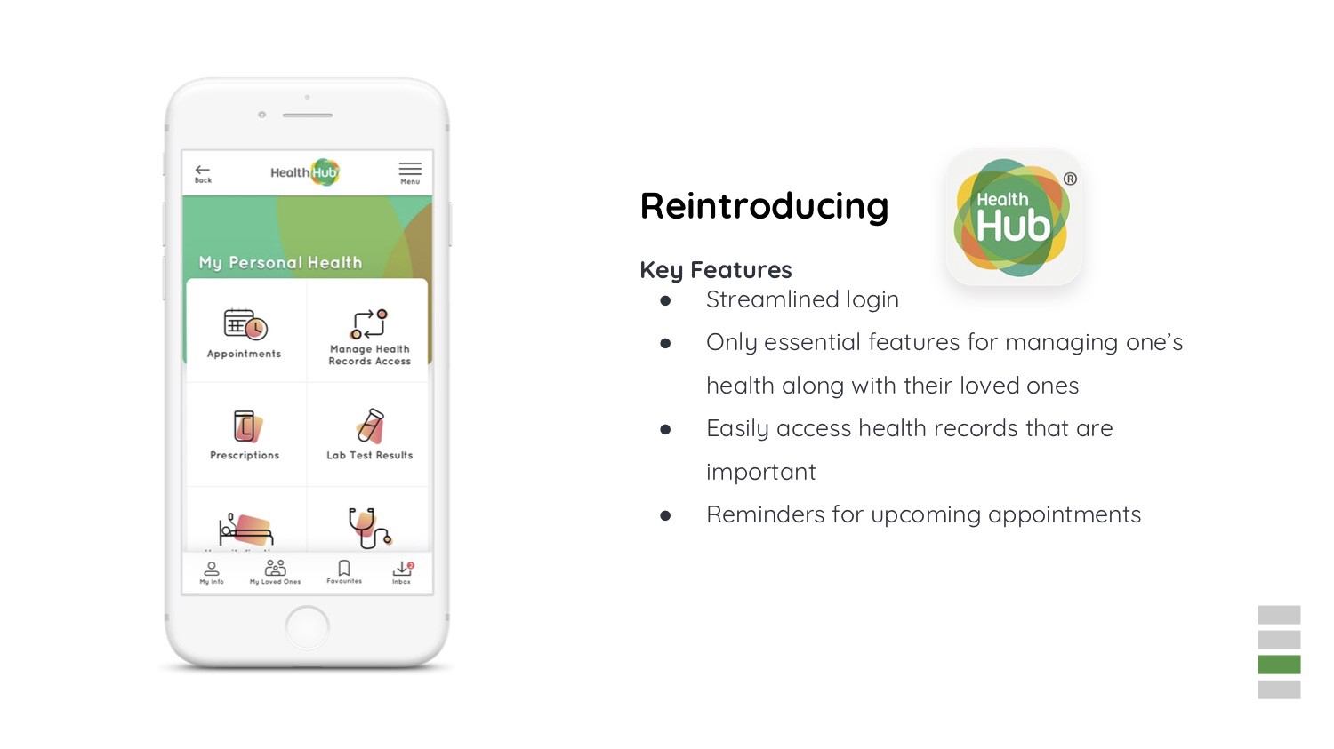
Key Features
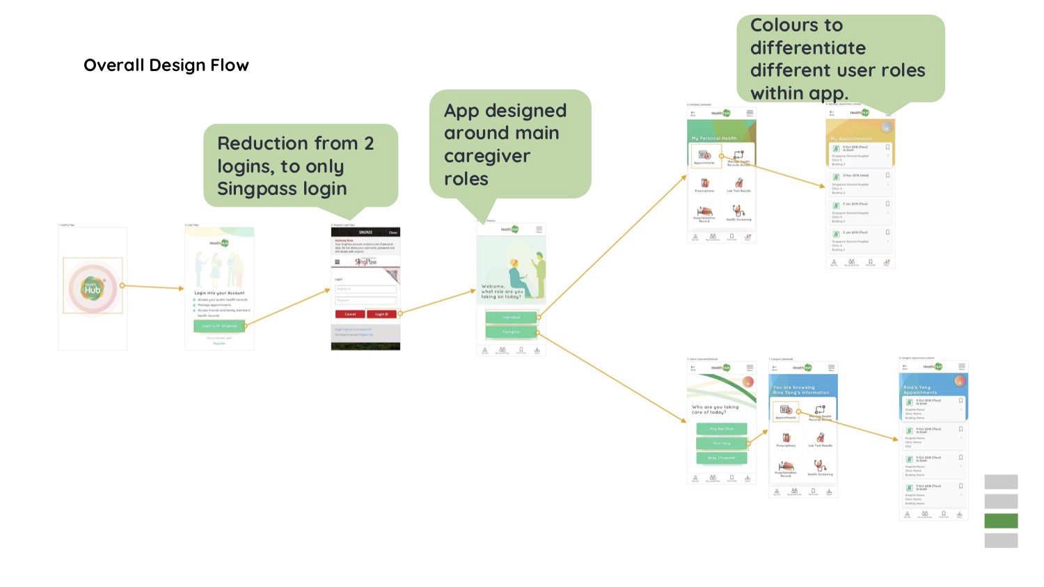
We have streamlined the login process to just once, with the Singpass login. Only essential features have been included in the redesign, to manage one’s health readily, along with their loved ones’ as well.
They would now be able to easily access health records that are important to them and they will feel that they play an equally important role in managing their medical records and health.
There will be reminders for upcoming appointments through in app-notifications that will appear when their appointment is nearing.
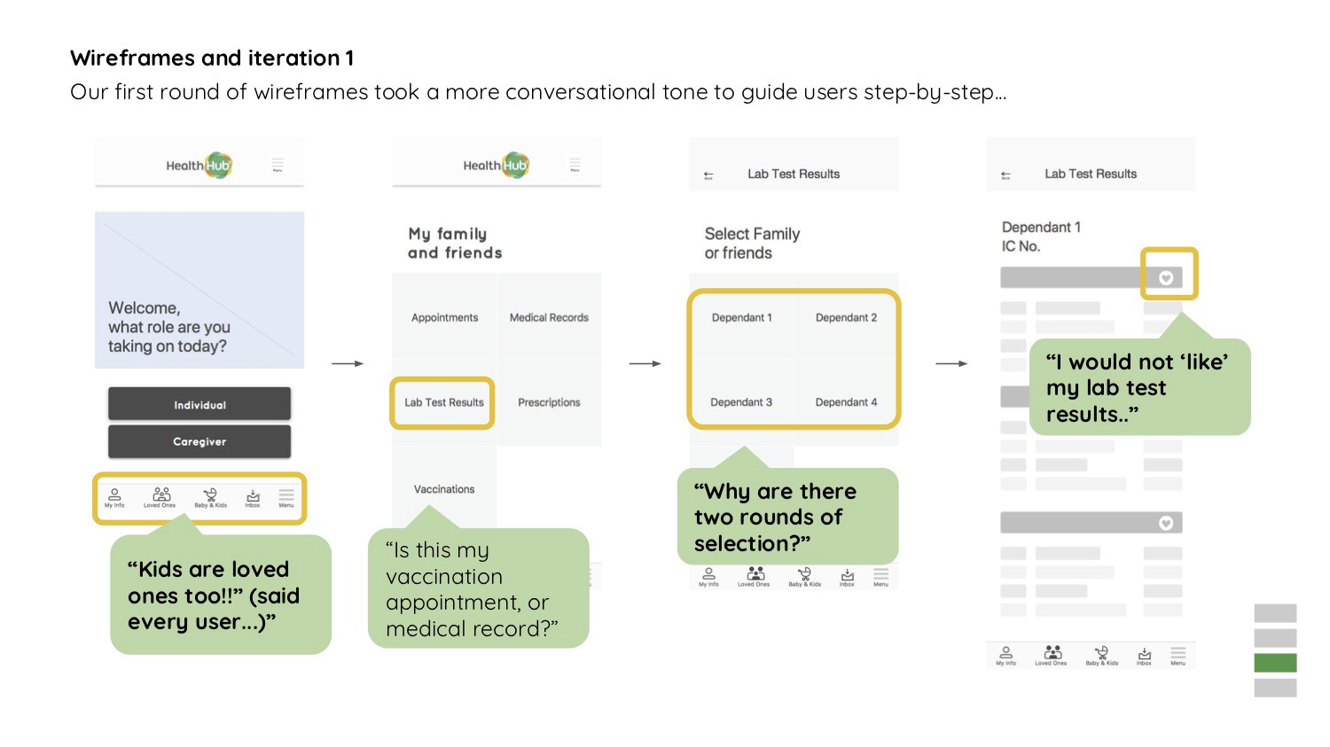
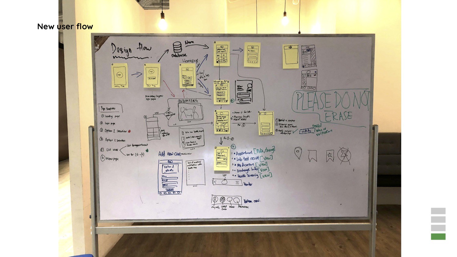
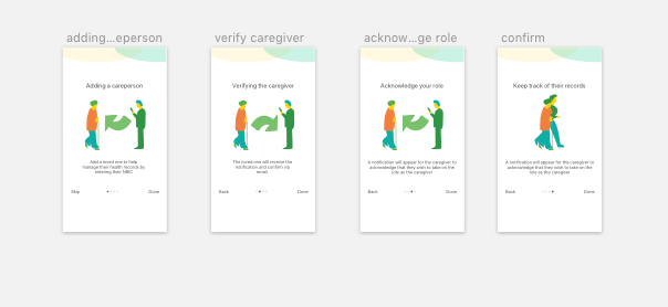
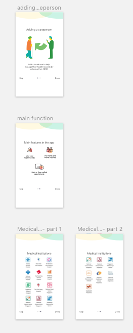
Wireframes and iteration 1
Our first round of wireframes took a more conversational tone to guide users step-by-step to finish and accomplish the different tasks set out by them.
“Kids are loved ones too!!” (said every user…)”
“Is this my vaccination appointment, or medical record?”
“Why are there two rounds of selection?”
“I would not ‘like’ my lab test results..”
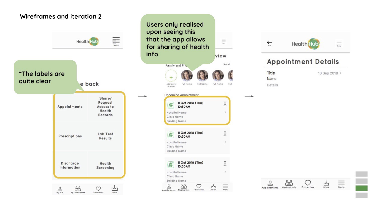
Wireframes and iteration 2
“The labels are quite clear”
Users only realized upon seeing this function of the walkthrough, that the app allows for sharing of health information. This is a significant validation in the assumption that was made by the group.
There was a reduction from two logins, to only having the Singpass login. This helped to ease the frustration of users who had to toggle between the Health Promotion Board login as well as the Singpass login.
The app was designed emphasizing mainly on the caregiver role. Colors were also included for the landing pages to differentiate between user roles within the app.
Color blindness test simulation
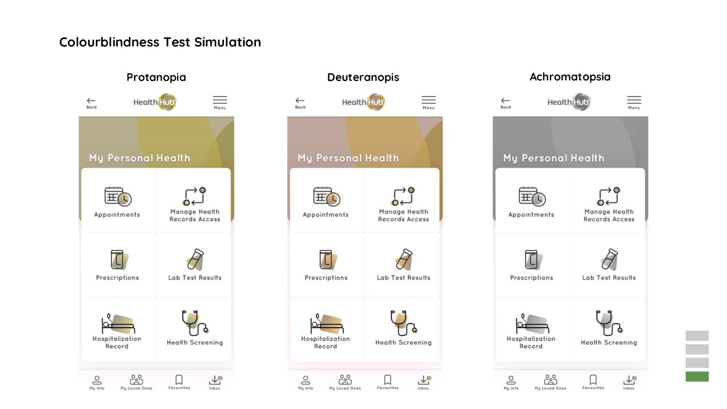
Green was chosen as the primary color for the app, because of the original logo of HealthHub. More importantly, it was used across the different pages to cater to individuals with color deficiencies. The app scored well for the color blindness test.
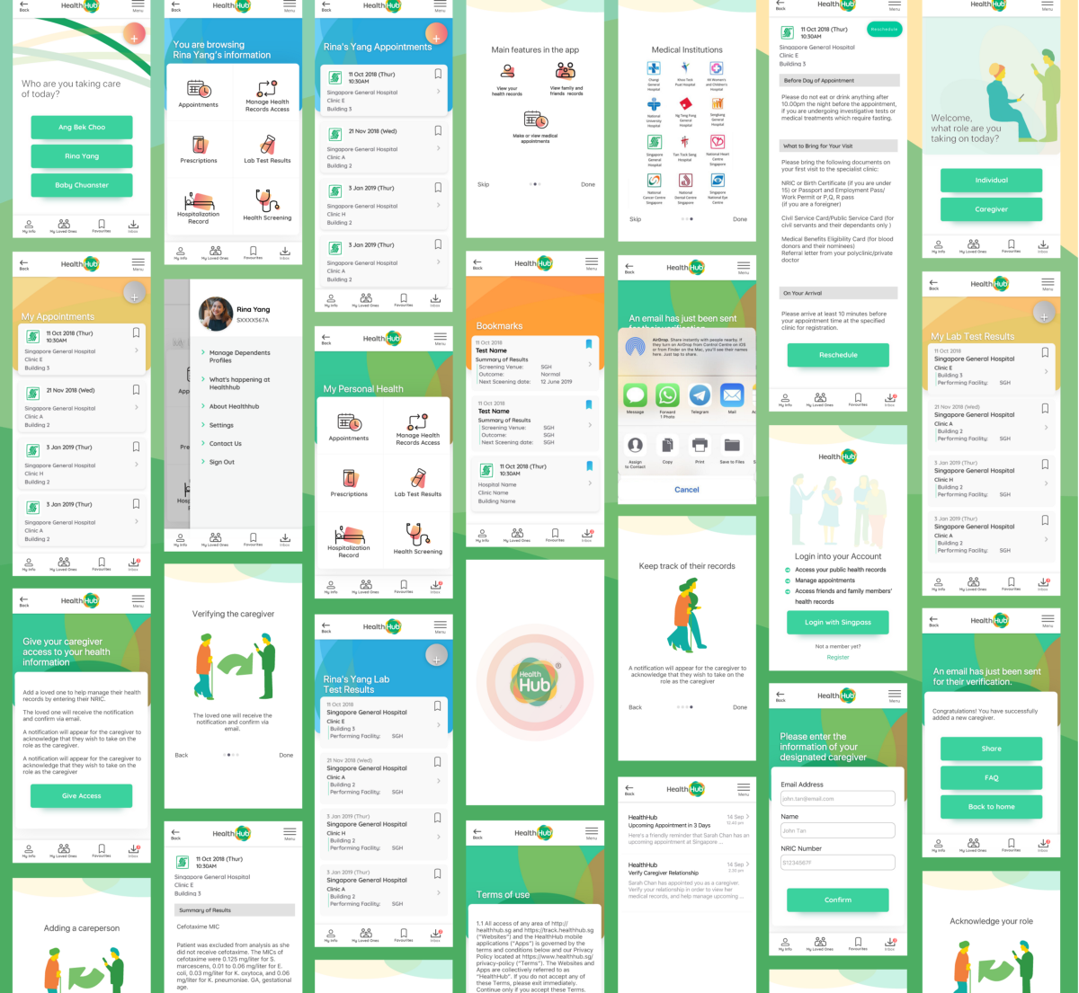
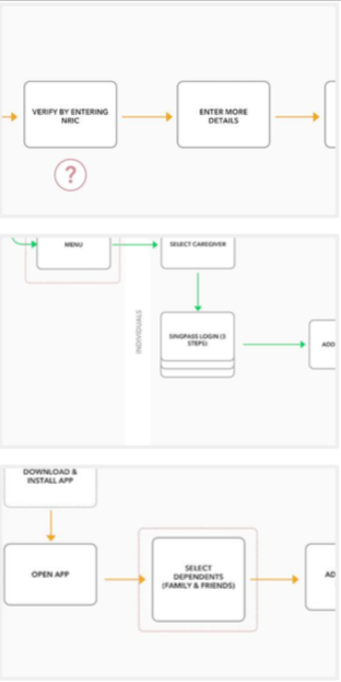
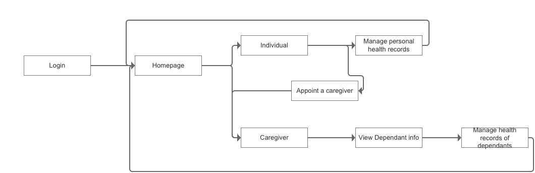
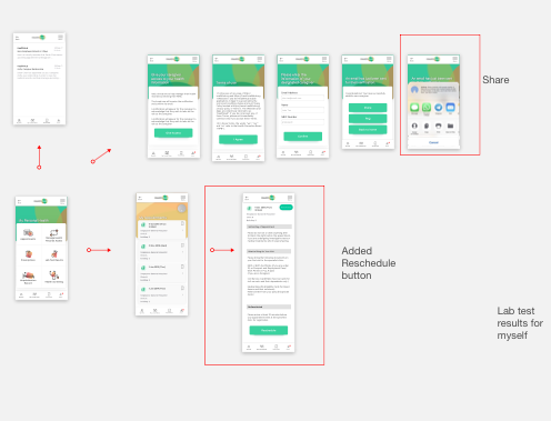
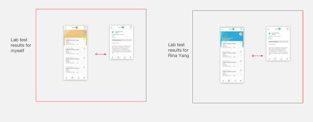
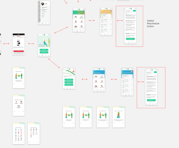
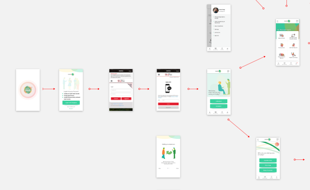
Screens of current flow
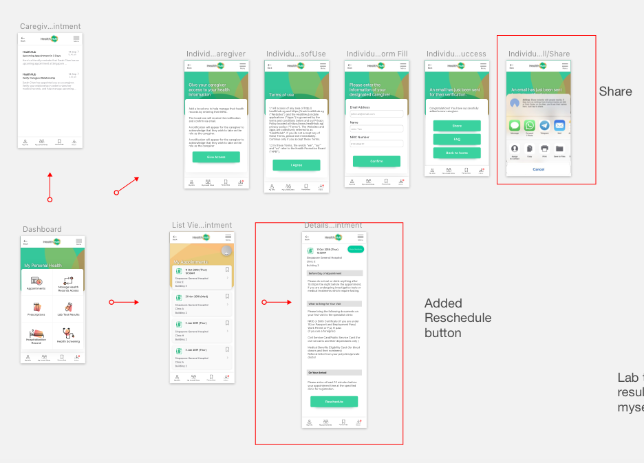
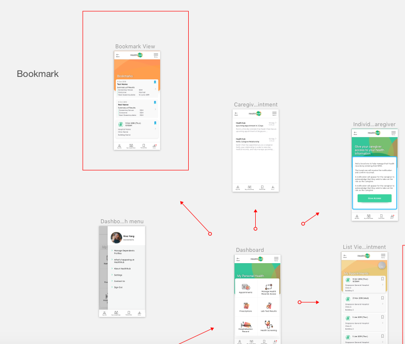
Shown below are the screens that have been designed for the primary functions of the app. Also shown would be the addition of process flows the user would take, managing their own healthcare records as well as the process flow if they were to take on the caregiver role.

Next steps
The next steps would be to implement the option of having a translation of different languages within the app. There would also be the option of having the option to toggle between different point sizes to cater to the elderly who might use the app.
Thoughts
I am extremely grateful for the team that I’ve worked with, who actually came together serendipitously. Without whom, this would not have been possible.
This was an extremely rewarding and fruitful project that has informed the way I see how UI/UX can possibly affect change for the people, for the greater good. It has also changed the way I see how design can affect people’s lives and how government work can actually be meaningful too.
The star team
And lastly, this would not have been possible without both Elaine and Aaron, that was instrumental in making this redesign such a meaningful and beautiful experience. You guys rock!