Building multi-brand colour systems that support light and dark modes with minimum effort. It is all about organizing, naming and choosing the right colour values for the system to work.
I would like to share my view on the issue and tell about the methods I choose to make the system.
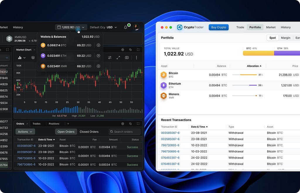
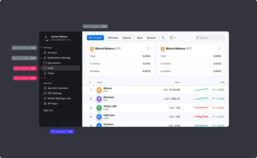
Made with design tokens
Design tokens are great, go check them out if you have not already. And one more good article that goes technical about design tokens — Building better products with a design token pipeline.
So each colour name in the system is a design token, that simple.
System architecture
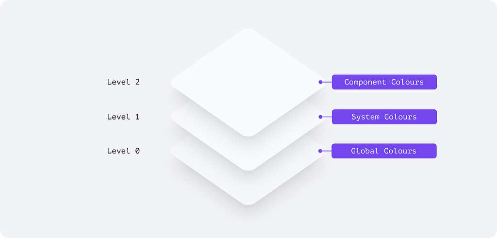
The colour system has three main components:
- Global colours are a common library of colour swatches that sets the tone for your visual language
- System colours bring a structure to enable light and dark mode transition
- Component colours represent individual UI elements
Ground level: global colours
This is an optional component and is a tool to optimize theme production time.
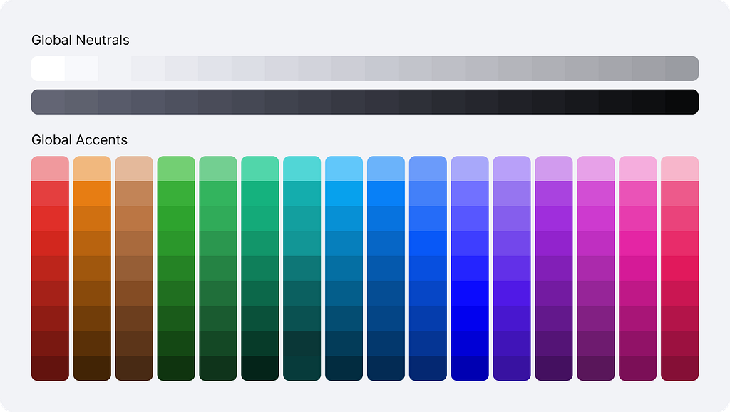
Global Colours are a set of swatches I used these to define a visual language for an application. Never exposed directly, globals are the source of the colour system.
Level one: system colours
This is the main palette to decorate everything.
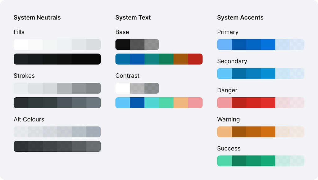
System colours are the core values in our design language, represented by context-agnostic names. A designer can define these by hand, but I found it more efficient to derive from global ones.
Level two: component colours
This is optional to have, yet it would extend your arsenal whenever you need some extra flexibility between two themes and better communication with your devs.
Component colours are a comprehensive representation of every value associated with a component. They are always derived from system colours but are named in a very specific way to enable engineering teams to apply tokens in component development.
Structure & naming convention
In my view, a good system is well organized, and clearly named and establishes a relationship between colours that would transition naturally between light and dark modes.
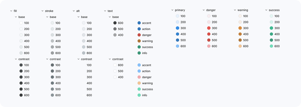
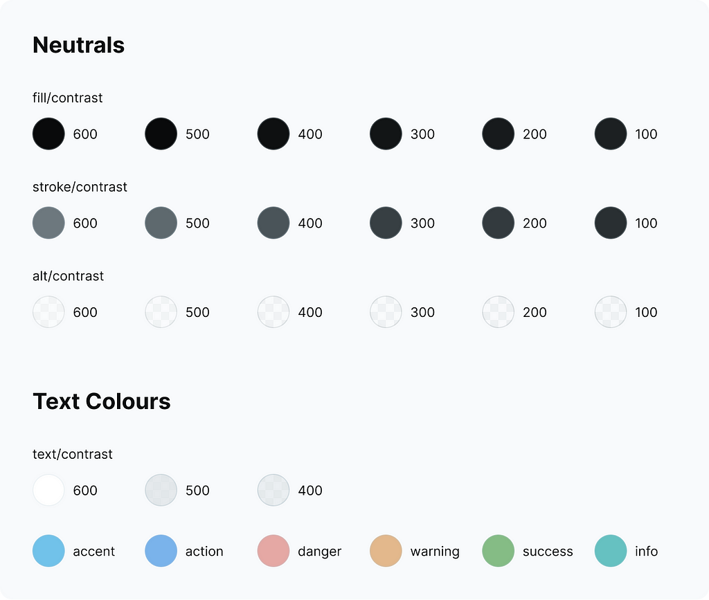
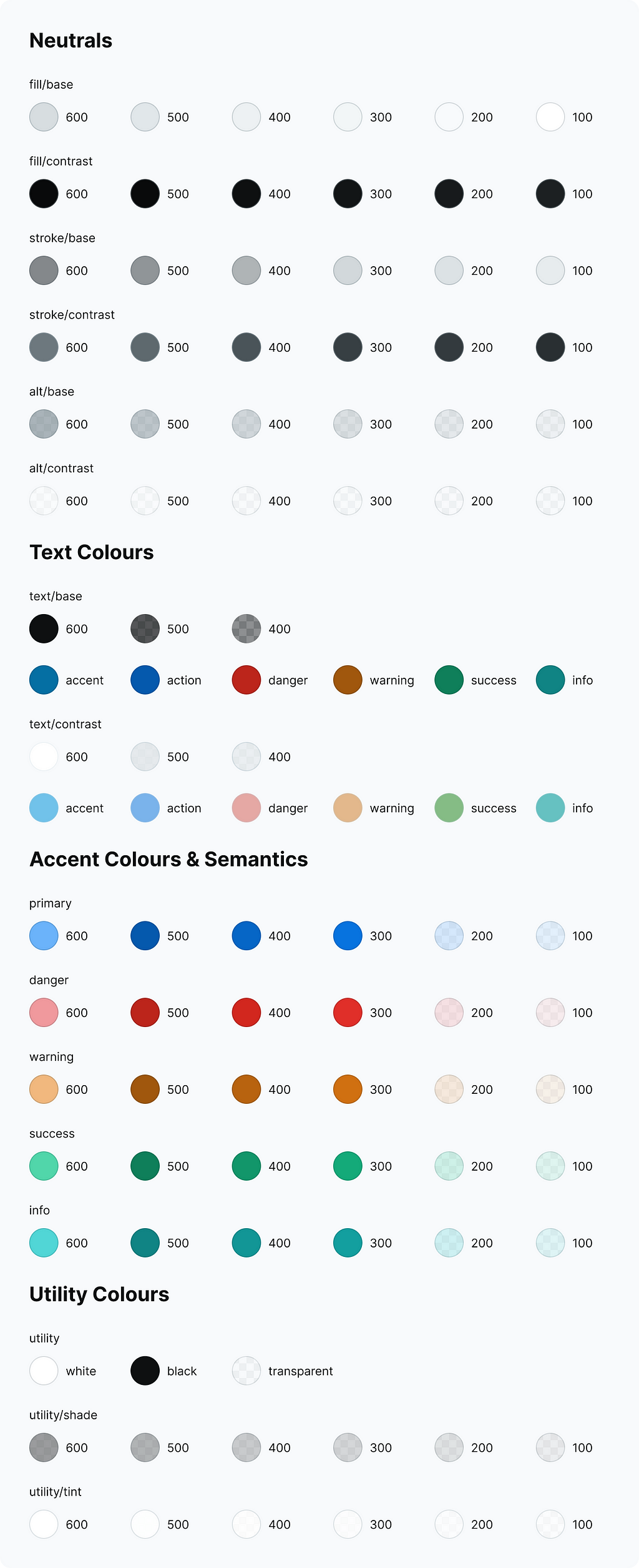
Neutrals
Neutral colours are the foundation for the visual language that defines the overall tone of your application. It could be fully desaturated, a bit colder or warmer or even tinted in a fancy way to support the brand.
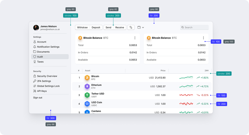
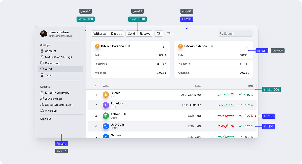
As a designer, I always saw it through the lens of professional software I’ve been using. I would add a fill to a surface that needs background colour, an optional stroke for borders and lines and a text colour for a copy that sits on top. For temporary visual states, I would use semi-transparent alt colours.
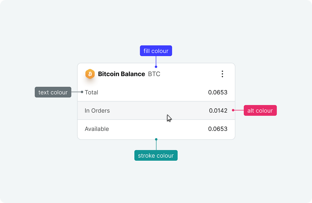
This draws the main categories based on how we apply colour in UI design.
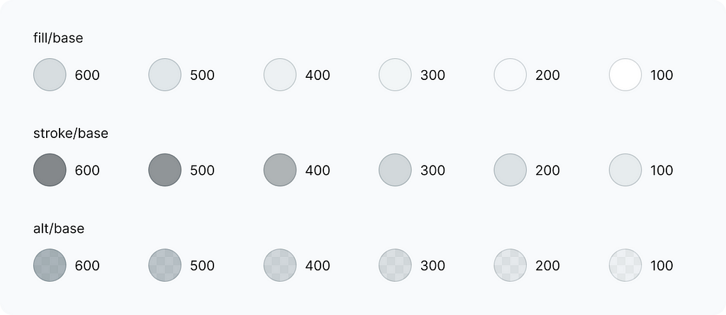
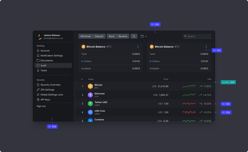
I believe every designer understands terms like “fill” and “stroke” therefore I’ve decided to name the colours using these words. It makes the naming convention easy to follow without digging deep into the system principles.
I have set the following relation between these three colour types:
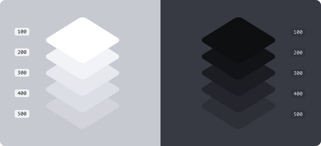
- Fills are the lightest shades in your arsenal, these to be your main background colours
- Strokes are not supposed to fill large areas but outline or divide them. The rule of thumb here is that the strokes should be visible against the background colour of the same intensity
- Alt or alternative colours are semi-transparent ones and could be applied both as fills and strokes
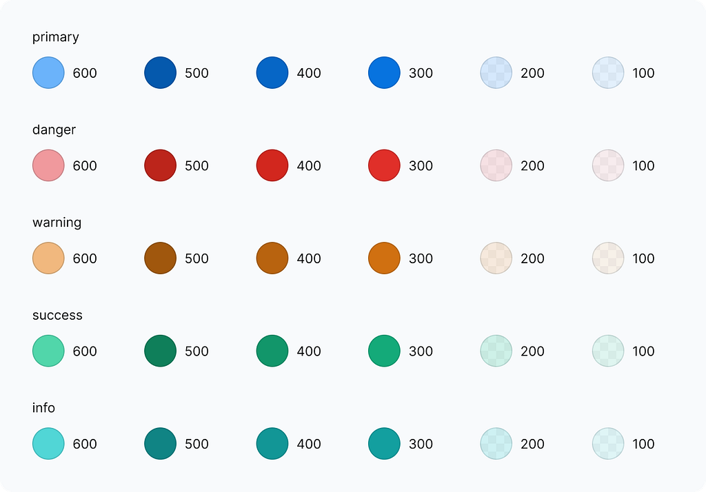
Accent palette & semantic colours
For colour spots, we would need a primary accent for brand & CTA elements and RAG for semantics
This is where I faced some complexity as I wanted to keep the palette concise. Now there are some rules for all accents.
Common rules
All accents are balanced to produce the same level of contrast which would define their usage. The list below is a simple set of intentions that defines how each shade should and could be applied.
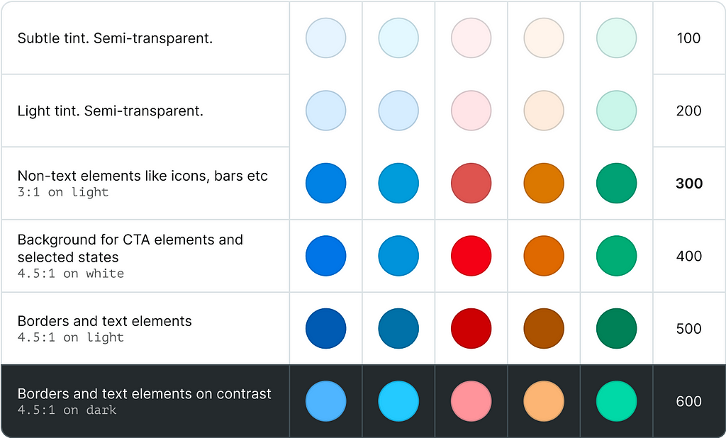
- Shades 600 and 500 would work best for distinct borders
- Shade 300 is a primary colour
- Shade 400 gives slightly higher contrast and could be used for non-text elements like glyphs or data visualisation colours
- Shades 200 and 100 are semi-transparent and made for tints and highlights
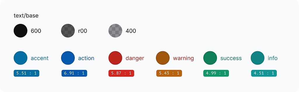
Text colours
For the text, we would need tree shades for visual hierarchy and several colours for semantics. I choose to have an independent sub-palette as it makes it easier to fit into WCAG accessibility requirements.
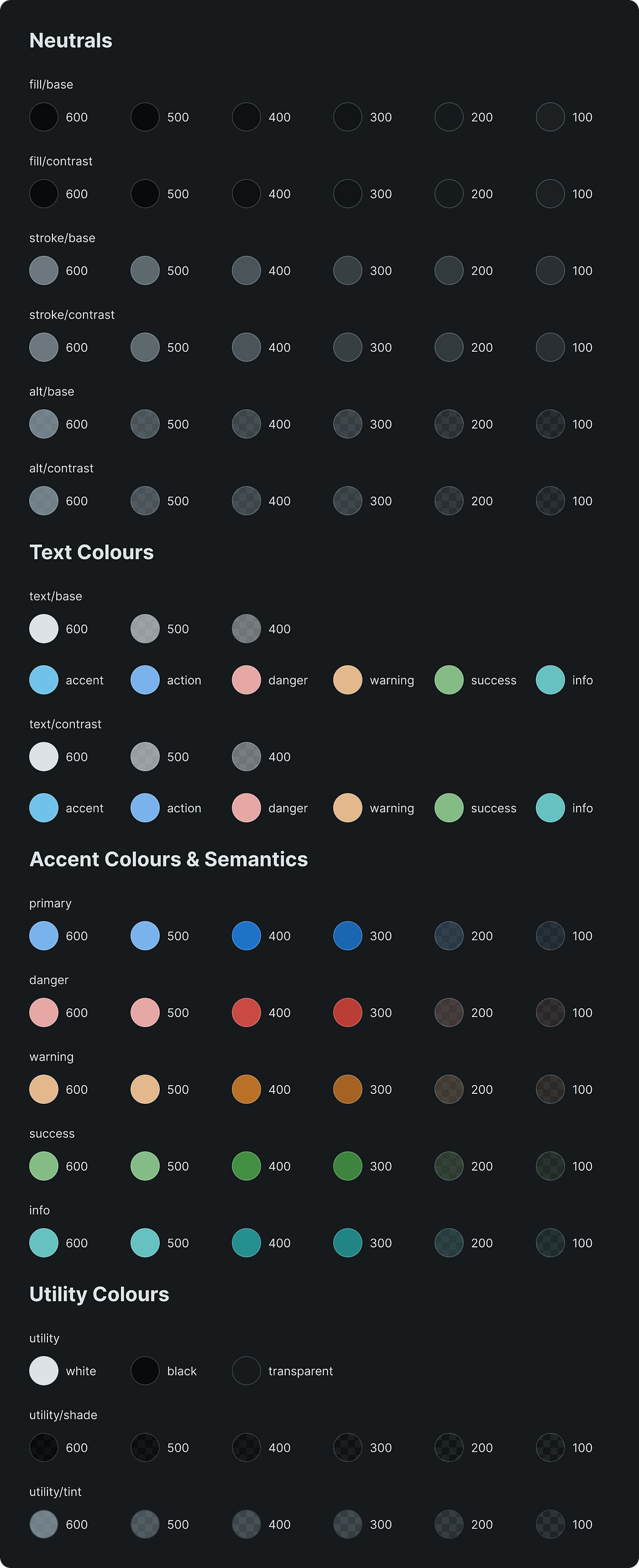
The contrast
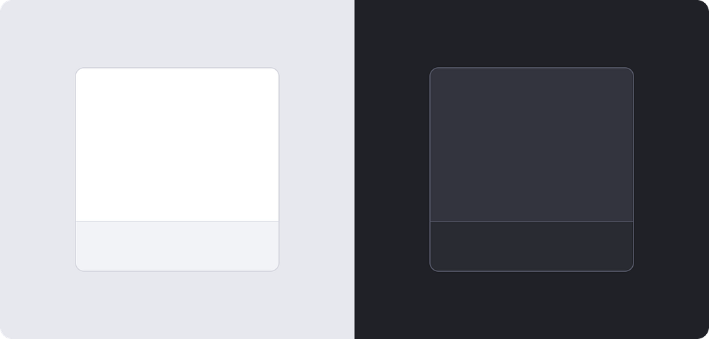
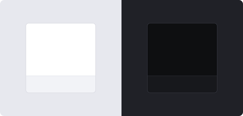
When it comes to colours it is all about the contrast that they would have against each other. With heavier accents, we need white text to work on these surfaces. And we need distinct lines, background colours and more. Think of primary actions, colourful banners and high-contrast UI elements. And it would be nice to be able to mix light and dark UI elements in one design too.
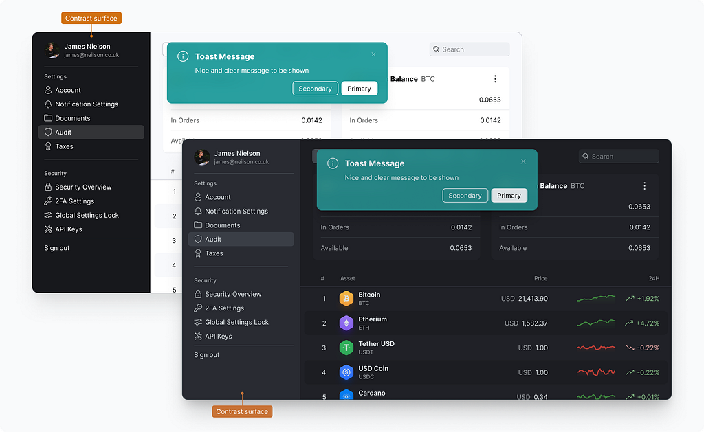
To support that we need to extend our palette with darker fills, strokes, text colours and alt colours. They have “contrast” in their name to indicate that they would create high contrast against their “base” counterparts.
On how to choose colour values I am going to expand on the practical guide below.
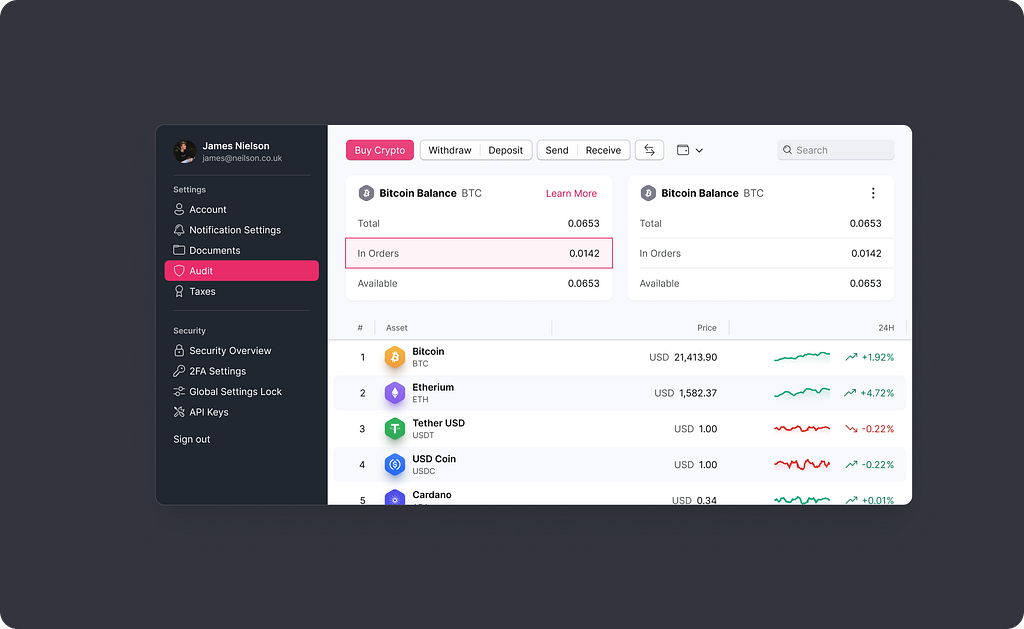
This is how these new extra colours have been used in application design.
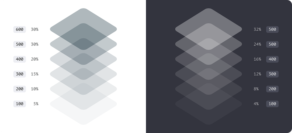
Utility colours
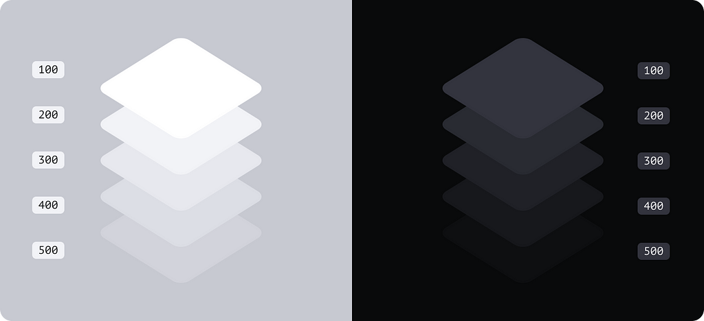
The last group of colours are supportive ones. I use shades for shadows and to darken areas below them. Tint would always lighten a surface.
White, black and transparent ones are theme agnostic and do not change with theme.
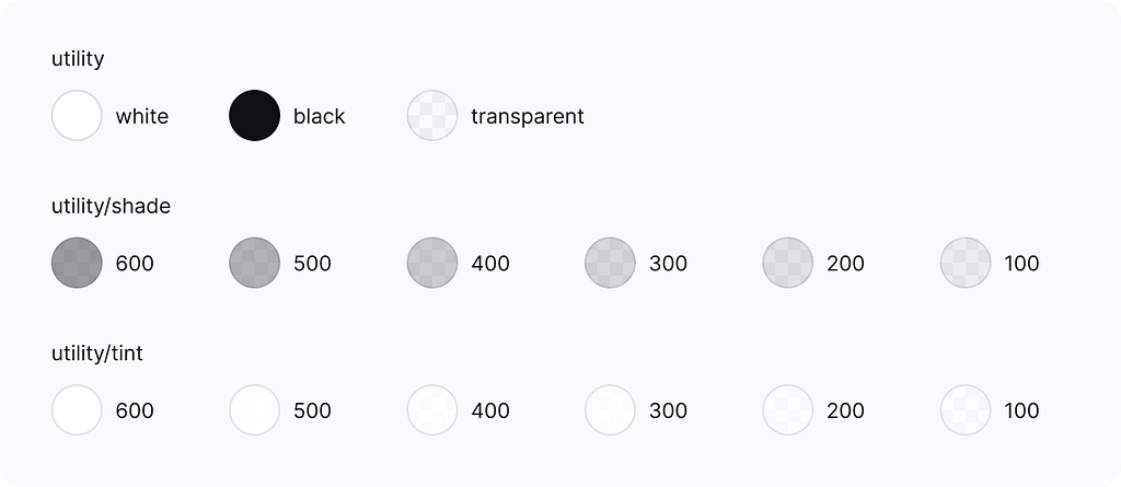
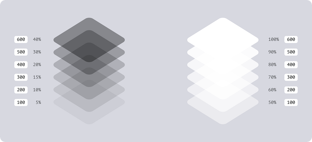
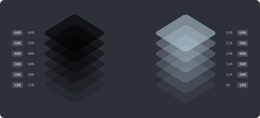
Shades and tints are semi-transparent and the opacity level depends on the theme. In the light mode, tints are more pronounced and shades use lower opacity levels and vice-versa.
Here is how it works in numbers for the light and dark.
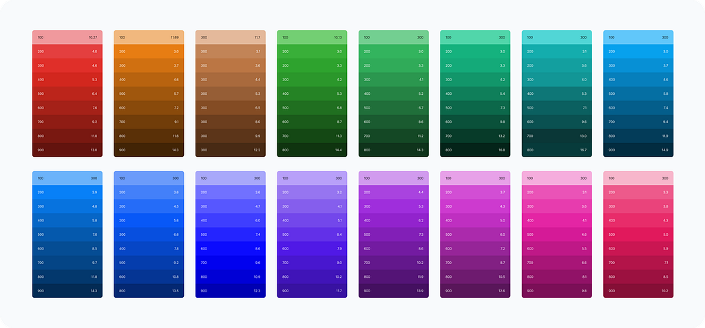
Full palette preview
99 colours in each palette
Please note, the dark mode palette only has special values for the contrast fills, strokes and alt colours. They are a few % lighter than their “base” peers. All the others are identical for both “contrast” and “base” counterparts.
Picking colours
The section below expands on how I choose colours that would work for light and dark modes.
Global neutrals
Global neutral colours are the foundation that would set the tone of your visual language.
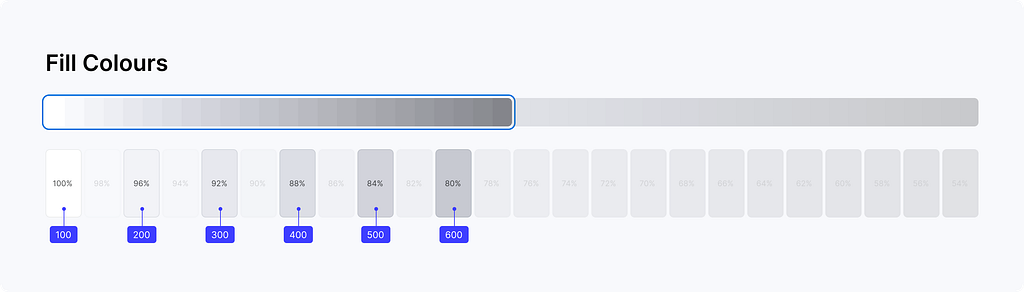
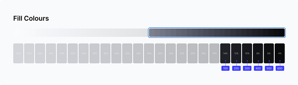
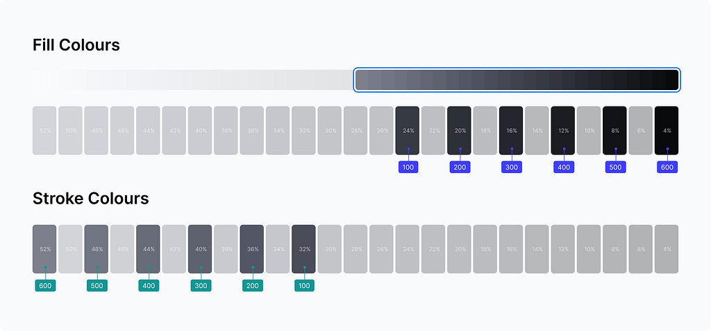
For a predictable result, I made an extremely wide range of shades. Starting from 100% lightness down to 4%. This number of stops is enough to support both light and dark themes. To make all these shades consistent and uniform I gave them the same hue value.
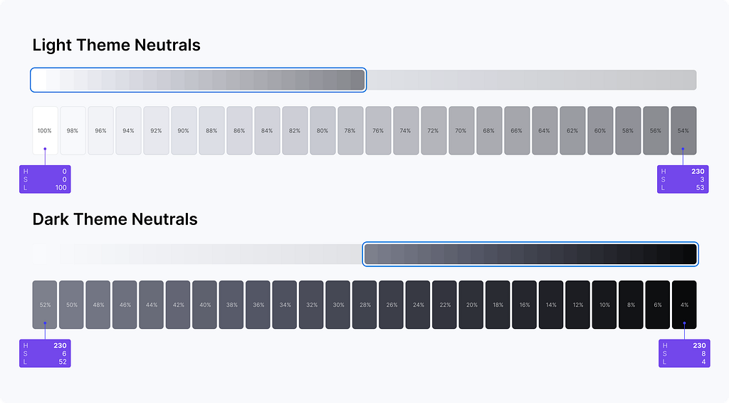
There are 48 steps, and each colour changes linearly from the lightest to the darkest shade using a 2% increment. From a mathematical standpoint, it is a simple linear progression that sets the minimal distance between two shades in the series. I just need to pick a starting point, set a direction and decide on the distance between adjacent shades.
Light theme colours
In the light theme, I always start with pure white and build progression from there.

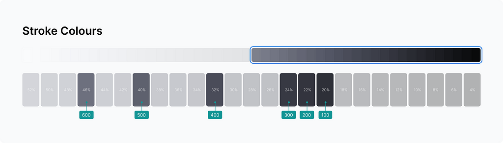
For stroke colours, I shifted the starting point to the right. The further it starts the more prominent borders are going to be.
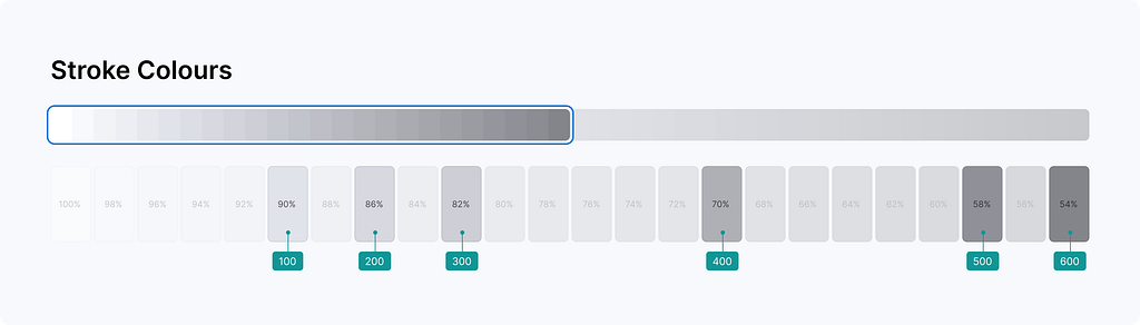
This is how it translates into the UI.
And I can use the same greys to make something slightly different. Below, I set a wider distance for adjacent colours to make the greys more intense.
Dark theme colours
Before picking colours we need to decide on the transition between light and dark sides. What would happen with white? It could either stay the lightest shade or become the darkest one. It gives two main options to choose from.
Dark elevated
This style uses the same gradient direction in both themes. From lightest to darkest.
And this is how it works in the UI design.
Dark deep
This one suggests the opposite direction. In the dark mode, it goes from darkest to lightest.
And this is how it plays in the UI design.
For the dark mode, I decided to go with the dark elevated theme and I used the same principle as with the light mode. Pick a starting point, set a direction and decide on a distance between steps. I took the last six shades at the end of the spectrum for a deep night experience.
Stroke colours went in the opposite direction, increasing intensity makes the colour lighter.
And this is how it translates into the UI.
Low contrast, ideal for low light environments. And I can play the contrast with a bigger step size. The same way I did for the light theme, I widened up the colours a bit, giving them a 4% difference against 2% before.
Now it feels different because of the contrast change.
Plug-and-play modules
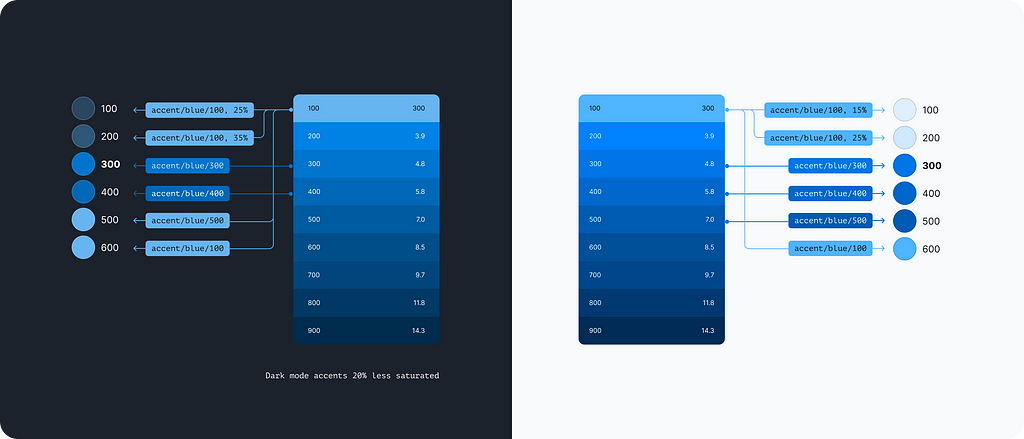
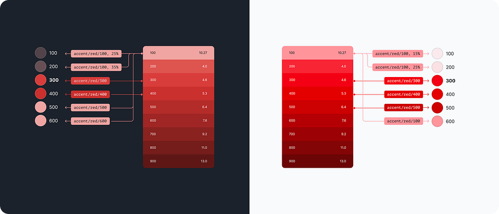
My idea is to have different sets of neutrals and accents that I can apply on top of the system colours. Each set is a consistent gradient of greys with slightly different parameters. I made these by spinning the hue and playing with the saturation.


Now if I take the latter bluish greys with 20% saturation and have them instead, it would outcome a different tone for the whole design.
Accent palette & semantics
The accent palette brings life and meaning to our product. These are colour spots that guide user attention, emphasize brand connection or communicate the certain state of the system.
Global accents
I have gone down the same route I took with the neutrals. Accents are yet another module that brings colours into our design. Every bright paint is derived from the global module in one way or another.
For the dark mode, I created another less saturated one.
Tools
There are plenty of tools to automate colour palette generation. Some are great ones and deserve to be mentioned.
Colour mapping
Now is the perfect time to pick the right colours and fit them into the system. Thus blue becomes primary, red turns into a danger indicator, amber stands for warnings and green clears the way.
Other accents are derived in the same way to produce similar results.
Primary accent
The primary accent could be derived from any global colour which makes it super easy to adapt the palette for specific brand needs.
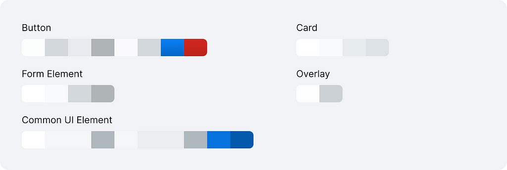
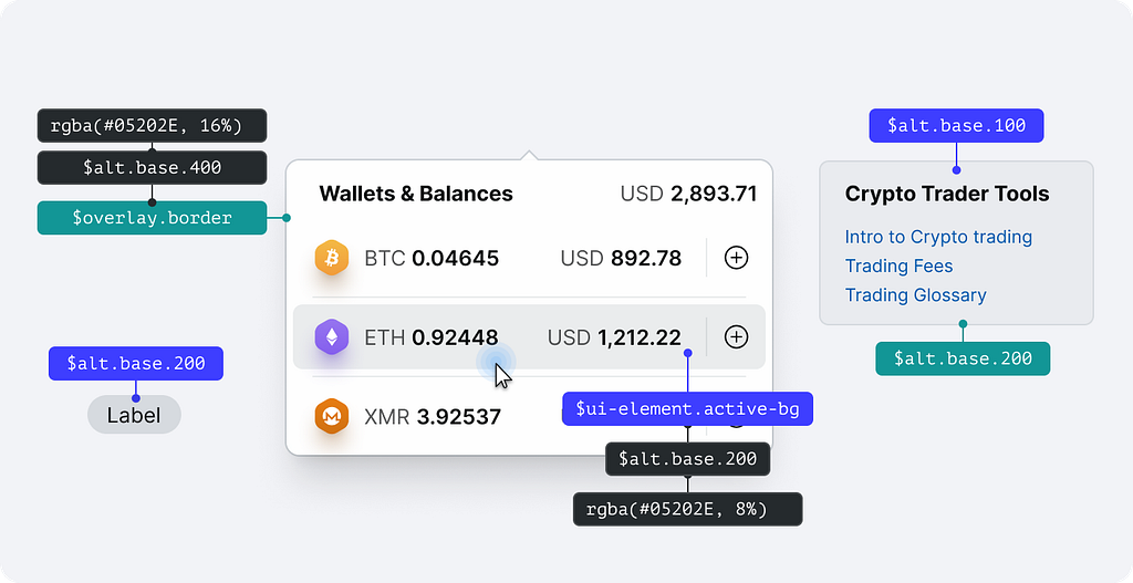
Component colours
Component colours are the last bit to cover. In a nutshell, they are decision tokens that represent a context in which a referenced value is used.
The tokens below are the bare minimum I would expect from a design system. All these elements would make up 90% of your design and it is good to have them right from the get-go.
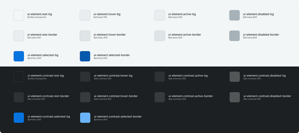
Common UI element
Common base for various interactive elements like menu items, list items, toolbar buttons etc. These colours are visual states.
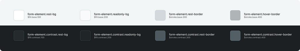
Form controls
Colours to visualize inputs, floating labels, checkboxes and radio buttons.
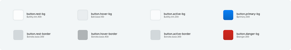
Button
Most important UI element of all.
Card
Basic content container.

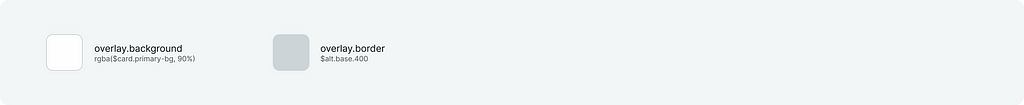
Overlay
Tokens for dropdown menus, popovers and modals.
Independent styles
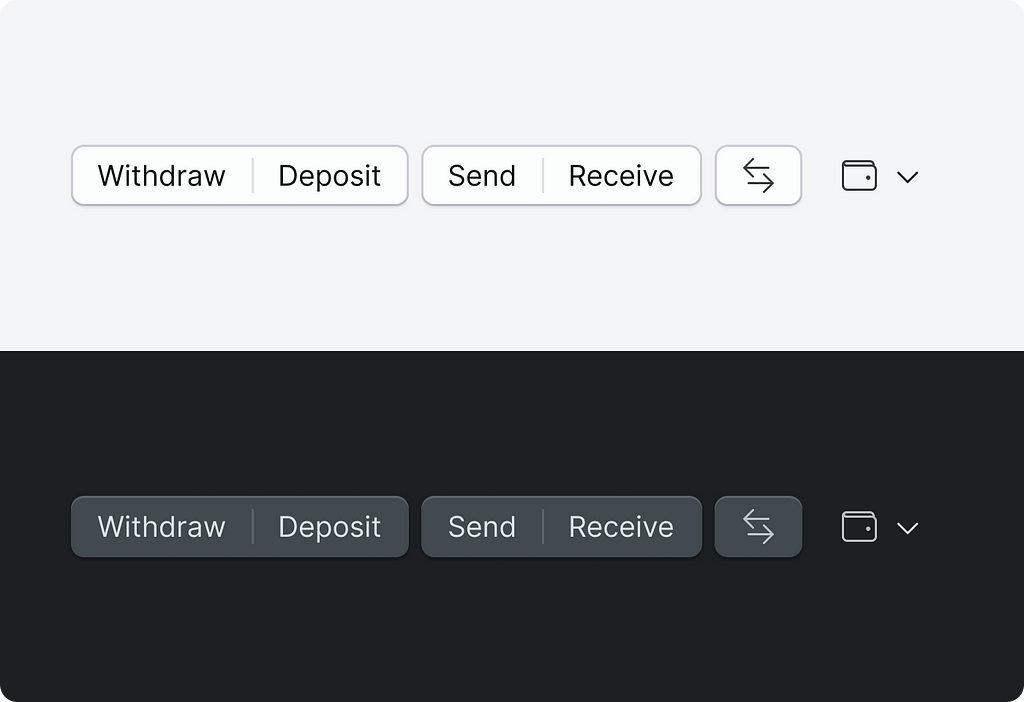
And there is a great benefit I should mention. It is a legit hook to introduce stylistic differences between the light and dark themes. For example, I used component tokens to style buttons differently in two themes. It takes time to figure out the main components that are subject to change, but the results are well worth it.
Additional resources
I made two design files for anyone to play with. Each file has a set of colour styles that are in line with the system described above. Plus there is a Tokens Studio plugin playground where you can explore how it was made. All instructions are inside the files below.
Multi-Theme File
Single file with two sets of styles for both light and dark themes
https://medium.com/media/e9420072fc99f713049cdd2e7c35b35b/href
Single-Theme File
One file — one theme. This is how most teams would work on a larger scale. This file serves colours straight, with no light/dark prefixes.
https://medium.com/media/0ee553ab52fa153450839f476ae370d1/href
Quick Experiment
It took me around 30 minutes to see how it would work on top of the official UI2: Figma’s Design System
https://medium.com/media/355b13960d27787db631904f59a0f42f/href
Resume
This system is made for designers in the first place. I wanted any design professional to get up to speed fast, just going by intuition and it worked fairly well. Sometimes not ideal, but with some practice, it becomes more fluent and fine-grained in both themes.
The system proved itself on the application family scale. I am talking about 100+ apps with thousands of screens.
Some devs have argued that the naming convention is “weird”, and for them, there are component colours to bridge the gap with engineering teams.
Very interesting, similar naming convention — https://medium.com/@thisisfranciswu/designing-hazels-accessible-color-system-part-1-8a73a2298c35
Should you have any questions do not hesitate to drop me a line
Designing a colour system was originally published in UX Collective on Medium, where people are continuing the conversation by highlighting and responding to this story.