
By Carolyn Li-Madeo and Deepak Mantena
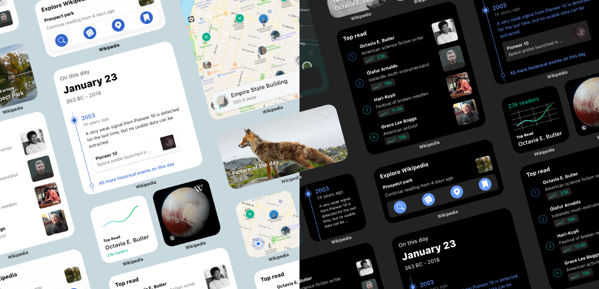
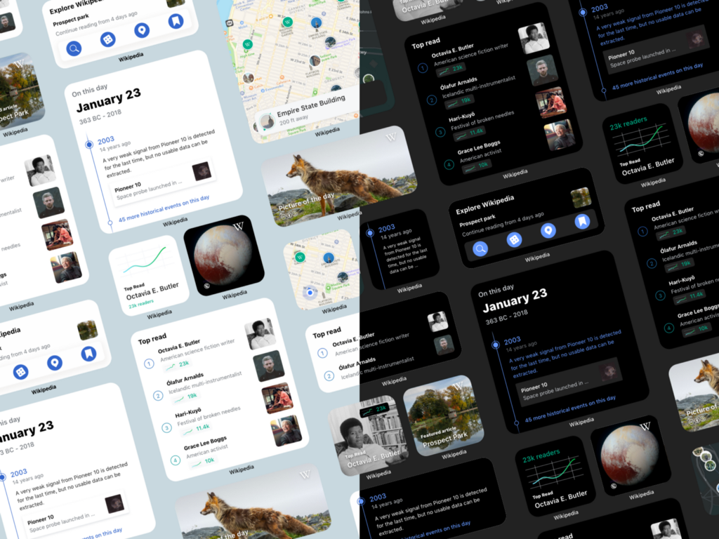
When Apple introduced an update to widgets with iOS 14, the Wikipedia iOS team was excited to take the opportunity to rethink our own. With the ability to place widgets right on the home screen, the team was curious about how we could highlight Wikipedia content in a way that was visually engaging, glanceable and up-to-date. For our first suite of home screen widgets, we built off of elements from the app’s Explore Feed to design and build three new widgets for iOS 14: On this day, Picture of the day and Top read on Wikipedia.
In this blog post, we’ll share some of our widget building process — from design to implementation.
Design principles for the Wikipedia iOS widgets
The iOS team defined the following design principles at the start of the project, which helped us to decide what features to highlight in our new widgets as well as to prioritize features like dark mode and supporting all three sizes for each of our widgets. These principles also guided the visual and interaction design of the widgets.
Content first
This design principle comes from the Wikimedia Design Style Guide.
People come to Wikimedia projects for their content. Our solutions should help to facilitate its creation, consumption, and sharing — without getting in the way. Our content (facts, images, quotes, etc.) is our most representative element, and needs to be emphasized in our solutions.
When it came to applying this principle to our widgets, we used this guidance to place a strong focus on the beautiful images and community written content in our widgets. Great encyclopedic content is why many people love Wikipedia and we wanted to ensure that our designs placed Wikipedia content front and center, with other design elements like graphs and headings taking a supporting role.
Focused
Home screens can easily become cluttered or distracting. With so many different apps, widgets and notifications pulling readers in different directions each time that they open their phone, we didn’t want to add to the noise or create unnecessary friction. We aimed to design widgets that were beautiful, glanceable and focused on a single element or content type from Wikipedia.
Dynamic
The Wikimedia projects are constantly changing and evolving. The projects are shaped by volunteer contributors from across the world. Readers also make their mark on Wikipedia, by following their unique interests and learning more about current events. With this in mind we want to highlight and celebrate the liveliness of Wikipedia with designs that reflect the dynamic nature of the Wikimedia projects.
Customizable
Widgets can come in three sizes (small, medium and large) and two reading themes (light and dark). We want to ensure that our readers can access the information that they are interested in, in a layout and theme that works well for them. Building off of the frameworks provided by Apple, we want to ensure that people can read comfortably (and in their preferred language, when available), regardless of the time of day or night.
Designing the Wikipedia iOS widgets
When it came time to begin designing our widgets, we looked to the WWDC 2020 talk on designing widgets and the information available through Apple’s Human Interface Guidelines. We wanted to ensure that whatever widgets we designed would adhere not only to our defined design principles but also to Apple’s design guidelines.
Some key takeaways from Apple’s guidelines were:
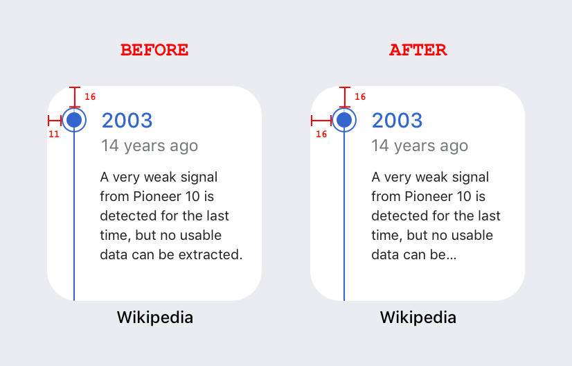
- Utilize a standard margin of 16pts for comfortable reading and design consistency.
- Focus on highlighting content that will change often to avoid widgets becoming stale.
- Create designs for both light and dark mode, or focus on creating designs that will work in both reading modes.
- Increase information with each widget size. Larger widgets should contain more information than their size small counterparts.
- SF Pro should be used over custom fonts so that widgets look at home with widgets from other apps.
- Remember that the associated app’s name will appear under each widget, so it isn’t necessary to include app icons or app names on the widget itself unless the widget is related to a content aggregator.
- Shapes inside of a widget should match the corner radius of the widget.
- Be mindful of how many deep links each widget size supports. As small widgets only support a single deep link, while there may be room to include more information, small widgets will only be able to link to a single location.
We utilized the templates provided in the Human Interface Guidelines to jumpstart the sketching process.
Designing the Picture of the day widget
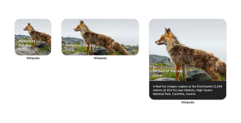
Vulpes vulpes image by Uoaei1
The first widget we designed was the Picture of the day widget. We wanted to start with something that would be easy to implement but also visually striking. Every day, the Wikimedia Commons community selects a freely usable image to be the ‘Picture of the day.’ These high-resolution images range from composite images of lunar eclipses to striking landscapes from around the world (and much more).
When designing this widget we wanted to make sure that the beautiful images were given as much room as possible, with other necessary information (like copyright and the widget title) coming second. This widget really embodies our design principle of ‘Content first’ by placing an emphasis on imagery over secondary information. When designing this widget, we also had to consider how cropping might affect different aspect ratios and photo subjects. With each increase in widget size, more of the image is shown and on the largest size the first three lines of the image description are also displayed. Tapping on the widget in any size deep links you into a full screen view of the featured image in the app.
For this design, we did not make separate light and dark mode designs as the content is full bleed and we typically display description text over a dark background in the app.
Designing the On this day widget
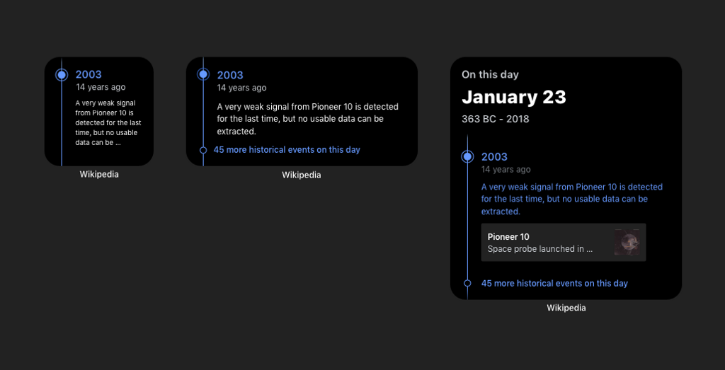
We love helping to ignite new rabbit holes for our readers, so we created a widget that would change each day and encourage readers to check out an article they might not have read before.
The design of this widget was based off of the ‘On this day’ card from the app’s Explore feed. Both the widget and the Explore feed card highlight the work of Wikipedia’s volunteer editors, who compile and annotate lists of important events throughout history for each day of the year.
When considering how to adapt this feature from the app to the three widget sizes, we began first with the largest widget size. The largest widget size allowed us to include multiple tap targets (linking directly to the associated article or to a timeline view of the day’s events) and to include a splash of typography that illustrates the day’s date and date range. Including the timeline element also helped to create a sense of continuity between the widget and the existing feature on the app which utilizes the same timeline design. With the smaller widgets we focused more on the event text (removing the card representing the related article) and utilized a single tap target for both of these sizes.
As the feature is already available on the app in our four reading themes, it was easy to support both light and dark modes for this widget.
After completing the first draft of our widgets, we received some very helpful feedback from the designers at Apple, who suggested we move the puck on the timeline up in order to better mimic the widget’s corner radius. It was a change of just a few pixels, but really helped to balance the visual design of the widgets and we were super grateful to have their feedback.
Designing the Top read widget
Seeing what the world is reading on Wikipedia is a constant source of fascination for many readers and editors (ourselves included!). We had previously supported a Top read widget in the older iOS style and were glad to have the time to be able to update this widget and bring it to the home screen.
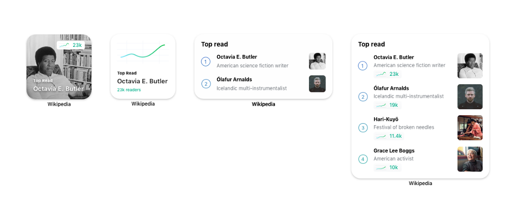
One of the first considerations with this widget was how to display articles that might not have an associated image, without needing to use a placeholder image. We wanted to avoid placeholder images as they don’t include relevant, encyclopedic content and can be repetitive if reproduced multiple times in a list. This was most important for the smallest size widget which only has space to link to one article. For the small widget with an available image we went with a full bleed image with a small spark map representing the popularity of the article over the past week. This sparkline was then enlarged and used as the primary imagery for articles that did not have an associated image. The sparklines were also included in the largest widget size, where we had just enough room to fit the top four articles, their associated sparklines and their title descriptions. For the medium-sized widget we wanted to ensure that we could show more articles than were available on the small widget, so we focused on presenting two articles without their sparklines vs. one article with more meta information than we could show on the small widget size.
This widget was also quite easy to translate into both light and dark designs as we were able to utilize our existing color palettes, which were designed to share the green used in the sparklines.
Building the widgets
These new widgets also gave the engineering team an opportunity to experiment with new platform technologies. The widgets are implemented using SwiftUI — Apple’s new user interface toolkit that aims to help bridge the gap between design and implementation. Converting the Top read sparkline we currently use in the app to SwiftUI provided valuable practical experience. It was encouraging to see potentially complex interface elements translate elegantly to the new framework.
Engineering work began during the early betas of iOS 14. The biggest implementation challenge we faced was using the unfinished development tools. The debugger, a tool used during development to examine the state of running widgets, often failed to work at all. Another challenge we encountered was balancing the expectation of always updated widget data with being considerate of the device’s battery life. This remains something we’re interested in refining — contributions are always welcome.
What’s next?
Increased multilingual support
Currently, the widgets utilize each reader’s primary language as set in-app settings. We would like to provide a way for multilingual readers to set a language preference on a per-widget basis, which would enable readers to keep an eye on what articles are trending on multiple Wikipedias or see what was happening on this day in history across the world.
More dynamic On this day widget
The On this day widget currently updates once a day and highlights a single event each day. In the future, we would like to make this widget more dynamic by featuring multiple events each day.
Future widget ideas
Due to time constraints we were unable to build all of the widgets that we dreamed up. In the future we would love to update three of our older style widgets: Today’s featured article, In the news and Continue reading. Additionally, we had some ideas around a widget that would enable you to jump straight into exploring Wikipedia with deep links into features like randomizer or reading lists. Finally, we had designed a map-based widget that built off of our Places feature and would have enabled readers to quickly locate and read Wikipedia articles about landmarks near them.
Join us in developing and designing new widgets!
The Wikipedia iOS app is open source and contributions are always welcome! If you are interested in developing one of our already designed widgets or if you have an idea for something new, please do reach out! You can follow along with the team’s work on Phabricator and file design or development tickets there, or feel free to contribute to the project on GitHub.
Thanks to Lucy Blackwell, Rita Ho, Robin Schoenbaechler, Matt Cleinman and Toni Sevener for editing help. Thank you to Deepak Mantena for writing the ‘Building the widgets’ section.

Bringing Wikipedia to the homescreen on iOS was originally published in UX Collective on Medium, where people are continuing the conversation by highlighting and responding to this story.