There has been a lot of buzz recently about Artificial Intelligence, with some people speculating that we are approaching the long-awaited AI revolution. This hype has been chiefly generated by recent advanced algorithms powering ChatGPT and other language-related models. While I believe that these models are still a far cry from general AI (AI which is able to learn for any task or problem), there is certainly a lot of power behind Artificial Intelligence driven algorithms.
While the field has been around for a long time, it has only been recently (in the last decade) that Deep Machine Learning approaches have started to take off. These advancements are owed to a couple of key factors.
This blog post will focus on how to specialize AI for understanding user interfaces for accessibility testing, the importance of algorithm and data integrity for accessibility, and how machine learning (machine learning is a subset of Artificial Intelligence that employs a variety of statistical and mathematical methods) can be used to simplify accessibility testing.
Advancements in Machine Learning
First, time has allowed researchers to collect data and also focus on high-quality data. That’s been one of the things that we’ve focused on at Deque. Larger datasets require solidifying data management practices. In turn, larger data sets and better data collection methods result in better performance from algorithms that are trained on that data.
It’s important as you scale up your data sets to make sure that you’re not introducing any noise and that you’re targeting your data collection in areas that will actually yield improvements for your artificial intelligence (AI) algorithms.
Secondly, algorithms are becoming more and more advanced. As mentioned, the basic convolutional neural network has been around since the 1980s and is a relatively primitive technology as far as things go. Since then, significantly more advanced approaches to computer vision have come out that have really helped drive performance in AI.
Lastly, there’s more advanced hardware to train the neural networks on. The GPUs that we have today are very good at processing large amounts of data in parallel and very quickly. They’ve made it very easy to train on large data sets and see huge gains.
ChatGPT has recently generated a lot of hype around AI. For those who haven’t heard about ChatGPT, it is what’s referred to as a Large Language Model (LLM). LLMs are trained on an incredibly large corpus of data and as a result, they can predict next sequences in text and code very effectively. They work on the same probabilistic principles as other algorithms. LLMs are very powerful for quickly generating easy-to-understand answers to prompts, code completions, and more.
It’s important to note that ChatGPT doesn’t actually work particularly well for accessibility. That’s because it’s trained on a general corpus of code and information available on the internet, which as we know, is not particularly reliable from an accessibility perspective.
Specializing Machine Learning for Accessibility
To tackle accessibility with AI and ML, we need a specialized model trained on specialized data. Machine Learning is well-suited in instances where you want to understand something a little bit deeper than what’s just there in the programming.
For example, ML can help if you want to understand what the role of an object is, or what its significance is in a user interface. We use ML to infer the role that an object in a user interface performs. In turn, that can help us check that its programming in the markup meets certain conditions.
This is helpful for a variety of reasons because it reduces the amount of fully manual testing and the amount of knowledge required to test things, while also increasing efficiency. At Deque, we address this particular problem by using several ML techniques: optical character recognition, computer vision, and human-centered AI.
A few years ago, it became our mission to achieve a large-scale, high-quality, accessibility-focused dataset with algorithms designed to interpret user interface design. We should note that Machine Learning is a statistical approximation of real-world data. Unless you can derive a very simple, very basic example, it is impossible to get everything right.
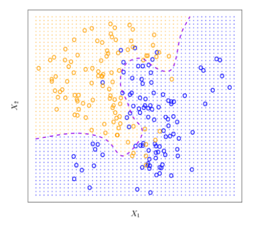
In the chart above, I have plotted what’s referred to as a decision boundary. The decision boundary does a decent job of separating the blue and orange points into their respective classes. Everything on one side of the decision boundary will be considered as one class, and everything on the other side will be in the other. However, unless you model an arbitrarily complex decision boundary, which will actually hurt your performance on real-world data outside of what it was trained on, some things will be classified incorrectly. The algorithms and the tests that power Machine Learning models are designed for account for a certain degree of error-proneness that the models have. Instead of using ML models as a source of truth, we use them to guide users into accessible design.
Computer Vision and Accessibility
At Deque, we use computer vision to tackle the problem of semantic role. Computer vision is a field of AI that enables computers and systems to derive meaningful information from digital images, videos, and other visual inputs and take action or make recommendations based on that information.
Deque’s ML models look at a webpage and analyze the visual appearance of all the components on the page. They also compare the components to one another to incorporate more context, determining what the role of everything on a webpage is and whether it’s interactive or structural.
For instance, a structural component is a heading, a navigation area, a list, a table, etc. The interactive components could be buttons, icons, tabs, list boxes, and inputs. By leveraging our large user base to help us collect machine learning data, we have a huge amount of customers, and subsequently, a huge amount of screens, that we can train on.
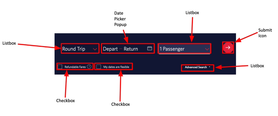
Here’s an example of what we use computer vision for: Above is a screenshot of a flight checkout page with a list box to select round trip, one-way, or multi-city. There’s also a date picker, popup button, another list box to select the number of passages, a submit icon, two checkboxes, and another list box for advanced search.
Deque’s ML looks at this webpage and outputs a bounding box around every single element on this page and what it thinks its role is. Our Intelligent Guided Tests (IGT) in the axe DevTools browser extension compare this prediction to what is actually in the markup. This allows us to test things further and make sure that they were programmed with the correct role.
The Importance of Reliable Data for Accessibility
We use a team of qualified human experts to label our data to ensure that the training data we use for our algorithms are accurate and reliable. This is especially important for accessibility as you can’t just rely on what’s in the markup because it often contains semantic role issues. In that case, we actually have humans that are trained in user interface design patterns to verify the accuracy and integrity of our data.
Human experts make sure that what is labeled and inputted into our neural networks is consistent with what is actually semantically there on the page, not what’s in the markup. This ensures better accuracy for our ML models, even though it is often more time-consuming and expensive to collect this data. We want to maintain veracity and reliability with the data outputs.
Using AI to Find Interactive Elements
One of the first examples of how Deque uses this in the real world is in our interactive elements IGT tool. Our ML-based interactive elements tests analyze webpages on their visual appearance and checks that the semantic role of an object on the webpage matches what the ML thinks it is.
For example, our ML algorithms can look at a screenshot of a webpage and identify the buttons, inputs, and other controls, just like a sighted user would. Afterward, this inference is compared to the markup to check that the role makes sense. Once we believe we know what the role of something is, we can test further.
Below is the list of interactive elements our Machine Learning is able to reliably identify:
- Accordion, Advertisement, Card, Carousel, Checkbox, Current Nav Item, Date Picker, Icon, Input, Link, List Item, Listbox, Map, Modal, Nav Bar, Popup Button, Radio Button, Selected Tab, Slider, Switch, Tab List, Text Button, Unselected Nav Item, Unselected Tab, Video
The most common objects are navigation items, list boxes, inputs, radio buttons, checkboxes, and text buttons.
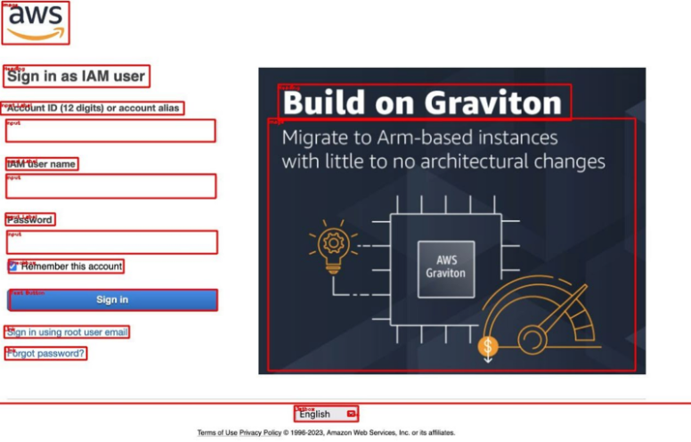
Above is an example on the Amazon Web Services login page. At the top, there is a heading that says sign-in as an IAM user. From the bounding boxes on the screenshot, you can see our machine learning has identified everything on this page. All inputs, the sign-in button, links, and logos have been identified and correctly classified. Note that we’ve also identified all of the inputs and the input labels that are associated with them.
Our ML can associate inputs and input labels together on a visual basis. In other words, we don’t need to rely on what’s there in the markup to know which inputs are associated with which input labels.
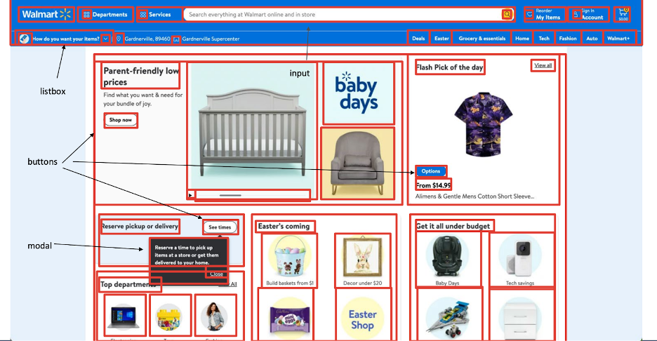
Above is a screenshot of the Walmart homepage. Observe that there are many different interactive and structural components on this page. Our ML has identified all of them. At the top, we have a navigation menu with several icons and navigation items. For clarity, some labels have been omitted.
An interesting note is that there are several nested presentational tables or layout tables here on the page. Inside each of those tables, we’ve identified the cards, the headings, and the images. In a complicated page with nested components, our ML is able to identify everything present.
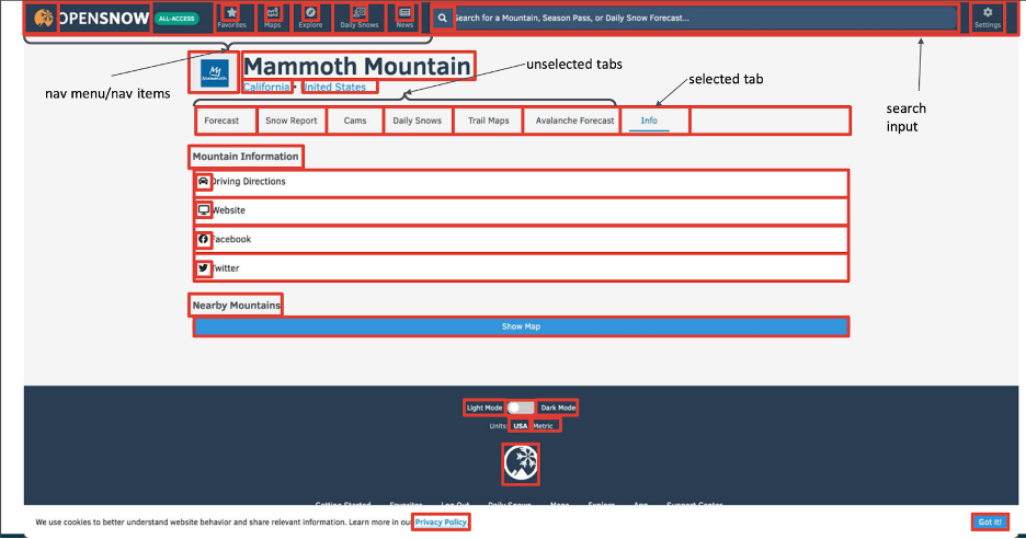
Above is the OpenSnow page for my personal favorite ski mountain, Mammoth Mountain. This webpage contains a navigation menu and a tab menu. In many ways, these two items are quite similar, but they do have an important difference and our ML algorithm is actually able to tell the difference between them.
We’ve also identified the button to show a map, all of the headings, all of the list items, all of the icons, the search field at the top, and the switch at the bottom.
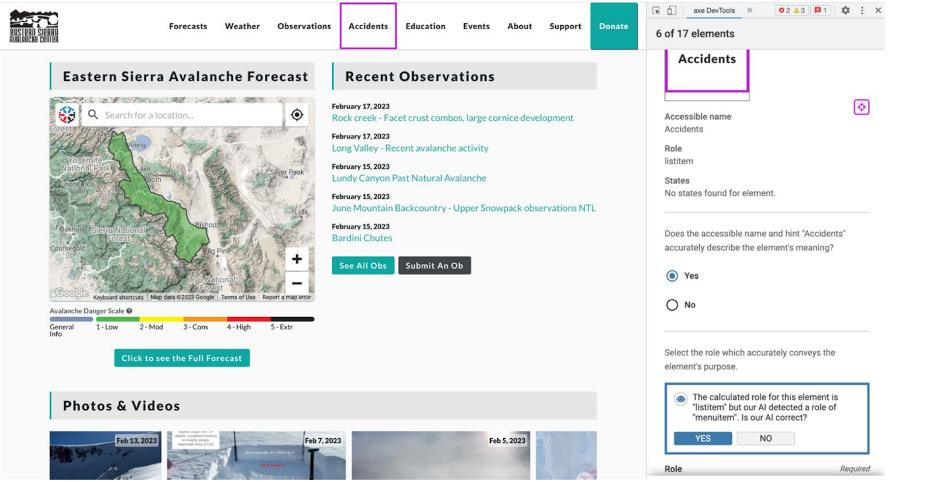
The example above shows our interactive elements tool and what we actually do with the output of the ML model. This screenshot is from the Eastern Sierra Avalanche Center, a nonprofit resource that outputs forecasts for avalanche danger on any given day.
When analyzing their page with our interactive elements tool, we’re able to identify a small issue with it: there is a navigation menu that allows you to select from a couple of options. The navigation item that is being analyzed is labeled “accidents.” This item has been marked up as a list item, and the interactive elements tool’s calculated role for this element is list item, but our AI detected that this is a menu item. Is our AI correct?
Instead of telling the user that they are wrong, we ask a question to guide them toward the right accessible markup. We give them the option to say, “No, actually your AI is wrong here. We like the option that we selected more.” In this case, we could argue that a menu item is the most correct markup. In the field of AI, this is called Human-Centered AI (HCAI). Human-centered AI is an emerging discipline intent on creating AI systems that amplify and augment rather than displace human abilities.
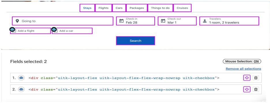
Here is another example of a flight checkout page through the context of our tool. In this example, there are two checkboxes at the bottom and the associated text, “add a flight” and “add a car.” Again, we’ve identified everything on this page. The fact that our AI knows which tab is selected just from the difference in the color of the text is of particular interest.
Instead of considering objects individually from one another, our ML looks at them and augments our object detection network with a module that considers object detections relative to one another. This allows us to do some really neat things, like determining which element is the selected tab.
It’s also important to note that our interactive elements tool flagged a potential accessibility issue. These checkboxes have been programmed using a div tag with no provided role. Our ML is able to look at these, know that these are checkboxes, see that there’s no role provided, and then ask the user a question about whether or not there should be a role provided. It will also suggest that a checkbox is the correct role in this case.
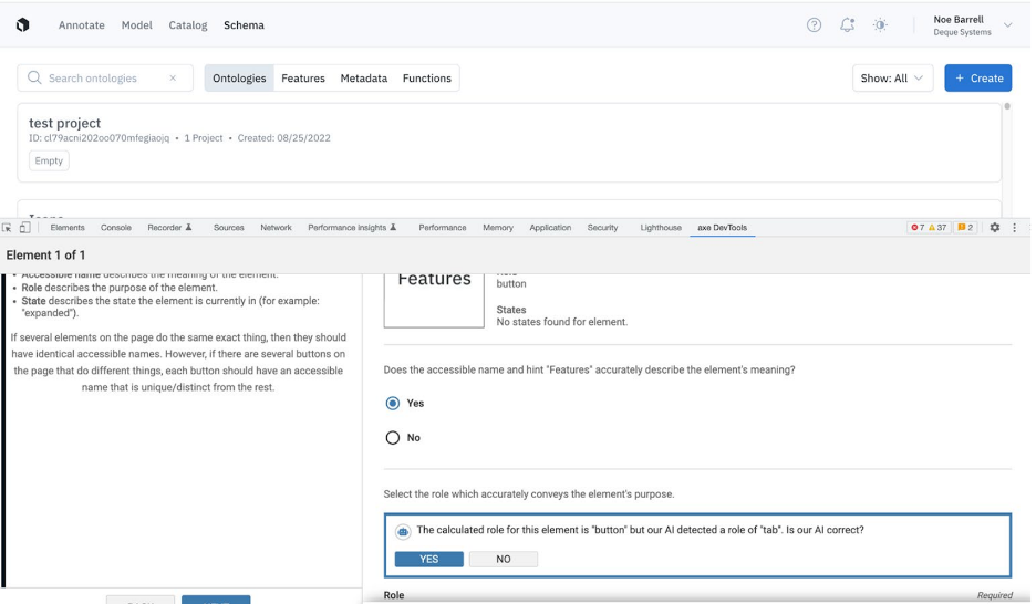
For a final example, there is a tab list at the top of this webpage. It says ontologies, features, metadata, and functions. Those are, in my opinion, the four tabs in this tab list. The provided role of the features tab is a button. One could argue that a button is a fine role for this tab in this particular tab list, but it could also be argued that because only one of these things can be selected at any given time and the focus changes based on which one you select, our AI is correct in suggesting that tab should be the markup here.
Again, instead of telling the user that they’re wrong, we ask them a question based on what our AI thinks is going on. We give the user a chance to say, “No, your AI is not correct,” or, “Yes your suggestion is correct.” This approach can help guide you more efficiently and effectively toward a more accessible design without inserting a potential false positive based on our ML detections.
Using ML to Understand Table Structure
Machine Learning is beneficial to digital accessibility testing not just with interactive components, but also with structural components. We use ML to look at and interpret the structure of tables. Deque’s systems can tell what the headings are and what the table, row, and column headers are.
Similar to our interactive elements tool, we check that the visual semantics of the table structure matches how they’re programmed. For example, we look at table cells, table headers, etc. We ensure that what our ML sees on the page matches our understanding of what is programmed. We also identify other structural components such as layout tables, lists, headings, input labels, and their associated input.
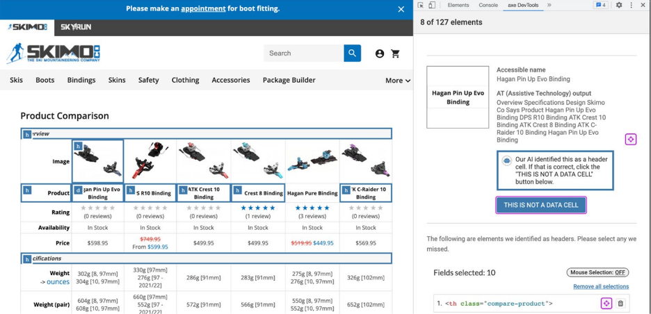
In the example above, there is a comparison table for different ski bindings with axe DevTools Pro open with the table tool. This is a complicated table with multiple headers, both for columns and for rows. In fact, there are two column headers on top of one another. The first column header here is an image for the binding, and the second one is the name of the binding. There are also headers like image, product rating, availability, price, etc.
Our ML will take a look at a screenshot of this table and analyze what it thinks the headings and the table cells are. In this example, the first row images have correctly been marked up as headers and all the columns on the left have also correctly been marked up as headers but the name of the binding has not been marked up as a header. This has been marked up as a data cell.
Our ML is able to look at this very complicated table example with multiple layers and determine that the second row is actually a row of headers. This has been programmed as a data cell but the AI identified this as a header cell. Our IGT will then ask the user if that is correct.
Unique ML Challenges in UI Interpretation
When we started this project several years ago, there was little to no prior work or research done on using Machine Learning or computer vision to interpret web pages and user interfaces. There are a couple of unique problems with using computer vision on a web page or user interface.
For instance, user interfaces can be very densely populated with objects. You can have a lot of objects on top of one another or right next to one another. It’s important to have a network that can efficiently process all of these objects.
User interfaces also have objects of very large and very small relative sizes. For example, an icon vs. a footer or a navigation menu. The relative size of those is a factor of many tens, maybe even a hundred. It is a technical challenge to consider so many objects of varying sizes through our neural network efficiently in a single pass.
Then, there’s the challenge with the data. All of the data that is out there for user interfaces or for the web is not collected with accessibility in mind. We had to collect our own data and ensure that the data is labeled manually by humans who are trained in user interface semantics.
Labeling training data can actually be quite time-consuming and expensive to collect because of how many objects can be on a page and how big pages can be. One screen can take up to 30 minutes for one of our experts to label manually. It’s taken many years to grow our dataset to the size that it is. It’s very important to ensure that as our dataset grows, we do not sacrifice quality because it’s very easy to just add a bunch of low-quality data, train on it, and hope for the best.
It’s important to ensure that the labeled data points of our dataset actually add to the diversity of our data. We have implemented targeted data collection methods to ensure that the data that we capture is improving our models so that our investment in this area is targeted.
A Look at Our Algorithm
Our computer vision algorithms are unique because they implicitly encode information about the relationships that objects have with one another. We do this by including a module in our object detection network that considers object detections relative to one another.
In the tab example, it would be impossible to tell whether or not one tab is selected or not by considering it on its own but because of this module in our neural network, we can consider the relationships that objects may have with one another.
There are many more complicated and nuanced examples in a user interface. For example, the search is at the icon next to the input in the navigation menu. Once we implemented this approach, we all of a sudden see much more consistent and reasonable detections coming out of our neural network.
This is a project several years in the making that started as an experiment out of a Jupyter Python Notebook. We wanted to see what was possible with AI and accessibility because there was nothing that existed at the time. Even in the broader field of user interface interpretation with ML, there wasn’t much out there.
Our data sets have grown considerably and our algorithms have advanced to the point where ML is now shaking up the way that we think about accessibility testing. Our data management practices and targeted collection efforts have also helped our advancements significantly.
What Sets Deque Apart
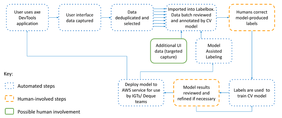
At Deque, our customers help inform our ML algorithms. We also have a complicated and continuous automated data pipeline. Every time we see a data point, it gets integrated into our data pipeline and allows us to learn. If we get something wrong in our interactive elements or our tables tool, our users will let us know. We use this as a future training example for our algorithms.
The amount of time between when we see we get it wrong, when we learn, and when we have a fix in the deployed model out in production is at most two weeks. Lastly, our computer vision algorithms are designed specifically to meet the concerns of user interface design. We are using this relationship module in our neural network to specifically target the user interface design specifics and the relationships that objects have to one another. We also have a team of expert human labelers that are trained in user interface semantics and they verify the accuracy and integrity of every single data point that we have.
We also use some unsupervised ML methods and human input to perform targeted data collection to ensure that any investment we have in our data set does not go to waste and that all the data points that we collect are actually helping to improve our networks.
Data Management and Collection
Deque has access to the largest accessibility ML data set in the world. We have several hundreds of thousands of user interface screens and we train on all that have been labeled and verified for their integrity. Each user interface screenshot has all of its components labeled structural and interactive by these experts.
We do a couple of things here to increase our labeling efficiency. First of all, our ML models are used to pre-annotate each data point so that our labelers aren’t just starting from scratch. They’re actually correcting the template label that we give them from our ML model. We found that this improves efficiency from anywhere between 25-50% during the labeling process.
We also use unsupervised machine learning model methods to compare our potential data points to one another. If we know that we’re doing poorly on one class and one object in the user interface, we can actually use some of these methods to automatically suggest future data points as training examples. This helps us to speed up, target our data collection, and make sure that our investment is well spent.
This has significantly improved the gains from our models with less time and financial investment. We’re able to quickly deploy models that have improvements and see gains and improvements in our ML models.
Deque’s Continuous AI Data Pipeline
Deque has a continuous and automatic AI data pipeline which is illustrated in the image below.
AI and ML Simplifies Accessibility
We are using machine learning to simplify several parts of accessibility testing. This means that we can reduce the barrier of entry to accessibility testing. We can increase the efficiency by reducing the amount of manual testing required and we can allow for further testing of components before they need to be fixed to match their appearance.
If we know what a component is, it doesn’t need to be fixed to test. If we know that a component is an input, it doesn’t need to be fixed to test input-related items on that component.
In Summary
AI and ML can sometimes be seen as a dirty word in the accessibility community. There are some solutions that claim that using AI can magically solve all digital accessibility issues on a page. Additionally, neural networks like ChatGPT don’t work well enough for digital accessibility because it’s trained on a very large general dataset of all the code on the internet that is mostly inaccessible.
The truth is that AI-augmented tools can be ethical if they are built by accessibility experts and used to simplify the testing process. AI can significantly expand what is possible for automated accessibility testing and lower the barrier of entry for non-experts to do manual testing.
