
Let me tell you a story along the lines of…Button, Button, Who’s Got The Button?
Typical “how to” articles are dry laundry lists of tactical “do this/don’t do that” mechanics that do nothing to help you think about WHY you should do things differently. Today, I’m going to share a more strategic accessible design approach through the art of storytelling.
For a solid foundation, let’s agree that accessibility is rooted in usability. There are tons of insightful articles about this across the web, so I won’t rehash that here. If you need to jump over to do additional research right now just remember, “Y’all come on back now!”
The Problem
During a recent meeting at a client’s office, a developer asked me to help them with an upcoming conversation with a designer. I’ll call this developer ‘Jim.’
The conversation between the designer and Jim was about how to make an inactive button accessible. You know, the grayed-out-button-when-all-required-fields-are-not-complete type of inactive button. Together they planned to explore different potential solutions. Jim wanted help finding solutions he could bring to the discussion.
Let’s take a moment to give credit where it’s due. It was so heartening to see a developer so invested that they were actually preparing early for an upcoming design conversation. This was fantastic to see! Kudos, Jim!
How I Didn’t Answer Jim’s Question
Rather than give Jim a list of solutions (much like the approach we are taking here), I suggested an alternate approach–establishing a common understanding of the real problem to be solved. I suggested using the fishbone diagram technique (more on that later) to help them get to the root cause of the problem as quickly as possible. When you establish a common understanding of the problem, you’ve already nearly reached a common approach to a solution. A shared mission equates to a more achievable objective!
If Jim and his designer could eliminate the need for an inactive button through other design solutions, it would be more time and cost-effective. Returning to the “why” of the design could solve the problem at hand and also indirectly contribute other positive effects to the equation—like reducing user cognitive load. Together, they could establish whether they could pivot to a different design directly, or if they would need to take a staged approach to eliminate the need for this type of button.
Some things we determined Jim and the designer should explore together:
- Through what other means is the design communicating to the user that these data points are required? Are there multiple attributes communicating ‘required data?’
- Has the traditional asterisk (*) iconography indicating required fields been bypassed? If so, why?
- What design standards have been established for this digital product to communicate required data? Is the current design in line with those standards?
- Are there multiple styles/formats for required fields being communicated across this digital product? If so, do we have a much larger problem to solve?
- How about the company’s other digital properties? Are the styles/formats consistent across all digital products? Do users have to deal with several different styles being presented to them? What is the scale of the problem?
- What usability studies have been completed to understand how users know what fields are required?
- Have there been any user complaints about this form? These complaints could offer insights on how to approach solving the problem.
- Are there any metrics on this form such as completion rate, error rates compared to number of successful journeys, etc.?
- How is error messaging being handled in the design? Is this sufficient to guide the user to remediate the error?
- When is information validation being applied during the user’s journey?
- Is the format of the data being input a contributing factor to the problem?
- Can the form accept multiple formats, but the form conditions the data to a standard format regardless of user input? E.g. the user enters nine consecutive numbers for a phone number, but the UI display resolves to dashes within the numbers.
- Underlying this, is the data being passed to the system required to be in a set format? Is it formatted as part of processing–meaning after the fact?
- Is there a business requirement to have an inactive button, or could it be driven by traditional required data formats, strong microcopy, and help text?
- Is this form style currently in the design system or is it a unique, custom experience?
Ok, It’s Later: What is the Fishbone Technique?
A fishbone diagram is used to brainstorm the causes of a problem. It’s also a visual way to look at cause and effect. It is a more structured approach than some other methods, e.g., the Five Whys, and can extend as far as needed.
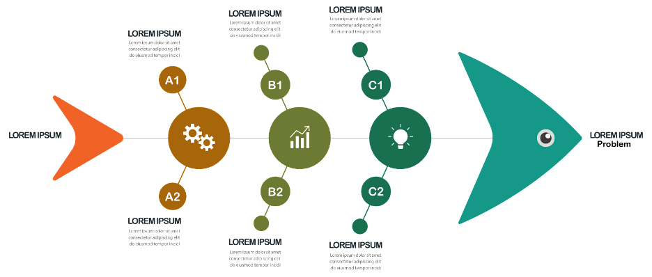
First, you identify the problem. Everyone needs to agree on the problem you are trying to solve. I’ve found that you often have different problems mashed up together–make multiple diagrams in these cases.
Second, identify causes and list them as the “ribs” or “bones” of the diagram. Keep brainstorming about causes–even if they seem far-fetched. Remember to put yourself in other people’s shoes and think about causes from their perspective.
Agree on a root cause. While there certainly can be contributing causes and factors, you want to find the problem–or problems–that are at the heart of the matter.
Work collaboratively on solutions. You could even identify stages to the solution delivery. What can you do immediately and how can your organization deliver the ultimate solution over time? Try to simultaneously work on solutioning and generating project plans, estimates, and funding models to be even more efficient.
Why I Didn’t Answer Jim’s Question Directly
To be fair, I started by telling Jim that I wouldn’t be answering their question directly and gave them these reasons why:
Without actual screens or wireframes, it’s difficult to hypothesize about the experience and how to improve it. I suggested we review the experience later if he could only afford tactical actions at this time.
Countless decisions have been made that led to the current experience that, as an outsider, I wasn’t privy to. It wouldn’t help for me to just make generalized statements without context; it’s far more effective to lead an open-ended-questioning conversation to guide teams to consider all possible solutions (as an aside, this technique is also highly effective for agile teams during their requirements gathering ceremonies with their peers).
A strong relationship, built on the dialog between a designer and developer, is critical for producing digital products—or any product, actually. Conversations that build sustainable relationships are a critical and strategic investment all teams should be making.
Finding and agreeing upon the root cause problem is the only way to resolve the problem fully. Band-aid-type solutions can be a good initial step in an emergency but defining more sustainable solutions resolves current and future users’ problems holistically–which is ultimately what we care about.
Finding a solution with a foundation in the design standards (and that may already be in their design system) will save design and development time and improve product owner and leadership acceptance.
While we all love to make unique experiences for our customers, deviating from well-understood user patterns (in the company’s products and, more importantly, across industry standards) means that the user must learn an unfamiliar pattern to be able to interact with it. This act of learning adds additional cognitive load for users. For people with learning and neurodiversity disabilities, for example, the cognitive load required is much higher. Anything designers can do to increase usability while reducing cognitive load for every and all users should be a priority.
Why I Love This Approach to Solve Design Problems at Scale
As you ponder this story, you can see how this approach could bloom into a much larger—and more difficult—conversation. It could uncover many more problems than you anticipated. Lots of people feel this methodology can be overwhelming and create a laundry list of issues (there’s that phrase again) making it harder to gain any traction. And, it’s easy to become paralyzed by the complexity of larger organizational issues.
I prefer to see it as a technique to find “themes” of issues that could be the catalyst for large-scale solutions and rapid change, like in this case, the need to set a standard for required fields for all forms across all digital properties so that all user journeys are consistent in this matter. Just because you identify the laundry list of issues doesn’t mean you have to address everything all at once. Look for opportunities to make changes that scale where applicable and staged approaches for others.
When organizations start to look at issues with this lens, leaps–instead of steps–are made. Organizations with disparate teams can roll out solutions concurrently, enabling scaling and speed. Other positive movements could be consolidating processes and code, training enhancement, stronger internal relationships between business and product teams, and a further ‘shift-left’ to ensure that design and development work hand-in-hand to build accessible experiences from the start—before any wireframe sketching or coding.
If you take a Design Thinking approach to solving problems, you unlock huge potential, truly transforming how your organization (your WHOLE organization) operates. Lean into it – every small step brings you and your team closer to the goal of ensuring equal access for everyone.
And they all lived accessibly ever after… 🙂
Design Strategy Blog Series
Deque will publish more about accessible design and design strategy in the coming months. If you have questions you’d like to submit or topics you would like to see us tackle, please comment below to send us ideas and content for consideration.