Back button, URL design, keyboard shortcuts, and other things we often forget about.
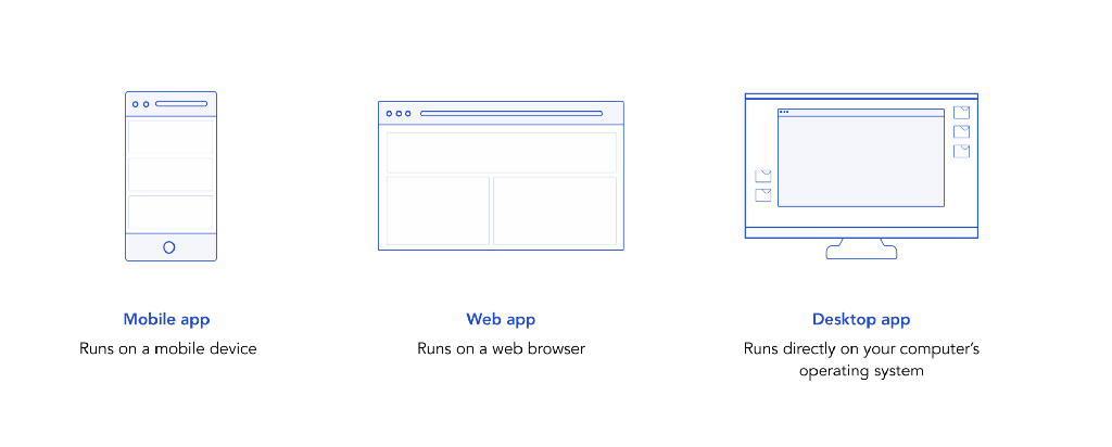
When designing an application, there are 3 major variations — mobile app, web app, and desktop app.
*It’s actually more complicated than this, but we’ll ignore that for now. Check out my other post to find out more about the different crossovers between web and desktop apps.*
Mobile app design is pretty comprehensively documented and understood. However, web and desktop apps are often lumped together as one.
The assumption seems to be that the only important factors to consider in designing for different types of apps is screen size and portability. However, there are specific considerations to be made when designing a web app as opposed to a desktop app, even though they might run on the same device.
A web app lives inside another application — your web browser — and there are certain constraints and opportunities to keep in mind when designing for this context.
Browser chrome
No, not the browser ‘Chrome’ – browser chrome is the UI frame that surrounds a web page, such as the URL bar, window resize controls, bookmarks, and settings buttons.
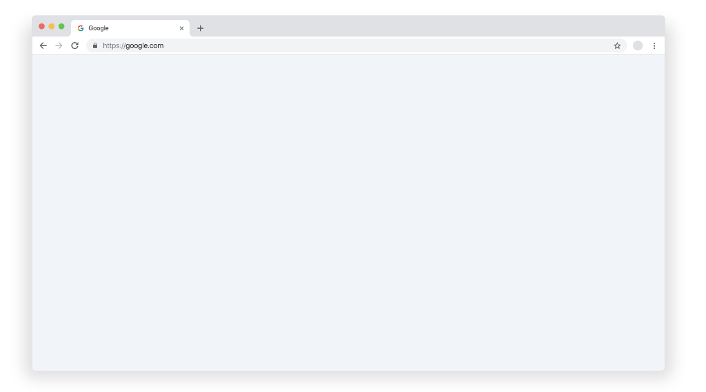
When designing a web app (or just a regular website), remember that your designs will be surrounded by this chrome. This is especially important if your app is somehow vertically responsive. Most design tools will have plugins to preview how designs will actually look within the browser.
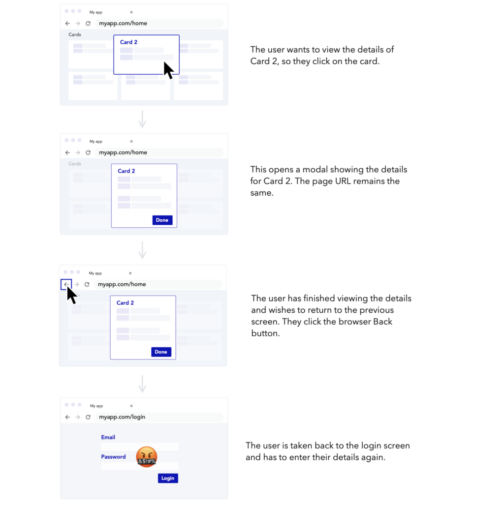
The back button
The saviour of anyone who has ever been lost on the web and needed to find their way home, the back button takes you back to the last page/URL you visited.
However, when not considered, the back button can be a source of frustration within a web app. Many web apps are single-page applications, meaning they don’t need to load different pages to present different views. This makes them feel a lot more responsive and closer to a desktop experience.
The issue with this is that pressing the back button on a single-page app could take you back to the login screen. This could result in losing a lot of unsaved progress, as well as the added annoyance of losing your context and having to log in again.
A sad Back Button journey
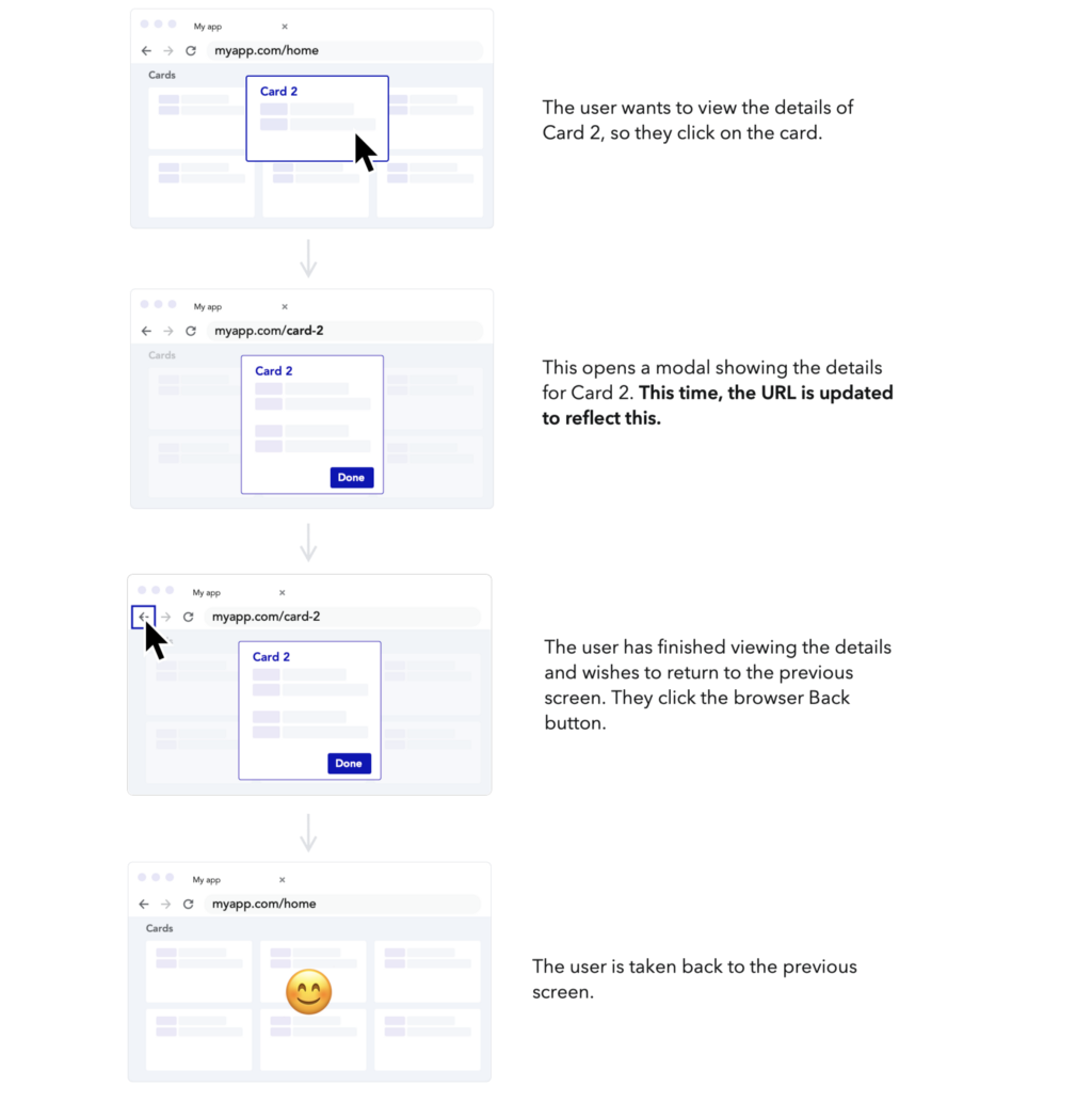
To avoid situations like this, we can make use of things like anchor tags, query parameters and the HTML5 History API to make the most of the back button without having to have separate pages for different views.
Consider the places in your app the user might want to ‘back out’ of an action —how can we make this a happy journey instead of a sad one?
A happy Back Button journey
URL Design
Aside from navigation using back/forward buttons, URLs can afford other useful functionalities. They can be used as a way of bookmarking a page for later or sharing it with someone else. When used like this, they become part of the experience and something that we can design.
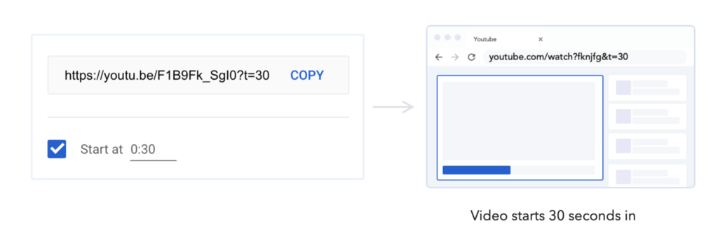
Linking to specific content
Firstly, you want to make sure that the URL that is saved/shared actually links to the specific content that the user intends.
Anchor tags <a> can be used to scroll to content within a page. Query parameters can be used to specify certain actions to be triggered within a page. Having an easy way to copy, save or share these links can be a really powerful tool when effectively matched to user’s tasks.
An example that might be familiar is the ability to link to a specific timestamp within a Youtube video:
Unique & human-readable
The structure of the URL itself is also something we can design, and ideally, we want to strike a balance between something that is both unique and human-readable.
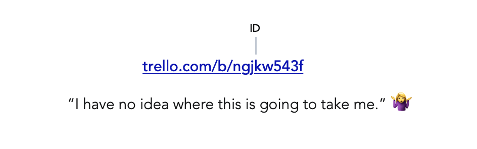
For example, Trello uses an 8 digit ID code for every board. An 8 digit alphanumeric code can have over 2 trillion possible combinations. This helps ensure that every single Trello board can safely have a unique identifier for many years to come (even with the hundreds of old boards that I have gathering dust).
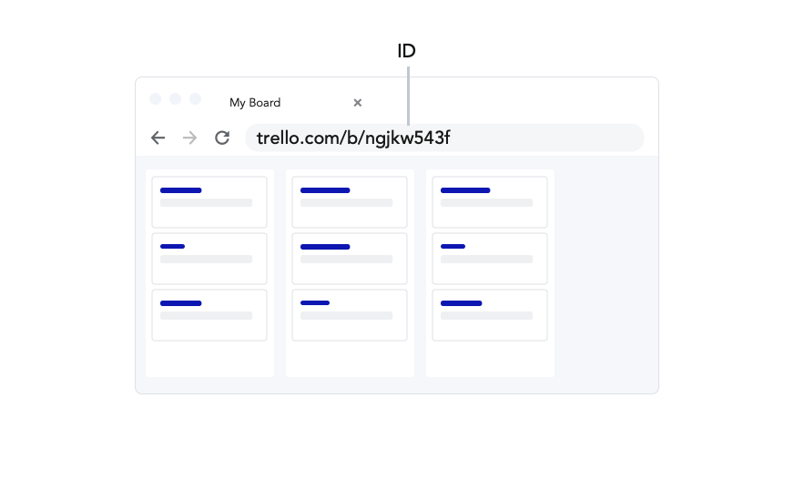
However, this code alone, while functional, is not very user-friendly. It would be difficult to know which board it links to just by looking at the URL:
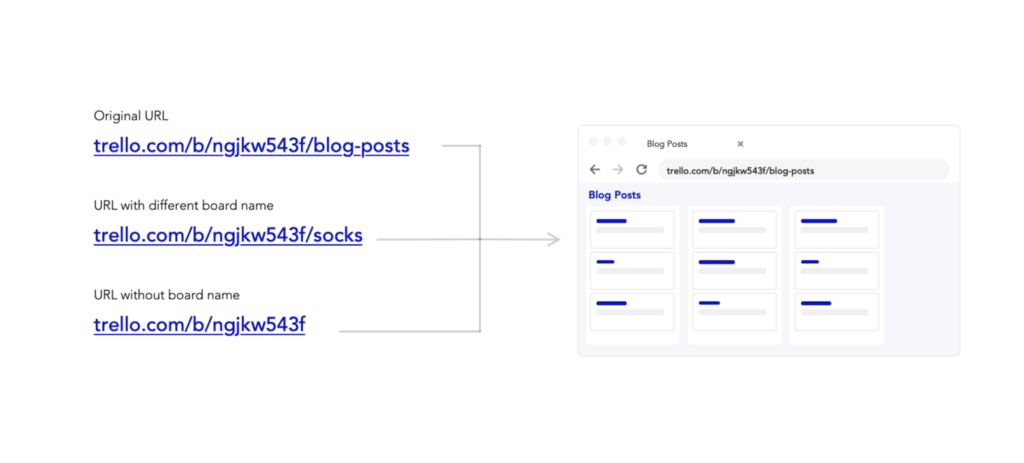
To get around this, Trello adds the name of the board after the ID. This makes it easy to see where the link will go. They also do some nice formatting to deal with spaces and special characters that are not accepted in URLs.
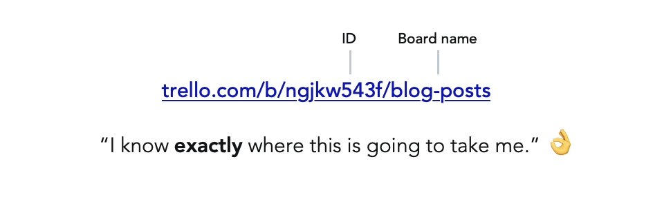
The name is essentially pointless from a technical standpoint, your browser just ignores it. You can replace it with any other word, or remove it completely, and still be taken to the same page.
The ID is the thing taking you to the right board, the name of the board is there purely to make the URLs more user-friendly. A perfect partnership of unique and human-readable!
Keyboard shortcuts
Keyboard shortcuts can be hugely beneficial to enabling a fast and efficient workflow. Many people have common shortcuts baked into their muscle memory and don’t even need to think before triggering them.
It makes sense that we should try to leverage this muscle memory and have keyboard shortcuts for important actions in our web apps, too. However, the browser is an application – it has its own set of shortcuts and overriding them can cause problems.
For example, most designers will be accustomed to using CMD+D / Ctrl + D to duplicate elements in design tools. It’s one that I use a lot because I hate throwing away ideas. Many times, when using a web-based design tool, I’ve used CMD+D to duplicate something and ended up saving the page to my bookmarks instead!
In this situation, I’d prefer to have the browser shortcut replaced with the one that I am used to using in the context of a design tool. However, many people will also use this shortcut to bookmark pages. How do we decide when to override, and when not to?
There’s no definite answer to this. Instead, we need to weigh up the variables of each situation. How likely are users to want to do the browser-based shortcut in the context of your app? How strong is their association with this shortcut? Which action is more important?
Of course, there’s always the option of creating a different shortcut to surface the desired action, but this requires relearning and loses the built-in muscle memory that might exist.
As a web-based design tool, I imagine the designers at Figma have grappled with this very question. To turn a disadvantage into an opportunity, they have gamified their shortcut help, so that the ones that have been used show up highlighted. I’m now on a mission to collect them all!
Context menus
A similar challenge arises with context menus. Showing relevant actions on right-click can save users a lot of time and frustration trying to find the right controls.
Users that are used to context menus in a desktop app may expect to see the same options on a web app. However, browsers are applications themselves and they have their own context menus that contain important controls. By overriding this menu, we are hiding controls that some users might need.
Again, there’s no single right answer to this, and it depends on the context (get it?). How likely are your users to need some of the built-in context menu items? Is the value of adding a custom menu worth the tradeoff of hiding the default one?
The designers at Google Docs clearly made the choice that a custom context menu is worth more than the default one. This makes total sense when you consider the task of writing a document. However, they also made it possible to see the default menu using Shift+Right Click (maybe not the most obvious interaction, it took me a while to find it).
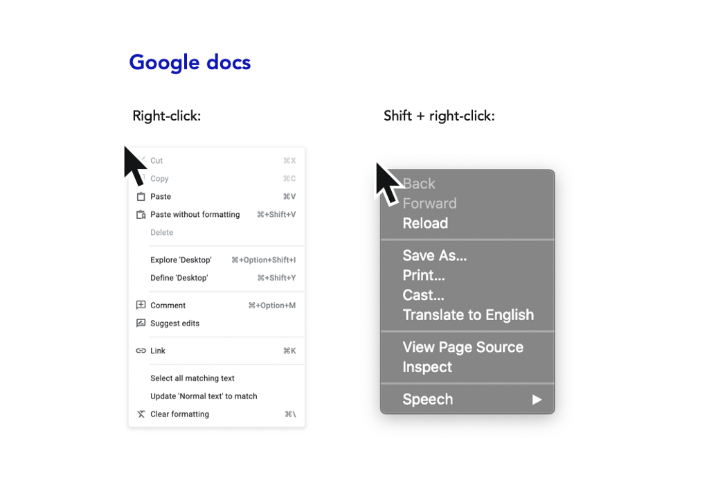
This is a great way to bridge the gap and get the benefit of custom context menus, without completely getting rid of the browser menu!
These are just some of the considerations I’ve noticed that are unique to designing an app for the web. Whether we are designing for web, desktop, or mobile, we should be aware of the constraints and opportunities that come with each environment, to help us craft the best experience possible.

![]()
Design with the web in mind was originally published in UX Collective on Medium, where people are continuing the conversation by highlighting and responding to this story.